Theming
Last updated on 2026-07-28 | Edit this page
Estimated time: 15 minutes
Overview
Questions
- How can I make the plot look good?
- How do I get rid of that grey background?
- How do I get rid of the gridlines?
Objectives
- Learn to use different themes
- Learn to adjust the appearance of specific parts of the plot
The THEME_FUNCTIONs
Every part of the plot can be changed. The grey background might be annoying The gridlines might be confusing.
These non-data components of the plots can be controlled using the
family of theme functions:
R
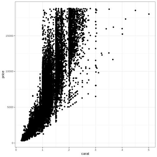
ggplot(diamonds, aes(carat, price)) +
  geom_point() +
  theme_bw()
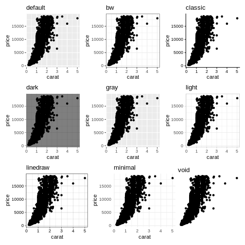
 More exists:
Notice the pattern?
A general pattern of function names in ggplot2 can be seen.
Themes are named “theme_” and then the name of the theme. We saw the same pattern with the scale functions: “scale_” and then the axis, followed by what we did to the axis, eg: “scale_y_log10”
Even more theming
Every element in the plot can be controlled. The
theme() function is the way to do that:
R
diamonds |>
  ggplot(aes(carat, price)) +
  geom_point() +
  theme_dark() +
  theme(axis.text.y = element_text(angle= 45))
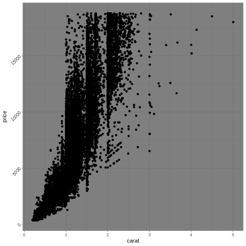
Angling the labels in a plot can be good for readability. However the actual way to do it can be a bit more involved as you see above. Read the help for theme to get at complete list of things that can be changed. There are 97 things in total.
Also note, that we can add theming on top of previous theming. Here we begin with a built-in theme that we like, and change the parts we want to change.
Finally note, that the order is important:
R
diamonds |>
  ggplot(aes(carat, price)) +
  geom_point() +
  theme_dark() +
  theme(axis.text.y = element_text(angle= 45))
and
R
diamonds |>
  ggplot(aes(carat, price)) +
  geom_point() +
  theme(axis.text.y = element_text(angle= 45)) +
  theme_dark()
Will not give the same result. theme_dark has a setting
for the way the text on the y-axis is shown, and will overwrite the
changes done before calling it.
Most of the elements of the plot need to be defined in a
special way. If we want the “theme” a text element, we set the
axis.text to be an element_text() function
with specific arguments to specify what we want to do. For the
background of the plot we are changing a rectangular object
element_rect, and can set the background colour like
this:
R
diamonds |>
  ggplot(aes(carat, price)) +
  geom_point() +
  theme(axis.text.y = element_text(angle= 45),
        panel.background = element_rect(fill = "red"))
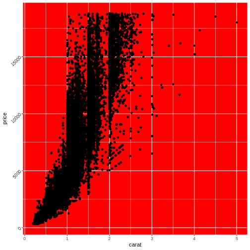 Note that we are not setting the
 plot.background, as that
would change the background of the entire plot, rather than the
background of the actual area on which we are plotting.
- EVERYTHING in the plot can be customized