What is an API?
Figure 1
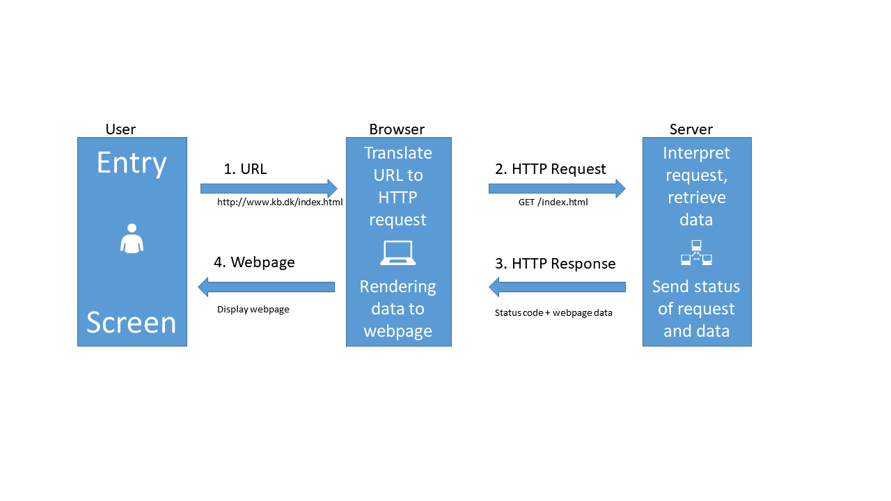
Figure 2
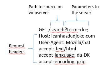
Figure 3
GETting data
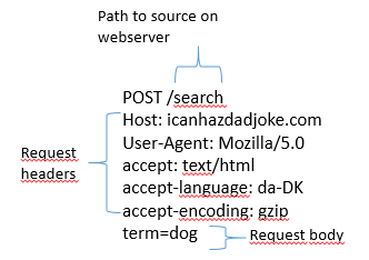
Using POST
Figure 1
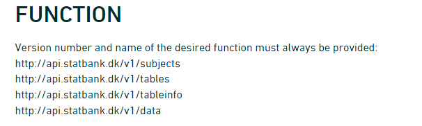 {Screenshot of endpoints at
Statistics Denmark API}
{Screenshot of endpoints at
Statistics Denmark API}
What about danstat?
A short note on timeA relatively short session on time.
ggplot2
Figure 1
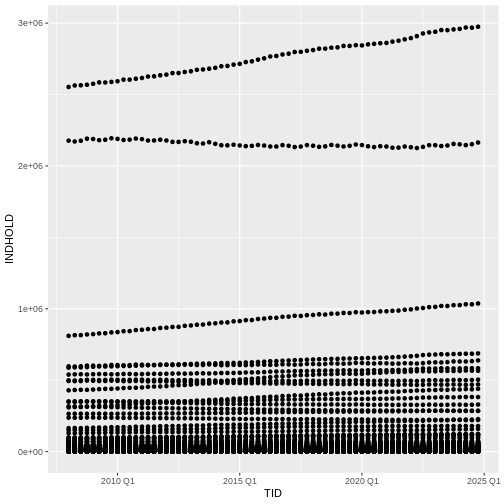 What we might note that the fact that we have ALL the municipalites
leads to a LOT of points.
What we might note that the fact that we have ALL the municipalites
leads to a LOT of points.
Figure 2
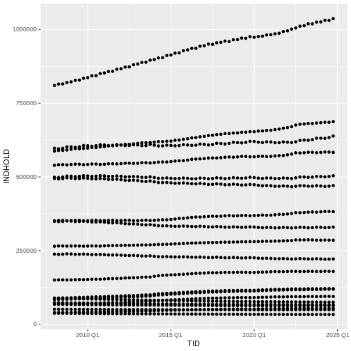 A lot better.
Figure 3

Figure 4
Figure 5
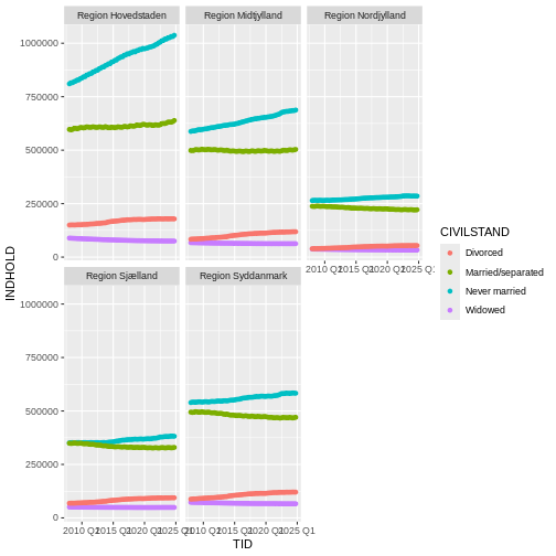
Figure 6
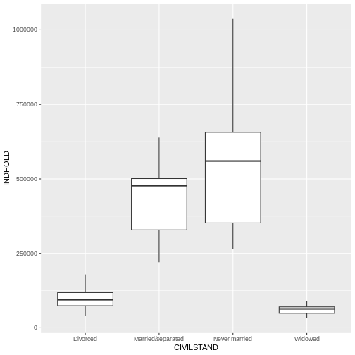 Let us be frank - a boxplot of these aggregated data is not really that
useful. Boxplots are however so useful, that it is relevant to show how
they are made.
Let us be frank - a boxplot of these aggregated data is not really that
useful. Boxplots are however so useful, that it is relevant to show how
they are made.
Figure 7
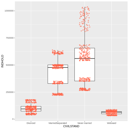 Jitter is a special way of plotting points. When we plot the points at
their exact location, we risk that some of the points overlap.
geom_jitter adds a small bit of noise to the data, in order to spread
them out. That way we can better see individual points.
Jitter is a special way of plotting points. When we plot the points at
their exact location, we risk that some of the points overlap.
geom_jitter adds a small bit of noise to the data, in order to spread
them out. That way we can better see individual points.
Figure 8
Figure 9
 Now we get the values from INDHOLD plotted on the y-axis. But we get ALL
the values from INDHOLD plotted. And we have INDHOLD from several years,
from several administrative parts of Denmark.
Now we get the values from INDHOLD plotted on the y-axis. But we get ALL
the values from INDHOLD plotted. And we have INDHOLD from several years,
from several administrative parts of Denmark.
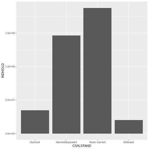
Figure 10
 Now we get more sensible numbers. But each bar is still the sum of the
number of divorced persons in ALL the regions.
Now we get more sensible numbers. But each bar is still the sum of the
number of divorced persons in ALL the regions.
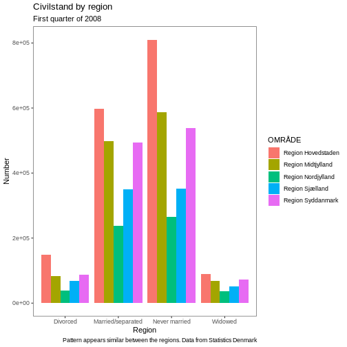
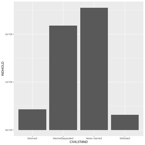
Figure 11
 Oops! Color only colors the outline of the bars. We can do better.
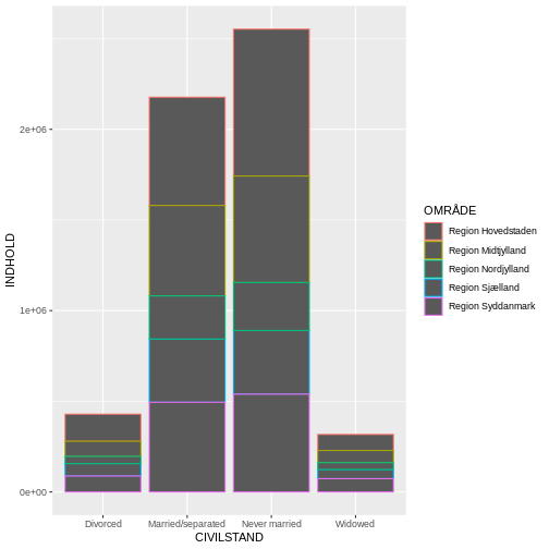
Figure 12
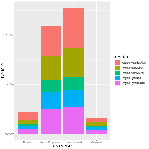
Figure 13
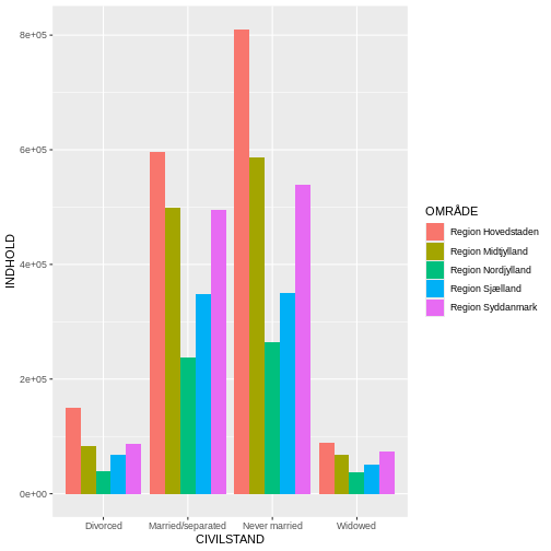
Figure 14
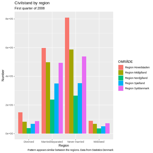
Figure 15