Getting to know the data
Overview
Teaching: 30 min
Exercises: 10 minQuestions
How do I import data?
How are the data distributed?
Are there correlations between variables?
Objectives
Importing data
getting an overview of data
how to find metadata
using plots to explore our data
Read in data in R
First we load tidyverse which make datamanipulation easier. We also load a
package to help us read Excel files:
library(tidyverse)
library(readxl)
Let us read in the excel spreadsheet we downloaded in preparation, and saved in the data folder of our project:
flightdata <- read_excel("data/flightdata.xlsx")
Taking a look at the data
Always begin by taking a look at your data!
flightdata %>%
  head() %>%
  view()
This dataset is pretty big. It is actually so big, that a view() of the
entire dataset takes about 10 seconds to render. And some of the other
things we would like to do to it, takes even longer.
Instead of waiting for that, it can be a good idea to work and experiment with a smaller part of the dataset, and only use the entirety of the data when we know what we want to do.
One way of doing that would be to use the function sample_frac to return a
random fraction of the dataset:
flightdata %>%
  sample_frac(0.005) %>%
  view()
After taking a quick look at the data, it is time to get some statistical insight.
The summary function returns summary statistics on our data:
summary(flightdata)
      year          month             day           dep_time    sched_dep_time
 Min.   :2013   Min.   : 1.000   Min.   : 1.00   Min.   :   1   Min.   : 106
 1st Qu.:2013   1st Qu.: 4.000   1st Qu.: 8.00   1st Qu.: 907   1st Qu.: 906
 Median :2013   Median : 7.000   Median :16.00   Median :1401   Median :1359
 Mean   :2013   Mean   : 6.549   Mean   :15.71   Mean   :1349   Mean   :1344
 3rd Qu.:2013   3rd Qu.:10.000   3rd Qu.:23.00   3rd Qu.:1744   3rd Qu.:1729
 Max.   :2013   Max.   :12.000   Max.   :31.00   Max.   :2400   Max.   :2359
                                                 NA's   :8255
   dep_delay          arr_time    sched_arr_time   arr_delay
 Min.   : -43.00   Min.   :   1   Min.   :   1   Min.   : -86.000
 1st Qu.:  -5.00   1st Qu.:1104   1st Qu.:1124   1st Qu.: -17.000
 Median :  -2.00   Median :1535   Median :1556   Median :  -5.000
 Mean   :  12.64   Mean   :1502   Mean   :1536   Mean   :   6.895
 3rd Qu.:  11.00   3rd Qu.:1940   3rd Qu.:1945   3rd Qu.:  14.000
 Max.   :1301.00   Max.   :2400   Max.   :2359   Max.   :1272.000
 NA's   :8255      NA's   :8713                  NA's   :9430
   carrier              flight       tailnum             origin
 Length:336776      Min.   :   1   Length:336776      Length:336776
 Class :character   1st Qu.: 553   Class :character   Class :character
 Mode  :character   Median :1496   Mode  :character   Mode  :character
                    Mean   :1972
                    3rd Qu.:3465
                    Max.   :8500

     dest              air_time        distance         hour
 Length:336776      Min.   : 20.0   Min.   :  17   Min.   : 1.00
 Class :character   1st Qu.: 82.0   1st Qu.: 502   1st Qu.: 9.00
 Mode  :character   Median :129.0   Median : 872   Median :13.00
                    Mean   :150.7   Mean   :1040   Mean   :13.18
                    3rd Qu.:192.0   3rd Qu.:1389   3rd Qu.:17.00
                    Max.   :695.0   Max.   :4983   Max.   :23.00
                    NA's   :9430
     minute        time_hour
 Min.   : 0.00   Min.   :2013-01-01 10:00:00.00
 1st Qu.: 8.00   1st Qu.:2013-04-04 17:00:00.00
 Median :29.00   Median :2013-07-03 14:00:00.00
 Mean   :26.23   Mean   :2013-07-03 09:22:54.64
 3rd Qu.:44.00   3rd Qu.:2013-10-01 11:00:00.00
 Max.   :59.00   Max.   :2014-01-01 04:00:00.00
We get an overview of all the data (and the summary function have no problems working with even very large datasets). From this we learn a bit about the datatypes in the data, and something about the distribution of the data.
Metadata
Metadata is data about the data. Usually we are interested in the provenance of the data. In this case it is data on all flights departing New York City i 2013, from the three commercial airports, JFK, LGA and EWR. The data was originally extracted from the US Bureau of Transportation Statistics, and can be found at https://www.transtats.bts.gov/Homepage.asp
The columns of the dataset contains the following data:
- year, month, day Date of departure.
- dep_time, arr_time Actual departure and arrival times (format HHMM or HMM), local tz.
- sched_dep_time, sched_arr_time Scheduled departure and arrival times (format HHMM or HMM), local tz.
- dep_delay, arr_delay Departure and arrival delays, in minutes. Negative times represent early departures/arrivals.
- carrier Two letter carrier abbreviation. See airlines to get name.
- flight Flight number.
- tailnum Plane tail number. See planes for additional metadata.
- origin, dest Origin and destination. See airports for additional metadata.
- air_time Amount of time spent in the air, in minutes.
- distance Distance between airports, in miles.
- hour, minute Time of scheduled departure broken into hour and minutes.
- time_hour Scheduled date and hour of the flight as a POSIXct date. Along with origin, can be used to join flights data to weather data.
Always remember to save information about what is actually in your data.
Let us make a plot
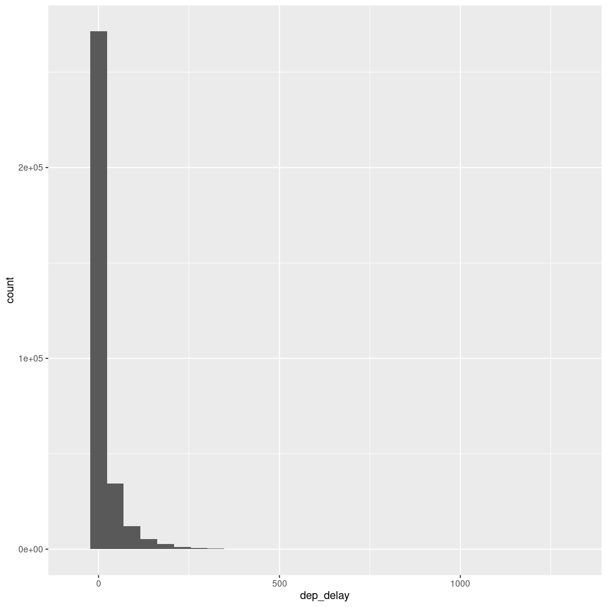
What is the distribution of departure delays? Are there a lot of flights that depart on time, and a few that are very delayed?
A histogram is a great way to get a first impression of a particular variable in the dataset, so let us make one of those:
flightdata %>%
  ggplot(mapping = aes(x = dep_delay)) +
    geom_histogram()
`stat_bin()` using `bins = 30`. Pick better value with `binwidth`.
Warning: Removed 8255 rows containing non-finite values (`stat_bin()`).
plot of chunk unnamed-chunk-7
A histogram divides the numeric values of the departure delay into “buckets” with a fixed width. It then counts the number of observations in each bucket, and plot a column matching that count.
Note the warning! By default ggplot divides the observations into 30 buckets.
30 buckets are almost never the right number, so adjust it by adding eg bins = 50
to geom_histogram().
What is the right number of bins?
The right number of bins is the number of bins that show what we want to show about the data. Tips on how to choose a number of bins can be found here: https://kubdatalab.github.io/forklaringer/12-histogrammer/index.html
Let us make another plot!
After looking at the distrubtion of observations in the different variables, we might want to explore correlations between them.
What, for example, is the connection between delays of departure vs. arrival for these flights?
flightdata %>%
  sample_frac(.005) %>%
  ggplot(mapping = aes( x = dep_delay, y = arr_delay)) +
  geom_point()
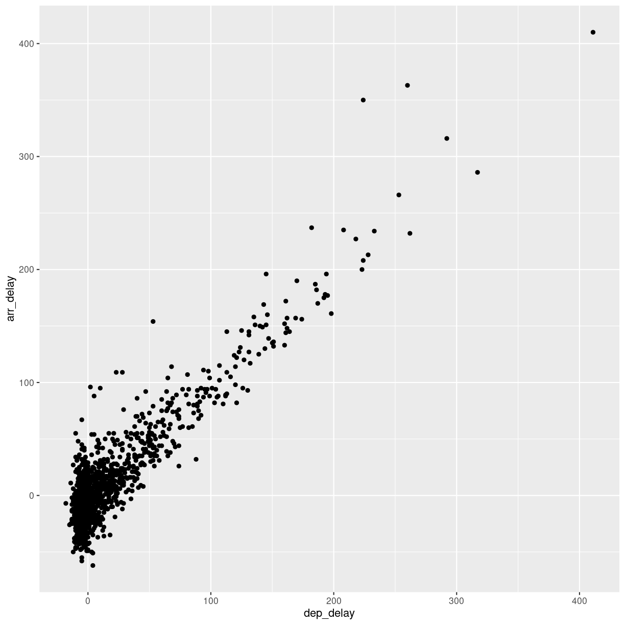
plot of chunk unnamed-chunk-8
We pipe the data to sample_frac in order to look at 0.5% of the data.
The result of that is piped to the ggplot function, where we specify that
the data should be mapped to the plot, by placing the values of the delay of
departure on the X-axis, and the delay of arrival on the Y-axis.
That in itself is not very interesting, so we add something to the plot:
+ geom_point(), specifying that we would like the data plotted as points.
This is an example of a case where it can be a good idea to work on a smaller dataset. Plotting the entirety of the data takes about 40 times longer than plotting 0.5% of the data.
When we explore data, we often want to look at correlations in the data. If one variable falls, does another fall? Or rise?
Making these kinds of plots can help us identify interesting correlations, but it is cumbersome to make a lot of them. So that can be automated.
The build-in plot function in R will take a dataframe, and plot each
individual column against every other column.
To illustrate this we cut down the dataset some more, looking at an even smaller subset of the rows, and eliminating some of the columns. To get a better plot without a lot of warnings, we also remove missing values from the dataset:
flightdata %>%
  na.omit() %>%
  sample_frac(.0001) %>%
  select(-c(year, carrier, flight, tailnum, hour, minute, time_hour, origin, dest)) %>%
  plot()
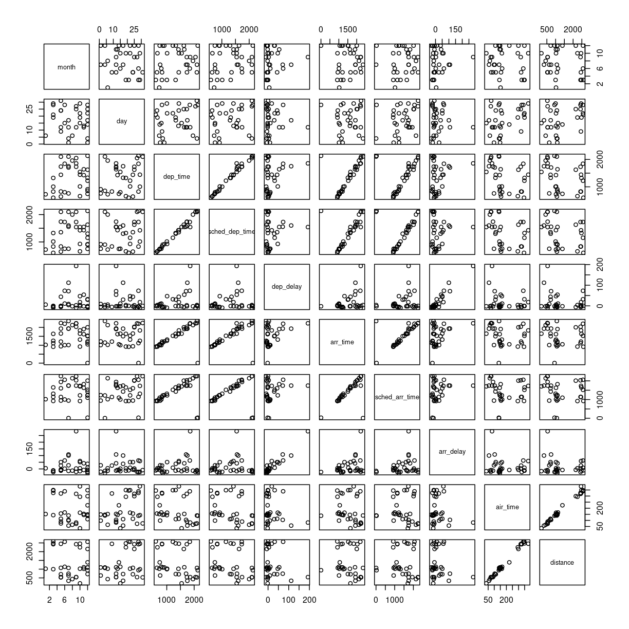
plot of chunk unnamed-chunk-9
This gives us a good first indication of how the different variables varies
together. The name of this type of plot is correllogram because it shows
all the correlations between the selected variables.
Bringing distrubtion and correlation together
A better, or perhaps just prettier, way of doing the above is to use the library
GGally, which have a fancier version, showing both the distribution of values
in the different columns, but also the correlation between the variables.
Begin by installing GGally:
install.packages("GGally")
Now we can plot:
library(GGally)
flightdata %>%
  sample_frac(.0001) %>%
  select(-c(year, carrier, flight, tailnum, hour, minute, time_hour, origin, dest)) %>%
  na.omit() %>%
  ggpairs(progress = F)
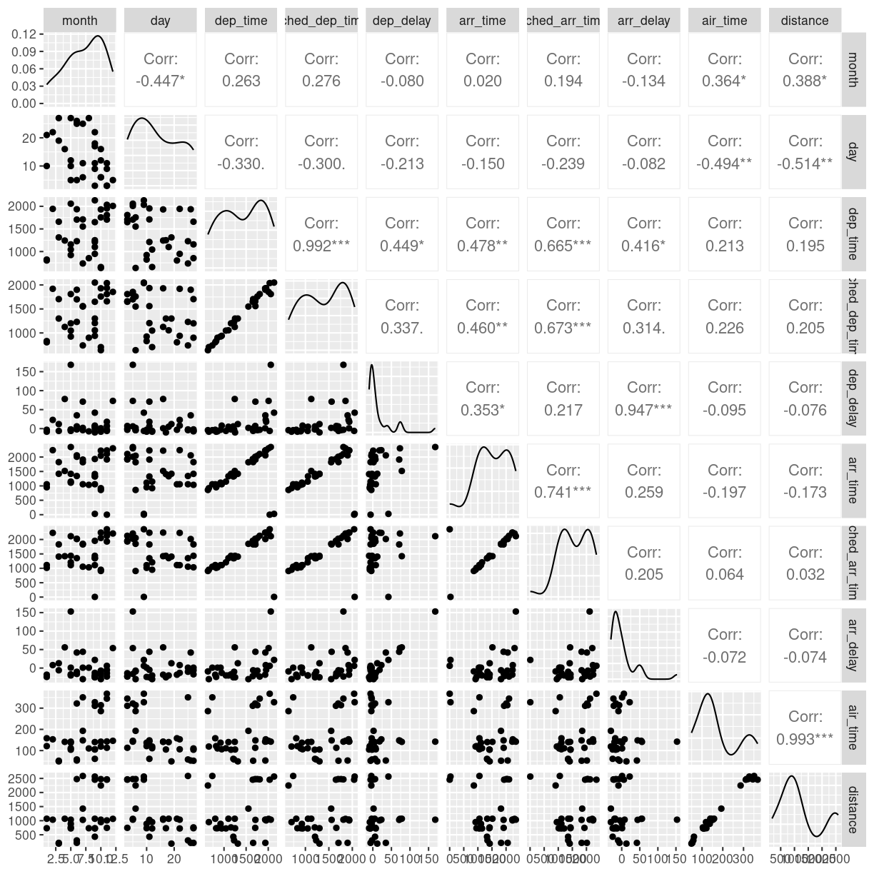
plot of chunk unnamed-chunk-11
We need to cut down the number of observations again - the scatterplots would be unreadable otherwise. The classical corellogram is enriched with a densityplot in the diagonal, basically a very smooth histogram, and the correlation coefficients above the diagonal.
Key Points
Always start by looking at the data
Always keep track of the metadata