Before we Start
Overview
Teaching: 10 min
Exercises: 5 minQuestions
What is EDA?
How to get ready to do data analysis?
How to get the data we are working with?
Objectives
Make sure tidyverse is updated.
Make a new project.
Organize your folders.
Download the data.
What is EDA?
EDA stands for Exploratory Data Analysis. It is a process of analyzing and summarizing a dataset in order to understand its main characteristics, such as the distribution of variables, the presence of outliers, and the relationship between different variables.
In R, EDA typically involves using a combination of visual and quantitative methods to explore and summarize the data, such as creating histograms, scatter plots, and summary statistics, which can be done using a variety of R packages such as ggplot2 and dplyr.
Getting set up
It is good practice to keep a set of related data, analyses, and text self-contained in a single folder called the working directory. All of the scripts within this folder can then use relative paths to files. Relative paths indicate where inside the project a file is located (as opposed to absolute paths, which point to where a file is on a specific computer). Working this way makes it a lot easier to move your project around on your computer and share it with others without having to directly modify file paths in the individual scripts.
RStudio provides a helpful set of tools to do this through its “Projects” interface, which not only creates a working directory for you but also remembers its location (allowing you to quickly navigate to it). The interface also (optionally) preserves custom settings and open files to make it easier to resume work after a break.
Create a new project
- Under the
Filemenu, click onNew project, chooseNew directory, thenNew project - Enter a name for this new folder (or “directory”) and choose a convenient
location for it. This will be your working directory for the rest of the
day (e.g.,
~/data-carpentry) - Click on
Create project - Create a new file where we will type our scripts. Go to File > New File > R
script. Click the save icon on your toolbar and save your script as
“
script.R”.
The simplest way to open an RStudio project once it has been created is to
navigate through your files to where the project was saved and double
click on the .Rproj (blue cube) file. This will open RStudio and start your R
session in the same directory as the .Rproj file. All your data, plots and
scripts will now be relative to the project directory. RStudio projects have the
added benefit of allowing you to open multiple projects at the same time each
open to its own project directory. This allows you to keep multiple projects
open without them interfering with each other.
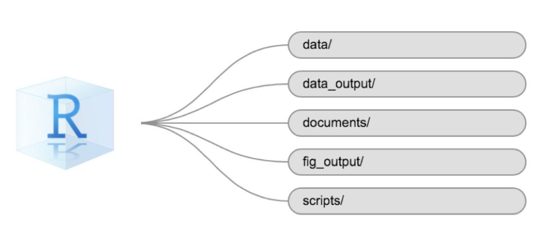
Organizing your working directory
Using a consistent folder structure across your projects will help keep things organized and make it easy to find/file things in the future. This can be especially helpful when you have multiple projects. In general, you might create directories (folders) for scripts, data, and documents. Here are some examples of suggested directories:
data/Use this folder to store your raw data and intermediate datasets. For the sake of transparency and provenance, you should always keep a copy of your raw data accessible and do as much of your data cleanup and preprocessing programmatically (i.e., with scripts, rather than manually) as possible.data_output/When you need to modify your raw data, it might be useful to store the modified versions of the datasets in a different folder.documents/Used for outlines, drafts, and other text.fig_output/This folder can store the graphics that are generated by your scripts.scripts/A place to keep your R scripts for different analyses or plotting.
You may want additional directories or subdirectories depending on your project needs, but these should form the backbone of your working directory.
Not all projects needs the entire filestructure, but when analysing data, we
strongly recommend that you have at least the data folder established as a
place to store your original, raw, data.
The working directory
The working directory is an important concept to understand. It is the place where R will look for and save files. When you write code for your project, your scripts should refer to files in relation to the root of your working directory and only to files within this structure.
Using RStudio projects makes this easy and ensures that your working directory
is set up properly. If you need to check it, you can use getwd(). If for some
reason your working directory is not the same as the location of your RStudio
project, it is likely that you opened an R script or RMarkdown file not your
.Rproj file. You should close out of RStudio and open the .Rproj file by
double clicking on the blue cube!
Is everything up to date?
After setting up our project, it is time to make sure our libraries are up to date.
Run the install.packages() functions on the libraries you are going to use. In this case we are going to use the tidyverse packages, and the readxl package to import data:
install.packages("tidyverse")
install.packages("readxl")
Getting the data
Getting the data can be the most time consuming part of any dataanalysis.
In this workshop, we are going to analyse flight data. You should already have
downloaded the data. Move the file to the data folder of your project.
If not, you will need to download the data, now:
download.file("https://raw.githubusercontent.com/KUBDatalab/R-EDA/main/data/flightdata.xlsx",
              "data/flightdata.xlsx", mode = "wb")
Key Points
A good project is an organized project
Getting to know the data
Overview
Teaching: 30 min
Exercises: 10 minQuestions
How do I import data?
How are the data distributed?
Are there correlations between variables?
Objectives
Importing data
getting an overview of data
how to find metadata
using plots to explore our data
Read in data in R
First we load tidyverse which make datamanipulation easier. We also load a
package to help us read Excel files:
library(tidyverse)
library(readxl)
Let us read in the excel spreadsheet we downloaded in preparation, and saved in the data folder of our project:
flightdata <- read_excel("data/flightdata.xlsx")
Taking a look at the data
Always begin by taking a look at your data!
flightdata %>%
  head() %>%
  view()
This dataset is pretty big. It is actually so big, that a view() of the
entire dataset takes about 10 seconds to render. And some of the other
things we would like to do to it, takes even longer.
Instead of waiting for that, it can be a good idea to work and experiment with a smaller part of the dataset, and only use the entirety of the data when we know what we want to do.
One way of doing that would be to use the function sample_frac to return a
random fraction of the dataset:
flightdata %>%
  sample_frac(0.005) %>%
  view()
After taking a quick look at the data, it is time to get some statistical insight.
The summary function returns summary statistics on our data:
summary(flightdata)
      year          month             day           dep_time    sched_dep_time
 Min.   :2013   Min.   : 1.000   Min.   : 1.00   Min.   :   1   Min.   : 106
 1st Qu.:2013   1st Qu.: 4.000   1st Qu.: 8.00   1st Qu.: 907   1st Qu.: 906
 Median :2013   Median : 7.000   Median :16.00   Median :1401   Median :1359
 Mean   :2013   Mean   : 6.549   Mean   :15.71   Mean   :1349   Mean   :1344
 3rd Qu.:2013   3rd Qu.:10.000   3rd Qu.:23.00   3rd Qu.:1744   3rd Qu.:1729
 Max.   :2013   Max.   :12.000   Max.   :31.00   Max.   :2400   Max.   :2359
                                                 NA's   :8255
   dep_delay          arr_time    sched_arr_time   arr_delay
 Min.   : -43.00   Min.   :   1   Min.   :   1   Min.   : -86.000
 1st Qu.:  -5.00   1st Qu.:1104   1st Qu.:1124   1st Qu.: -17.000
 Median :  -2.00   Median :1535   Median :1556   Median :  -5.000
 Mean   :  12.64   Mean   :1502   Mean   :1536   Mean   :   6.895
 3rd Qu.:  11.00   3rd Qu.:1940   3rd Qu.:1945   3rd Qu.:  14.000
 Max.   :1301.00   Max.   :2400   Max.   :2359   Max.   :1272.000
 NA's   :8255      NA's   :8713                  NA's   :9430
   carrier              flight       tailnum             origin
 Length:336776      Min.   :   1   Length:336776      Length:336776
 Class :character   1st Qu.: 553   Class :character   Class :character
 Mode  :character   Median :1496   Mode  :character   Mode  :character
                    Mean   :1972
                    3rd Qu.:3465
                    Max.   :8500

     dest              air_time        distance         hour
 Length:336776      Min.   : 20.0   Min.   :  17   Min.   : 1.00
 Class :character   1st Qu.: 82.0   1st Qu.: 502   1st Qu.: 9.00
 Mode  :character   Median :129.0   Median : 872   Median :13.00
                    Mean   :150.7   Mean   :1040   Mean   :13.18
                    3rd Qu.:192.0   3rd Qu.:1389   3rd Qu.:17.00
                    Max.   :695.0   Max.   :4983   Max.   :23.00
                    NA's   :9430
     minute        time_hour
 Min.   : 0.00   Min.   :2013-01-01 10:00:00.00
 1st Qu.: 8.00   1st Qu.:2013-04-04 17:00:00.00
 Median :29.00   Median :2013-07-03 14:00:00.00
 Mean   :26.23   Mean   :2013-07-03 09:22:54.64
 3rd Qu.:44.00   3rd Qu.:2013-10-01 11:00:00.00
 Max.   :59.00   Max.   :2014-01-01 04:00:00.00
We get an overview of all the data (and the summary function have no problems working with even very large datasets). From this we learn a bit about the datatypes in the data, and something about the distribution of the data.
Metadata
Metadata is data about the data. Usually we are interested in the provenance of the data. In this case it is data on all flights departing New York City i 2013, from the three commercial airports, JFK, LGA and EWR. The data was originally extracted from the US Bureau of Transportation Statistics, and can be found at https://www.transtats.bts.gov/Homepage.asp
The columns of the dataset contains the following data:
- year, month, day Date of departure.
- dep_time, arr_time Actual departure and arrival times (format HHMM or HMM), local tz.
- sched_dep_time, sched_arr_time Scheduled departure and arrival times (format HHMM or HMM), local tz.
- dep_delay, arr_delay Departure and arrival delays, in minutes. Negative times represent early departures/arrivals.
- carrier Two letter carrier abbreviation. See airlines to get name.
- flight Flight number.
- tailnum Plane tail number. See planes for additional metadata.
- origin, dest Origin and destination. See airports for additional metadata.
- air_time Amount of time spent in the air, in minutes.
- distance Distance between airports, in miles.
- hour, minute Time of scheduled departure broken into hour and minutes.
- time_hour Scheduled date and hour of the flight as a POSIXct date. Along with origin, can be used to join flights data to weather data.
Always remember to save information about what is actually in your data.
Let us make a plot
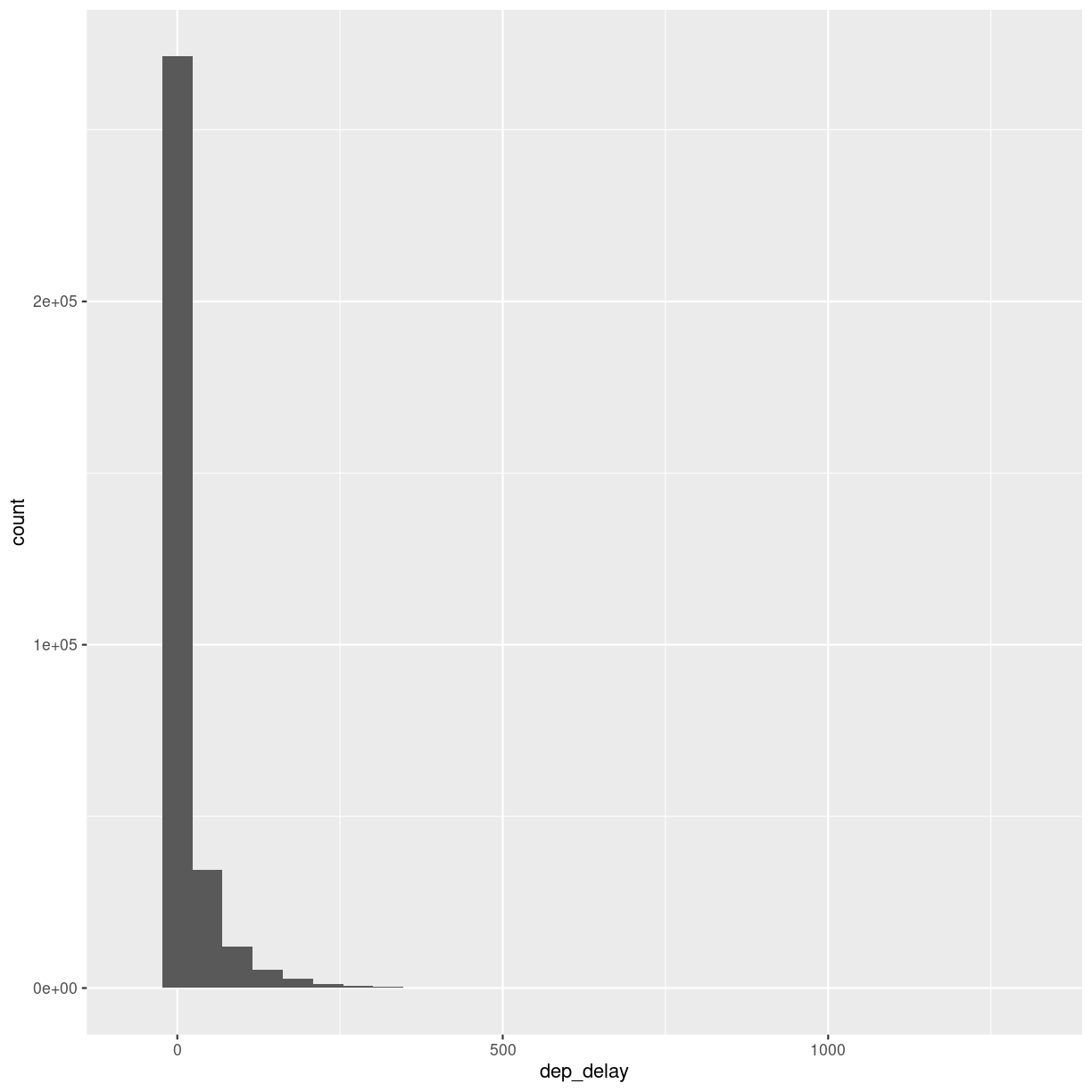
What is the distribution of departure delays? Are there a lot of flights that depart on time, and a few that are very delayed?
A histogram is a great way to get a first impression of a particular variable in the dataset, so let us make one of those:
flightdata %>%
  ggplot(mapping = aes(x = dep_delay)) +
    geom_histogram()
`stat_bin()` using `bins = 30`. Pick better value with `binwidth`.
Warning: Removed 8255 rows containing non-finite values (`stat_bin()`).
plot of chunk unnamed-chunk-7
A histogram divides the numeric values of the departure delay into “buckets” with a fixed width. It then counts the number of observations in each bucket, and plot a column matching that count.
Note the warning! By default ggplot divides the observations into 30 buckets.
30 buckets are almost never the right number, so adjust it by adding eg bins = 50
to geom_histogram().
What is the right number of bins?
The right number of bins is the number of bins that show what we want to show about the data. Tips on how to choose a number of bins can be found here: https://kubdatalab.github.io/forklaringer/12-histogrammer/index.html
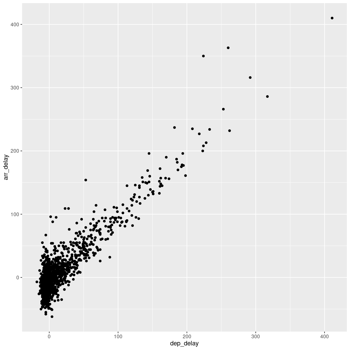
Let us make another plot!
After looking at the distrubtion of observations in the different variables, we might want to explore correlations between them.
What, for example, is the connection between delays of departure vs. arrival for these flights?
flightdata %>%
  sample_frac(.005) %>%
  ggplot(mapping = aes( x = dep_delay, y = arr_delay)) +
  geom_point()
plot of chunk unnamed-chunk-8
We pipe the data to sample_frac in order to look at 0.5% of the data.
The result of that is piped to the ggplot function, where we specify that
the data should be mapped to the plot, by placing the values of the delay of
departure on the X-axis, and the delay of arrival on the Y-axis.
That in itself is not very interesting, so we add something to the plot:
+ geom_point(), specifying that we would like the data plotted as points.
This is an example of a case where it can be a good idea to work on a smaller dataset. Plotting the entirety of the data takes about 40 times longer than plotting 0.5% of the data.
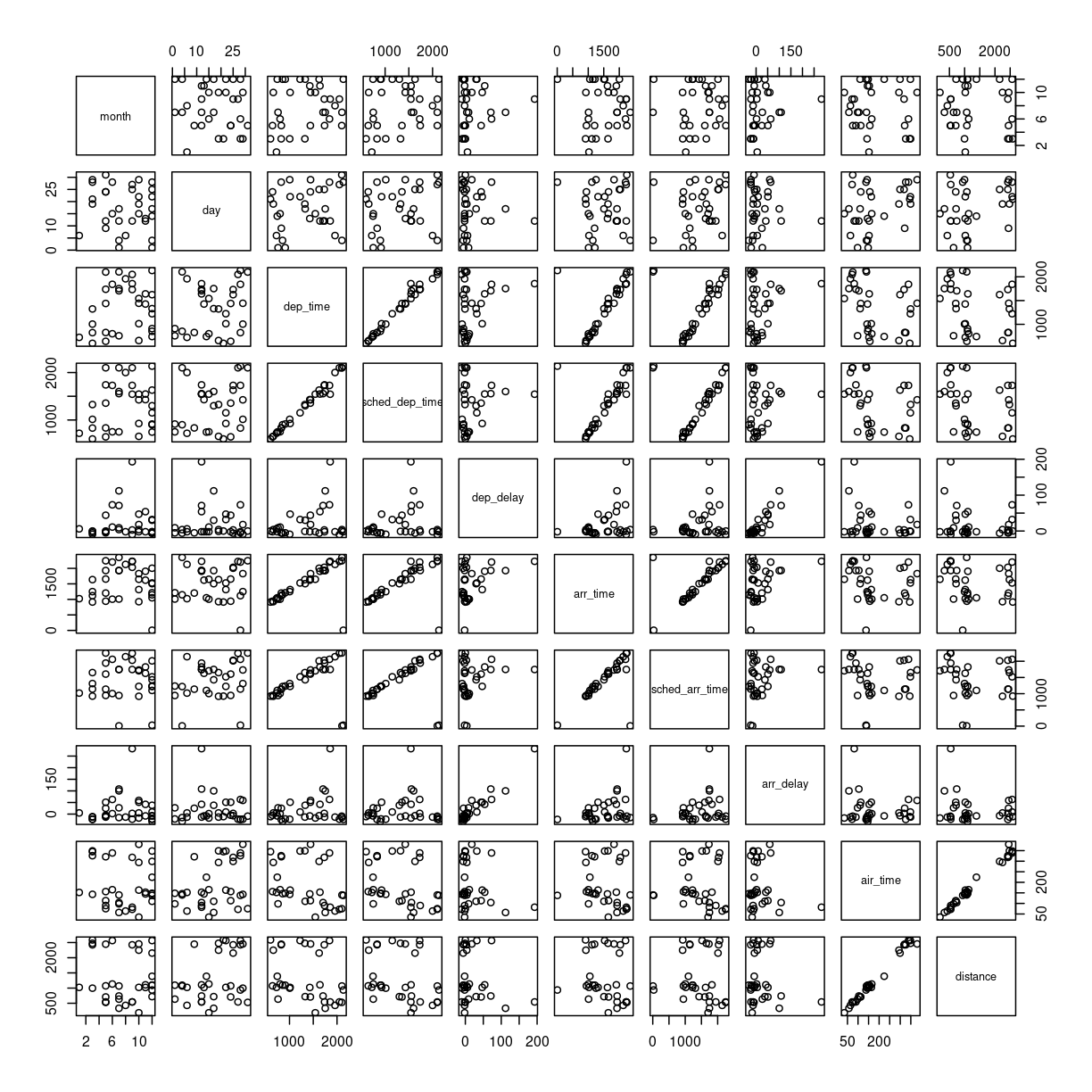
When we explore data, we often want to look at correlations in the data. If one variable falls, does another fall? Or rise?
Making these kinds of plots can help us identify interesting correlations, but it is cumbersome to make a lot of them. So that can be automated.
The build-in plot function in R will take a dataframe, and plot each
individual column against every other column.
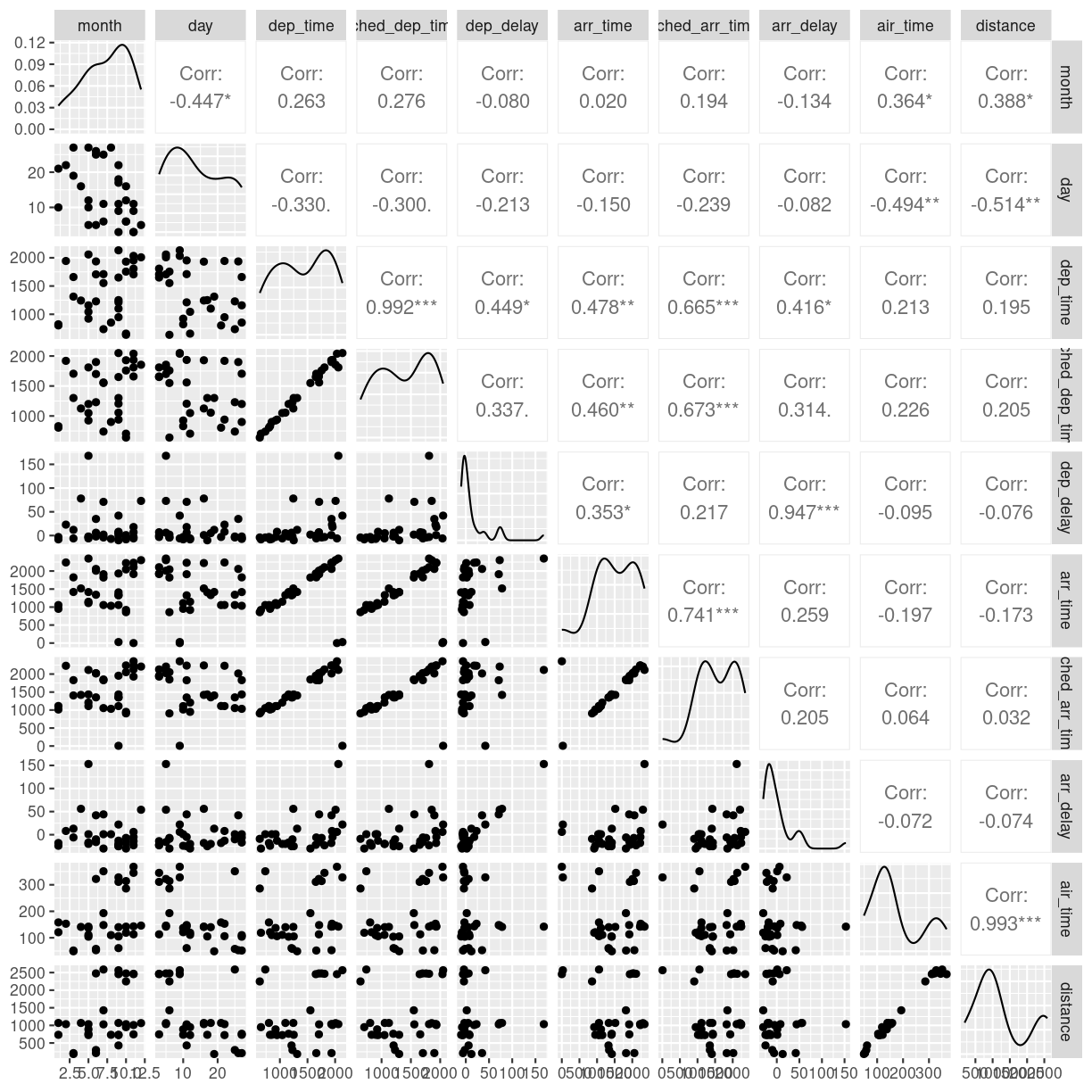
To illustrate this we cut down the dataset some more, looking at an even smaller subset of the rows, and eliminating some of the columns. To get a better plot without a lot of warnings, we also remove missing values from the dataset:
flightdata %>%
  na.omit() %>%
  sample_frac(.0001) %>%
  select(-c(year, carrier, flight, tailnum, hour, minute, time_hour, origin, dest)) %>%
  plot()
plot of chunk unnamed-chunk-9
This gives us a good first indication of how the different variables varies
together. The name of this type of plot is correllogram because it shows
all the correlations between the selected variables.
Bringing distrubtion and correlation together
A better, or perhaps just prettier, way of doing the above is to use the library
GGally, which have a fancier version, showing both the distribution of values
in the different columns, but also the correlation between the variables.
Begin by installing GGally:
install.packages("GGally")
Now we can plot:
library(GGally)
flightdata %>%
  sample_frac(.0001) %>%
  select(-c(year, carrier, flight, tailnum, hour, minute, time_hour, origin, dest)) %>%
  na.omit() %>%
  ggpairs(progress = F)
plot of chunk unnamed-chunk-11
We need to cut down the number of observations again - the scatterplots would be unreadable otherwise. The classical corellogram is enriched with a densityplot in the diagonal, basically a very smooth histogram, and the correlation coefficients above the diagonal.
Key Points
Always start by looking at the data
Always keep track of the metadata
Exploring with summary statistics
Overview
Teaching: 30 min
Exercises: 10 minQuestions
How do I get means, medians, IQRs and other summary statistics on my data?
How do I get summary statistics for different groups in my data?
Objectives
Learn the summarise and group_by functions for efficient summary statistics.
Summary statistics
What is the average delay on the departure of these flights?
Most of the functions we use for these operations comes from the library dplyr, which is part of the tidyverse package.
The function to get summary statistics (average/mean, median, standard deviation etc)
from dataframes is summarise. It works like this, remember to add na.rm = T
to handle missing values:
flightdata %>%
  summarise(avg_dep_delay = mean(dep_delay, na.rm = T),
            med_dep_delay = median(dep_delay, na.rm = T),
            sd_dep_delay = sd(dep_delay, na.rm = T),
            max_dep_delay = max(dep_delay, na.rm = T),
            min_dep_delay = min(dep_delay, na.rm  =T),
            iqr = IQR(dep_delay, na.rm = T))
# A tibble: 1 × 6
  avg_dep_delay med_dep_delay sd_dep_delay max_dep_delay min_dep_delay   iqr
          <dbl>         <dbl>        <dbl>         <dbl>         <dbl> <dbl>
1          12.6            -2         40.2          1301           -43    16
IQR
Lining up all values of departure delay in order from the lowest to the highest, we can split up the observations in quartiles, each containing 25% of the observations. The Inter Quartile Range, tells us the range in which the middle 50% of the observations are. It is a measure of the spread of the observations around the median.
Which airline is most delayed?
Adding group_by() we can get the summary statistics for all
airlines:
flightdata %>%
  group_by(carrier) %>%
  summarise(avg_dep_delay = mean(dep_delay, na.rm = T),
            med_dep_delay = median(dep_delay, na.rm = T),
            sd_dep_delay = sd(dep_delay, na.rm = T),
            max_dep_delay = max(dep_delay, na.rm = T),
            min_dep_delay = min(dep_delay, na.rm  =T),
            iqr = IQR(dep_delay, na.rm = T))
# A tibble: 16 × 7
   carrier avg_dep_delay med_dep_delay sd_dep_delay max_dep_delay min_dep_delay
   <chr>           <dbl>         <dbl>        <dbl>         <dbl>         <dbl>
 1 9E              16.7           -2           45.9           747           -24
 2 AA               8.59          -3           37.4          1014           -24
 3 AS               5.80          -3           31.4           225           -21
 4 B6              13.0           -1           38.5           502           -43
 5 DL               9.26          -2           39.7           960           -33
 6 EV              20.0           -1           46.6           548           -32
 7 F9              20.2            0.5         58.4           853           -27
 8 FL              18.7            1           52.7           602           -22
 9 HA               4.90          -4           74.1          1301           -16
10 MQ              10.6           -3           39.2          1137           -26
11 OO              12.6           -6           43.1           154           -14
12 UA              12.1            0           35.7           483           -20
13 US               3.78          -4           28.1           500           -19
14 VX              12.9            0           44.8           653           -20
15 WN              17.7            1           43.3           471           -13
16 YV              19.0           -2           49.2           387           -16
# ℹ 1 more variable: iqr <dbl>
A second step would be to sort the carriers by the average departure delay. The arrange() function does this:
flightdata %>%
  group_by(carrier) %>%
  summarise(avg_dep_delay = mean(dep_delay, na.rm = T),
            med_dep_delay = median(dep_delay, na.rm = T),
            sd_dep_delay = sd(dep_delay, na.rm = T),
            max_dep_delay = max(dep_delay, na.rm = T),
            min_dep_delay = min(dep_delay, na.rm  =T),
            iqr = IQR(dep_delay, na.rm = T)) %>%
  arrange(avg_dep_delay)
# A tibble: 16 × 7
   carrier avg_dep_delay med_dep_delay sd_dep_delay max_dep_delay min_dep_delay
   <chr>           <dbl>         <dbl>        <dbl>         <dbl>         <dbl>
 1 US               3.78          -4           28.1           500           -19
 2 HA               4.90          -4           74.1          1301           -16
 3 AS               5.80          -3           31.4           225           -21
 4 AA               8.59          -3           37.4          1014           -24
 5 DL               9.26          -2           39.7           960           -33
 6 MQ              10.6           -3           39.2          1137           -26
 7 UA              12.1            0           35.7           483           -20
 8 OO              12.6           -6           43.1           154           -14
 9 VX              12.9            0           44.8           653           -20
10 B6              13.0           -1           38.5           502           -43
11 9E              16.7           -2           45.9           747           -24
12 WN              17.7            1           43.3           471           -13
13 FL              18.7            1           52.7           602           -22
14 YV              19.0           -2           49.2           387           -16
15 EV              20.0           -1           46.6           548           -32
16 F9              20.2            0.5         58.4           853           -27
# ℹ 1 more variable: iqr <dbl>
The carrier “US” does best. What carrier is that actually?
Before doing that, let us save the result in an object:
summary_delays <- flightdata %>%
  group_by(carrier) %>%
  summarise(avg_dep_delay = mean(dep_delay, na.rm = T),
            med_dep_delay = median(dep_delay, na.rm = T),
            sd_dep_delay = sd(dep_delay, na.rm = T),
            max_dep_delay = max(dep_delay, na.rm = T),
            min_dep_delay = min(dep_delay, na.rm  =T),
            iqr = IQR(dep_delay, na.rm = T)) %>%
  arrange(avg_dep_delay)
Next up - how to figure out the name of the carrier “US”.
Key Points
Summary statistics tells us about the distribution of data
Joining data
Overview
Teaching: 20 min
Exercises: 10 minQuestions
How do I import data from other sheets in a spreadsheet?
How do I enrich tables with additional data?
What is a join?
Objectives
Learn how to import data from sheet number 2 (and 3 etc) in spreadsheets
Learn how to join data frames
What is the actual name of the best airline?
It is nice to be able to identify the airline that is most on time. But we have carrier codes, not the actual names of them.
How do we get that?
Reading another sheet in a spreadsheet
Our spreadsheet contains more that one sheet. The second sheet contains the names and carrier codes of the relevant airlines.
We can read sheet number 2 from the Excelfile, by giving read_excel() a
second argument, specifying the sheet we want:
carriers <- read_excel("data/flightdata.xlsx", sheet = 2)
carriers
# A tibble: 16 × 2
   carrier name
   <chr>   <chr>
 1 9E      Endeavor Air Inc.
 2 AA      American Airlines Inc.
 3 AS      Alaska Airlines Inc.
 4 B6      JetBlue Airways
 5 DL      Delta Air Lines Inc.
 6 EV      ExpressJet Airlines Inc.
 7 F9      Frontier Airlines Inc.
 8 FL      AirTran Airways Corporation
 9 HA      Hawaiian Airlines Inc.
10 MQ      Envoy Air
11 OO      SkyWest Airlines Inc.
12 UA      United Air Lines Inc.
13 US      US Airways Inc.
14 VX      Virgin America
15 WN      Southwest Airlines Co.
16 YV      Mesa Airlines Inc.
We now have a second data frame, containing the names of the carriers. And we have a data frame containing the average delays
summary_delays
# A tibble: 16 × 7
   carrier avg_dep_delay med_dep_delay sd_dep_delay max_dep_delay min_dep_delay
   <chr>           <dbl>         <dbl>        <dbl>         <dbl>         <dbl>
 1 US               3.78          -4           28.1           500           -19
 2 HA               4.90          -4           74.1          1301           -16
 3 AS               5.80          -3           31.4           225           -21
 4 AA               8.59          -3           37.4          1014           -24
 5 DL               9.26          -2           39.7           960           -33
 6 MQ              10.6           -3           39.2          1137           -26
 7 UA              12.1            0           35.7           483           -20
 8 OO              12.6           -6           43.1           154           -14
 9 VX              12.9            0           44.8           653           -20
10 B6              13.0           -1           38.5           502           -43
11 9E              16.7           -2           45.9           747           -24
12 WN              17.7            1           43.3           471           -13
13 FL              18.7            1           52.7           602           -22
14 YV              19.0           -2           49.2           387           -16
15 EV              20.0           -1           46.6           548           -32
16 F9              20.2            0.5         58.4           853           -27
# ℹ 1 more variable: iqr <dbl>
what we would like is something like this:
# A tibble: 16 × 8
   carrier name           avg_dep_delay med_dep_delay sd_dep_delay max_dep_delay
   <chr>   <chr>                  <dbl>         <dbl>        <dbl>         <dbl>
 1 US      US Airways In…          3.78          -4           28.1           500
 2 HA      Hawaiian Airl…          4.90          -4           74.1          1301
 3 AS      Alaska Airlin…          5.80          -3           31.4           225
 4 AA      American Airl…          8.59          -3           37.4          1014
 5 DL      Delta Air Lin…          9.26          -2           39.7           960
 6 MQ      Envoy Air              10.6           -3           39.2          1137
 7 UA      United Air Li…         12.1            0           35.7           483
 8 OO      SkyWest Airli…         12.6           -6           43.1           154
 9 VX      Virgin America         12.9            0           44.8           653
10 B6      JetBlue Airwa…         13.0           -1           38.5           502
11 9E      Endeavor Air …         16.7           -2           45.9           747
12 WN      Southwest Air…         17.7            1           43.3           471
13 FL      AirTran Airwa…         18.7            1           52.7           602
14 YV      Mesa Airlines…         19.0           -2           49.2           387
15 EV      ExpressJet Ai…         20.0           -1           46.6           548
16 F9      Frontier Airl…         20.2            0.5         58.4           853
# ℹ 2 more variables: min_dep_delay <dbl>, iqr <dbl>
What we want to do is joining the two dataframes, so we enrich the original dataframe containing summary statistics on departure delays, with the name matching the carrier code.
Several different types of joins exist. The one we need here is left_join()
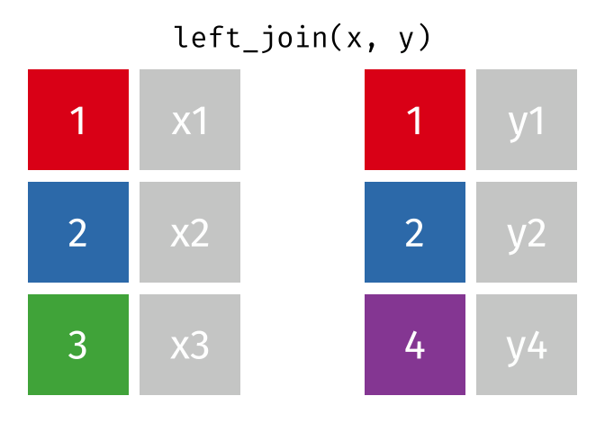 .
.
With a left_join() we join the two dataframes. All rows in the left dataframe
are returned, enriched with the matching values from the columns in the right
dataframe. Rows in the left dataframe, that does not have a matching row in
the right dataframe will get NA-values.
Let us do that!
summary_delays %>%
  left_join(carriers) %>%
  relocate(name, .after = carrier)
Joining with `by = join_by(carrier)`
# A tibble: 16 × 8
   carrier name           avg_dep_delay med_dep_delay sd_dep_delay max_dep_delay
   <chr>   <chr>                  <dbl>         <dbl>        <dbl>         <dbl>
 1 US      US Airways In…          3.78          -4           28.1           500
 2 HA      Hawaiian Airl…          4.90          -4           74.1          1301
 3 AS      Alaska Airlin…          5.80          -3           31.4           225
 4 AA      American Airl…          8.59          -3           37.4          1014
 5 DL      Delta Air Lin…          9.26          -2           39.7           960
 6 MQ      Envoy Air              10.6           -3           39.2          1137
 7 UA      United Air Li…         12.1            0           35.7           483
 8 OO      SkyWest Airli…         12.6           -6           43.1           154
 9 VX      Virgin America         12.9            0           44.8           653
10 B6      JetBlue Airwa…         13.0           -1           38.5           502
11 9E      Endeavor Air …         16.7           -2           45.9           747
12 WN      Southwest Air…         17.7            1           43.3           471
13 FL      AirTran Airwa…         18.7            1           52.7           602
14 YV      Mesa Airlines…         19.0           -2           49.2           387
15 EV      ExpressJet Ai…         20.0           -1           46.6           548
16 F9      Frontier Airl…         20.2            0.5         58.4           853
# ℹ 2 more variables: min_dep_delay <dbl>, iqr <dbl>
The relocate function is used to change the order of the columns.
There are other join functions
left_join is an example of a mutating join. Like the mutate function
left_join introduces new variables, new columns, in our dataframe.
Mutating joins
The closes cousin of the left_join funtion is the right_join.
The left_join returns all rows on the left hand side of the join, augmented with values from the dataframe on the right hand side of the join, based on matching values.
The right_join function returns all rows on the right hand side of the join. Depending on the flow of our code, we choose the variant that best suit our purpose.
inner_join keeps only the rows on the left hand side of the join, that have matching values in the dataframe on the right hand side of the join. Whereas left_join and right_join keeps all rows, and add NA values where there is no match, inner_join only returns rows that have a match.
full_join on the other hand keeps all rows from both dataframes being joined. Any observations that does not have a match in the other dataframe, will have NA values added.
Filtering joins
These joins will filter rows from the left hand dataframe, based on the presence or absence of matches in the right hand dataframe.
semi_join returns all rows that have a match on the right hand side of the join. But not those that do not have a match.
anti_join returns all rows, that do not have a match on the rigth hand side of the join.
Can we plot the average delays with carrier names?
Yes we can!
We take the summary_delays dataframe, containing the average delays, and join it with the data on carrier names. We do not have to specify the column on which we are joining, since there is only one shared column name. We then pipe that result to ggplot, where we specify that we would like the delay to be on the x-axis, and the name of the carrier on the y-axis:
summary_delays %>%
  left_join(carriers) %>%
  ggplot(mapping = aes(x = avg_dep_delay, y = name)) +
    geom_col()
Joining with `by = join_by(carrier)`
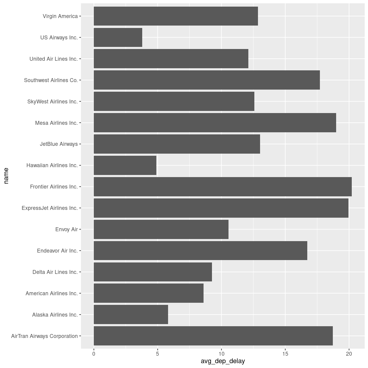
plot of chunk unnamed-chunk-7
Key Points
Data is often organized in separate tables, joining them can enrich the data we are analysing
Boxplots and linear regressions
Overview
Teaching: 80 min
Exercises: 35 minQuestions
How do I make a Boxplot?
How do I make a linear regression?
Objectives
Learn how to visualise the distribution of your data using boxplots
Learn how to investigate correlations between variables using linear regressions
Boxplots
Boxplots are a common way of quickly visualizing some summary statistics for different groups in our data.
For this example, we use air_time, the time the flight takes, instead of departure delays.
flightdata %>%
  left_join(carriers) %>% relocate(name, .after = carrier) %>%
  ggplot(mapping = aes(x = name, y = air_time)) +
  geom_boxplot() +
  coord_flip()
Joining with `by = join_by(carrier)`
Warning: Removed 9430 rows containing non-finite values (`stat_boxplot()`).
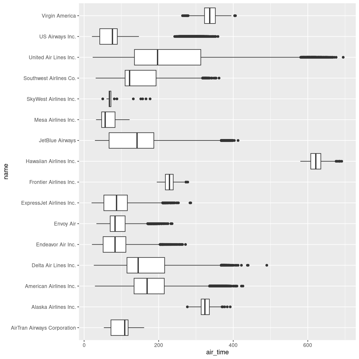
plot of chunk unnamed-chunk-2
The boxplots show the inter quartile range with the white box. The solid black line within that, is the median of the air_time. The horizontal lines, called whiskers, on each side of the white box shows the “minimum” and “maximum” observations, defined as the observations that lies no longer from the IQR than 1.5 of the IQR.
The solid dots at each end of the boxplot, represents outliers, observations that lies outside the whiskers.
Depending on the data, and the nature of the analyses we are going to do, outliers are either very interesting, or something that we can ignore.
In this case it might be interesting to investigate which destinations Hawaiian Airlines serve. Their fligts are much longer than the flights of the rest of the airlines.
Let us take a look:
flightdata %>%
  left_join(carriers) %>% relocate(name, .after = carrier) %>%
  filter(name == "Hawaiian Airlines Inc.") %>%
  count(dest)
Joining with `by = join_by(carrier)`
# A tibble: 1 × 2
  dest      n
  <chr> <int>
1 HNL     342
The count() function counts the number of times a value exists in a given
column, in this case dest.
Conclusion: Hawaiian Airlines only flies to Honolulu.
Which airlines flies to Honolulu?
flightdata %>%
  left_join(carriers) %>% relocate(name, .after = carrier) %>%
  filter(dest == "HNL") %>%
  count(name)
Joining with `by = join_by(carrier)`
# A tibble: 2 × 2
  name                       n
  <chr>                  <int>
1 Hawaiian Airlines Inc.   342
2 United Air Lines Inc.    365
Here we filter in order to only have flights to Honolulu, and then count the different airlines. Only United Air Lines and Hawaiian Airlines have fligths to Honolulu.
This also reveals, that the “outliers” for United Air Lines at the extreme right of the plot are not really outliers. They appear because these are the flights to Honolulu. The representation of the data implies that there are a lot of outliers from one single distribution of airtime for United Air Lines. But in reality, the airtime for UA is a bimodal distribution.
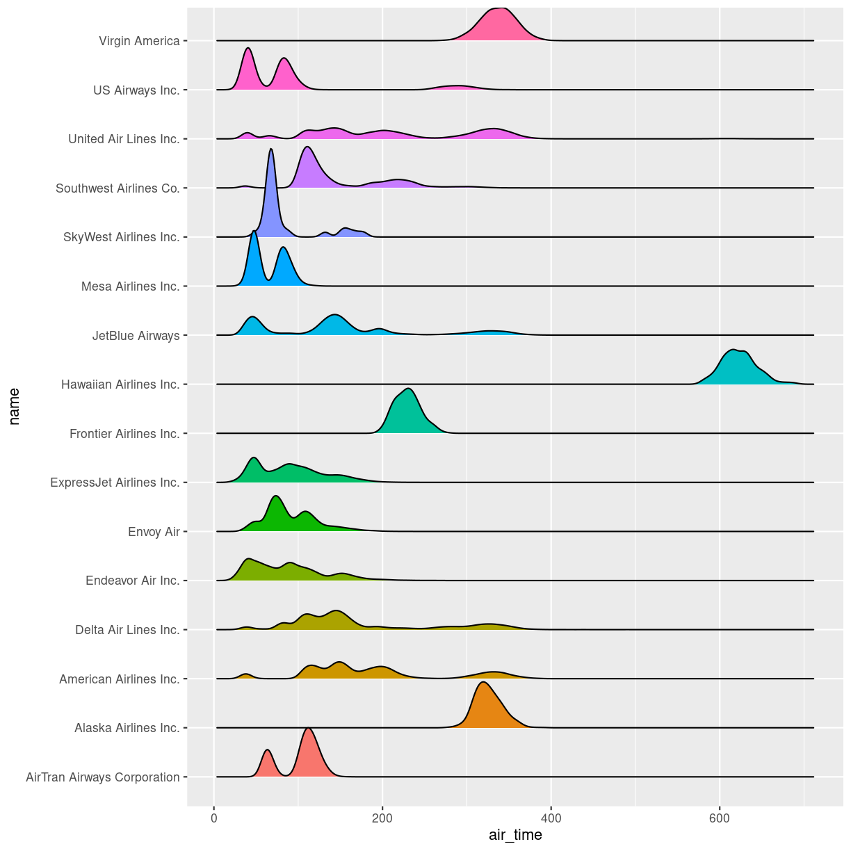
Boxplots are not necessarily a good idea
The boxplots of the air_time indicates that there is more structure in the data than boxplots can reveal. Maybe we should look at the distribution of airtime amongst the airlines.
We could plot histograms of the airtime for each airline. Or we could plot
the smoothed histograms we saw in the correllograms for each airline. Or
we can use an extra package, ggridges to do something fancy.
Begin by installing the package:
install.packages("ggridges")
Then load the package, and plot the data:
library(ggridges)

flightdata %>%
  left_join(carriers) %>% relocate(name, .after = carrier) %>%
ggplot(aes(x = air_time, y = name, fill = name)) +
  geom_density_ridges() +
  theme(legend.position = "none")
Joining with `by = join_by(carrier)`
Picking joint bandwidth of 5.42
Warning: Removed 9430 rows containing non-finite values
(`stat_density_ridges()`).
plot of chunk unnamed-chunk-6
The number of flights United Air Lines have to Hawaii is too low to actually see here. But we do get a more nuanced view of the distribution of airtime for the individual airlines than we do using boxplots.
What about a linear regression?
We saw earlier, that there was a correlation between departure delay and arrival delay. Can we use the data to predict how delayed we will be upon arrival, when we know that the departure was 47 minutes delayed.
First, the plot:
flightdata %>%
  sample_frac(0.005) %>%
  ggplot(mapping = aes(x = dep_delay, y = arr_delay)) +
  geom_point()
Warning: Removed 48 rows containing missing values (`geom_point()`).
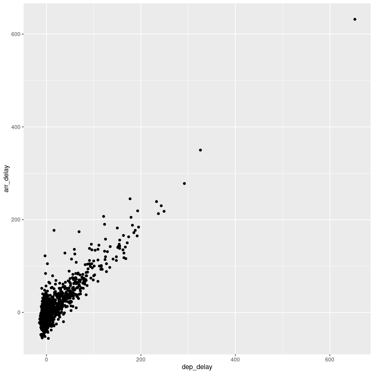
plot of chunk unnamed-chunk-7
This looks more or less linear. We can place a linear regression line in the plot
using the function geom_smooth(method = "lm"), where we specify that the function
should fit a linear line to the data.
flightdata %>%
  sample_frac(0.005) %>%
  ggplot(mapping = aes(x = dep_delay, y = arr_delay)) +
  geom_point() +
  geom_smooth(method = "lm")
`geom_smooth()` using formula = 'y ~ x'
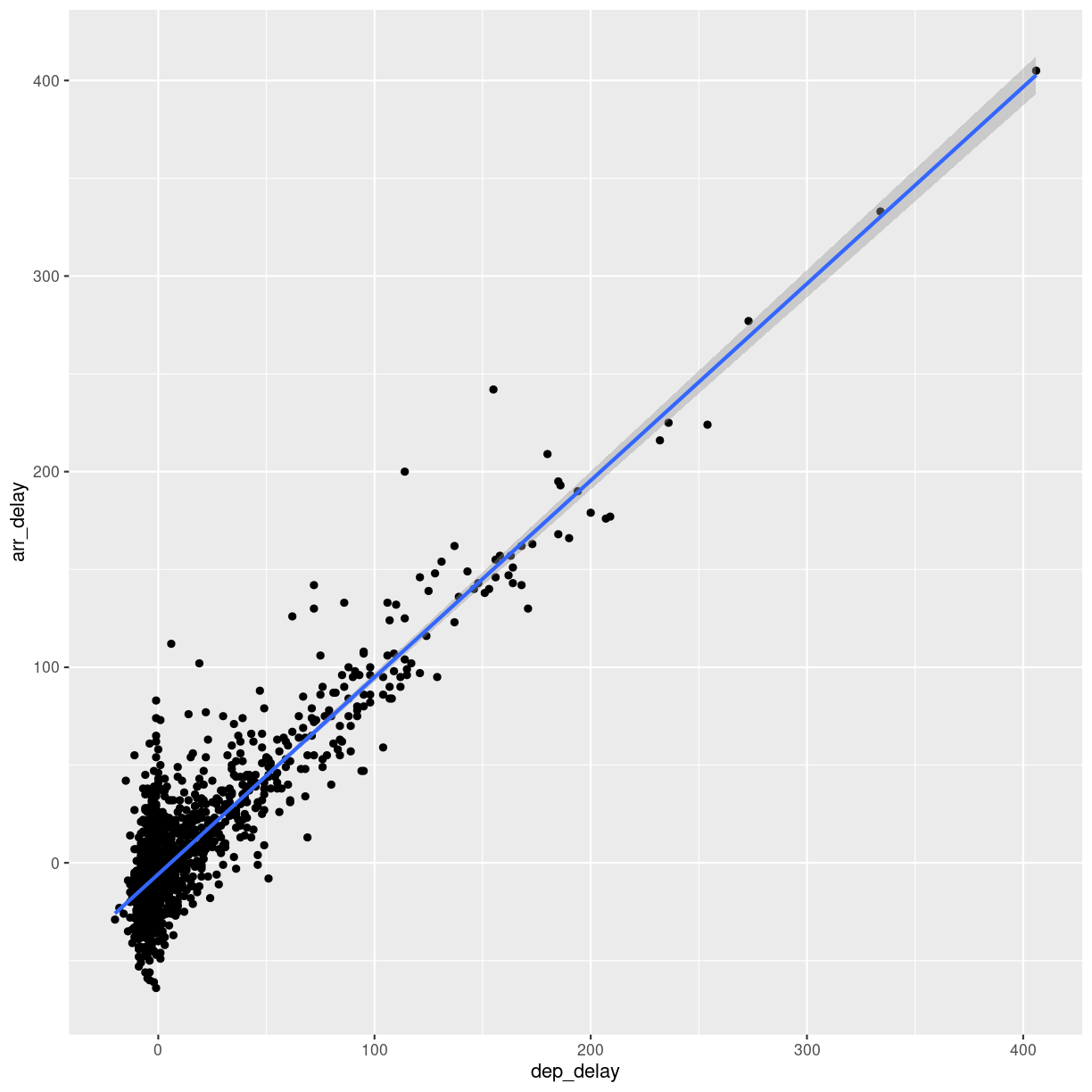
plot of chunk unnamed-chunk-8
So, what is the actual linear model of this data?
A linear model in this case would be a formula on the form:
$arr_{delay} = a\cdot dep_{delay} + b$
The task is now to find the values of a and b that best fit the data. This is
called “fitting a linear model”.
Fitting a linear model to data is done using the lm() function.
We need to specify the actual model that we want to fit, using the special formula notation in R:
arr_delay ~ dep_delay
In addition we have to specify the input data in the function:
model <- lm(arr_delay ~ dep_delay, data = flightdata)
We do this on the entire dataset without any problems.
Let us take a look at the result:
model
Call:
lm(formula = arr_delay ~ dep_delay, data = flightdata)

Coefficients:
(Intercept)    dep_delay
     -5.899        1.019
We will not spend time on a complete discussion on p-values, but the way to get
them is to call the function summary() on the model:
summary(model)
Call:
lm(formula = arr_delay ~ dep_delay, data = flightdata)

Residuals:
     Min       1Q   Median       3Q      Max
-107.587  -11.005   -1.883    8.938  201.938

Coefficients:
              Estimate Std. Error t value Pr(>|t|)
(Intercept) -5.8994935  0.0330195  -178.7   <2e-16 ***
dep_delay    1.0190929  0.0007864  1295.8   <2e-16 ***
---
Signif. codes:  0 '***' 0.001 '**' 0.01 '*' 0.05 '.' 0.1 ' ' 1

Residual standard error: 18.03 on 327344 degrees of freedom
  (9430 observations deleted due to missingness)
Multiple R-squared:  0.8369,	Adjusted R-squared:  0.8369
F-statistic: 1.679e+06 on 1 and 327344 DF,  p-value: < 2.2e-16
Linear regressions are used to find connections between data. We might be building a model, where we try to figure out what causes delays in this data. Or find the correlation between taking a specific drug and recovering from a disease.
Correlation does not imply causation!
Even if you find a strong correlation between two variables in your data, you have not necessarily found an explanation. There is a very strong correlation between how much it rains in Hillsborough County in Florida, USA, and how much money The United Kingdom spends on its military. That does not imply that spending more money on guns in the UK will make it rain more in Florida.
The lm() function can handle more than one explanatory variable.
Simple linear combinations of them are specified using a + in the
formula, like this:
model_2 <- lm(arr_delay ~ dep_delay + air_time, data = flightdata)
summary(model_2)
Call:
lm(formula = arr_delay ~ dep_delay + air_time, data = flightdata)

Residuals:
     Min       1Q   Median       3Q      Max
-107.679  -10.979   -1.759    8.810  203.240

Coefficients:
              Estimate Std. Error t value Pr(>|t|)
(Intercept) -4.8318053  0.0606415  -79.68   <2e-16 ***
dep_delay    1.0187233  0.0007861 1295.92   <2e-16 ***
air_time    -0.0070547  0.0003362  -20.98   <2e-16 ***
---
Signif. codes:  0 '***' 0.001 '**' 0.01 '*' 0.05 '.' 0.1 ' ' 1

Residual standard error: 18.02 on 327343 degrees of freedom
  (9430 observations deleted due to missingness)
Multiple R-squared:  0.8371,	Adjusted R-squared:  0.8371
F-statistic: 8.41e+05 on 2 and 327343 DF,  p-value: < 2.2e-16
Interactions between explanatory variables are specied using a * sign:
model_3 <- lm(arr_delay ~ dep_delay*air_time, data = flightdata)
summary(model_3)
Call:
lm(formula = arr_delay ~ dep_delay * air_time, data = flightdata)

Residuals:
     Min       1Q   Median       3Q      Max
-107.475  -10.963   -1.784    8.809  203.376

Coefficients:
                     Estimate Std. Error t value Pr(>|t|)
(Intercept)        -4.739e+00  6.236e-02 -75.998  < 2e-16 ***
dep_delay           1.011e+00  1.459e-03 692.785  < 2e-16 ***
air_time           -7.672e-03  3.499e-04 -21.923  < 2e-16 ***
dep_delay:air_time  5.451e-05  8.590e-06   6.346 2.22e-10 ***
---
Signif. codes:  0 '***' 0.001 '**' 0.01 '*' 0.05 '.' 0.1 ' ' 1

Residual standard error: 18.01 on 327342 degrees of freedom
  (9430 observations deleted due to missingness)
Multiple R-squared:  0.8371,	Adjusted R-squared:  0.8371
F-statistic: 5.607e+05 on 3 and 327342 DF,  p-value: < 2.2e-16
Key Points
Boxplots are useful for comparing distributions
Boxplots can hide multiple distributions in a variable
Density plots can reveal multiple distributions in variables
Correlations between variables can be quantified using linear models
What is the next step?
Overview
Teaching: 10 min
Exercises: 0 minQuestions
What do I do now?
What is the next step?
Objectives
Present suggestions for further reading,
Tips on problems to work on to practice,
What should I do next?
Great data
First of all: If you do not have data you want to work with already. Find some!
Kaggle host competitions in machine learning. For the use of those competitions, they give access to a lot of interesting datasets to work with. With more than 200.000 datasets at time of writing, it can be a bit overwhelming, so consider looking at the “datasets” available as CSV-files.
Great books
Many exists, some are available online, some are even free!
Our favorite is R for Data Science by Hadley Wickham and Garrett Grolemund. The https://r4ds.hadley.nz/ is coming soon. Both editions have a chapter on Exploratory Data Analysis.
Great sites
Most of the larger sites offering online courses in “something-with-data” offers courses that can support your learning in regards to exploratory data analysis:
Contact us!
The whole reason for the existence of KUB Datalab is to help and assist students (and teachers and researchers) working with data.
We do not guarantee that we will be able to solve your problems, but we will do our best to help you.
Our calender, containing our activities, courses, seminars, datasprints etc.
Our website
Our mail: kubdatalab@kb.dk
Key Points
Practice is important!
Working on data that YOU find interesting is a really good idea,
The amount of ressources online is immense.
KUB Datalab is there for your.