Different types of plots
Last updated on 2026-07-28 | Edit this page
Overview
Questions
- What other types of plots can we make?
- How can we control the order of stuff in plots?
Objectives
- Learn how to make histograms, barcharts, boxplots and violinplots
Scatterplots are very useful, but we often need other types of plots. In this part of the course, we are going to look at some of the more common types.
Histograms
Histograms splits all observations of a variable up in a number of “bins”. It counts how many observations are in each bin. Then we plot a column with a height equivalent to the number of observations for each bin.
Note that we here use the pipe to get the diamonds data
into ggplot(). Both methods can be used. However piping the
data into ggplot() is useful if we need to manipulate the
data before plotting, eg. by filtering it.
R
diamonds |>
  ggplot(mapping = aes(carat)) +
  geom_histogram()
OUTPUT
`stat_bin()` using `bins = 30`. Pick better value `binwidth`.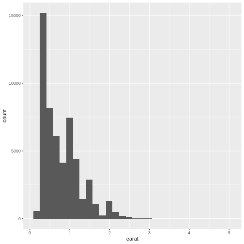
Note that we get a warning from geom_histogram that the
number of bins by default is set to 30. 30 bins will almost never be the
correct number of bins, and we should chose a better value ourself.
R
diamonds |>
  ggplot(aes(carat)) +
  geom_histogram(bins = 25)
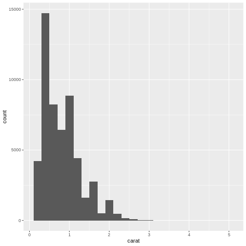
What number of bins should I choose? Some heuristics for choosing does exists, but in general it is our recommendation that you experiment with different number of bins to find the one that best shows your data.
Note that we excluded the mapping part of the
ggplot function. The first argument of ggplot
is always data, and we can get that via the pipe. The second argument is
always mapping, and therefore we do not need to
specify it.
In the following we are sometimes going to specify the
mapping argument. There are two reasons for that. One: We
have forgotten to be consistent. Two: In some cases it is useful to
remind ourselves that we are actually mapping data to something.
Barcharts
Not to be confused with histograms, barcharts count the number of observations in different groups. Where the scale in histograms is continuous, and split into bins, the scale in barcharts is discrete.
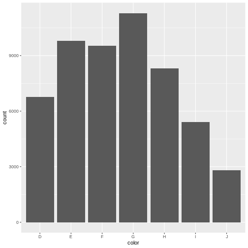
Here we map the color-variable to the x-axis in the
barchart. geom_bar counts the number of observations itself
- we do not need to provide a count:
R
diamonds |>
  ggplot(aes(color)) +
  geom_bar()
A small excursion
Why are the columns in the barchart above in that order?
One might guess that they are simply in alphabetical order.
Not so! color is a categorical variable. Diamonds either
have the colour “D” (which is the best colour), or another colour (like
“J”, which is the worst).
There are no “D.E” colours, they do not exist on a continuous range.
This is called “factors” in R. The data in a factor can take one of several values, called levels. And the order of these levels are what control the order in the plot.
The order can be either arbitrary, or there can exist an implicit order in the data, like with the colour of the diamonds, where D is the best colour, and J is the worst. These types of ordered categorical data are called ordinal data.
They look like this:
R
diamonds |>
  select(cut, color, clarity) |>
  str()
OUTPUT
tibble [53,940 × 3] (S3: tbl_df/tbl/data.frame)
 $ cut    : Ord.factor w/ 5 levels "Fair"<"Good"<..: 5 4 2 4 2 3 3 3 1 3 ...
 $ color  : Ord.factor w/ 7 levels "D"<"E"<"F"<"G"<..: 2 2 2 6 7 7 6 5 2 5 ...
 $ clarity: Ord.factor w/ 8 levels "I1"<"SI2"<"SI1"<..: 2 3 5 4 2 6 7 3 4 5 ...
Note that even though the colour “D” is better than “E”, the levels
of the color factor indicates that “D<E”.
All this just to say: We can control the order of columns in the plot, by controlling the order of the levels of the categorical value we are plotting:
R
diamonds |>
  mutate(color = fct_rev(color)) |>
  ggplot(aes(color)) +
  geom_bar()
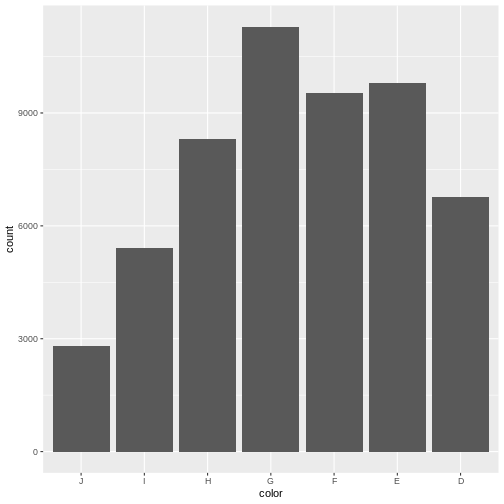
fct_rev is a function that reverses the order of a
factor. It comes from the library forcats that makes it
easier to work with categorical data.
Boxplots
Boxplots are suitable for visualising the distribution of data. We can make a boxplot of a single variable in the data - or we can make several boxplots in one plot:
R
diamonds |>
  ggplot(aes(x = carat, y = cut)) +
  geom_boxplot()
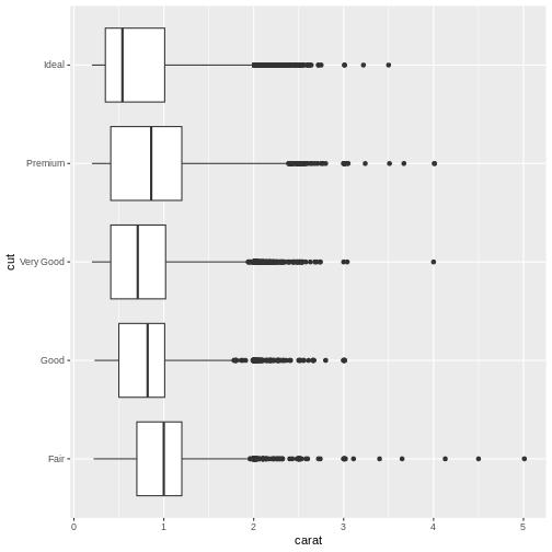
Here we have the variable we are making boxplots of, on the x-axis, and splitting them up in one plot per cut, on the y-axis.
What is a boxplot?
Boxplots are useful for showing different distributions. The fat line in the middle of the box is the median, the two ends of the box is first and third quartile, and the two whiskers (or lines) on both sides of the box shows the minimum and maximum values - excluding outliers, defined for this purpose as values that lies more that 1.5 times the interquartile range from the box.
Violinplots
Boxplots are not necessarily the best option for showing distributions. A good alternative could be violinplots. They show a density plot - basically a histogram with infinite bins - for each group, plotted symmetrically around an axis:
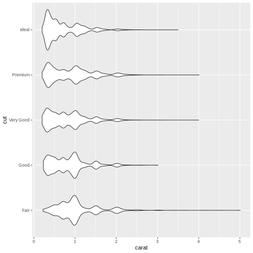
Exercise
The geom_ for making violin plots is geom_violin Look at
the help for geom_violin and make a violinplot with carat
on the x-axis, and cut on the y-axis.
R
diamonds |>
ggplot(aes(carat, y = cut)) +
geom_violin()
And many more
ggplot2 is born with a multitude of different plots. A complete list of plots will be very long, and take up all the time for this course. Take a look at The R Graph Gallery or at Graphs in R (NB a work in progress), where we will collect weird and wonderful plots, when to use them, when not to use them. And how to make them.
ggplot2 is written as an extensible package, meaning that developers can create packages making plots that are not included in ggplot2, or introduce more advanced functionality around plots. Two of the more interesting extensions are:
ggforce extends ggplot2 with specialised plottypes.
gganimate makes it easyish to make animated plots using
ggplot2
- Categorical data, aka factors can control the order of data in plots
- ggplot makes it easy to make many different types of plots
- ggplot have many useful extensions