Facetting
Last updated on 2026-07-28 | Edit this page
Overview
Questions
- What is facetting?
Objectives
- Learn to use small multiples in your plots
Small multiples
If we only make one plot we quickly runs into the problem of trying
to plot too much information in the plot. Here we plot the price against
carat, colour by the color of the diamonds. And represent
their clarity by the shape of the points:
R
ggplot(data = diamonds, mapping = aes(x = carat, y = price, colour = color, shape = clarity)) +
  geom_point()
WARNING
Warning: Using shapes for an ordinal variable is not advisedWARNING
Warning: The shape palette can deal with a maximum of 6 discrete values because more
than 6 becomes difficult to discriminate
ℹ you have requested 8 values. Consider specifying shapes manually if you need
  that many of them.
WARNING
Warning: Removed 5445 rows containing missing values or values outside the scale range
(`geom_point()`).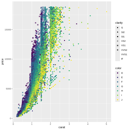
This is probably not the best way to discover patterns in the data. It is actually so bad that ggplot warns us that we are using too many different shapes!
One way of handling that, is to plot “small multiples” of the data.
Instead of plotting information on the clarity of the diamonds in one plot, along with all the other information, we make one plot for each value of clarity. This is called facetting:
R
ggplot(data = diamonds, mapping = aes(x = carat, y = price, colour = color)) +
  geom_point() +
  facet_wrap(~clarity)
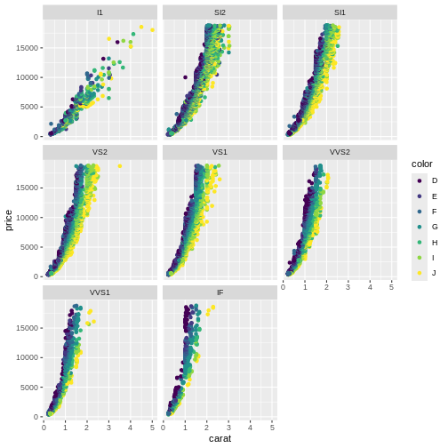 Here we can see that the price rises more rapidly with size, for the
better clarities, something that would have been impossible to see in
the previous plot.
Here we can see that the price rises more rapidly with size, for the
better clarities, something that would have been impossible to see in
the previous plot.
The fundamental idea behind faceting, is the concept “small multiples”, popularised by Edward Tufte. He describes it as (resembling) “the frames of a movie: a series of graphics, showing the same combination of variables, indexed by changes in another variable.” The method is also known as”trellis”, “lattice”, “grid” or “panel” charts. They allows us to break down a very “busy” chart, containing too much information, making it possible for the reader of the charts to walk through them one category at a time, and make comparisons.
Exercise
Plot price as a function of depth (price on the y-axis, depth on the
x-axis), and facet by cut. If you want a colourful plot, colour the
points by color.
R
ggplot(data = diamonds, mapping = aes(x = depth, y = price, colour = color)) +
  geom_point() +
  facet_wrap(~cut)
Note that for the better cuts, diamonds are cut to pretty specific proportions. Worse (Fair) diamonds have more varied proportions.
More than one multiple
We can expand on the “small multiple” concept, by plotting the facets in a grid, defined by two categorical values.
In this plot we plot price as a function of carate, and make
individual plots for each combination of clarity and
color:
R
diamonds |>
  ggplot(aes(x = carat, y = price, colour = color)) +
    geom_point() +
    facet_grid(clarity ~ color)
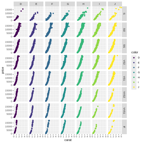
Be careful using facets, especially facet_grid when you work with small datasets. You might end up with too little data in each facet.
- Facetting can make busy plots more understandable
- Grid facetting in two dimensions allows us to plot even more variables