Getting started
Last updated on 2026-07-28 | Edit this page
Overview
Questions
- How do we build a plot with ggplot2?
Objectives
- Get to understand the layers in ggplot2
- Make our first plot
The grammar of graphics
Plotting using ggplot2 is based on “The Grammar of Graphics”, a theoretical treatment of how to talk about and conceptualize plots by Leland Wilkinson.
That theoretical treatise has been implemented in the package ggplot2
We do not need to know or understand all details of this 620 page book. But some weird naming conventions follows from this.
What we do need to know, is that based on the grammar of graphics, the layered structure of a plot using ggplot, is build like this:
R
ggplot(data = <DATA>, mapping = aes(<MAPPINGS>)) +
  <GEOM_FUNCTION>(
     mapping = aes(<MAPPINGS>),
     stat = <STAT>,
     position = <POSITION>
  ) +
  <COORDINATE_FUNCTION> +
  <SCALE_FUNCTION> +
  <FACET_FUNCTION> +
  <THEME_FUNCTION>
The “<” and “>” indicates that we should supply something here.
We are going to cover each element in the following.
What is the difference?
ggplot2 is the library, containing different types of functions for plotting, theming the plots, changing colours and lots of other stuff.
ggplot is one of these functions in ggplot2, and the one that begins every plot we make.
Yes it is confusing!
ggplot in it self
The first thing we need to provide for ggplot is some
<DATA>. We are working with the diamond dataset:
R
ggplot(data = diamonds)
 This in itself produces an extremely boring plot. But it is a plot, and
actually contains the data already. What is missing is information on
what exactly it is in the dataset we are trying to plot. How should our
data be mapped to the area of our plot? Or, what should we have
on the X-axis, and what should be on the Y-axis?
This in itself produces an extremely boring plot. But it is a plot, and
actually contains the data already. What is missing is information on
what exactly it is in the dataset we are trying to plot. How should our
data be mapped to the area of our plot? Or, what should we have
on the X-axis, and what should be on the Y-axis?
We provide that information to ggplot using the
<MAPPINGS> argument to the ggplot function. Here we
want to plot carat on the x-axis, and the
price on the y-axis:
R
ggplot(data = diamonds, mapping = aes(x = carat, y = price))
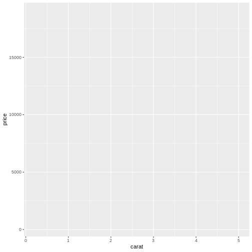
We are not actually seeing any data, because we have not specified the way the individual datapoints should be plotted. But we do see that the axes now have values. The data has influenced the plot!
We would like to make a classic scatter plot, and do that by adding
the right <GEOM_FUNCTION> to our plot. The
<GEOM_FUNCTION> that do this, is called
geom_points():
R
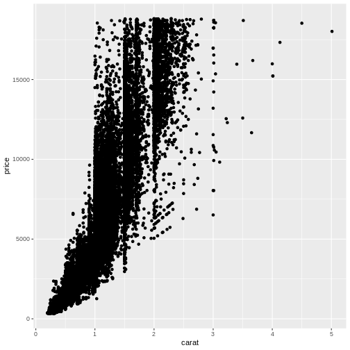
ggplot(data = diamonds, mapping = aes(x = carat, y = price)) +
  geom_point()
Comparing with the original template, we did not place any mapping in
the <GEOM_FUNCTION> but rather in the first
ggplot() function. The <GEOM_FUNCTION>
will inherit the original mapping, if we do not provide a specific
mapping for it.
That means that:
R
ggplot(data = diamonds, mapping = aes(x = carat, y = price)) +
  geom_point()
and
R
ggplot(data = diamonds) +
  geom_point(mapping = aes(x = carat, y = price))
will yield the same result.
We can even provide the same mapping in both places.
R
ggplot(data = diamonds, mapping = aes(x = carat, y = price)) +
  geom_point(mapping = aes(x = carat, y = price))
ggplot2 is a variation on the original grammar of graphics, called layered grammar of graphics, where the individual parts of the plot are added as layers, one on top of another. The + sign adds these layers.
geoms
geom_point() is the function we use to make scatter plots; because points is a geometric object. Other geometric objects can be plotted: geom_histogram() will plot histograms geom_line() will plot lines
All geometries in ggplot2 are named using the pattern geom_
The plus sign
The use of the + sign allows us to break up the code producing the plot in multiple lines. This makes it easier to read (and write!) the code producing the plot.
Note that the correct placement of + and linebreaks are very important.
This code will work:
R
ggplot() +
  geom_point()
This will not add the new layer and will return an error message:
R
ggplot()
  + geom_point()
Exercise
Plot “carat” (the weight of the diamond) against “x” (the length of the diamond). Make it a scatterplot
R
ggplot(data = diamonds, mapping = aes(carat, x)) +
  geom_point()
Note that some outliers, probably erroneous data, are discovered. A length of 0 is highly suspicious. Plots are also useful to reveal this sort of things!
- Plots in ggplot2 are build by adding layers