Before we Start
Last updated on 2026-07-28 | Edit this page
Overview
Questions
- Why are we even visualizing?
- What are the metadata of this dataset?
Objectives
- Get to know the importance of visualisations
- Get to know the data we are going to work with
Why even visualise data?
Data can be complex. Data can be confusing. And a good visualisation of data can reduce some of that complexity and confusion.
A good visualisation can reveal patterns in our data.
A really good visualisation can even provide insight that is difficult, or impossible to find without.
A good example is this map, where the English physician John Snow
plotted the deaths from Cholera in Soho, London from 19th august to 30th
September 1854. 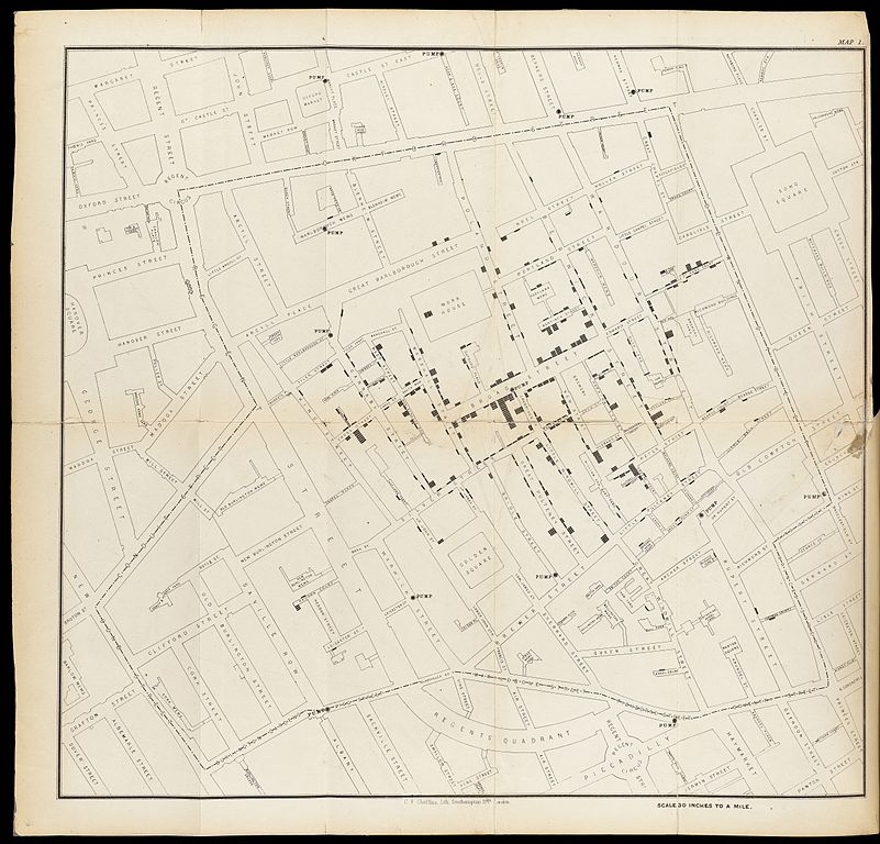
The concentration of deaths indicated that the source of the disease was a common water pump. Removing the handle from the pump brought an end to the outbreak.
We are probably not going to discover patterns of equal importance in this course.
The dataset we are working with
We are going to study a dataset containing information on prices and
other attributes of 53940 diamonds. The dataset is included in the
ggplot2 package, that we installed as part of
tidyverse
R
library(tidyverse)
head(diamonds)
OUTPUT
# A tibble: 6 × 10
  carat cut       color clarity depth table price     x     y     z
  <dbl> <ord>     <ord> <ord>   <dbl> <dbl> <int> <dbl> <dbl> <dbl>
1  0.23 Ideal     E     SI2      61.5    55   326  3.95  3.98  2.43
2  0.21 Premium   E     SI1      59.8    61   326  3.89  3.84  2.31
3  0.23 Good      E     VS1      56.9    65   327  4.05  4.07  2.31
4  0.29 Premium   I     VS2      62.4    58   334  4.2   4.23  2.63
5  0.31 Good      J     SI2      63.3    58   335  4.34  4.35  2.75
6  0.24 Very Good J     VVS2     62.8    57   336  3.94  3.96  2.48
There are 10 variables in the dataset:
| Variable | What is it? |
|---|---|
| carat | Weight of the diamond in carat (0.200 gram) |
| cut | Quality of the cut of the diamond (Fair, Good, Very Good, Premium, Ideal) |
| color | Colour of the diamond from D (best), to J (worst) |
| clarity | How clear is the diamond. I1 (worst), SI2, SI1, VS2, VS1, VVS2, VVS1, IF (best) |
| depth | Total depth percentage = z / mean(x, y) |
| table | Width of the top of the diamond relative to its widest point |
| price | Price in US dollars |
| x | Length in mm |
| y | Width in mm |
| z | depth in mm |
Slightly more detailed information can be found in the help for the dataset:
R
?diamonds
What are we not going to spend time on?
There are often several considerations to take into account when we plot.
Two of those, are not covered here:
- Is the plot suitable for the data we are working with?
- Is the plot looking cool and impressive?
We are not making art. And if a specific type of plot is useful, we do not care if it is actually suitable for the diamond data we are working with.
- This is not an introduction to R
- Visualisation is a useful way of representing data
- We are going to study diamonds!