All in One View
Content from Before we Start
Last updated on 2026-07-28 | Edit this page
Overview
Questions
- Why are we even visualizing?
- What are the metadata of this dataset?
Objectives
- Get to know the importance of visualisations
- Get to know the data we are going to work with
Why even visualise data?
Data can be complex. Data can be confusing. And a good visualisation of data can reduce some of that complexity and confusion.
A good visualisation can reveal patterns in our data.
A really good visualisation can even provide insight that is difficult, or impossible to find without.
A good example is this map, where the English physician John Snow
plotted the deaths from Cholera in Soho, London from 19th august to 30th
September 1854. 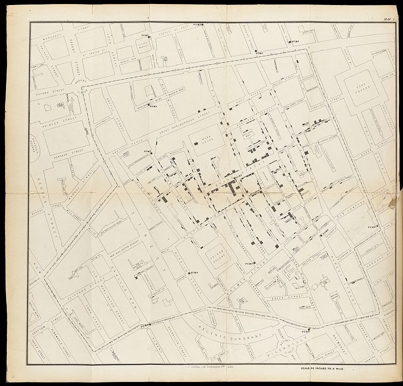
The concentration of deaths indicated that the source of the disease was a common water pump. Removing the handle from the pump brought an end to the outbreak.
We are probably not going to discover patterns of equal importance in this course.
The dataset we are working with
We are going to study a dataset containing information on prices and
other attributes of 53940 diamonds. The dataset is included in the
ggplot2 package, that we installed as part of
tidyverse
R
library(tidyverse)
head(diamonds)
OUTPUT
# A tibble: 6 × 10
  carat cut       color clarity depth table price     x     y     z
  <dbl> <ord>     <ord> <ord>   <dbl> <dbl> <int> <dbl> <dbl> <dbl>
1  0.23 Ideal     E     SI2      61.5    55   326  3.95  3.98  2.43
2  0.21 Premium   E     SI1      59.8    61   326  3.89  3.84  2.31
3  0.23 Good      E     VS1      56.9    65   327  4.05  4.07  2.31
4  0.29 Premium   I     VS2      62.4    58   334  4.2   4.23  2.63
5  0.31 Good      J     SI2      63.3    58   335  4.34  4.35  2.75
6  0.24 Very Good J     VVS2     62.8    57   336  3.94  3.96  2.48
There are 10 variables in the dataset:
| Variable | What is it? |
|---|---|
| carat | Weight of the diamond in carat (0.200 gram) |
| cut | Quality of the cut of the diamond (Fair, Good, Very Good, Premium, Ideal) |
| color | Colour of the diamond from D (best), to J (worst) |
| clarity | How clear is the diamond. I1 (worst), SI2, SI1, VS2, VS1, VVS2, VVS1, IF (best) |
| depth | Total depth percentage = z / mean(x, y) |
| table | Width of the top of the diamond relative to its widest point |
| price | Price in US dollars |
| x | Length in mm |
| y | Width in mm |
| z | depth in mm |
Slightly more detailed information can be found in the help for the dataset:
R
?diamonds
What are we not going to spend time on?
There are often several considerations to take into account when we plot.
Two of those, are not covered here:
- Is the plot suitable for the data we are working with?
- Is the plot looking cool and impressive?
We are not making art. And if a specific type of plot is useful, we do not care if it is actually suitable for the diamond data we are working with.
- This is not an introduction to R
- Visualisation is a useful way of representing data
- We are going to study diamonds!
Content from Getting started
Last updated on 2026-07-28 | Edit this page
Overview
Questions
- How do we build a plot with ggplot2?
Objectives
- Get to understand the layers in ggplot2
- Make our first plot
The grammar of graphics
Plotting using ggplot2 is based on “The Grammar of Graphics”, a theoretical treatment of how to talk about and conceptualize plots by Leland Wilkinson.
That theoretical treatise has been implemented in the package ggplot2
We do not need to know or understand all details of this 620 page book. But some weird naming conventions follows from this.
What we do need to know, is that based on the grammar of graphics, the layered structure of a plot using ggplot, is build like this:
R
ggplot(data = <DATA>, mapping = aes(<MAPPINGS>)) +
  <GEOM_FUNCTION>(
     mapping = aes(<MAPPINGS>),
     stat = <STAT>,
     position = <POSITION>
  ) +
  <COORDINATE_FUNCTION> +
  <SCALE_FUNCTION> +
  <FACET_FUNCTION> +
  <THEME_FUNCTION>
The “<” and “>” indicates that we should supply something here.
We are going to cover each element in the following.
What is the difference?
ggplot2 is the library, containing different types of functions for plotting, theming the plots, changing colours and lots of other stuff.
ggplot is one of these functions in ggplot2, and the one that begins every plot we make.
Yes it is confusing!
ggplot in it self
The first thing we need to provide for ggplot is some
<DATA>. We are working with the diamond dataset:
R
ggplot(data = diamonds)
 This in itself produces an extremely boring plot. But it is a plot, and
actually contains the data already. What is missing is information on
what exactly it is in the dataset we are trying to plot. How should our
data be mapped to the area of our plot? Or, what should we have
on the X-axis, and what should be on the Y-axis?
This in itself produces an extremely boring plot. But it is a plot, and
actually contains the data already. What is missing is information on
what exactly it is in the dataset we are trying to plot. How should our
data be mapped to the area of our plot? Or, what should we have
on the X-axis, and what should be on the Y-axis?
We provide that information to ggplot using the
<MAPPINGS> argument to the ggplot function. Here we
want to plot carat on the x-axis, and the
price on the y-axis:
R
ggplot(data = diamonds, mapping = aes(x = carat, y = price))
We are not actually seeing any data, because we have not specified the way the individual datapoints should be plotted. But we do see that the axes now have values. The data has influenced the plot!
We would like to make a classic scatter plot, and do that by adding
the right <GEOM_FUNCTION> to our plot. The
<GEOM_FUNCTION> that do this, is called
geom_points():
R
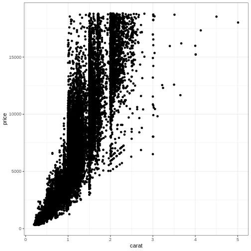
ggplot(data = diamonds, mapping = aes(x = carat, y = price)) +
  geom_point()
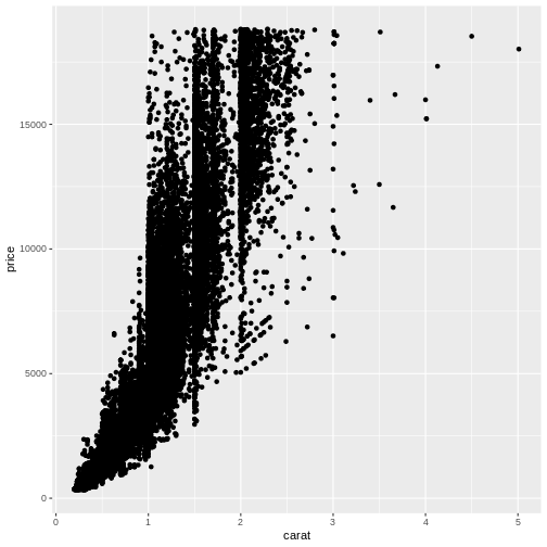
Comparing with the original template, we did not place any mapping in
the <GEOM_FUNCTION> but rather in the first
ggplot() function. The <GEOM_FUNCTION>
will inherit the original mapping, if we do not provide a specific
mapping for it.
That means that:
R
ggplot(data = diamonds, mapping = aes(x = carat, y = price)) +
  geom_point()
and
R
ggplot(data = diamonds) +
  geom_point(mapping = aes(x = carat, y = price))
will yield the same result.
We can even provide the same mapping in both places.
R
ggplot(data = diamonds, mapping = aes(x = carat, y = price)) +
  geom_point(mapping = aes(x = carat, y = price))
ggplot2 is a variation on the original grammar of graphics, called layered grammar of graphics, where the individual parts of the plot are added as layers, one on top of another. The + sign adds these layers.
geoms
geom_point() is the function we use to make scatter plots; because points is a geometric object. Other geometric objects can be plotted: geom_histogram() will plot histograms geom_line() will plot lines
All geometries in ggplot2 are named using the pattern geom_
The plus sign
The use of the + sign allows us to break up the code producing the plot in multiple lines. This makes it easier to read (and write!) the code producing the plot.
Note that the correct placement of + and linebreaks are very important.
This code will work:
R
ggplot() +
  geom_point()
This will not add the new layer and will return an error message:
R
ggplot()
  + geom_point()
Exercise
Plot “carat” (the weight of the diamond) against “x” (the length of the diamond). Make it a scatterplot
R
ggplot(data = diamonds, mapping = aes(carat, x)) +
  geom_point()
Note that some outliers, probably erroneous data, are discovered. A length of 0 is highly suspicious. Plots are also useful to reveal this sort of things!
- Plots in ggplot2 are build by adding layers
Content from Further mapping
Last updated on 2026-07-28 | Edit this page
Overview
Questions
- Can we show data using something other than position?
- What is correct, colour or color?
- How do I find out what a
geom_can do?
Objectives
- Learn to plot more than just positions
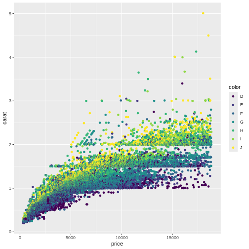
We saw how to map data to a position in a scatterplot. But we are able to map the data to other elements of a plot, eg the colour of the points.
R
ggplot(data = diamonds, mapping = aes(x = carat, y = price, colour = color)) +
  geom_point()
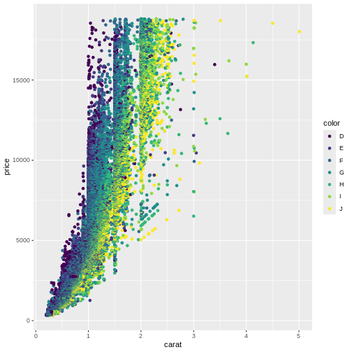
The argument to which we are mapping the values in the column color is also called colour, making the code look a bit weird.
Are these colours suitable? Probably not. The authors of this course material are not able to distinguish all of the colours. We will return to how to change colours in plots later in this course.
Spelling
Colour, and some other words can be spelled in more than one way. For arguments, ggplot understands both the correct english spelling colour and the american spelling color.
Note that this only applies to the arguments in the functions. If the column in the dataset is called color, ggplot will not find it if you write colour instead.
In an attempt to reduce confusion, we use colour for the
arguments and color when we refer to the variable
color.
Not surprisingly, the “best” colour, D have higher prices than the “worst” colour, “J”.
A common mistake is to place the colour argument a wrong place:
R
ggplot(data = diamonds, mapping = aes(x = carat, y = price), colour = color) +
  geom_point()
WARNING
Warning in fortify(data, ...): Arguments in `...` must be used.
✖ Problematic argument:
• colour = color
ℹ Did you misspell an argument name?
What happened to the colour? The colour argument is outside the aes()
function. That means that we are not mapping data to the colour!
What happened to the colour? The colour argument is outside the aes()
function. That means that we are not mapping data to the colour!
What else can we map data to?
More or less every phenomenon in a scatter plot can have data mapped to it, eg. the size of the points:
R
ggplot(data = diamonds, mapping = aes(x = carat, y = price, colour = color, size = table)) +
  geom_point()
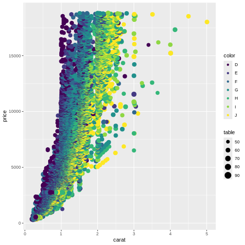
Not at good plot… We need to think about the combination of stuff we want to plot. Often two plots are better than trying to cram everything into a single plot.
What can be mapped to the plot depends on the geom we are using.
Calling the help function, eg ?geom_point, on a geom
will provide insight on that question. Doing it on the
geom_point() function, reveals that x and y are mandatory
because they are in bold.
The list of stuff we can map data to in geom_point:
- x
- y
- alpha
- colour
- fill
- group
- shape
- size
- stroke
Different geom_ functions have different mandatory/required aesthetics.
Not really mapping. Sorta.
Rather than mapping values from data to an aesthetic, we can provide
values directly. One very useful aesthetic to play with, at least when
we have as many datapoints as we have here, is alpha:
R
ggplot(data = diamonds, mapping = aes(x = carat, y = price, colour = color)) +
  geom_point(alpha = 0.1)
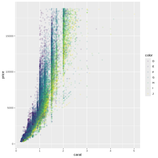
alpha controls the transparency of the points plotted,
and is a handy way of handling overplotting, the phenomenon that
multiple data points might be identical. In this example we set
alpha to be 0.1, we could have mapped a variable to it
instead.
geoms
geom_point() is the function we use to make scatter plots; because points is a geometric object. Other geometric objects can be plotted:
- geom_histogram() will plot histograms
- geom_line() will plot lines
All geometries in ggplot2 are named using the pattern geom_
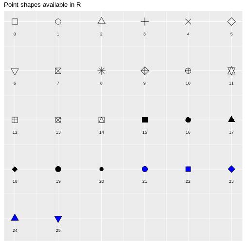
Using shapes in the plot
Shapes can be useful if we want to make plots that are robust in regards to colour reproduction on screens, in printers or for people with reduced colour vision. In principle we can plot any kind of shape. But without having to program them ourself, these are available directly in ggplot. They are numbered, because it is easier to write “14” than “square box with upwardspointing triangle inside”.
- Data can be plottet as something other than position
- Types of plots are determined by
geom_functions
Content from Different types of plots
Last updated on 2026-07-28 | Edit this page
Overview
Questions
- What other types of plots can we make?
- How can we control the order of stuff in plots?
Objectives
- Learn how to make histograms, barcharts, boxplots and violinplots
Scatterplots are very useful, but we often need other types of plots. In this part of the course, we are going to look at some of the more common types.
Histograms
Histograms splits all observations of a variable up in a number of “bins”. It counts how many observations are in each bin. Then we plot a column with a height equivalent to the number of observations for each bin.
Note that we here use the pipe to get the diamonds data
into ggplot(). Both methods can be used. However piping the
data into ggplot() is useful if we need to manipulate the
data before plotting, eg. by filtering it.
R
diamonds |>
  ggplot(mapping = aes(carat)) +
  geom_histogram()
OUTPUT
`stat_bin()` using `bins = 30`. Pick better value `binwidth`.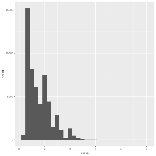
Note that we get a warning from geom_histogram that the
number of bins by default is set to 30. 30 bins will almost never be the
correct number of bins, and we should chose a better value ourself.
R
diamonds |>
  ggplot(aes(carat)) +
  geom_histogram(bins = 25)
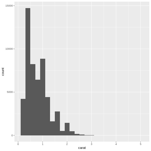
What number of bins should I choose? Some heuristics for choosing does exists, but in general it is our recommendation that you experiment with different number of bins to find the one that best shows your data.
Note that we excluded the mapping part of the
ggplot function. The first argument of ggplot
is always data, and we can get that via the pipe. The second argument is
always mapping, and therefore we do not need to
specify it.
In the following we are sometimes going to specify the
mapping argument. There are two reasons for that. One: We
have forgotten to be consistent. Two: In some cases it is useful to
remind ourselves that we are actually mapping data to something.
Barcharts
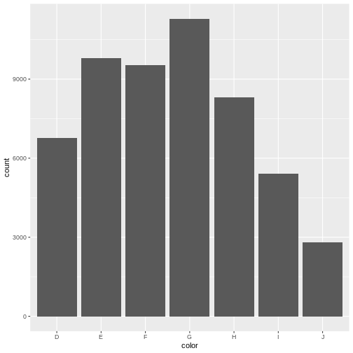
Not to be confused with histograms, barcharts count the number of observations in different groups. Where the scale in histograms is continuous, and split into bins, the scale in barcharts is discrete.
Here we map the color-variable to the x-axis in the
barchart. geom_bar counts the number of observations itself
- we do not need to provide a count:
R
diamonds |>
  ggplot(aes(color)) +
  geom_bar()
A small excursion
Why are the columns in the barchart above in that order?
One might guess that they are simply in alphabetical order.
Not so! color is a categorical variable. Diamonds either
have the colour “D” (which is the best colour), or another colour (like
“J”, which is the worst).
There are no “D.E” colours, they do not exist on a continuous range.
This is called “factors” in R. The data in a factor can take one of several values, called levels. And the order of these levels are what control the order in the plot.
The order can be either arbitrary, or there can exist an implicit order in the data, like with the colour of the diamonds, where D is the best colour, and J is the worst. These types of ordered categorical data are called ordinal data.
They look like this:
R
diamonds |>
  select(cut, color, clarity) |>
  str()
OUTPUT
tibble [53,940 × 3] (S3: tbl_df/tbl/data.frame)
 $ cut    : Ord.factor w/ 5 levels "Fair"<"Good"<..: 5 4 2 4 2 3 3 3 1 3 ...
 $ color  : Ord.factor w/ 7 levels "D"<"E"<"F"<"G"<..: 2 2 2 6 7 7 6 5 2 5 ...
 $ clarity: Ord.factor w/ 8 levels "I1"<"SI2"<"SI1"<..: 2 3 5 4 2 6 7 3 4 5 ...
Note that even though the colour “D” is better than “E”, the levels
of the color factor indicates that “D<E”.
All this just to say: We can control the order of columns in the plot, by controlling the order of the levels of the categorical value we are plotting:
R
diamonds |>
  mutate(color = fct_rev(color)) |>
  ggplot(aes(color)) +
  geom_bar()
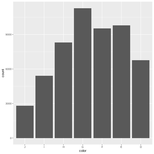
fct_rev is a function that reverses the order of a
factor. It comes from the library forcats that makes it
easier to work with categorical data.
Boxplots
Boxplots are suitable for visualising the distribution of data. We can make a boxplot of a single variable in the data - or we can make several boxplots in one plot:
R
diamonds |>
  ggplot(aes(x = carat, y = cut)) +
  geom_boxplot()
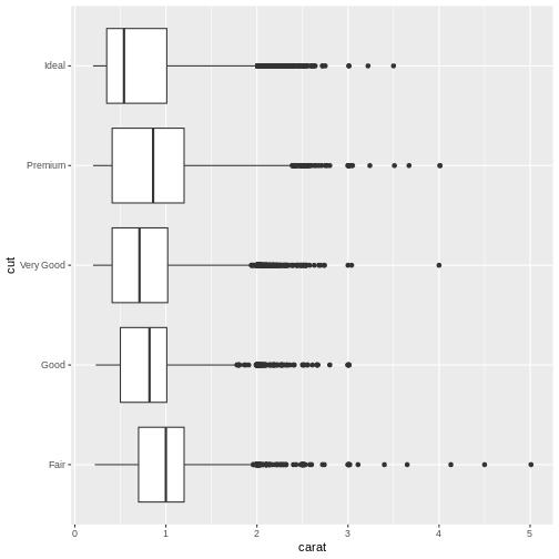
Here we have the variable we are making boxplots of, on the x-axis, and splitting them up in one plot per cut, on the y-axis.
What is a boxplot?
Boxplots are useful for showing different distributions. The fat line in the middle of the box is the median, the two ends of the box is first and third quartile, and the two whiskers (or lines) on both sides of the box shows the minimum and maximum values - excluding outliers, defined for this purpose as values that lies more that 1.5 times the interquartile range from the box.
Violinplots
Boxplots are not necessarily the best option for showing distributions. A good alternative could be violinplots. They show a density plot - basically a histogram with infinite bins - for each group, plotted symmetrically around an axis:
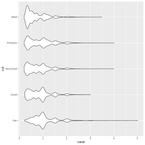
Exercise
The geom_ for making violin plots is geom_violin Look at
the help for geom_violin and make a violinplot with carat
on the x-axis, and cut on the y-axis.
R
diamonds |>
ggplot(aes(carat, y = cut)) +
geom_violin()
And many more
ggplot2 is born with a multitude of different plots. A complete list of plots will be very long, and take up all the time for this course. Take a look at The R Graph Gallery or at Graphs in R (NB a work in progress), where we will collect weird and wonderful plots, when to use them, when not to use them. And how to make them.
ggplot2 is written as an extensible package, meaning that developers can create packages making plots that are not included in ggplot2, or introduce more advanced functionality around plots. Two of the more interesting extensions are:
ggforce extends ggplot2 with specialised plottypes.
gganimate makes it easyish to make animated plots using
ggplot2
- Categorical data, aka factors can control the order of data in plots
- ggplot makes it easy to make many different types of plots
- ggplot have many useful extensions
Content from Facetting
Last updated on 2026-07-28 | Edit this page
Overview
Questions
- What is facetting?
Objectives
- Learn to use small multiples in your plots
Small multiples
If we only make one plot we quickly runs into the problem of trying
to plot too much information in the plot. Here we plot the price against
carat, colour by the color of the diamonds. And represent
their clarity by the shape of the points:
R
ggplot(data = diamonds, mapping = aes(x = carat, y = price, colour = color, shape = clarity)) +
  geom_point()
WARNING
Warning: Using shapes for an ordinal variable is not advisedWARNING
Warning: The shape palette can deal with a maximum of 6 discrete values because more
than 6 becomes difficult to discriminate
ℹ you have requested 8 values. Consider specifying shapes manually if you need
  that many of them.
WARNING
Warning: Removed 5445 rows containing missing values or values outside the scale range
(`geom_point()`).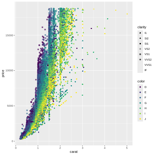
This is probably not the best way to discover patterns in the data. It is actually so bad that ggplot warns us that we are using too many different shapes!
One way of handling that, is to plot “small multiples” of the data.
Instead of plotting information on the clarity of the diamonds in one plot, along with all the other information, we make one plot for each value of clarity. This is called facetting:
R
ggplot(data = diamonds, mapping = aes(x = carat, y = price, colour = color)) +
  geom_point() +
  facet_wrap(~clarity)
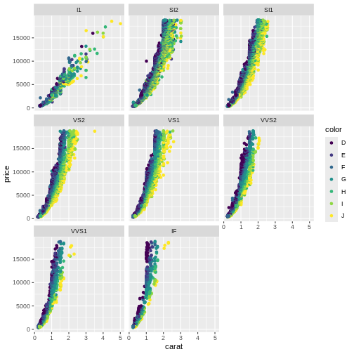 Here we can see that the price rises more rapidly with size, for the
better clarities, something that would have been impossible to see in
the previous plot.
Here we can see that the price rises more rapidly with size, for the
better clarities, something that would have been impossible to see in
the previous plot.
The fundamental idea behind faceting, is the concept “small multiples”, popularised by Edward Tufte. He describes it as (resembling) “the frames of a movie: a series of graphics, showing the same combination of variables, indexed by changes in another variable.” The method is also known as”trellis”, “lattice”, “grid” or “panel” charts. They allows us to break down a very “busy” chart, containing too much information, making it possible for the reader of the charts to walk through them one category at a time, and make comparisons.
Exercise
Plot price as a function of depth (price on the y-axis, depth on the
x-axis), and facet by cut. If you want a colourful plot, colour the
points by color.
R
ggplot(data = diamonds, mapping = aes(x = depth, y = price, colour = color)) +
  geom_point() +
  facet_wrap(~cut)
Note that for the better cuts, diamonds are cut to pretty specific proportions. Worse (Fair) diamonds have more varied proportions.
More than one multiple
We can expand on the “small multiple” concept, by plotting the facets in a grid, defined by two categorical values.
In this plot we plot price as a function of carate, and make
individual plots for each combination of clarity and
color:
R
diamonds |>
  ggplot(aes(x = carat, y = price, colour = color)) +
    geom_point() +
    facet_grid(clarity ~ color)
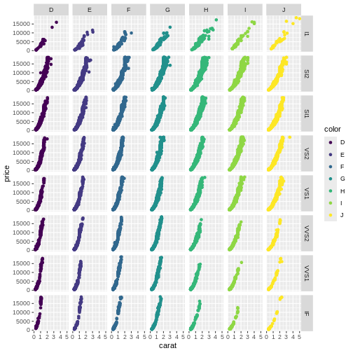
Be careful using facets, especially facet_grid when you work with small datasets. You might end up with too little data in each facet.
- Facetting can make busy plots more understandable
- Grid facetting in two dimensions allows us to plot even more variables
Content from Scaling and coordinates
Last updated on 2026-07-28 | Edit this page
Overview
Questions
- How can we adjust the scales in a plot?
- How can we zoom-in to specific parts of a plot?
- How can we change the colours of the plot?
- How do I make a pie-chart?
Objectives
- Learn to zoom by adjusting scales
- Learn how to make log-scale plots
- Learn why you should not make a pie-chart
- Learn how to control the colour-scale
Changing scale and coordinates
ggplot chooses a coordinate system for us. Like bins in histograms, that coordinate system might not be the right one for our data.
One of the more commonly cited “rules” for plots and graphs is that the coordinate system should begin at zero. And ggplot does not necessarily give us a coordinate system that begins at zero. So how do we force it to?
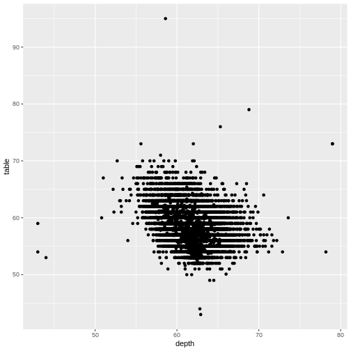
R
diamonds|>
  ggplot(aes(depth, table)) +
  geom_point()
We can control the axes precisely by adding xlim and/or ylim to the plot. We need to provide these functions with a vector of length 2, indicating the minimum and maximum values we want:
R
diamonds |>
  ggplot(aes(depth, table)) +
  geom_point() +
  xlim(c(0,80)) +
  ylim(c(0,100))
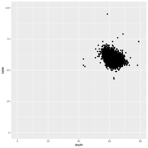
It is nice to be able to control the two axes seperately. Because the coordinate system should not always begin at zero. Especially time-series, showing a development over time, should often not begin at zero.
Zooming
Let us zoom in on the plot above, and look at tables between 50 and 70, by adjusting the ylim:
R
diamonds |>
  ggplot(aes(depth, table)) +
  geom_point() +
  ylim(c(50,70))
WARNING
Warning: Removed 12 rows containing missing values or values outside the scale range
(`geom_point()`).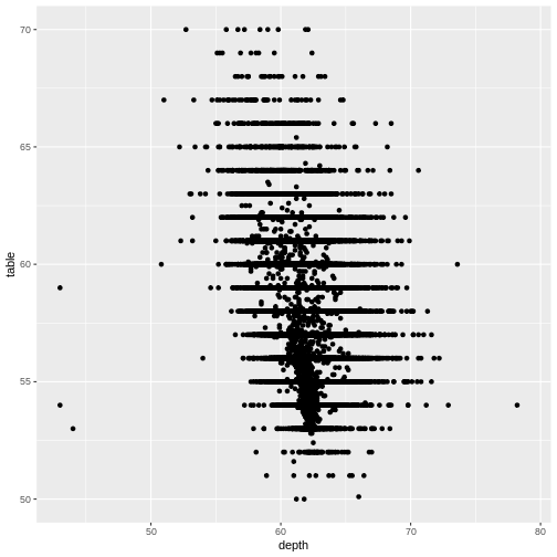
That returns a warning! Some data is not within the limits we placed on the y-axis. This might not be a problem. Or it might.
If we are doing more advanced stuff like scaling the axes (eg. logarithmically), cutting of data might be a bad idea.
Zooming in on particular areas of the plot is done better using the
coord_cartesian function:
R
diamonds |>
  ggplot(aes(depth, table)) +
  geom_point() +
  coord_cartesian(ylim = c(50,70))

This will not cut out data from the plot, they are still there for other geoms that might need them, they are simply not plotted.
Why would that be a problem?
That would be a problem, because the ylim approach
removes data before the plot is actually made. Functions that would use
these removed data will no longer have access to them. Let us show -
without going deep into what is actually happening, the difference.
We can add a smoothing function to a plot, that adds a trendline to
the data. This “smoother” is based on all the data available to it. Let
us make two plots, one where we zoom using ylim, and one
where we zoom using coord_cartesian:
R
library(patchwork)
p1 <- diamonds |>
  ggplot(aes(depth, table)) +
  geom_point() +
  ylim(c(50,70)) +
  geom_smooth() +
  ggtitle("Zoom by ylim", subtitle = "Smooth only uses a subset of data")

p2 <- diamonds |>
  ggplot(aes(depth, table)) +
  geom_point() +
  coord_cartesian(ylim = c(50,70)) +
  geom_smooth() +
  ggtitle("Zoom by coord_cartesian", subtitle = "Smooth uses all data")


print(p1 + p2)
OUTPUT
`geom_smooth()` using method = 'gam' and formula = 'y ~ s(x, bs = "cs")'WARNING
Warning: Removed 12 rows containing non-finite outside the scale range
(`stat_smooth()`).
WARNING
Warning: Removed 12 rows containing missing values or values outside the scale range
(`geom_point()`).
OUTPUT
`geom_smooth()` using method = 'gam' and formula = 'y ~ s(x, bs = "cs")'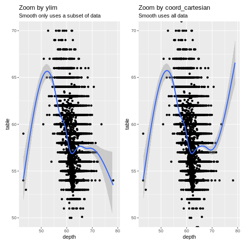 The trendlines are very different, because the data they are based on,
is different. Also note that we get one set of warnings about missing
data. When we zoom using
The trendlines are very different, because the data they are based on,
is different. Also note that we get one set of warnings about missing
data. When we zoom using ylim both
geom_smooth, and geom_point are missing data.
When we zoom using coord_cartesian they have access to all
data - but do not plot it.
Changing the coordinate system
We saw above that we could adjust the coordinate system in order to zoom in on specific parts of the plot. We can do other things with the coordinate system!
Should we want to flip the coordinates, we could interchange the x and y values in the mapping argument. Or we could add a coordinate function that changes the coordinate system:
R
ggplot(data = diamonds, mapping = aes(x = carat, y = price, colour = color)) +
  geom_point() +
  coord_flip()
Other coord_ functions exists, that does more advanced transformations of the coordinate system.
Log-scale
With data that span several orders of magnitude, it is often useful to plot it in a logarithmic or double-logarithmic coordinate system. That might reveal structure in the data that is otherwise invisible.
And sometimes, eg in chemistry studying reaction kinetics, we use logarithmic scales to address logarithms in the model we have for our data.
By default ggplot comes with the function scale_y_log10
that will transform the y-axis to a logarithmic scale using base 10 for
the logarithm. The equivalent function scale_x_log10 does
the same for the x-axis. If you need the natural logarithm, you will
need to look into the package scales:
R
diamonds |>
  ggplot(aes(carat, price)) +
  geom_point() +
  scale_y_log10()
![]() This plot reveals a gap in the prices. There are no diamonds in this
dataset with a price between 1454 USD and 1546 USD. The educated guess
is an error in the original dataset.
This plot reveals a gap in the prices. There are no diamonds in this
dataset with a price between 1454 USD and 1546 USD. The educated guess
is an error in the original dataset.
exercise
Try to plot price against carat (carat on the x-axis, and price on y-axis) with both axes log transformed.
What new insights do we gain?
R
ggplot(data = diamonds, mapping = aes(x = depth, y = price)) +
  scale_x_log10() +
  scale_y_log10()
The correlation between carat and price appears to be roughly linear (with a lot of noise) then both carat and price are log transformed.
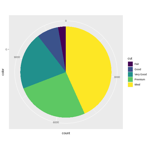
Pie charts - the forbidden charts
A very popular plot type is pie charts. Pie charts in ggplot can be defined by making a stacked bar-chart, and changing the coordinate system to polar.
We begin by filtering the data set to only include diamonds with the
color “G”, and then make a barchart. We add the argument
position = "stack" to geom_bar to stack the
bars rather than having them side by side. And then we adjust the
coordinate system to be polar (the y-axis specifically), beginning at
0:
R
diamonds |>
  mutate(color = as.character(color)) |>
  filter(color == "G") |>
  ggplot(aes(x = color, fill = cut)) +
  geom_bar(position = "stack") +
  coord_polar("y", start=0)
Our ordinary coordinate system is a cartesian coordinate system. Each point in the system are defined by two values, X and Y, representing the distance from the origin or reference point of the coordinate system.
In a polar coordinate system, each point in the plane is defined by two values: radius (r) and angle (θ). The radius represents the distance from a reference point (called the pole) to the point in question, and the angle is the angle formed between the positive x-axis (in ggplot2, this is usually the horizontal axis) and the line connecting the pole to the point.
In a polar coordinate system, we still have a point of origin, 0,0 but now the points are plottet using an angle from the x-axis and a distance
Why does geom_pie() not exist?
ggplot2 is an opinionated package. It forces us to think about including 0,0 in our plots. When we make histograms, the number of bins are chosen to be particularly bad, so we have to choose something different.
And piecharts are a very bad idea. They map values to an angle in the plot, and humans are not very good at seeing the difference between two angles.
Rare exceptions exists. But making pie charts should be done with EXTREME caution.
Colouring the scale
Looking at the plot below, the authors of this course get pretty frustrated.
R
ggplot(data = diamonds, mapping = aes(x = carat, y = price, colour = color)) +
  geom_point()

We are not really able to distinquish the colour for “D” and “E”. Or for “G” and “H”. Controlling the colours is important not only for aesthetic reasons, but also for actually illustrating what the plot is showing.
Here, the colour is introduced by mapping the color of
the diamonds to the colouring of the points. This actually is mapping a
value to a scale, no different from the mapping of the price to the
y-axis.
In the same way we can adjust the scale of the y-axis as shown above, we are able to adjust the actual colours in the plot.
The functions for this are (almost) all called scale_
and then continues with colour if we are colouring points,
fill if we want to control the fill-colour of a solid
object in the plot, and finally something that specifies either the type
of data we are plotting, or specific functionality to control the
colour.
Below we adjust the colour using the special family of functions
brewer: scale_colour_brewer. Nice colours, but
even worse:
R
ggplot(data = diamonds, mapping = aes(x = carat, y = price, colour = color)) +
  geom_point() +
  scale_colour_brewer() +
  theme(panel.background = element_rect(fill = "black"))
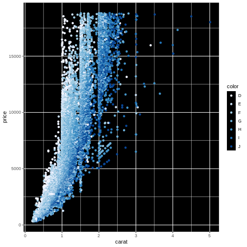 What we did to change the background will be covered in the next
episode.
What we did to change the background will be covered in the next
episode.
Finding the optimal colours usually requires a lot of fiddling around. Rather than using functions to choose the colours, we can choose them manually, like this:
R
ggplot(data = diamonds, mapping = aes(x = carat, y = price, colour = color)) +
  geom_point() +
  scale_colour_manual(values=c('#7fc97f','#beaed4','#fdc086','#ffff99','#386cb0','#f0027f','#bf5b17'))
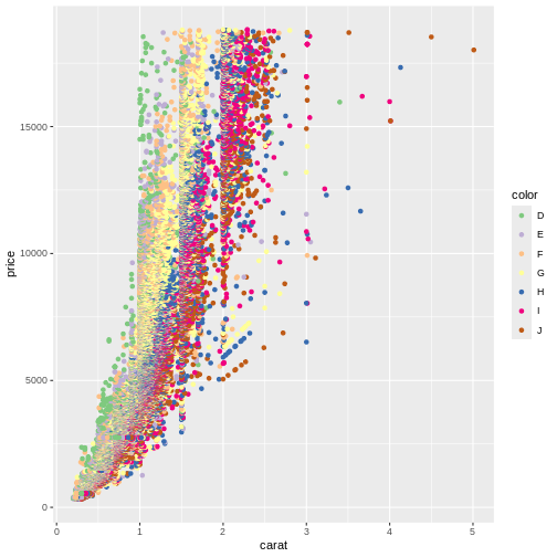
The codes #7fc97f are “hex-codes”, specifying the colours. You can find websites allowing you to chose a colour, and get the code. A good place to get suggestions for colour-pallettes is Colorbrewer2.
- Pie charts are a bad idea!
- Zooming might exclude data if done wrong
- Play around to find the colours you like
Content from Theming
Last updated on 2026-07-28 | Edit this page
Overview
Questions
- How can I make the plot look good?
- How do I get rid of that grey background?
- How do I get rid of the gridlines?
Objectives
- Learn to use different themes
- Learn to adjust the appearance of specific parts of the plot
The THEME_FUNCTIONs
Every part of the plot can be changed. The grey background might be annoying The gridlines might be confusing.
These non-data components of the plots can be controlled using the
family of theme functions:
R
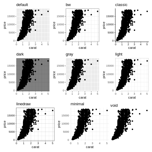
ggplot(diamonds, aes(carat, price)) +
  geom_point() +
  theme_bw()
 More exists:
Notice the pattern?
A general pattern of function names in ggplot2 can be seen.
Themes are named “theme_” and then the name of the theme. We saw the same pattern with the scale functions: “scale_” and then the axis, followed by what we did to the axis, eg: “scale_y_log10”
Even more theming
Every element in the plot can be controlled. The
theme() function is the way to do that:
R
diamonds |>
  ggplot(aes(carat, price)) +
  geom_point() +
  theme_dark() +
  theme(axis.text.y = element_text(angle= 45))
Angling the labels in a plot can be good for readability. However the actual way to do it can be a bit more involved as you see above. Read the help for theme to get at complete list of things that can be changed. There are 97 things in total.
Also note, that we can add theming on top of previous theming. Here we begin with a built-in theme that we like, and change the parts we want to change.
Finally note, that the order is important:
R
diamonds |>
  ggplot(aes(carat, price)) +
  geom_point() +
  theme_dark() +
  theme(axis.text.y = element_text(angle= 45))
and
R
diamonds |>
  ggplot(aes(carat, price)) +
  geom_point() +
  theme(axis.text.y = element_text(angle= 45)) +
  theme_dark()
Will not give the same result. theme_dark has a setting
for the way the text on the y-axis is shown, and will overwrite the
changes done before calling it.
Most of the elements of the plot need to be defined in a
special way. If we want the “theme” a text element, we set the
axis.text to be an element_text() function
with specific arguments to specify what we want to do. For the
background of the plot we are changing a rectangular object
element_rect, and can set the background colour like
this:
R
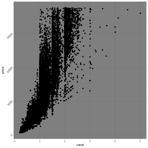
diamonds |>
  ggplot(aes(carat, price)) +
  geom_point() +
  theme(axis.text.y = element_text(angle= 45),
        panel.background = element_rect(fill = "red"))
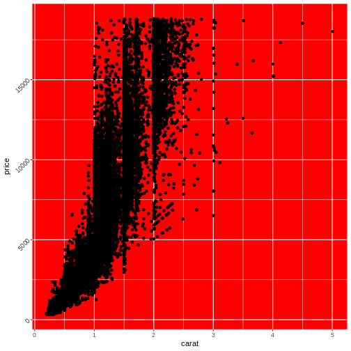 Note that we are not setting the
 plot.background, as that
would change the background of the entire plot, rather than the
background of the actual area on which we are plotting.
- EVERYTHING in the plot can be customized
Content from Saving and exporting
Last updated on 2026-07-28 | Edit this page
Overview
Questions
- How can I save the plots?
Objectives
- Learn how to save your plots in different formats
It would be nice to be able to save the plot.
Saving a plot can be done directly from the plot pane in Positron
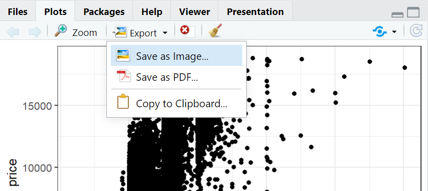
ggplot2 also includes a function for saving the last plot you made. This function will save it as “myimage.png” in your current directory. The image will be 800x600 pixels (px) in size, and with a resolution of 300 dpi.
R
ggsave("myimage.png", width = 800,
       height = 600, units = "px",
       dpi = 300)
However, this does not look very nice: 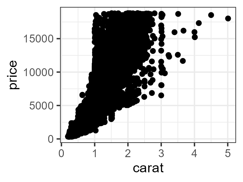 The points are too big for the plot!
Be prepared for a lot of fiddling about with your plots if you want
to use ggsave().
Adjusting size, and getting af nice image is often easier adjusting the size of the plot pane directly in RStudio.
The saved image will reflect what you see on the screen.
There is more than JPG and PNG in the world!
JPG is a popular format for saving images. It produces nice, small files. PNG is also a popular format for images.
By default, ggsave is able to recognize the extension you give your file name (.png in the example above), and save to these formats:
- eps
- ps
- tex
- jpeg/jpg
- tiff
- png
- bmp
- svg
- wmf (only on windows)
We would like to recommend the “svg” format. That format is a “vector-based” format that you can scale to any size you want.
- The easiest way to adjust the size of your saved plots is by adjusting the plot window in RStudio
Content from Whats next?
Last updated on 2026-07-28 | Edit this page
Overview
Questions
- What is the next step in learning to plot?
Objectives
- Provide tips on where to locate data for plotting
- Provide tips for finding inspiration for plotting
What should I do next?
First of all: If you do not have data you want to visualise already. Find some!
Kaggle host competitions in machine learning. For the use of those competitions, they give access to a lot of interesting datasets to work with. With more than 200.000 datasets at time of writing, it can be a bit overwhelming, so consider looking at the “Data Visualization” category. The link provided only shows datasets saved as CSV-files, and has only about 2.500 datasets.
Play around!
ggplot2 comes with a lot of functionality. This is the list of build-in geoms in ggplot2:
OUTPUT
 [1] "geom_abline"            "geom_area"              "geom_bar"
 [4] "geom_bin_2d"            "geom_bin2d"             "geom_blank"
 [7] "geom_boxplot"           "geom_col"               "geom_contour"
[10] "geom_contour_filled"    "geom_count"             "geom_crossbar"
[13] "geom_curve"             "geom_density"           "geom_density_2d"
[16] "geom_density_2d_filled" "geom_density2d"         "geom_density2d_filled"
[19] "geom_dotplot"           "geom_errorbar"          "geom_errorbarh"
[22] "geom_freqpoly"          "geom_function"          "geom_hex"
[25] "geom_histogram"         "geom_hline"             "geom_jitter"
[28] "geom_label"             "geom_line"              "geom_linerange"
[31] "geom_map"               "geom_path"              "geom_point"
[34] "geom_pointrange"        "geom_polygon"           "geom_qq"
[37] "geom_qq_line"           "geom_quantile"          "geom_raster"
[40] "geom_rect"              "geom_ribbon"            "geom_rug"
[43] "geom_segment"           "geom_sf"                "geom_sf_label"
[46] "geom_sf_text"           "geom_smooth"            "geom_spoke"
[49] "geom_step"              "geom_text"              "geom_tile"
[52] "geom_violin"            "geom_vline"
ggplot2 is also build as an extensible package, making it relatively easy to build extensions, that does things that ggplot2 is not able to on its own. This page contains a collection of these.
Get some inspiration!
The website/book Fundamentals of Data Visualization is a great resource for tips, tricks and thinking about visualizations, especially the directory of visualizations. Note, however, that the author does not provide examples of the code you need to write to make the plots.
There exist an online challenge, #30DayChartChallenge, that challenges you to create a data visualization on a certain topic each day of april. That can be a bit of a mouthful and we are not going to participate ourselves. But! The collection of visualizations from 2022 is humongous, and a great place to find ideas.
Sometimes you have a pretty good idea about what you want to visualise. But you are uncertain about what graphs might be used for that. Or you know what graph you want to make, but can’t quite figure out how to write the code. The R Graph Gallery have a wide selection of chart types with code!
Other online courses
EdX offers a multitude of interesting courses - here we link to their ggplot-related courses.
Codecademy also offers free courses (and a certificate of completion if you pay) This course offers a more indepth introduction to ggplot2.
Extensions
ggplot2 is build for extensions. And there are many.
- (Hack for ggplot)[https://teunbrand.github.io/ggh4x/] A packages with utilities for doing stuff on the edge of what ggplot is designed for.
- ggplot2 is extensible - a LOT of extensions are available