All Images
Before we Start
Figure 1
A good example is this map, where the English physician John Snow
plotted the deaths from Cholera in Soho, London from 19th august to 30th
September 1854. 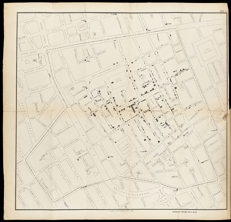
Getting started
Figure 1
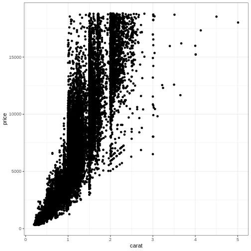
 This in itself produces an extremely boring plot. But it is a plot, and
actually contains the data already. What is missing is information on
what exactly it is in the dataset we are trying to plot. How should our
data be mapped to the area of our plot? Or, what should we have
on the X-axis, and what should be on the Y-axis?
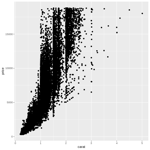
This in itself produces an extremely boring plot. But it is a plot, and
actually contains the data already. What is missing is information on
what exactly it is in the dataset we are trying to plot. How should our
data be mapped to the area of our plot? Or, what should we have
on the X-axis, and what should be on the Y-axis?
Figure 2
Figure 3
Further mapping
Figure 1
Figure 2
 What happened to the colour? The colour argument is outside the aes()
function. That means that we are not mapping data to the colour!
What happened to the colour? The colour argument is outside the aes()
function. That means that we are not mapping data to the colour!
Figure 3
Figure 4
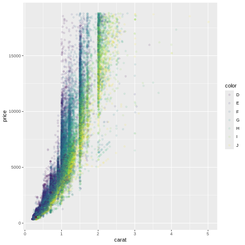
Figure 5
Different types of plots
Figure 1
Figure 2
Figure 3
Figure 4
Figure 5
Figure 6
Facetting
Figure 1
Figure 2
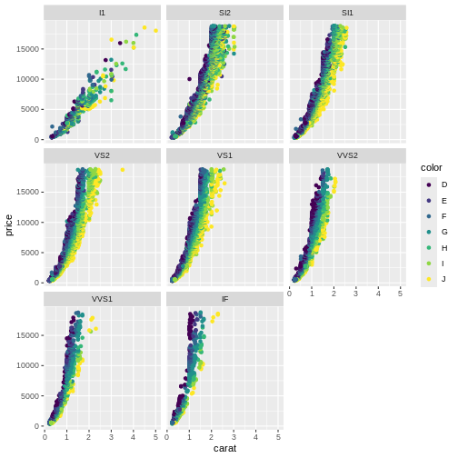 Here we can see that the price rises more rapidly with size, for the
better clarities, something that would have been impossible to see in
the previous plot.
Here we can see that the price rises more rapidly with size, for the
better clarities, something that would have been impossible to see in
the previous plot.
Figure 3
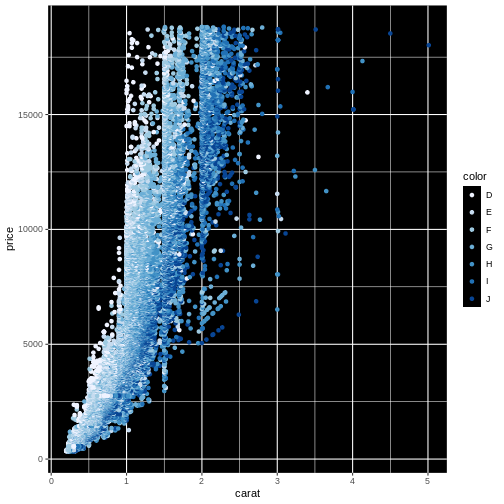
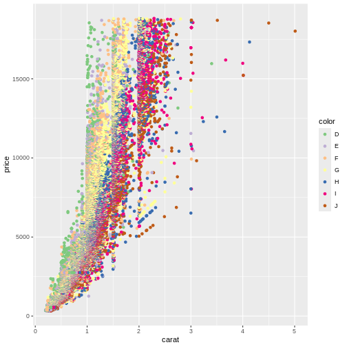
Scaling and coordinates
Figure 1
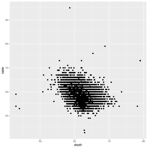
Figure 2
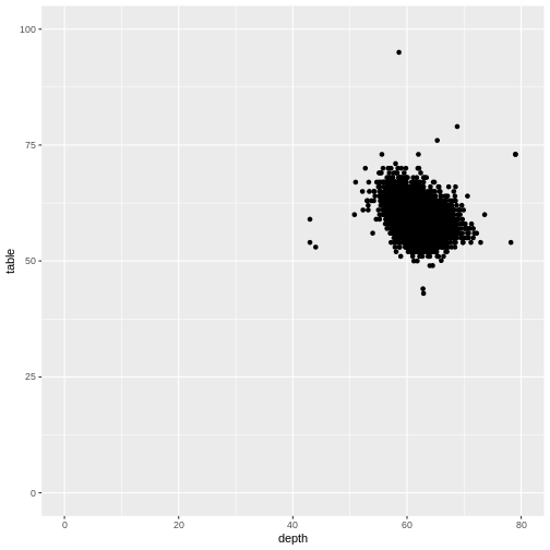
Figure 3
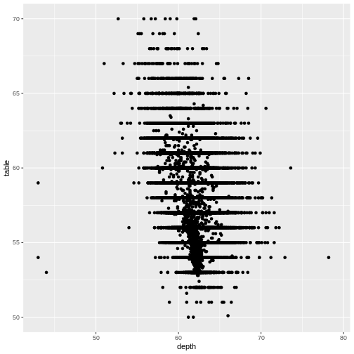
Figure 4

Figure 5
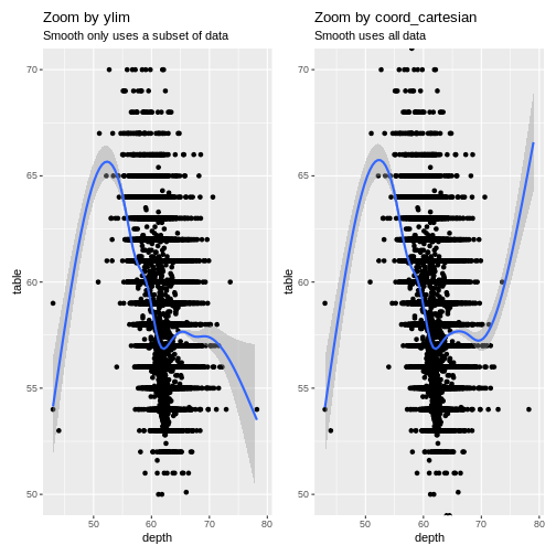 The trendlines are very different, because the data they are based on,
is different. Also note that we get one set of warnings about missing
data. When we zoom using
The trendlines are very different, because the data they are based on,
is different. Also note that we get one set of warnings about missing
data. When we zoom using ylim both
geom_smooth, and geom_point are missing data.
When we zoom using coord_cartesian they have access to all
data - but do not plot it.
Figure 6
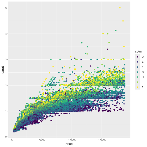
Figure 7
![]() This plot reveals a gap in the prices. There are no diamonds in this
dataset with a price between 1454 USD and 1546 USD. The educated guess
is an error in the original dataset.
This plot reveals a gap in the prices. There are no diamonds in this
dataset with a price between 1454 USD and 1546 USD. The educated guess
is an error in the original dataset.
Figure 8
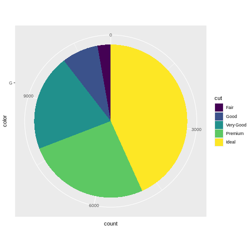
Figure 9

Figure 10
 What we did to change the background will be covered in the next
episode.
What we did to change the background will be covered in the next
episode.
Figure 11
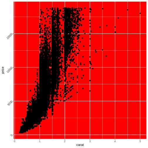
Theming
Figure 1
 More exists:
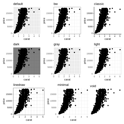
Figure 2
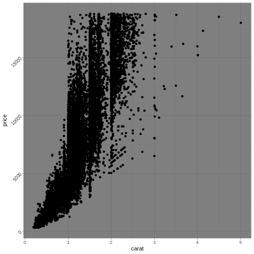
Figure 3
 Note that we are not setting the
 plot.background, as that
would change the background of the entire plot, rather than the
background of the actual area on which we are plotting.
Saving and exporting
Figure 1
Saving a plot can be done directly from the plot pane in Positron
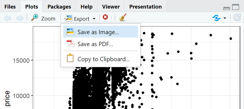
Figure 2
However, this does not look very nice: 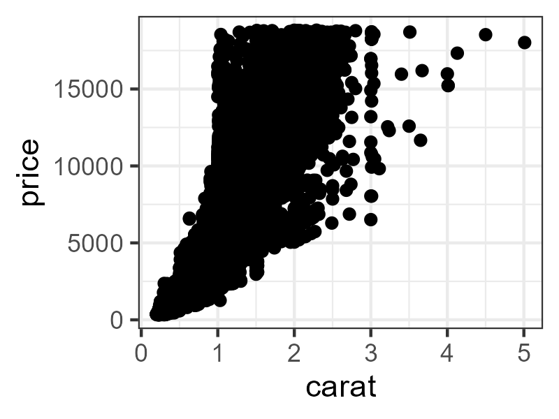 The points are too big for the plot!