Ranking
Overview
Teaching: 42 min
Exercises: 47 minQuestions
FIXME
Objectives
FIXME
tag et kig på: https://clauswilke.com/dataviz/directory-of-visualizations.html
Plot types useful for showing rankings - that is, which type of observation is the most common, and which is the least common.
Barplots
What are they?
What do we use them for?
We use them for showing a relationship between a numeric and a categorical variable.
That can be
geom_bar
function (mapping = NULL, data = NULL, stat = "count", position = "stack",
    ..., just = 0.5, width = NULL, na.rm = FALSE, orientation = NA,
    show.legend = NA, inherit.aes = TRUE)
{
    layer(data = data, mapping = mapping, stat = stat, geom = GeomBar,
        position = position, show.legend = show.legend, inherit.aes = inherit.aes,
        params = list2(just = just, width = width, na.rm = na.rm,
            orientation = orientation, ...))
}
<bytecode: 0x55f20cc807c8>
<environment: namespace:ggplot2>
how do we make them?
Interesting variations
Think about
Be careful! It is tempting to use barplots for other stuff, like the mean value of two groups. This can be missleading. Here is an example:
set.seed(47)
group1 <- rnorm(n = 100, mean = 1, sd = 1)
group2 <- rlnorm(n = 100,
                 meanlog = log(1^2/sqrt(1^2 + 1^2)),
                 sdlog = sqrt(log(1+(1^2/1^2))))
groups_long <- cbind(
  group1,
  group2
) %>%
  as.data.frame() %>%
  gather("group", "response", 1:2)

bar <- groups_long %>%
  ggplot(aes(x = group, y = response)) +
  geom_bar(stat = "summary", fun = mean,
           width = 0.7, alpha = 0.8,
           aes(fill = group)) +
  stat_summary(geom = "errorbar", fun.data = "mean_se",
               width = 0.1, size = 1)
Warning: Using `size` aesthetic for lines was deprecated in ggplot2 3.4.0.
ℹ Please use `linewidth` instead.
This warning is displayed once every 8 hours.
Call `lifecycle::last_lifecycle_warnings()` to see where this warning was
generated.
dotplot <- groups_long %>%
  ggplot(aes(x = group, y = response)) +
  ggbeeswarm::geom_quasirandom(
    shape = 21, color = "white",
    alpha = 0.8, size = 3,
    aes(fill = group)
  ) +
  labs(x = "Group",
       y = "Response",
        caption = paste0("OH!!!\nP = ",
                        signif(ks.test(group1, group2)$p.value, 2),
                        " (Kolmogorov–Smirnov test)")) +
  theme_classic() +
  theme(
    text = element_text(size = 12, face = "bold", color = "black"),
    axis.text = element_text(color = "black"),
    legend.position = "none",
    plot.title = element_text(size = 10),
    plot.caption = element_text(hjust = 0)
  ) +
  ggtitle(
    paste0(
      "group1: median = ", signif(median(group1), 2),
      "; IQR = ", signif(IQR(group1), 2), "\n",
      "group2: median = ", signif(median(group2), 2),
      "; IQR = ", signif(IQR(group2), 2)
    )
  )

wrap_plots(
  bar, dotplot, nrow = 1
)
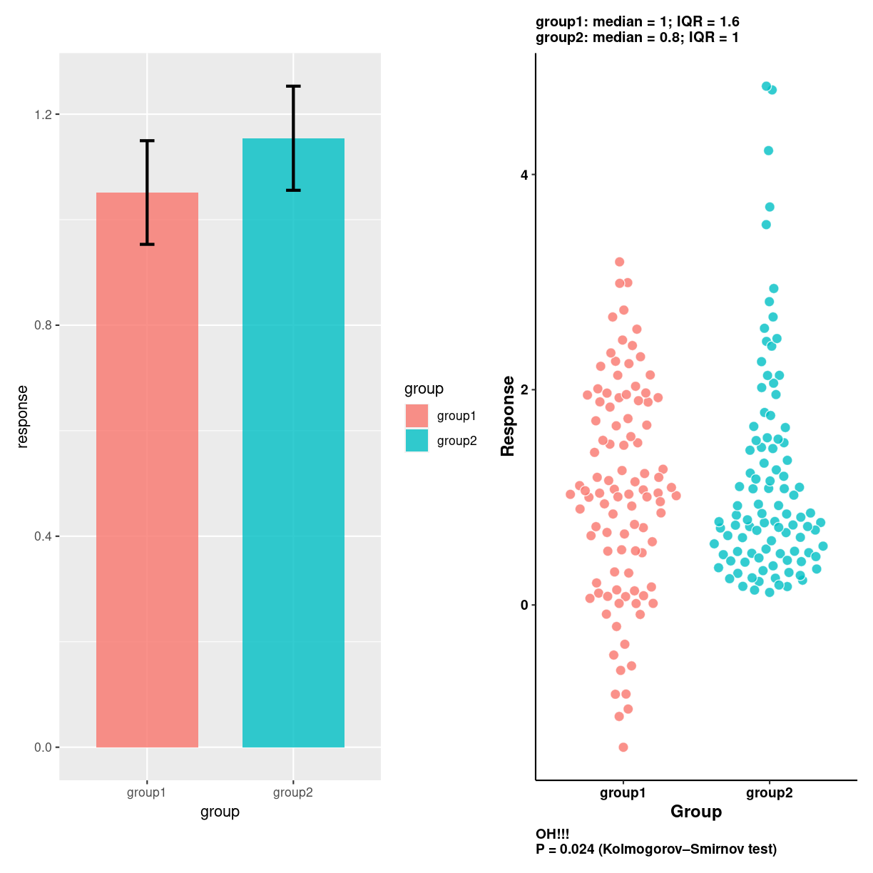
plot of chunk unnamed-chunk-3
spider/radar plots
What are they?
A two-dimensional chart designed to plot one or more series of values over multiple quantitative variables.
What do we use them for?
how do we make them?
ggradar
library(fmsb)
Interesting variations
Think about
We are plotting quantitative values, and those are difficult to read in a circular layout.
Folk kigger på formen. Og den er stærkt afhængig af rækkefølgen af kategorier
library(fmsb)

# Create data: note in High school for Jonathan:
data <- as.data.frame(matrix( sample( 2:20 , 10 , replace=T) , ncol=10))
colnames(data) <- c("math" , "english" , "biology" , "music" , "R-coding", "data-viz" , "french" , "physic", "statistic", "sport" )

# To use the fmsb package, I have to add 2 lines to the dataframe: the max and min of each topic to show on the plot!
data <- rbind(rep(20,10) , rep(0,10) , data)

# Check your data, it has to look like this!
head(data)
  math english biology music R-coding data-viz french physic statistic sport
1   20      20      20    20       20       20     20     20        20    20
2    0       0       0     0        0        0      0      0         0     0
3   15       8      11     5       18        9     18      9         9    17
data %>%
  mutate(tal = c("max", "min", "data"), .before = 1) %>%
  pivot_longer(2:11)
# A tibble: 30 × 3
   tal   name      value
   <chr> <chr>     <dbl>
 1 max   math         20
 2 max   english      20
 3 max   biology      20
 4 max   music        20
 5 max   R-coding     20
 6 max   data-viz     20
 7 max   french       20
 8 max   physic       20
 9 max   statistic    20
10 max   sport        20
# ℹ 20 more rows
# The default radar chart
radarchart(data)
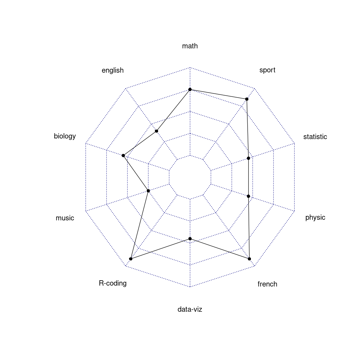
plot of chunk unnamed-chunk-5
Det her er også noget skrammel…
https://www.data-to-viz.com/caveat/spider.html
Wordclouds
What are they?
What do we use them for?
how do we make them?
Interesting variations
Think about
Wordclouds are very popular.
But they have a lot of problems.
- They do not (neccesarily) group together words with the same meaning. “Difficult” and “hard” might mean the same thing, but a standard wordcloud will treat them as two different words.
- They do not capture complex themes. “Expensive” is the same as “not cheap” or “costs too much”. This is subtly different from the previous point.
- They lack context. If something is helpful - what is helpful?
- They are prone to bias. Try to show people the same word cloud, and ask them to list the top five information in them.
- They obscure the relative importance of stuff. Is the first issue actually as important as the second? Are the first three equally important?
Parallel
What are they?
What do we use them for?
how do we make them?
Interesting variations
Think about
Lollipop
What are they?
What do we use them for?
how do we make them?
Interesting variations
Think about
Circular barplot
What are they?
What do we use them for?
how do we make them?
Interesting variations
Think about
Key Points
FIXME