Intro
Overview
Teaching: 0 min
Exercises: 0 minQuestions
What is this?
Objectives
Align expections
What is this?
This is a collection of graphs and plots, primarily made with ggplot2.
It contains notes on what a given type of plot is, what it is usually used for, how to make it, interesting variations, and pitfalls one should be aware of using it.
What is it not?
This is not a course. We use this as reference for part of the work we do in KUB Datalab, and as supplemental material in certain courses.
It is also not a statistics page. We show (when we get around to actually doing it), how to make a survival plot. But how the data behind such a plot is not something we get into.
What is here?
Plots are organised by their use. For each type of plot, there are notes on what it is, what it is typically used for, how we make them, some interesting variations on the major theme (if there are any. Or if we can imagine them.). And notes on common pitfalls, mistakes and errors using this particular plot.
Hvad har du af data?
What is missing?
Send us an email on kubdatalab@kb.dk or, better, report an issue on https://github.com/KUBDatalab/R-graphs/issues if you spot a mistake, have a favorite plot we have not included, or are frustrated because we have not finished the description of a particular plot type that you need now!
Key Points
This is not a course
We only focus on how to make plots
Contact us if you spot something wrong
Also contact us if you have specific wishes
Introduction
Overview
Teaching: 0 min
Exercises: 0 minQuestions
Key question (FIXME)
Objectives
First learning objective. (FIXME)
FIXME
Key Points
First key point. Brief Answer to questions. (FIXME)
Setup
Overview
Teaching: 0 min
Exercises: 0 minQuestions
What should I have installed if I want to follow along?
Objectives
FIXME
Setup
We are working with ggplot here. Base is nice. Plotly is also nice. But for now we are almost exclusively sticking with ggplot2.
Besides ggplot2, we are working with other libraries to extend the functionality of ggplot or access interesting data.
Therefore: Install the following libraries:
install.packages("tidyverse")
install.packages("cowplot")
install.packages("palmerpenguins")
install.packages("ggExtra")
And load them:
library(tidyverse)
── Attaching core tidyverse packages ──────────────────────── tidyverse 2.0.0 ──
✔ dplyr     1.1.3     ✔ readr     2.1.4
✔ forcats   1.0.0     ✔ stringr   1.5.0
✔ ggplot2   3.4.3     ✔ tibble    3.2.1
✔ lubridate 1.9.2     ✔ tidyr     1.3.0
✔ purrr     1.0.2
── Conflicts ────────────────────────────────────────── tidyverse_conflicts() ──
✖ dplyr::filter() masks stats::filter()
✖ dplyr::lag()    masks stats::lag()
ℹ Use the conflicted package (<http://conflicted.r-lib.org/>) to force all conflicts to become errors
library(cowplot)
Attaching package: 'cowplot'

The following object is masked from 'package:lubridate':

    stamp
library(palmerpenguins)
There, done!
Key Points
Again this is not a course
Distributions
Overview
Teaching: 0 min
Exercises: 0 minQuestions
What are histograms?
What are violin plots?
What are density plots?
What are boxplots?
Objectives
FIXME
We have some data on the mass of penguins. We expect some penguins to weigh more than others. Perhaps it is a smaller kind of penguin. Perhaps it is a female penguin, and they are smaller than male penguins. And maybe some penguins are fatter than other penguins.
Ranking penguins from light to heavy, how many are there at each weight, or, what is the distribution of their weight?
The plots in this section are useful for visualizing distributions of data.
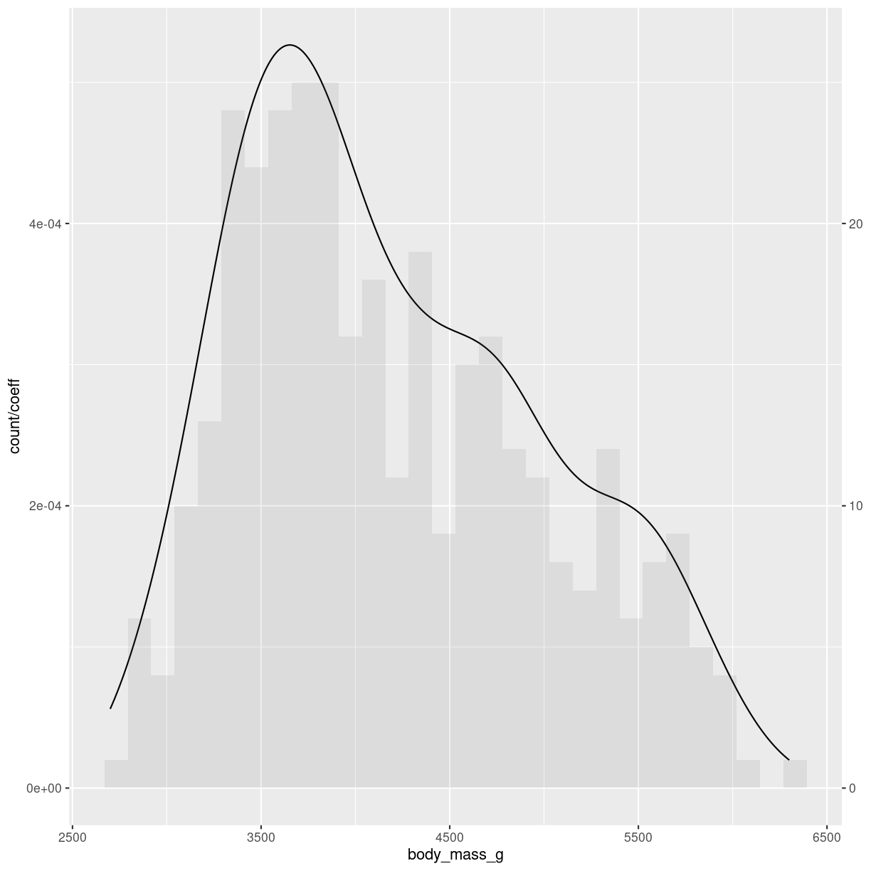
Histograms
What are they?
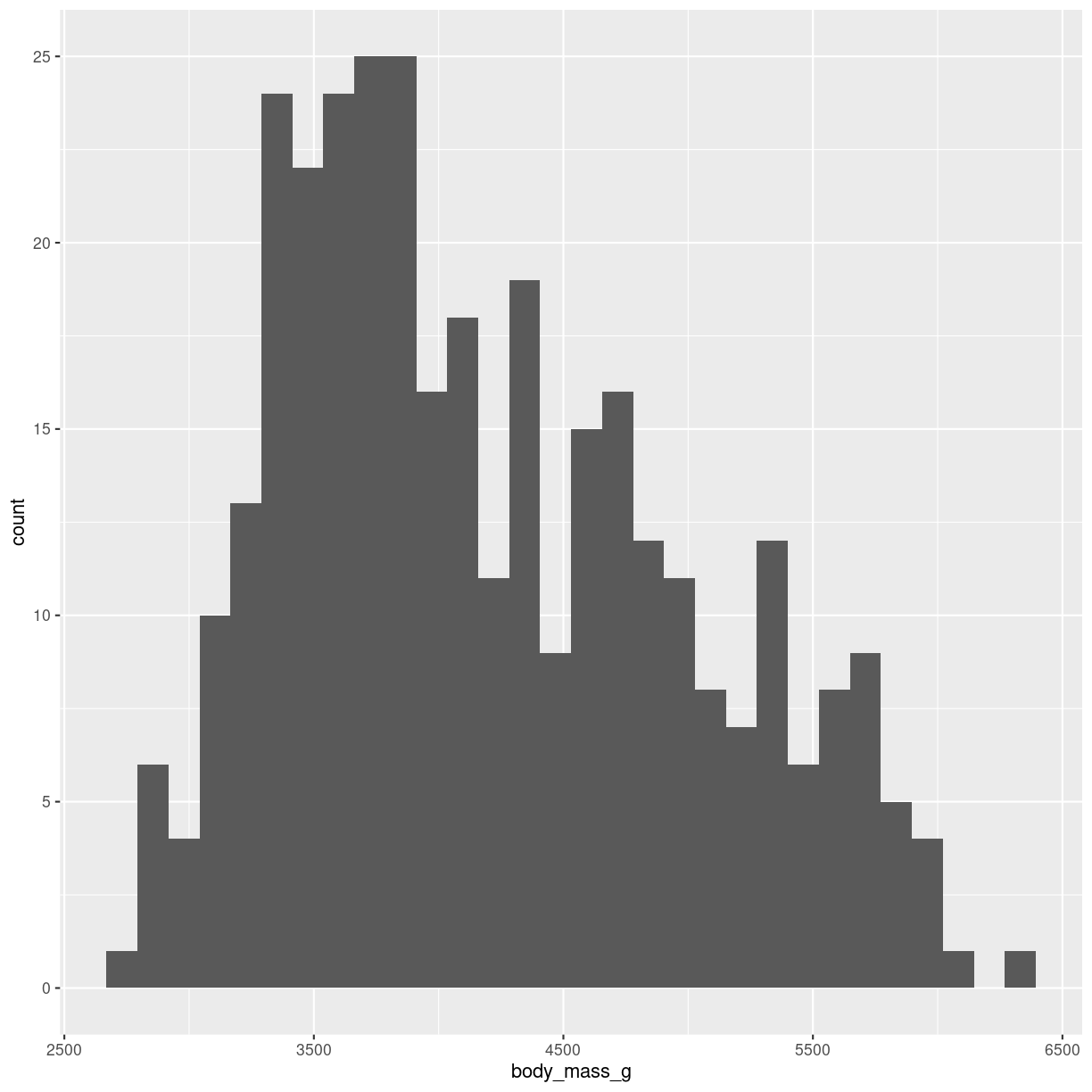
Histograms takes all the weights of the penguins, divides them into intervals, or bins, of weight, eg one bin with 3300 to 3400 grams, and the next bin from 3400 to 3500 grams. Then we count how many penguins are in a specific bin. And plot it. It might look like this:

plot of chunk histogram-show
What do we use them for?
We typically use histograms to visualise the distribution of a variable. Is it normal, bimodal, uniform or skewed? It can quickly reveal mistakes in data or weird outliers.
We can also use histograms to compare different variables. But beware of comparing too many, it can make the graphs difficult to read, and the aim of visualising is to make things easier to understand.
How do we make them?
The geom_ we are using here is geom_histogram(). It takes only one variable in the mapping.
ggplot(penguins, aes(x=body_mass_g)) +
  geom_histogram()
`stat_bin()` using `bins = 30`. Pick better value with `binwidth`.
plot of chunk histogram-making
Built into the geom_histogram is the statistical transformation, that counts the number of observations in each bin.
Note the message that this statistical transformation as default uses bins = 30. This is the default number of bins. And it is almost guaranteed that it is not the best number of bins.
Bins can be determined in two ways, either by providing a number of bins:
geom_histogram(bins = 30)
or by specifying the width of the bins:
geom_histogram(binwidth = 500)
Interesting variations
More than one distribution on same axis
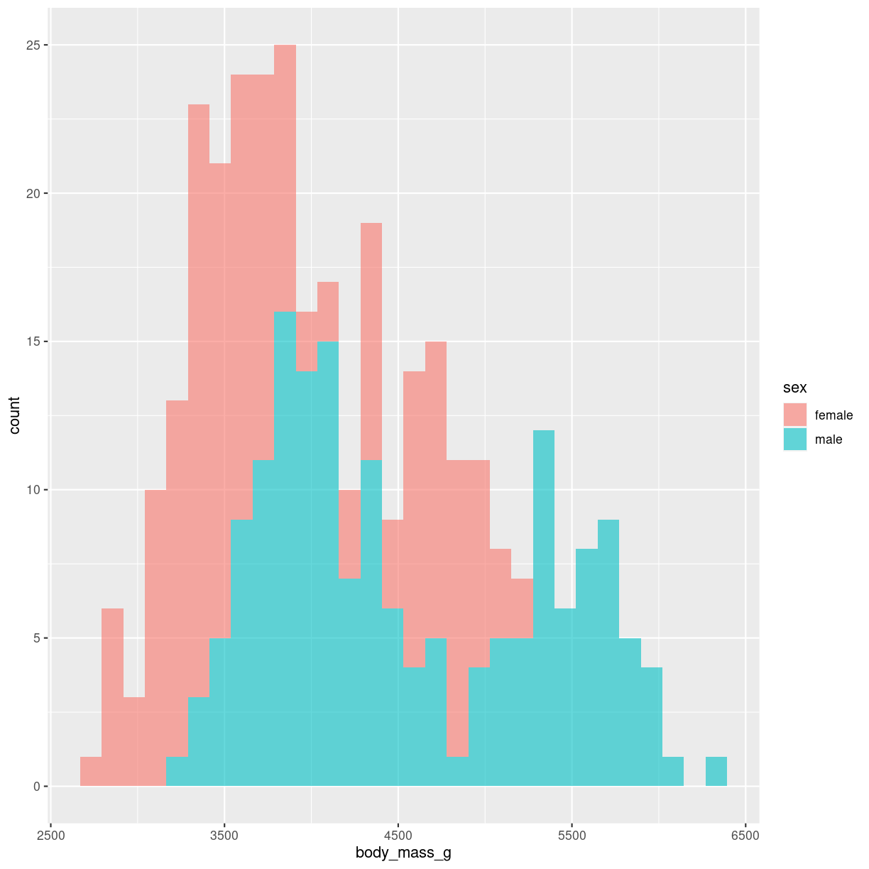
We can plot more than one distribution in the same plot.
The addition of alpha = 0.6 makes the bars transparent.
penguins %>%
  filter(!is.na(sex)) %>%
  ggplot( aes(x=body_mass_g, fill=sex)) +
  geom_histogram(alpha = 0.6)
plot of chunk unnamed-chunk-2
We do not map sex to color, but rather to fill. Color is the color of the outline of the individual bars, fill the inside of the bars.
Upside-down
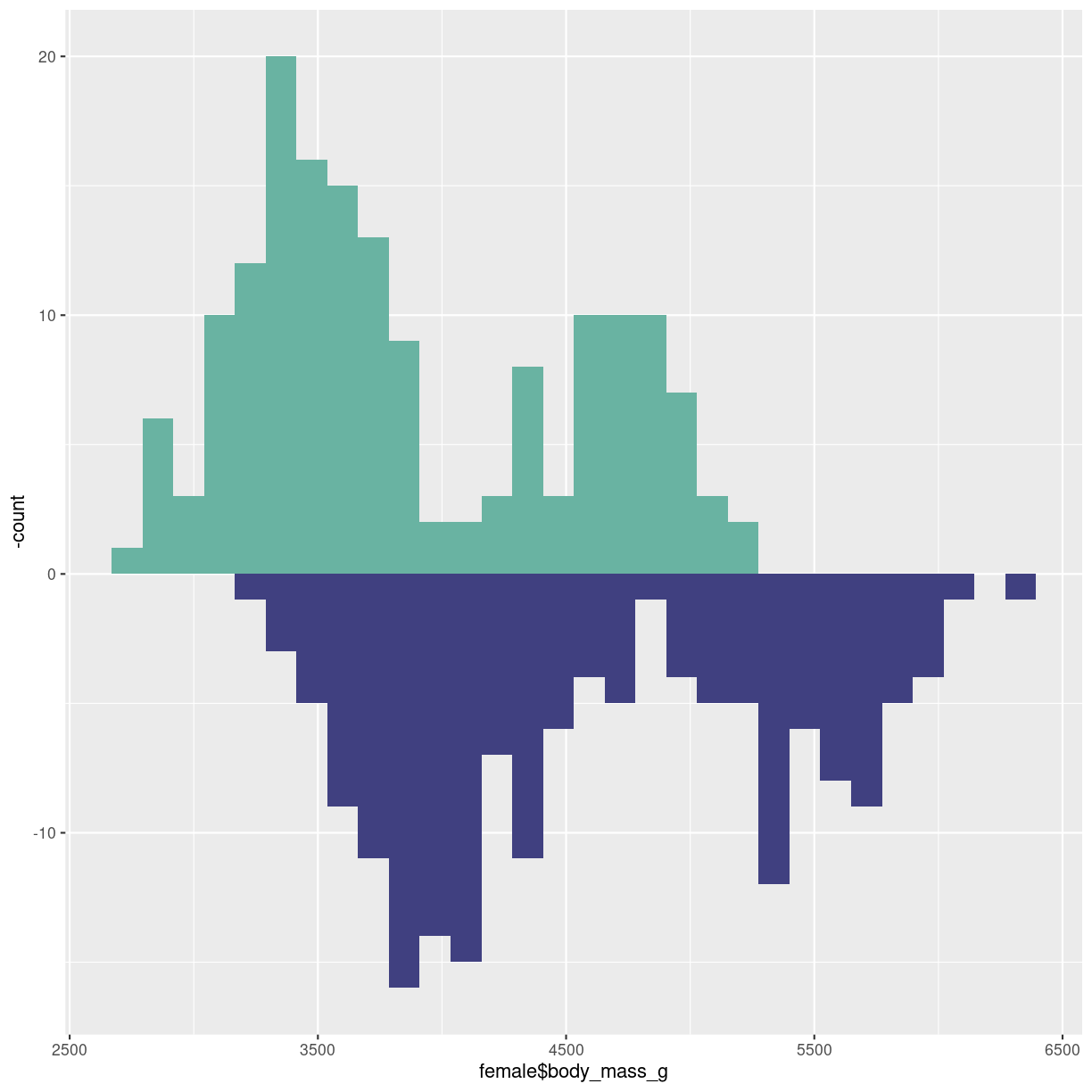
Or mirrored histogram. One distribution above the x-axis, one below.
The code gets a bit more readable if we construct two different dataframes, one for each sex. The statistical transformation that counts the observations in each bin was build into geom_histogram. We now need to plot the negative count for one of the dataframes. Therefore we have to specify the statistical transformation, in order to place a minus sign in front of it in the second line.
Two individual dataframes are plotted, and we have to specify color, since there
is no grouping variabel that can be mapped to the fill argument:
male <- penguins %>%
  filter(sex == "male")
female <- penguins %>%
  filter(sex == "female")
ggplot() +
  geom_histogram(aes(x = female$body_mass_g), fill="#69b3a2" ) +
  geom_histogram(aes(x = male$body_mass_g, y = -..count.. ), fill= "#404080")
Warning: The dot-dot notation (`..count..`) was deprecated in ggplot2 3.4.0.
ℹ Please use `after_stat(count)` instead.
This warning is displayed once every 8 hours.
Call `lifecycle::last_lifecycle_warnings()` to see where this warning was
generated.
plot of chunk histogram-mirror
Grid
Trying to plot more than two, max three distributions in the same histogram is
bad pratice because it becomes difficult to visually separate the different
distributions
A good workaround is to plot small multiples.
We use facetwrap:
penguins %>%
  filter(!is.na(sex)) %>%
  ggplot(aes(body_mass_g)) +
  geom_histogram() +
  facet_wrap(vars(species), nrow = 2)
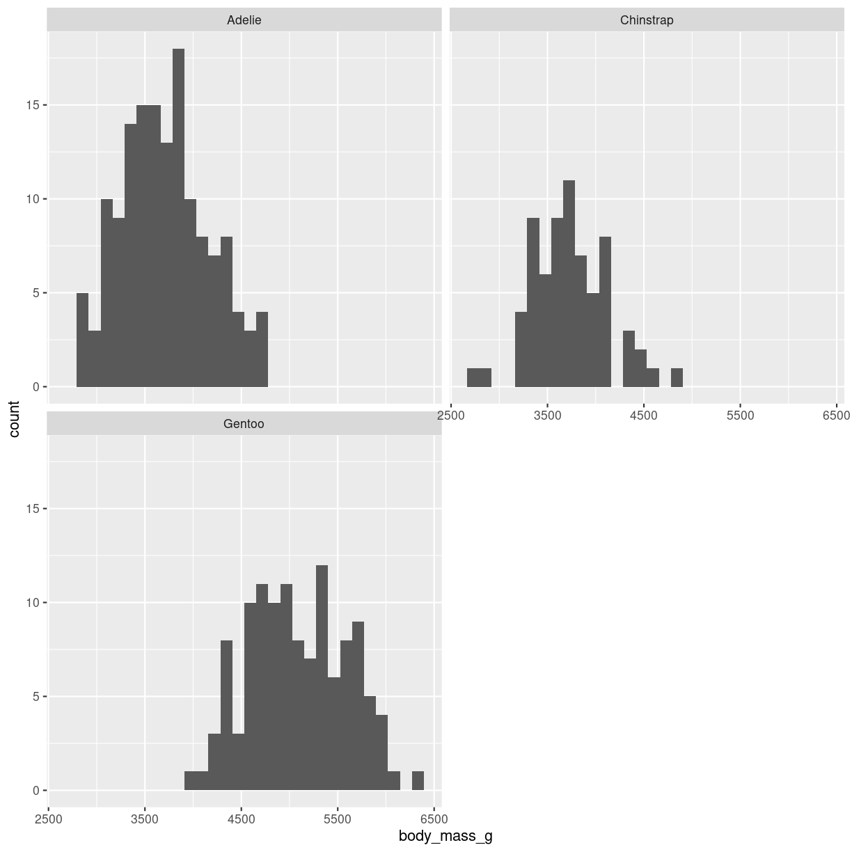
plot of chunk histogram-grid
Rather than specifying the variable used to split the data using vars(species),
it can be specified using the formula notation ~species.
nrows and ncols specify the number of rows and columns respectively the the grid.
We can facet wrap on more that one variable:
penguins %>%
  filter(!is.na(sex)) %>%
  ggplot(aes(body_mass_g)) +
  geom_histogram() +
  facet_wrap(vars(sex, species))
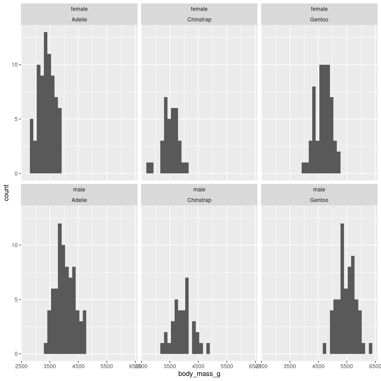
plot of chunk histogram-grid-2
It is also possible to place the six plots in a grid. In that case we use the
facet_grid() function:
penguins %>%
  filter(!is.na(sex)) %>%
  ggplot(aes(body_mass_g)) +
  geom_histogram() +
  facet_grid(rows = vars(sex), cols= vars(species))
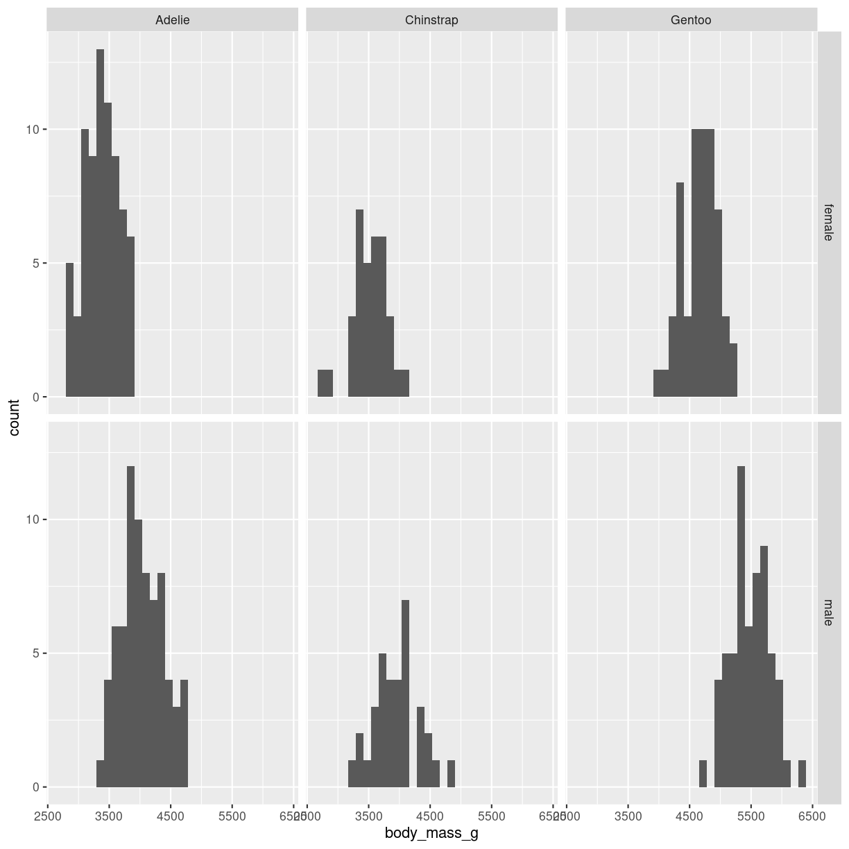
plot of chunk histogram-grid-3
This provides a more consistent presentation of the two facets.
Facetting on more than two variable can get confusing, but can be done.
Think about
The number of bins (or their width, these two are equivalent) can lead to very different conclusions. Try several sizes.
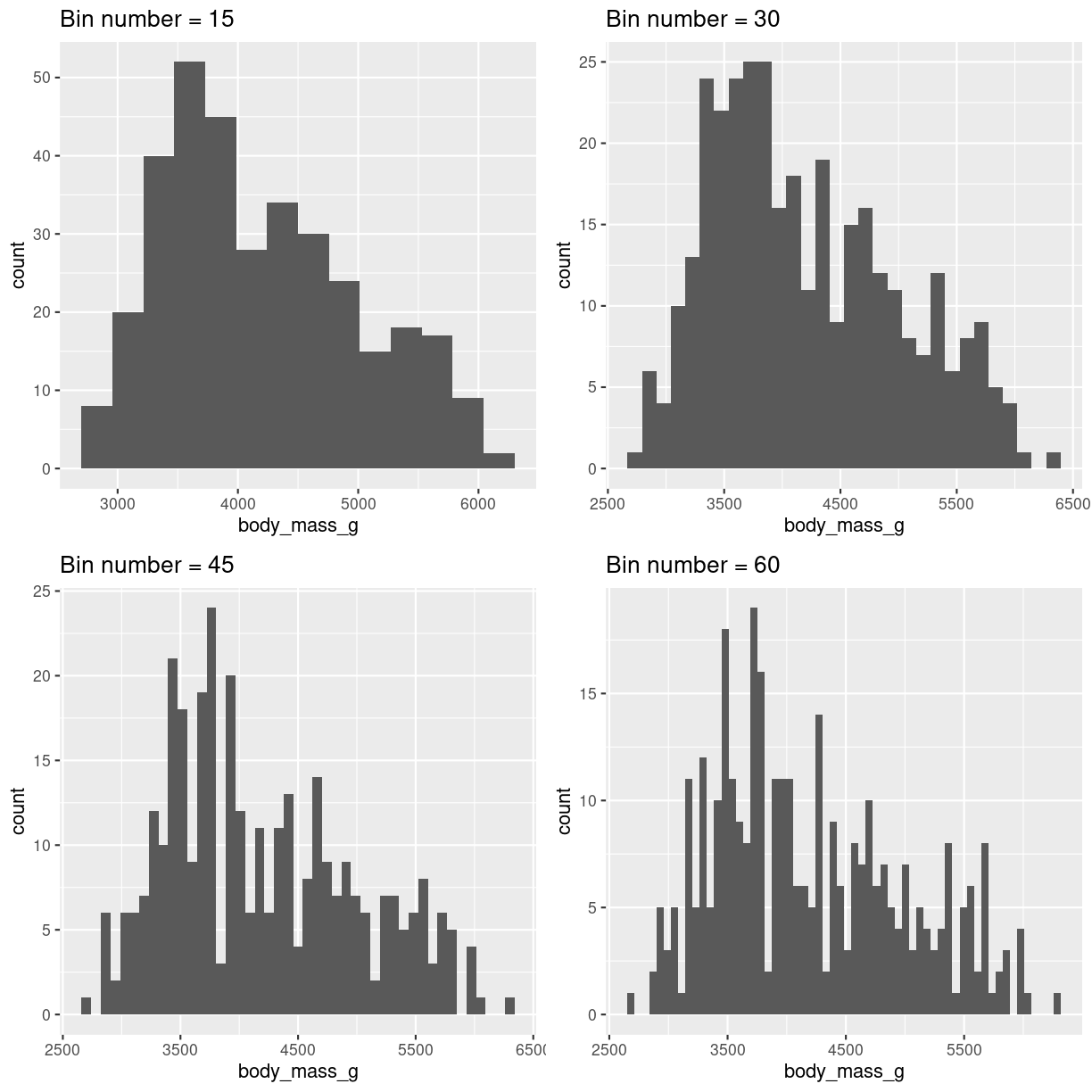
plot of chunk histogram-bin-choices
- Weird and complicated color schemes does not add insight. Avoid them.
- This is not a barplot! Histograms plot the distribution of a single variable.
- Avoid comparing more than two, maybe three groups in the same histogram.
- Do not use unequal bin widths.
Boxplots
What are they?
A summary of one numeric variable. It has several elements.
- The line dividing the box represents the median of the data.
- The ends of the box represents the upper and lower quartiles, (Q3 and Q1 respectively). 50% of the observations are in this box. This is also called the interquartile range (IQR).
- The line at the top of the box, shows Q3 + 1.5 * IQR. This is interpreted as the values above Q3 that are not outliers.
- The line at the bottom of the box, shows Q1 + 1.5 * IQR. This is interpreted as the values below Q1 that are not outliers.
- Dots at each end of the lines shows potential outliers.

plot of chunk boxplot-what
What do we use them for?
A boxplot summarises several important numbers related to the distribution of data. A rule of thumb (but not necessarily a good one), is that if two sets of data do not have overlapping boxes, they come for different distributions, and are therefore different. Typically we show more than one boxplot, but a collection of boxplots.
how do we make them?
penguins %>%
  ggplot(aes(x = body_mass_g)) +
  geom_boxplot()
plot of chunk boxplot-how
Typically we want to compare the weight of different groups of penguins. That is, compare the distribution of something, between different groups:
penguins %>%
  ggplot(aes(y = species, x = body_mass_g)) +
  geom_boxplot()
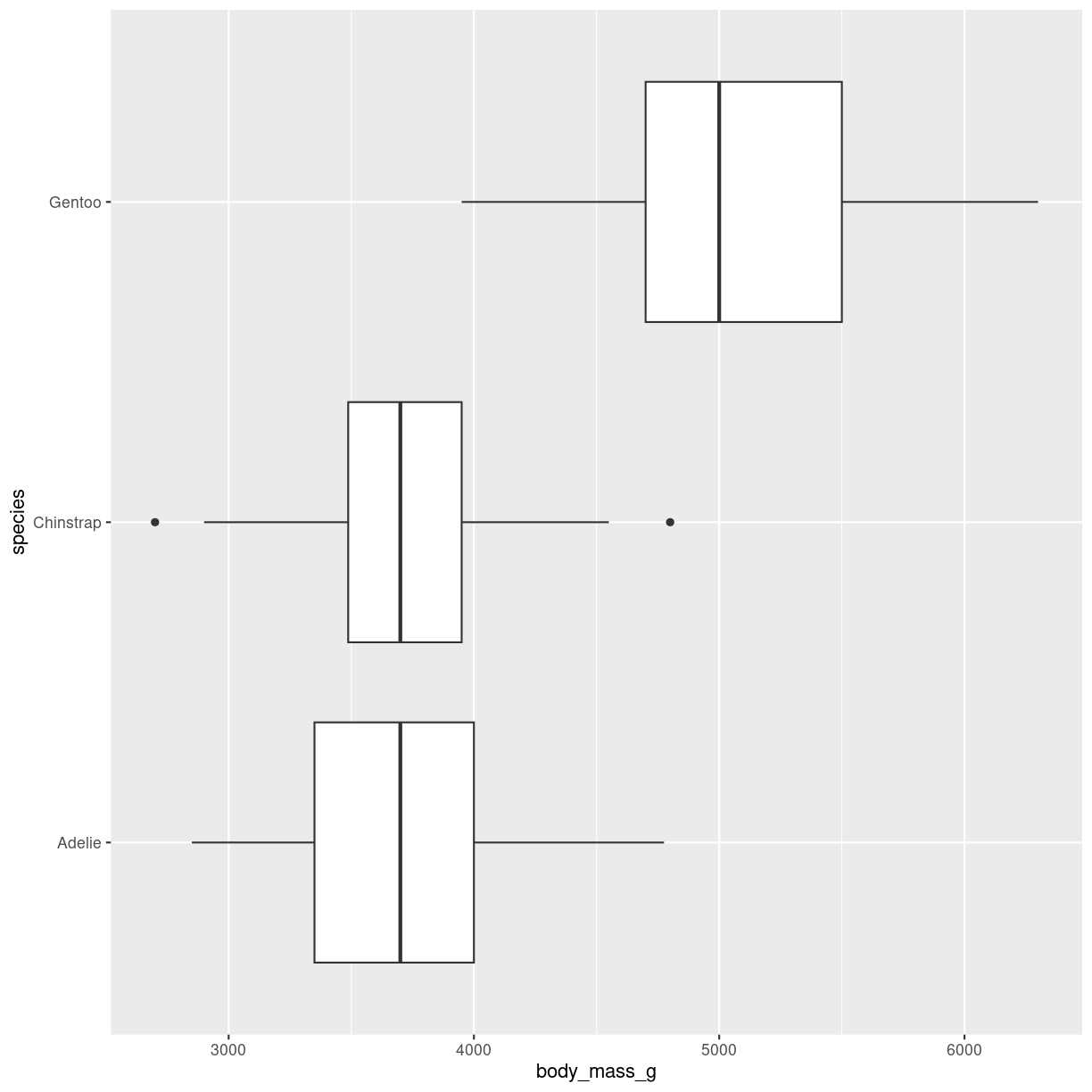
plot of chunk boxplot-groups
Interesting variations
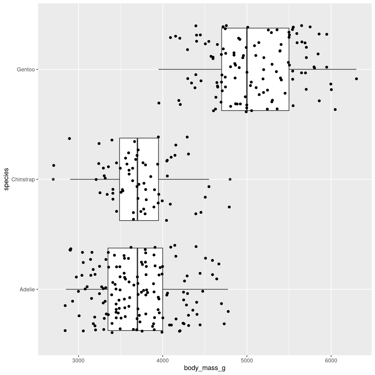
Boxplot with datapoints
geom_jitter adds small amounts of noise to the points. Points can also be added using geom_point()
penguins %>%
  ggplot(aes(y = species, x = body_mass_g)) +
  geom_boxplot() +
  geom_jitter()
plot of chunk boxplot_jitter
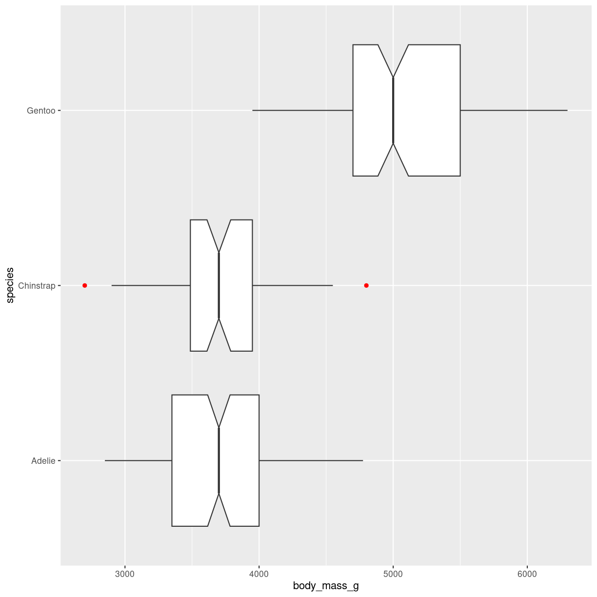
Notches and coloring outliers
penguins %>%
  ggplot(aes(y = species, x = body_mass_g)) +
  geom_boxplot(
    notch = T,
    notchwidth = 0.5,
    outlier.color = "red"
  )
plot of chunk notched-box
Outlier shape, fill, size, alpha and stroke can be controlled in similar ways.
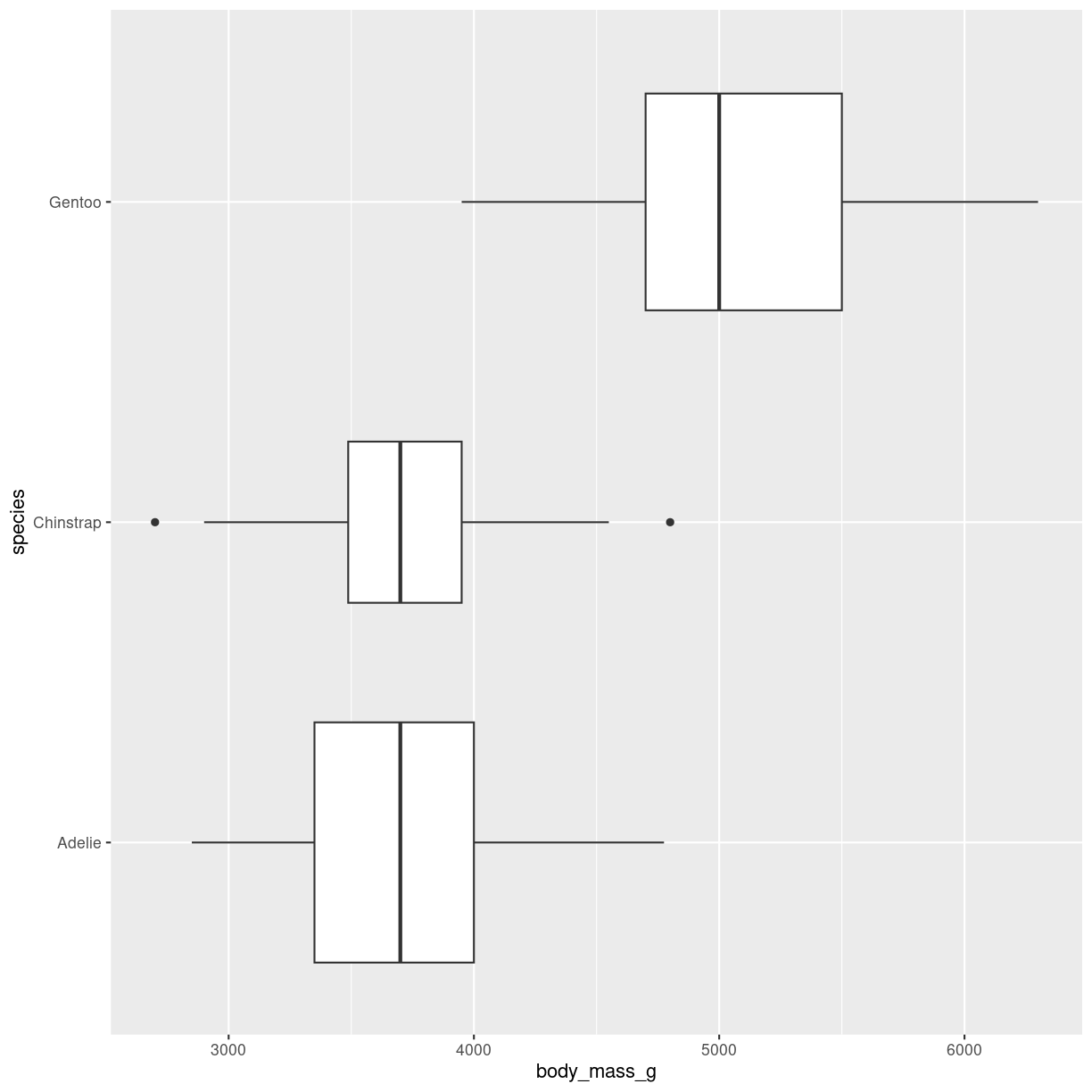
Variable width of boxes
varwidth = T will adjust the width of the boxes proportional to the squareroot of the number of observations in the groups.
penguins %>%
  ggplot(aes(y = species, x = body_mass_g)) +
  geom_boxplot(
   varwidth = T
  )
plot of chunk boxplot-var-width
Think about
Boxplots might hide features of the data. The two plots below show first two boxplots that are made from different distributions. The overlap might lead us to think they are similar. The plot on the right adds the individual datapoints revealing that the data is not that similar.
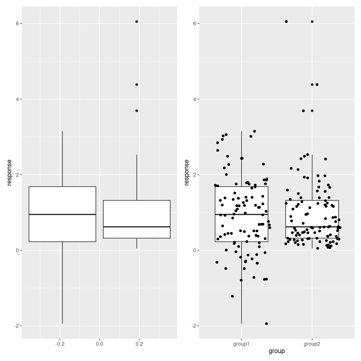
plot of chunk boxes_hiding_stuff
Density plots
What are they?
A plot of the kernel density estimation of the distribution.
Think of it as a smoothed histogram.
`stat_bin()` using `bins = 30`. Pick better value with `binwidth`.
plot of chunk density-what
What do we use them for?
Density plots show the distribution of a numeric variabel. It gets a bit closer to an actual continuous distribution than a histogram.
How do we make them?
As with histograms we only use one variable:
penguins %>%
  ggplot(aes(body_mass_g)) +
  geom_density()
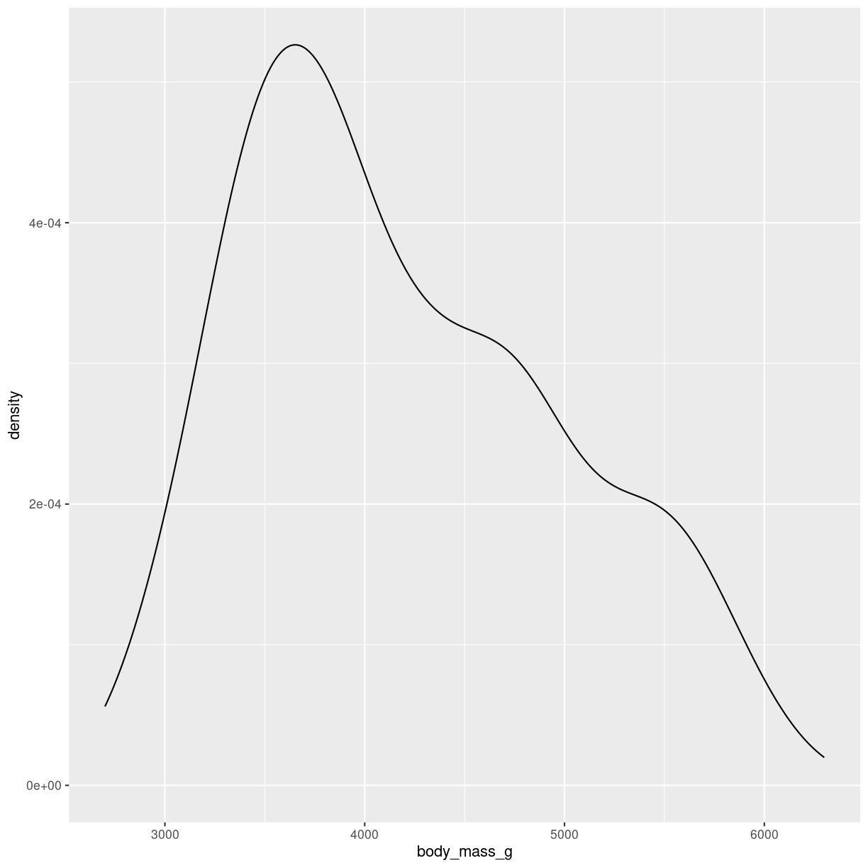
plot of chunk density-how
Interesting variations
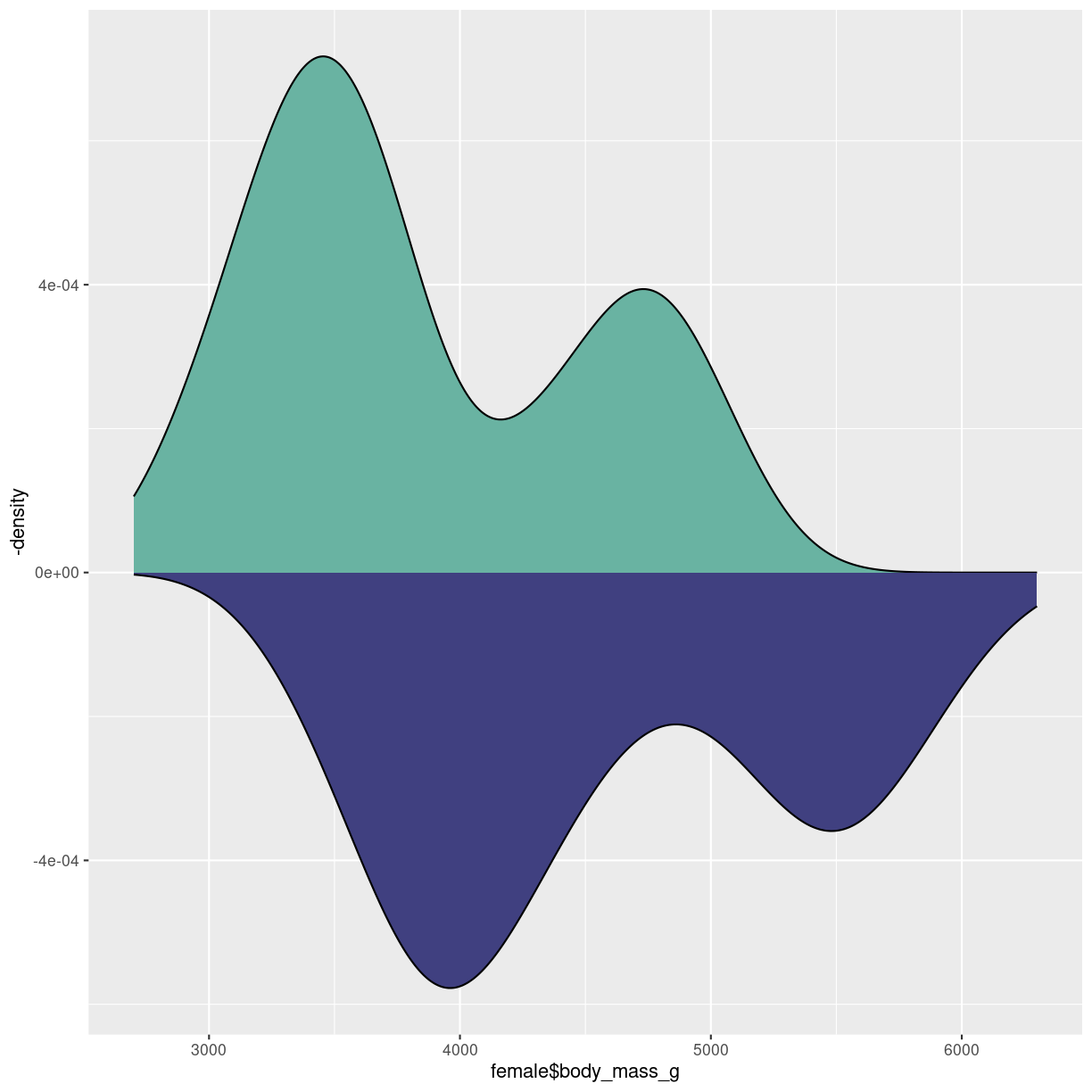
More than one distribution on same axis
Upside-down
Made in almost the same way as the mirrored histogram:
male <- penguins %>%
  filter(sex == "male")
female <- penguins %>%
  filter(sex == "female")
ggplot() +
  geom_density(aes(x = female$body_mass_g), fill="#69b3a2" ) +
  geom_density(aes(x = male$body_mass_g, y = -..density.. ), fill= "#404080")
plot of chunk density-mirror
Grid
Fuldstændigt parallelt til grids i histogrammer
Think about
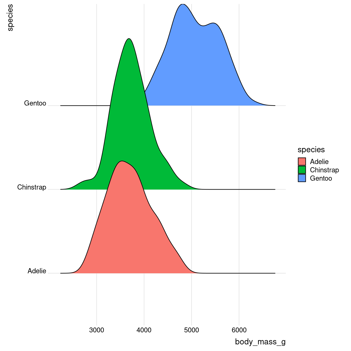
Ridgeline
library(ggridges)
What are they?
Det kan se ret cool ud. Det er grundlæggende “bare” et sæt af flere densityplots.
Også kendt som joyplots
Ren
Loading required package: viridisLite
Picking joint bandwidth of 153
Warning: Removed 2 rows containing non-finite values (`stat_density_ridges()`).
plot of chunk ridges-what
What do we use them for?
how do we make them?
library(ggridges)

penguins %>%
  ggplot(aes(x = body_mass_g, y = species, fill = species)) +
  geom_density_ridges()  +
    theme_ridges()
Picking joint bandwidth of 153
Warning: Removed 2 rows containing non-finite values (`stat_density_ridges()`).

plot of chunk ridges-how
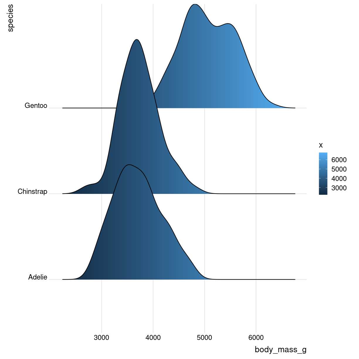
Interesting variations
Og med farvelægning efter vægt
library(ggridges)
library(viridis)
penguins %>%
  mutate(body_mass_g = as.numeric(body_mass_g)) %>%
  ggplot(aes(x = body_mass_g, y = species, fill = ..x..)) +
  geom_density_ridges_gradient()  +
    theme_ridges()
Picking joint bandwidth of 153
plot of chunk unnamed-chunk-4
Think about
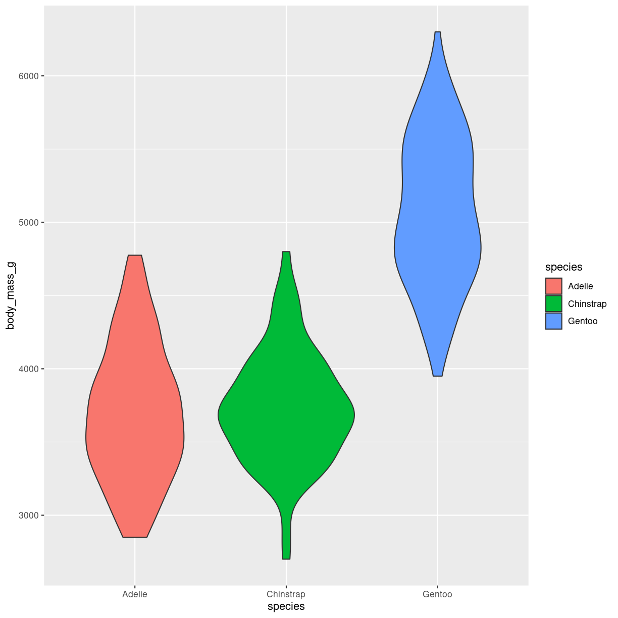
Violin
What are they?
en slags boxplot. formen repræsenterer density. På mange måder bedre end boxplots. Men stiller lidt større krav til folk der har vænnet sig til at læse boxplots.
penguins %>%
  ggplot(aes(body_mass_g, y = species, fill = species)) +
  geom_violin() +
  coord_flip()
plot of chunk violin-what
What do we use them for?
Tillader os både at se en ranking af forskellige grupper - og deres fordelinger.
how do we make them?
geom_violin()
Interesting variations
Think about
Pas på med at bruge dem hvis datasæt er for små. Da vil et boxplot med jitter ofte være bedre.
sorter/order grupperne efter median-værdien.
Hvis der er meget forskellige samplesizes, så vis det (se også små datasæt)
Pas også på med automatisk generering af violinplots. De risikerer at blive anatomisk korrekte.
Key Points
FIXME
Correlations
Overview
Teaching: 42 min
Exercises: 47 minQuestions
FIXME
Objectives
FIXME
Correlations
If one variable goes up, what happens to the other variable? How are they correlated?
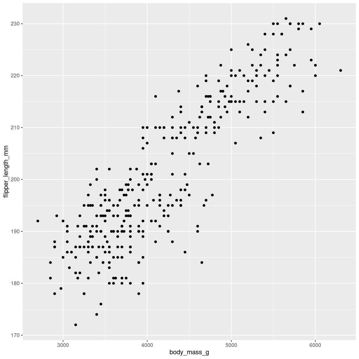
Scatterplots
What are they?
Shows the relation between two numeric variables. Each dot represents one observation. The position of the dot on the X-axis (horisontal, AKA abscissa), represents the value of the first variable for that observation. The position of the dot on the Y-axis (vertical, AKA ordinate), represents the value of the second variable for that observation.
Warning: Removed 2 rows containing missing values (`geom_point()`).

plot of chunk scatter-what
What do we use them for?
Typically used to show the relation between two variables.
how do we make them?
The geom_point() function makes the scatterplot. We need to provide the mapping of two variables:
ggplot(penguins, aes(x=body_mass_g, y=flipper_length_mm)) +
  geom_point()
Warning: Removed 2 rows containing missing values (`geom_point()`).
plot of chunk scatter-how
Interesting variations
all combinations
også kendt som corellogram, der dukker op senere.
Since scatterplots provides a quick way of visualizing the correlation between two variables, it can be useful to visualize all combinations of two variables in our data.
Base-R does it like this:
plot(penguins)
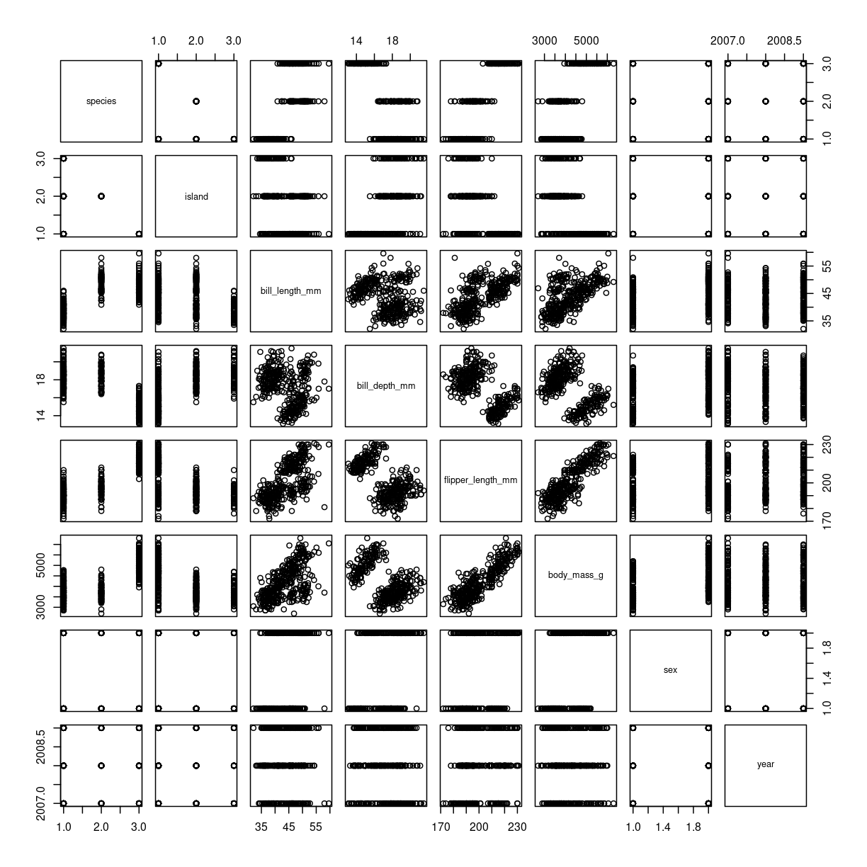
plot of chunk scatter-matrix
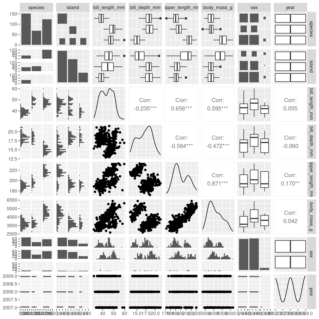
The package GGally provides a function ggpairs that does this in the
ggplot2 universe, making it easy to adjust the plot subsequently.
ggpairs(penguins)
Warning: Removed 2 rows containing non-finite values (`stat_boxplot()`).
Removed 2 rows containing non-finite values (`stat_boxplot()`).
Removed 2 rows containing non-finite values (`stat_boxplot()`).
Removed 2 rows containing non-finite values (`stat_boxplot()`).
Removed 2 rows containing non-finite values (`stat_boxplot()`).
Removed 2 rows containing non-finite values (`stat_boxplot()`).
Removed 2 rows containing non-finite values (`stat_boxplot()`).
Removed 2 rows containing non-finite values (`stat_boxplot()`).
`stat_bin()` using `bins = 30`. Pick better value with `binwidth`.
Warning: Removed 2 rows containing non-finite values (`stat_bin()`).
`stat_bin()` using `bins = 30`. Pick better value with `binwidth`.
Warning: Removed 2 rows containing non-finite values (`stat_bin()`).
Warning: Removed 2 rows containing non-finite values (`stat_density()`).
Warning in ggally_statistic(data = data, mapping = mapping, na.rm = na.rm, :
Removed 2 rows containing missing values
Warning in ggally_statistic(data = data, mapping = mapping, na.rm = na.rm, :
Removed 2 rows containing missing values
Warning in ggally_statistic(data = data, mapping = mapping, na.rm = na.rm, :
Removed 2 rows containing missing values
Warning: Removed 2 rows containing non-finite values (`stat_boxplot()`).
Warning in ggally_statistic(data = data, mapping = mapping, na.rm = na.rm, :
Removed 2 rows containing missing values
`stat_bin()` using `bins = 30`. Pick better value with `binwidth`.
Warning: Removed 2 rows containing non-finite values (`stat_bin()`).
`stat_bin()` using `bins = 30`. Pick better value with `binwidth`.
Warning: Removed 2 rows containing non-finite values (`stat_bin()`).
Warning: Removed 2 rows containing missing values (`geom_point()`).
Warning: Removed 2 rows containing non-finite values (`stat_density()`).
Warning in ggally_statistic(data = data, mapping = mapping, na.rm = na.rm, :
Removed 2 rows containing missing values
Warning in ggally_statistic(data = data, mapping = mapping, na.rm = na.rm, :
Removed 2 rows containing missing values
Warning: Removed 2 rows containing non-finite values (`stat_boxplot()`).
Warning in ggally_statistic(data = data, mapping = mapping, na.rm = na.rm, :
Removed 2 rows containing missing values
`stat_bin()` using `bins = 30`. Pick better value with `binwidth`.
Warning: Removed 2 rows containing non-finite values (`stat_bin()`).
`stat_bin()` using `bins = 30`. Pick better value with `binwidth`.
Warning: Removed 2 rows containing non-finite values (`stat_bin()`).
Warning: Removed 2 rows containing missing values (`geom_point()`).
Removed 2 rows containing missing values (`geom_point()`).
Warning: Removed 2 rows containing non-finite values (`stat_density()`).
Warning in ggally_statistic(data = data, mapping = mapping, na.rm = na.rm, :
Removed 2 rows containing missing values
Warning: Removed 2 rows containing non-finite values (`stat_boxplot()`).
Warning in ggally_statistic(data = data, mapping = mapping, na.rm = na.rm, :
Removed 2 rows containing missing values
`stat_bin()` using `bins = 30`. Pick better value with `binwidth`.
Warning: Removed 2 rows containing non-finite values (`stat_bin()`).
`stat_bin()` using `bins = 30`. Pick better value with `binwidth`.
Warning: Removed 2 rows containing non-finite values (`stat_bin()`).
Warning: Removed 2 rows containing missing values (`geom_point()`).
Removed 2 rows containing missing values (`geom_point()`).
Removed 2 rows containing missing values (`geom_point()`).
Warning: Removed 2 rows containing non-finite values (`stat_density()`).
Warning: Removed 2 rows containing non-finite values (`stat_boxplot()`).
Warning in ggally_statistic(data = data, mapping = mapping, na.rm = na.rm, :
Removed 2 rows containing missing values
`stat_bin()` using `bins = 30`. Pick better value with `binwidth`.
Warning: Removed 2 rows containing non-finite values (`stat_bin()`).
`stat_bin()` using `bins = 30`. Pick better value with `binwidth`.
Warning: Removed 2 rows containing non-finite values (`stat_bin()`).
`stat_bin()` using `bins = 30`. Pick better value with `binwidth`.
Warning: Removed 2 rows containing non-finite values (`stat_bin()`).
`stat_bin()` using `bins = 30`. Pick better value with `binwidth`.
Warning: Removed 2 rows containing non-finite values (`stat_bin()`).
Warning: Removed 11 rows containing missing values (`stat_boxplot()`).
`stat_bin()` using `bins = 30`. Pick better value with `binwidth`.
`stat_bin()` using `bins = 30`. Pick better value with `binwidth`.
Warning: Removed 2 rows containing missing values (`geom_point()`).
Warning: Removed 2 rows containing missing values (`geom_point()`).
Removed 2 rows containing missing values (`geom_point()`).
Removed 2 rows containing missing values (`geom_point()`).
`stat_bin()` using `bins = 30`. Pick better value with `binwidth`.
plot of chunk scatter-matrix-ggally
Be careful - the plot can get very busy!
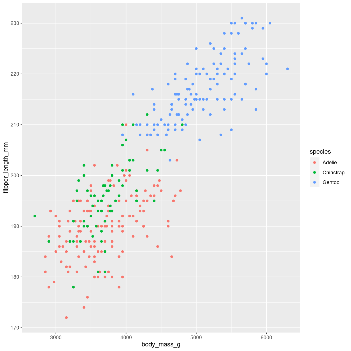
coloring
ggplot(penguins, aes(x=body_mass_g, y=flipper_length_mm, color = species)) +
  geom_point()
Warning: Removed 2 rows containing missing values (`geom_point()`).
plot of chunk scatter-how-color
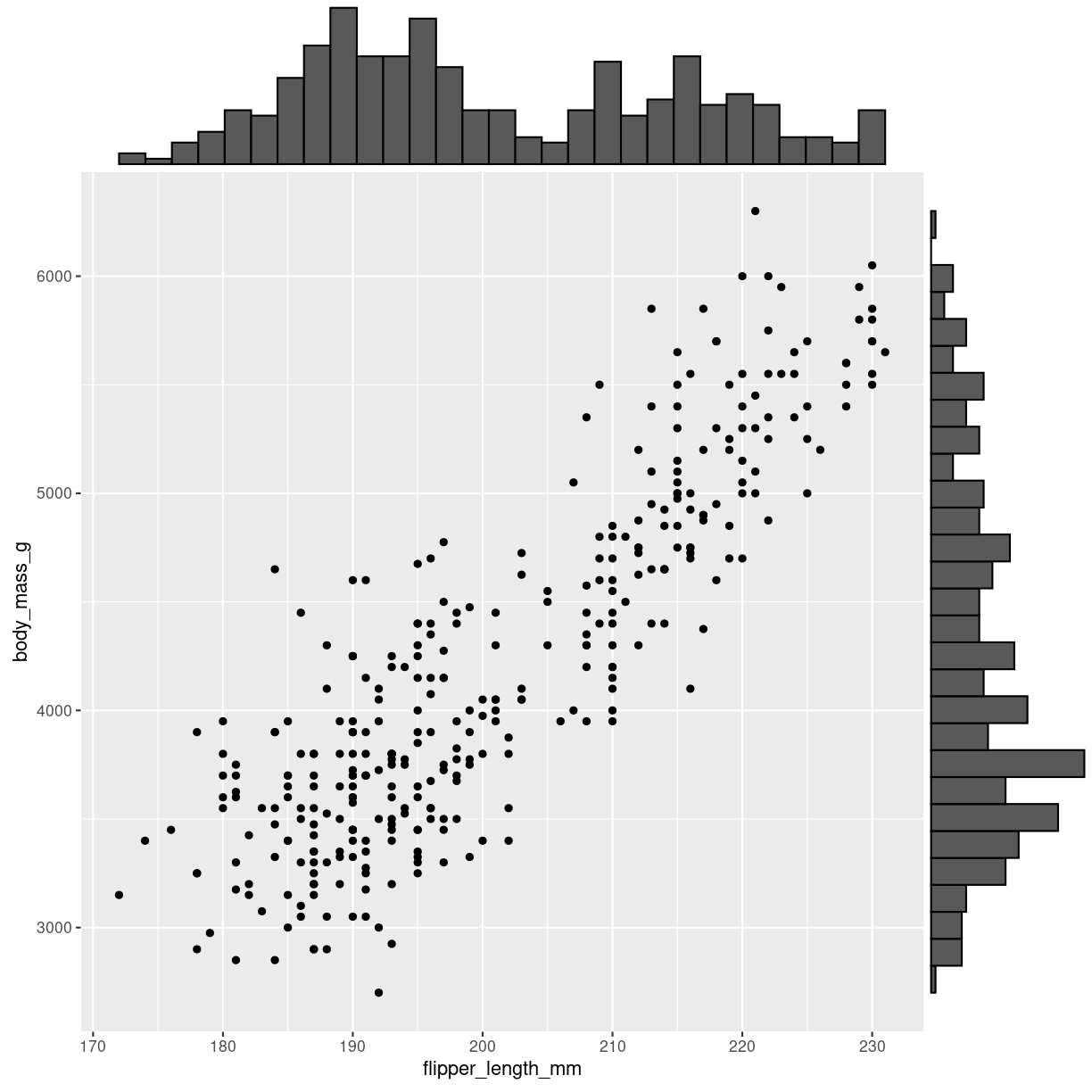
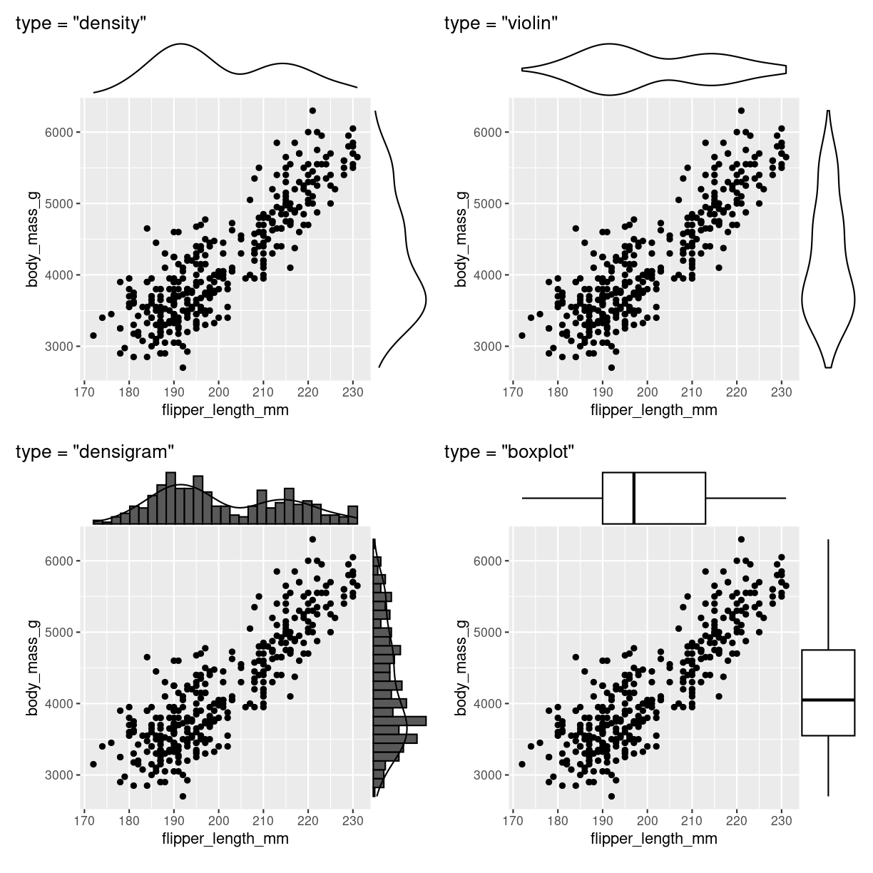
marginal distibution
Scatterplots kan udvides med plots på margenen: Det er ggmarginal fra ggextra der skal på banen hvis det skal være let.
p <- penguins %>%
  ggplot(aes(flipper_length_mm, body_mass_g)) +
  geom_point()
ggMarginal(p, type = "histogram")
Warning: Removed 2 rows containing missing values (`geom_point()`).
plot of chunk scatter_marginal_histogram
Bemærk at det ggmarginal element der kommer ud af det, ikke er helt let at arbejde videre med. Pak det ind i wrap_elements() fra patchwork pakken, så kører det.
Der er yderligere muligheder:
Warning: Removed 2 rows containing missing values (`geom_point()`).
Removed 2 rows containing missing values (`geom_point()`).
Removed 2 rows containing missing values (`geom_point()`).
Warning: The dot-dot notation (`..density..`) was deprecated in ggplot2 3.4.0.
ℹ Please use `after_stat(density)` instead.
ℹ The deprecated feature was likely used in the ggExtra package.
  Please report the issue at <https://github.com/daattali/ggExtra/issues>.
This warning is displayed once every 8 hours.
Call `lifecycle::last_lifecycle_warnings()` to see where this warning was
generated.
Warning: Removed 2 rows containing missing values (`geom_point()`).
plot of chunk scatter_marginal_flere
Think about
Overlapping points
Connected scatter
What are they?
https://r-graph-gallery.com/connected_scatterplot_ggplot2.html
What do we use them for?
how do we make them?
Interesting variations
Think about
heatmap
What are they?
https://r-graph-gallery.com/heatmap.html
What do we use them for?
how do we make them?
Interesting variations
Correlogram
What are they?
What do we use them for?
how do we make them?
Interesting variations
Bubble
https://r-graph-gallery.com/bubble-chart.html
What are they?
Et scatterplot hvor der plottes cirkler. En tredie numerisk variabel er mappet til størrelse af cirklen.
What do we use them for?
how do we make them?
Interesting variations
Density 2D
Et scatterplot, hvor en farvegradient beregnes efter hvor mange punkter der ligger omkring en koordinat.
What are they?
What do we use them for?
how do we make them?
Interesting variations
Key Points
FIXME
Ranking
Overview
Teaching: 42 min
Exercises: 47 minQuestions
FIXME
Objectives
FIXME
tag et kig på: https://clauswilke.com/dataviz/directory-of-visualizations.html
Plot types useful for showing rankings - that is, which type of observation is the most common, and which is the least common.
Barplots
What are they?
What do we use them for?
We use them for showing a relationship between a numeric and a categorical variable.
That can be
geom_bar
function (mapping = NULL, data = NULL, stat = "count", position = "stack",
    ..., just = 0.5, width = NULL, na.rm = FALSE, orientation = NA,
    show.legend = NA, inherit.aes = TRUE)
{
    layer(data = data, mapping = mapping, stat = stat, geom = GeomBar,
        position = position, show.legend = show.legend, inherit.aes = inherit.aes,
        params = list2(just = just, width = width, na.rm = na.rm,
            orientation = orientation, ...))
}
<bytecode: 0x55f20cc807c8>
<environment: namespace:ggplot2>
how do we make them?
Interesting variations
Think about
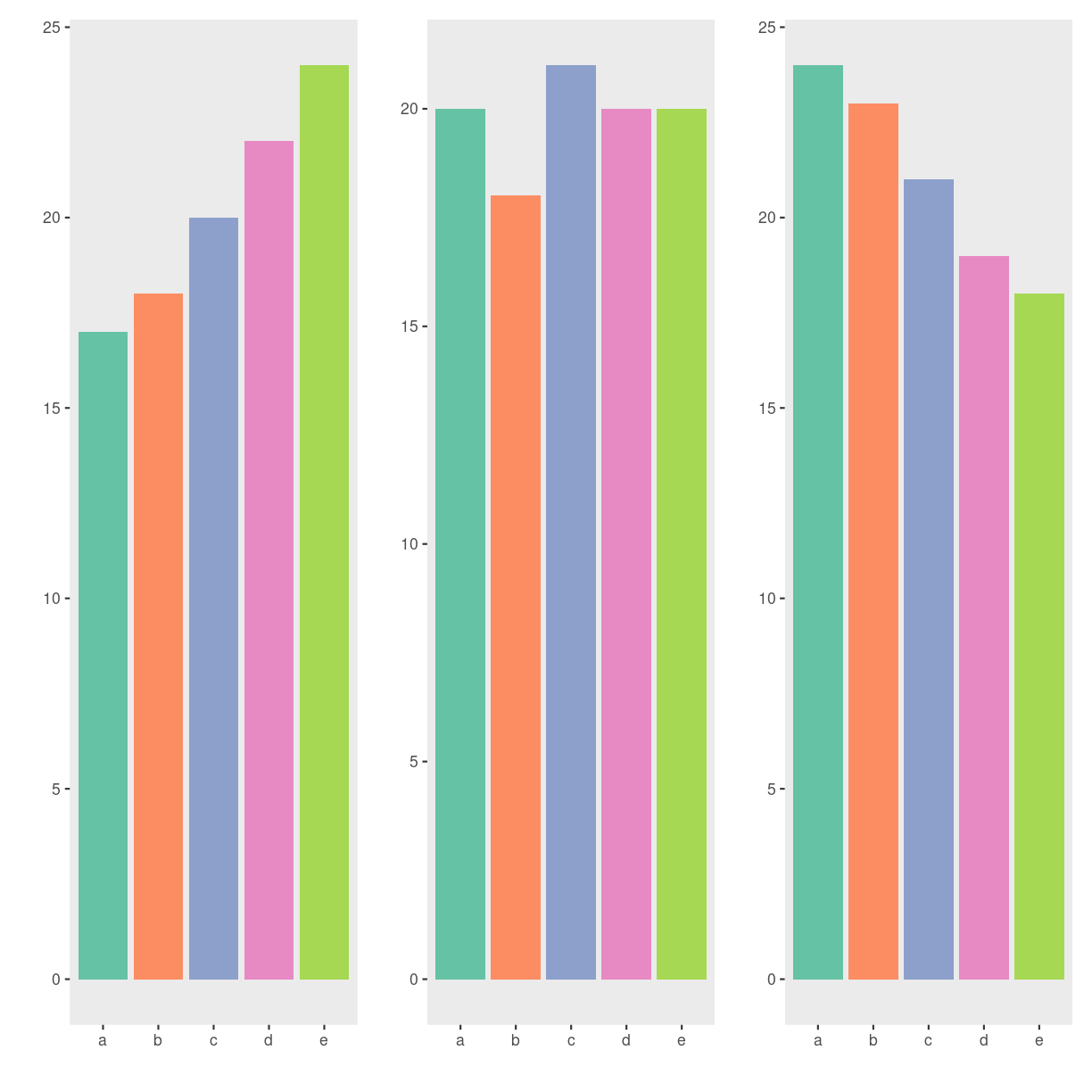
Be careful! It is tempting to use barplots for other stuff, like the mean value of two groups. This can be missleading. Here is an example:
set.seed(47)
group1 <- rnorm(n = 100, mean = 1, sd = 1)
group2 <- rlnorm(n = 100,
                 meanlog = log(1^2/sqrt(1^2 + 1^2)),
                 sdlog = sqrt(log(1+(1^2/1^2))))
groups_long <- cbind(
  group1,
  group2
) %>%
  as.data.frame() %>%
  gather("group", "response", 1:2)

bar <- groups_long %>%
  ggplot(aes(x = group, y = response)) +
  geom_bar(stat = "summary", fun = mean,
           width = 0.7, alpha = 0.8,
           aes(fill = group)) +
  stat_summary(geom = "errorbar", fun.data = "mean_se",
               width = 0.1, size = 1)
Warning: Using `size` aesthetic for lines was deprecated in ggplot2 3.4.0.
ℹ Please use `linewidth` instead.
This warning is displayed once every 8 hours.
Call `lifecycle::last_lifecycle_warnings()` to see where this warning was
generated.
dotplot <- groups_long %>%
  ggplot(aes(x = group, y = response)) +
  ggbeeswarm::geom_quasirandom(
    shape = 21, color = "white",
    alpha = 0.8, size = 3,
    aes(fill = group)
  ) +
  labs(x = "Group",
       y = "Response",
        caption = paste0("OH!!!\nP = ",
                        signif(ks.test(group1, group2)$p.value, 2),
                        " (Kolmogorov–Smirnov test)")) +
  theme_classic() +
  theme(
    text = element_text(size = 12, face = "bold", color = "black"),
    axis.text = element_text(color = "black"),
    legend.position = "none",
    plot.title = element_text(size = 10),
    plot.caption = element_text(hjust = 0)
  ) +
  ggtitle(
    paste0(
      "group1: median = ", signif(median(group1), 2),
      "; IQR = ", signif(IQR(group1), 2), "\n",
      "group2: median = ", signif(median(group2), 2),
      "; IQR = ", signif(IQR(group2), 2)
    )
  )

wrap_plots(
  bar, dotplot, nrow = 1
)
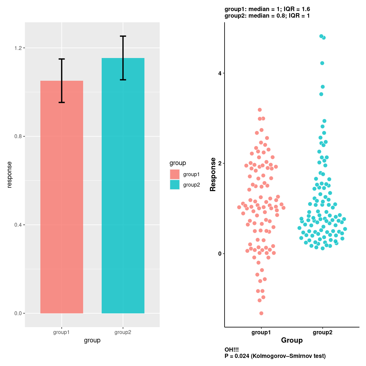
plot of chunk unnamed-chunk-3
spider/radar plots
What are they?
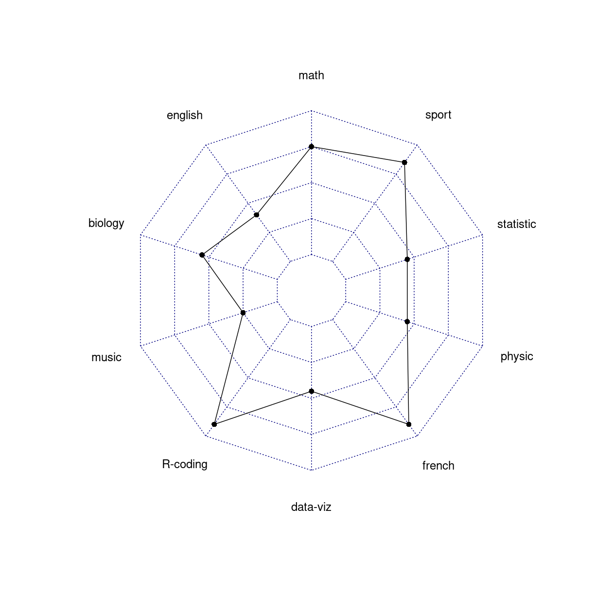
A two-dimensional chart designed to plot one or more series of values over multiple quantitative variables.
What do we use them for?
how do we make them?
ggradar
library(fmsb)
Interesting variations
Think about
We are plotting quantitative values, and those are difficult to read in a circular layout.
Folk kigger på formen. Og den er stærkt afhængig af rækkefølgen af kategorier
library(fmsb)

# Create data: note in High school for Jonathan:
data <- as.data.frame(matrix( sample( 2:20 , 10 , replace=T) , ncol=10))
colnames(data) <- c("math" , "english" , "biology" , "music" , "R-coding", "data-viz" , "french" , "physic", "statistic", "sport" )

# To use the fmsb package, I have to add 2 lines to the dataframe: the max and min of each topic to show on the plot!
data <- rbind(rep(20,10) , rep(0,10) , data)

# Check your data, it has to look like this!
head(data)
  math english biology music R-coding data-viz french physic statistic sport
1   20      20      20    20       20       20     20     20        20    20
2    0       0       0     0        0        0      0      0         0     0
3   15       8      11     5       18        9     18      9         9    17
data %>%
  mutate(tal = c("max", "min", "data"), .before = 1) %>%
  pivot_longer(2:11)
# A tibble: 30 × 3
   tal   name      value
   <chr> <chr>     <dbl>
 1 max   math         20
 2 max   english      20
 3 max   biology      20
 4 max   music        20
 5 max   R-coding     20
 6 max   data-viz     20
 7 max   french       20
 8 max   physic       20
 9 max   statistic    20
10 max   sport        20
# ℹ 20 more rows
# The default radar chart
radarchart(data)
plot of chunk unnamed-chunk-5
Det her er også noget skrammel…
https://www.data-to-viz.com/caveat/spider.html
Wordclouds
What are they?
What do we use them for?
how do we make them?
Interesting variations
Think about
Wordclouds are very popular.
But they have a lot of problems.
- They do not (neccesarily) group together words with the same meaning. “Difficult” and “hard” might mean the same thing, but a standard wordcloud will treat them as two different words.
- They do not capture complex themes. “Expensive” is the same as “not cheap” or “costs too much”. This is subtly different from the previous point.
- They lack context. If something is helpful - what is helpful?
- They are prone to bias. Try to show people the same word cloud, and ask them to list the top five information in them.
- They obscure the relative importance of stuff. Is the first issue actually as important as the second? Are the first three equally important?
Parallel
What are they?
What do we use them for?
how do we make them?
Interesting variations
Think about
Lollipop
What are they?
What do we use them for?
how do we make them?
Interesting variations
Think about
Circular barplot
What are they?
What do we use them for?
how do we make them?
Interesting variations
Think about
Key Points
FIXME
Parts of a whole
Overview
Teaching: 42 min
Exercises: 47 minQuestions
FIXME
Objectives
FIXME
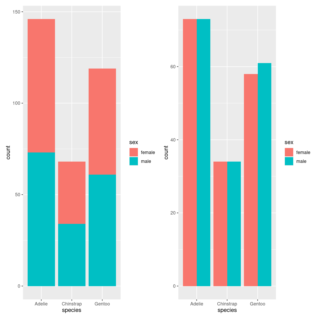
Barplot - grouped and stacked
What are they?
plot of chunk barplot_what
What do we use them for?
how do we make them?
penguins %>%
  filter(!is.na(sex)) %>%
  ggplot(aes(species, fill=sex)) +
  geom_bar()
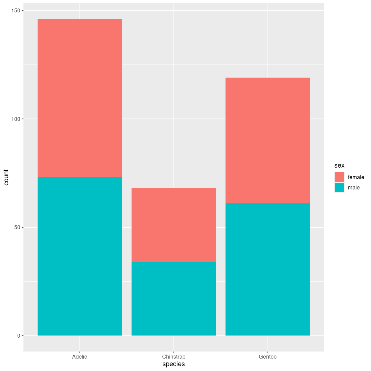
plot of chunk barplot_stacked_how
penguins %>%
  filter(!is.na(sex)) %>%
  ggplot(aes(species, fill=sex)) +
  geom_bar(position="dodge")
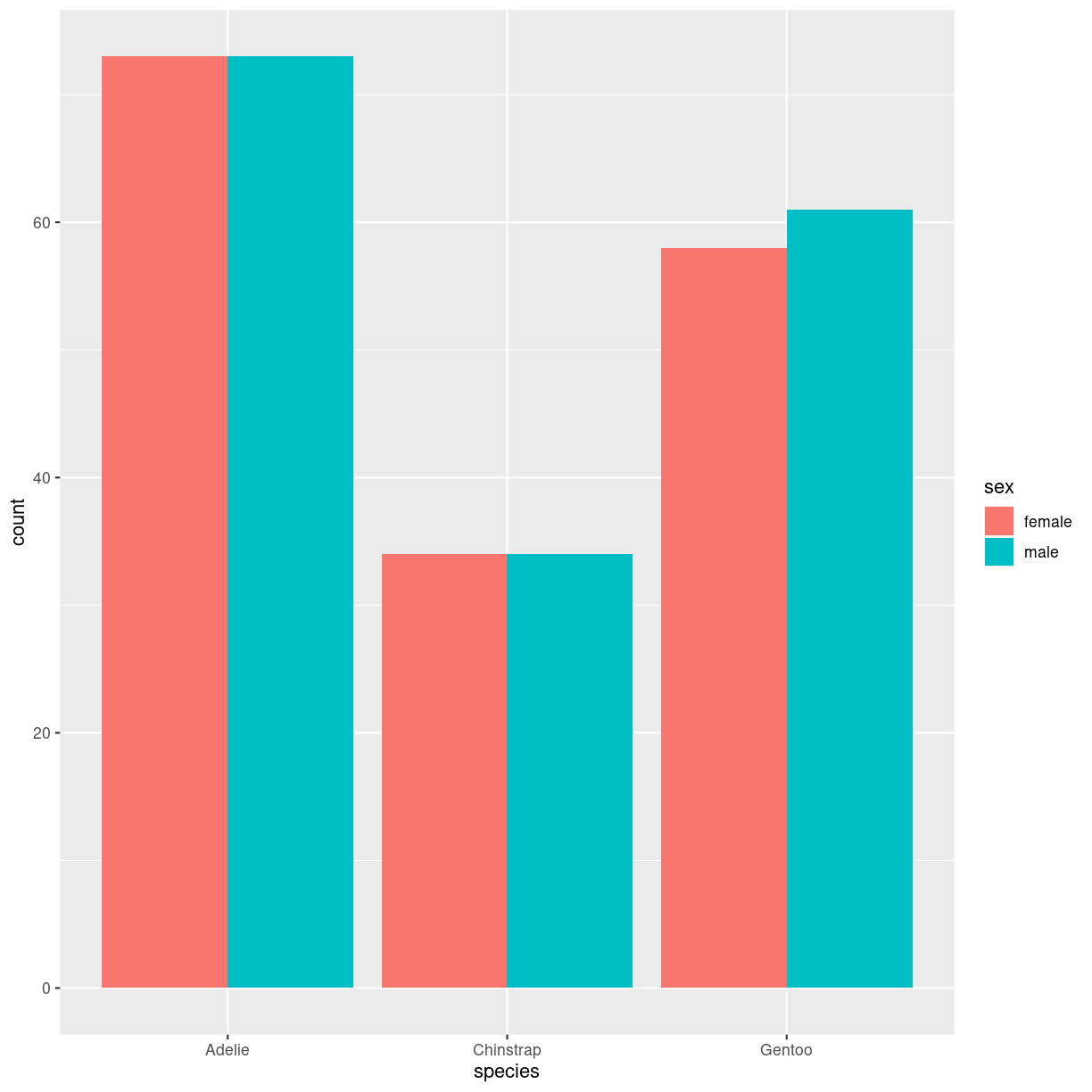
plot of chunk barplot_grouped_how
Interesting variations
Think about
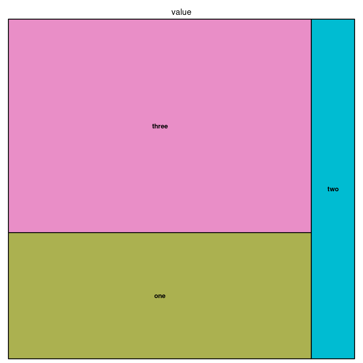
Treemap
What are they?
Viser hierarkisk data i nestede rektangler. Hver gruppe repræsenteres af en rektangel, hvis areal er proportionalt med dens værdi.
treemap.
Den kan også gøres interaktiv med detreeR.
What do we use them for?
how do we make them?
Vi bygger dem med pakken treemap.
Vi skal bruge noget data. Det organiseres, i den enkleste udgave på denne måde:
data <- tribble(~group, ~value,
                "one", 13,
                "two", 5,
                "three", 22)
Og så laver vi det med:
library(treemap)
treemap(data,
        index = "group",
        vSize="value")
plot of chunk unnamed-chunk-3
Det kan også gøres med ggplot:
library(treemapify)
ggplot(data, aes(area = value, fill = group)) +
  geom_treemap()

plot of chunk unnamed-chunk-4
Interesting variations
Hierarkisk
For det tilfælde at en (eller flere) grupper har underkategorier.
group <- c(rep("group-1",4),rep("group-2",2),rep("group-3",3))
subgroup <- paste("subgroup" , c(1,2,3,4,1,2,1,2,3), sep="-")
value <- c(13,5,22,12,11,7,3,1,23)
data <- data.frame(group,subgroup,value)

# treemap
treemap(data,
            index=c("group","subgroup"),
            vSize="value",
            type="index"
            )
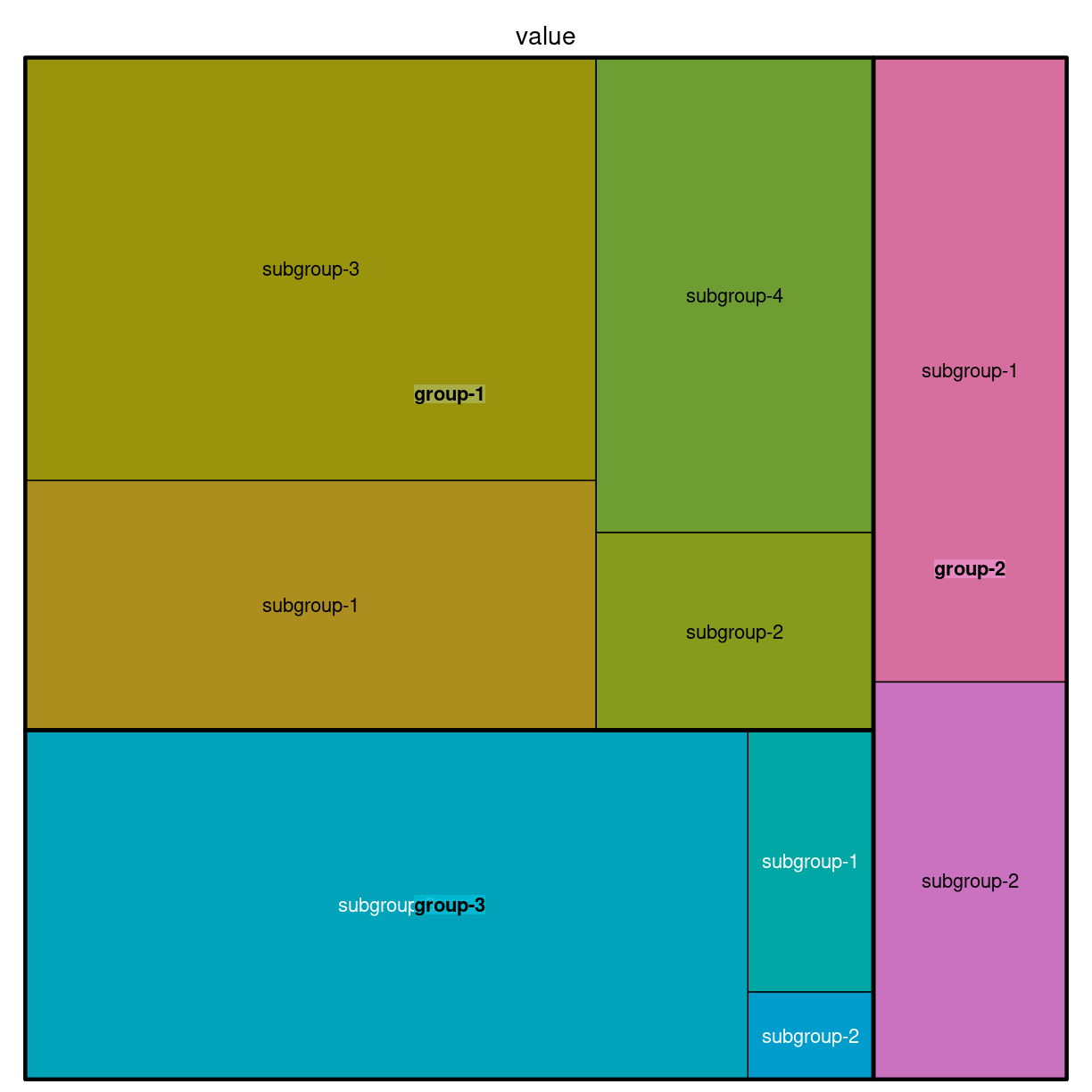
plot of chunk unnamed-chunk-5
Think about
Doughnut
What are they?
En lagkage med hul i. Og derfor ca. lige så ringe som lagkagediagrammer
What do we use them for?
Mange ting - som man ikke bør bruge dem til.
how do we make them?
fordi de er noget skrammel, understøtter ggplot2 dem ikke direkte.
penguins %>%
  group_by(species) %>%
  summarise(count = n()) %>%
  ungroup() %>%
  mutate(frac = count/sum(count)) %>%
  mutate(ymax = cumsum(frac)) %>%
  mutate(ymin = lag(ymax, default = 0)) %>%
  ggplot(aes(ymax=ymax, ymin = ymin, xmax = 4, xmin = 3, fill=species)) +
  geom_rect() +
  coord_polar(theta="y") +
  xlim(c(2,4))
plot of chunk unnamed-chunk-6
# Create test data.
data <- data.frame(
  category=c("A", "B", "C"),
  count=c(10, 60, 30)
)

# Compute percentages
data$fraction = data$count / sum(data$count)

# Compute the cumulative percentages (top of each rectangle)
data$ymax = cumsum(data$fraction)

# Compute the bottom of each rectangle
data$ymin = c(0, head(data$ymax, n=-1))

ggplot(data, aes(ymax=ymax, ymin=ymin, xmax=4, xmin=3, fill=category)) +
     geom_rect() +
     coord_polar(theta="y") + # Try to remove that to understand how the chart is built initially
     xlim(c(2, 4)) # Try to remove that to see how to make a pie chart
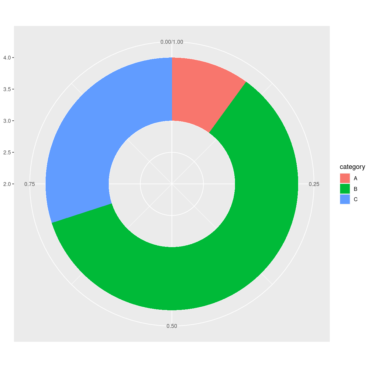
plot of chunk unnamed-chunk-7
Interesting variations
Think about
Pie chart
What are they?
verdens værste plot type.
En cirkel delt ind i slices hvor hver repræsentere en andel af helet.
What do we use them for?
Alt. det er en del af problemet…
how do we make them?
penguins %>%
  group_by(species) %>%
  summarise(count = n()) %>%
  ungroup() %>%
  ggplot(aes(x="", y =count, fill = species)) +
  geom_bar(stat = "identity", width = 1) +
  coord_polar("y", start = 0)
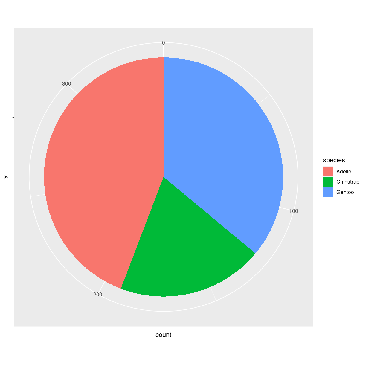
plot of chunk unnamed-chunk-8
ggplot har holdninger. Så der er ikke et geom_ i ggplot til at lave lagkager.
Skal man - så laver man et barplot, og ændrer på koordinatsystemet med coord_polar.
Interesting variations
Der er ingen gode variationer. Lad nu bare være.
Think about
Overvej helt at lade være med at lave den. Brug barcharts, treemaps eller andet.
Hvorfor er det grafen fra helvede?
Problemet med piecharts er at de grundlæggende viser forskelle på forskellige grupper ved at vise en vinkel. Og det er vi mennesker ret dårlige til.
lad os lave tre piecharts, og tre barcharts. https://www.data-to-viz.com/caveat/pie.html
library(tidyverse)
a <- data.frame( name=letters[1:5], value=c(17,18,20,22,24) )
b <- data.frame( name=letters[1:5], value=c(20,18,21,20,20)  )
c <- data.frame( name=letters[1:5], value=c(24,23,21,19,18) )

a <- a %>%
  arrange(desc(name)) %>%
  mutate(prop = value / sum(a$value) *100) %>%
  mutate(ypos = cumsum(prop)- 0.5*prop )

b <- b %>%
  arrange(desc(name)) %>%
  mutate(prop = value / sum(b$value) *100) %>%
  mutate(ypos = cumsum(prop)- 0.5*prop )

c <- c %>%
  arrange(desc(name)) %>%
  mutate(prop = value / sum(c$value) *100) %>%
  mutate(ypos = cumsum(prop)- 0.5*prop )

# Basic piechart
pa <- ggplot(a, aes(x="", y=prop, fill=name)) +
  geom_bar(stat="identity", width=1, color="white") +
  coord_polar("y", start=0) +
  theme_void() +
  theme(legend.position="none") +
  geom_text(aes(y = ypos, label = name), color = "white", size=6) +
  scale_fill_brewer(palette="Set2")

pb <- ggplot(b, aes(x="", y=prop, fill=name)) +
  geom_bar(stat="identity", width=1, color="white") +
  coord_polar("y", start=0) +
  theme_void() +
  theme(legend.position="none") +
  geom_text(aes(y = ypos, label = name), color = "white", size=6) +
  scale_fill_brewer(palette="Set2")

pc <- ggplot(c, aes(x="", y=prop, fill=name)) +
  geom_bar(stat="identity", width=1, color="white") +
  coord_polar("y", start=0) +
  theme_void() +
  theme(legend.position="none") +
  geom_text(aes(y = ypos, label = name), color = "white", size=6) +
  scale_fill_brewer(palette="Set2")

pa + pb + pc
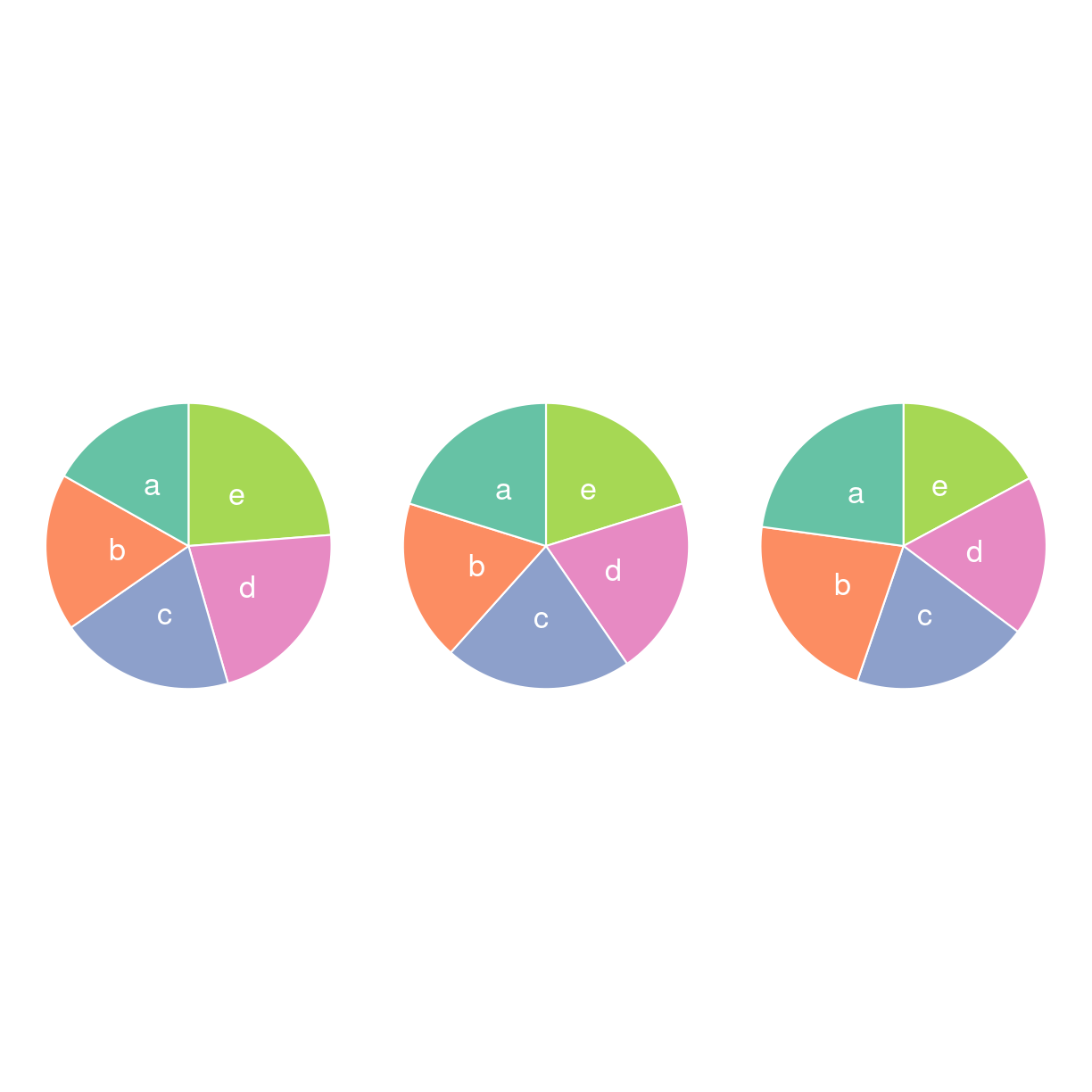
plot of chunk unnamed-chunk-9
Hvad er udviklingen i det?
ba <- a %>% ggplot(aes(name, value, fill = name))  +
  geom_bar(stat= "identity") +
  scale_fill_brewer(palette="Set2") +
  theme(
    legend.position = "none",
    panel.grid = element_blank()
  ) +
  xlab("") +
  ylab("")
bb <- b %>% ggplot(aes(name, value, fill = name))  +
  geom_bar(stat= "identity") +
  scale_fill_brewer(palette="Set2") +
  theme(
    legend.position = "none",
    panel.grid = element_blank()
  ) +
  xlab("") +
  ylab("")
bc <- c %>% ggplot(aes(name, value, fill = name))  +
  geom_bar(stat= "identity") +
  scale_fill_brewer(palette="Set2") +
  theme(
    legend.position = "none",
    panel.grid = element_blank()
  ) +
  xlab("") +
  ylab("")
ba+bb+bc
plot of chunk unnamed-chunk-10
Kunne du se det da det var lagkagediagrammer? Nej, det kunne du ikke. Så lad nu bare være med at lave dem.
Pie charts can be made even worse
Please dont. 3D-effects. Exploding piecharts. Percentages that do not sum to
- Too many slices. Almost anything added to piecharts will make them even worse.
It can be done in R. But it is difficult. ggplot2 have opinions, and makes it difficult to commit crimes against datavisualisation.
In some, very rare, cases a pie chart will be the best chart for what we want to visualize. And in some, even more rare cases, a pie chart can be improved to make it even better, by adding stuff to it.
But as a general rule: Dont.
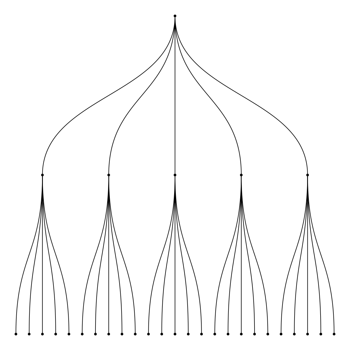
Dendrogram
https://cran.r-project.org/web/packages/ggdendro/vignettes/ggdendro.html
What are they?
What do we use them for?
how do we make them?
library(ggraph)
library(igraph)
Attaching package: 'igraph'
The following objects are masked from 'package:lubridate':

    %--%, union
The following objects are masked from 'package:dplyr':

    as_data_frame, groups, union
The following objects are masked from 'package:purrr':

    compose, simplify
The following object is masked from 'package:tidyr':

    crossing
The following object is masked from 'package:tibble':

    as_data_frame
The following objects are masked from 'package:stats':

    decompose, spectrum
The following object is masked from 'package:base':

    union
library(tidyverse)

# create an edge list data frame giving the hierarchical structure of your individuals
d1 <- data.frame(from="origin", to=paste("group", seq(1,5), sep=""))
d2 <- data.frame(from=rep(d1$to, each=5), to=paste("subgroup", seq(1,25), sep="_"))
edges <- rbind(d1, d2)

# Create a graph object
mygraph <- graph_from_data_frame( edges )

# Basic tree
ggraph(mygraph, layout = 'dendrogram', circular = FALSE) +
  geom_edge_diagonal() +
  geom_node_point() +
  theme_void()
Warning: Using the `size` aesthetic in this geom was deprecated in ggplot2 3.4.0.
ℹ Please use `linewidth` in the `default_aes` field and elsewhere instead.
This warning is displayed once every 8 hours.
Call `lifecycle::last_lifecycle_warnings()` to see where this warning was
generated.
plot of chunk unnamed-chunk-11
Men også ggdendro! Den baserer sig på resultater fra hclust
Interesting variations
Think about
Circular packing
What are they?
What do we use them for?
Kan vise hierarkisk organisering. Ækvivalent til treemap og dendrogrammer. Hver node repræsenteres af en cirkel. Hver subnode repræsenteres som en cirkel inden i denne cirkel.
Enkelt niveua laves med ggiraph og/eller packcirles.
Flere niveauer laves med ggraph
Der kan laves interaktive ting med flere niveauer med circlepackeR.
how do we make them?
Interesting variations
Think about
Key Points
FIXME
Evolution
Overview
Teaching: 42 min
Exercises: 47 minQuestions
FIXME
Objectives
FIXME
Not evolution as in biology, evolution as in something is changing
line chart
her skal vi have geom_ribbon og geom_smooth med.
What are they?
What do we use them for?
how do we make them?
Interesting variations
Area
What are they?
What do we use them for?
how do we make them?
Interesting variations
Stacked area
What are they?
What do we use them for?
how do we make them?
Interesting variations
Streamchart
What are they?
What do we use them for?
how do we make them?
Interesting variations
Time Series
What are they?
What do we use them for?
how do we make them?
Interesting variations
Key Points
FIXME
Maps
Overview
Teaching: 42 min
Exercises: 47 minQuestions
FIXME
Objectives
FIXME
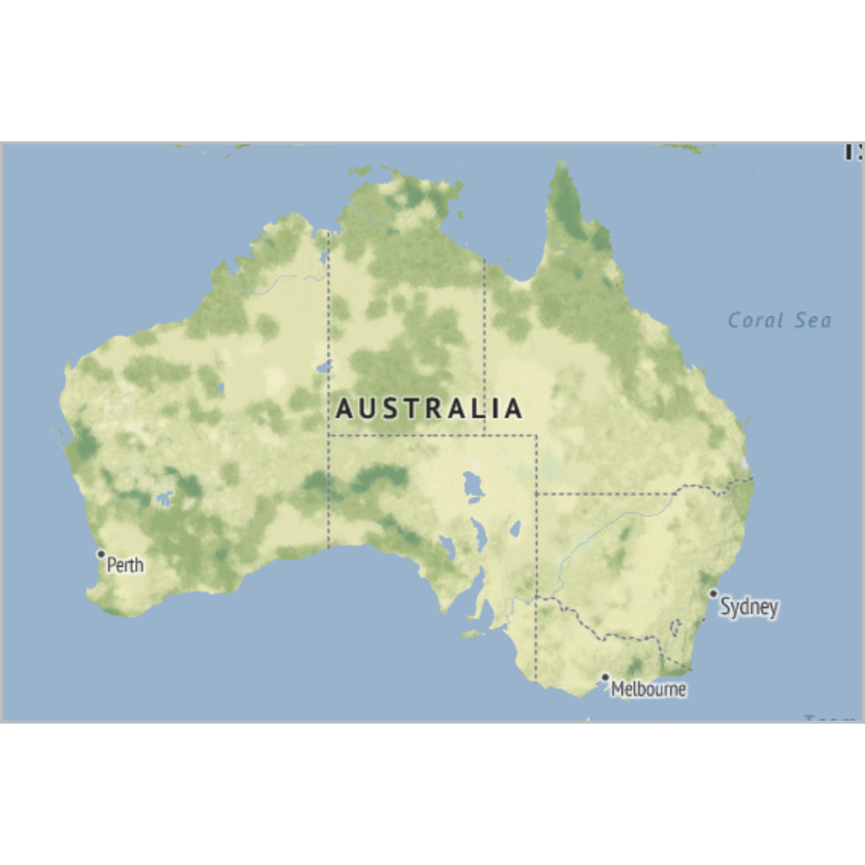
Map
What are they?
Det skal vi helst ikke forklare. Og de er i øvrig mest interessante i kombination med data.
What do we use them for?
how do we make them?
Det er ikke helt optimalt. Men det lader til at man kan få stamen til at fungere…
library(ggmap)
Loading required package: ggplot2
The legacy packages maptools, rgdal, and rgeos, underpinning the sp package,
which was just loaded, will retire in October 2023.
Please refer to R-spatial evolution reports for details, especially
https://r-spatial.org/r/2023/05/15/evolution4.html.
It may be desirable to make the sf package available;
package maintainers should consider adding sf to Suggests:.
The sp package is now running under evolution status 2
     (status 2 uses the sf package in place of rgdal)
ℹ Google's Terms of Service: <https://mapsplatform.google.com>
ℹ Please cite ggmap if you use it! Use `citation("ggmap")` for details.
library(tidyverse)
── Attaching core tidyverse packages ──────────────────────── tidyverse 2.0.0 ──
✔ dplyr     1.1.3     ✔ readr     2.1.4
✔ forcats   1.0.0     ✔ stringr   1.5.0
✔ lubridate 1.9.2     ✔ tibble    3.2.1
✔ purrr     1.0.2     ✔ tidyr     1.3.0
── Conflicts ────────────────────────────────────────── tidyverse_conflicts() ──
✖ dplyr::filter() masks stats::filter()
✖ dplyr::lag()    masks stats::lag()
ℹ Use the conflicted package (<http://conflicted.r-lib.org/>) to force all conflicts to become errors
map <- get_stamenmap( bbox = c(left = 110, bottom = -40, right = 160, top = -10), zoom = 4, maptype = "terrain")
ℹ Map tiles by Stamen Design, under CC BY 3.0. Data by OpenStreetMap, under ODbL.
ggmap(map) +
  theme_void() +
  theme(
    plot.title = element_text(colour = "orange"),
    panel.border = element_rect(colour = "grey", fill=NA, size=2)
  )
Warning: The `size` argument of `element_rect()` is deprecated as of ggplot2 3.4.0.
ℹ Please use the `linewidth` argument instead.
This warning is displayed once every 8 hours.
Call `lifecycle::last_lifecycle_warnings()` to see where this warning was
generated.
plot of chunk unnamed-chunk-2
Interesting variations
Think about
Choropleth
What are they?
Et kort som vi deler op i geografiske enheder. Og så farvelægger vi dem efter en eller anden variabel.
leaflet hvis interaktivt, ggplot2/ggmap for statiske kortl
What do we use them for?
how do we make them?
Kort generelt falder i to dele. Find data at indlæse. shapefiles eller geoJSON. Nogle pakker har data med der er egnet. Man kan også hente ting fra google og openstreetmap.
Manipuler data og plot det.
leaflet til interaktive kort.
HUSK - DER SKAL NOGET JAVE HEJS IND OVER FOR AT LAVE DEM!
ggmap til statiske kort.
Nyttige pakker med kortdata: maps, mapdata og oz
Interesting variations
Think about
Hexbin map
Her skal vi have fundet noget geografisk data på Frankrig!
What are they?
Kort, hvor vi splitter regionen/kloden/whatever vi plotter, op i hexagoner (sekskanter). Enten selve arealet, altså at hver kommune i danmark optræder som en hexagon. Eller hvor vi deler danmark op i hexagoner, og så plotter vi 2D densities på det kort.
What do we use them for?
how do we make them?
Interesting variations
Think about
Cartogram
What are they?
Kort hvor vi forvrænger regioners (landes, kommuners, delstaters etc.) form for at vise en egenskab.
Her bruger vi pakken cartogram
Den kan animeres. Og laves på hexbin kort
What do we use them for?
how do we make them?
Interesting variations
Think about
Connection
What are they?
What do we use them for?
how do we make them?
Interesting variations
Think about
Bubble map
What are they?
What do we use them for?
how do we make them?
Interesting variations
Think about
Key Points
FIXME
Flow
Overview
Teaching: 0 min
Exercises: 0 minQuestions
FIXME
Objectives
FIXME
Plots for something that becomes something else - or changes from one thing to another. Animationer er også gode til den slags.
Chord diagram
What are they?
circlize - statiske
What do we use them for?
how do we make them?
Interesting variations
Interaktivitet chorddiag Her har vi en udfordring - den er ikke tilgængelig
på denne udgave af R - er den for gammel eller for ny?
der er noget med htmlwidgets.
Networks
What are they?
Grafer der viser forbindelser mellem ting. Hver ting er repræsenteret med en “node” også kaldet “vertice” eller på dansk “knude”. Disse knuder er så forbundet med “kanter” eller links eller edges. Vi skal nævne alle navnene - det gør det lettere at google.
tre pakker: igraph, der både forbereder data, og kan plotte det. ggraph - som plotter i en gg-verden (og som vist bruges andre steder på denne side). Og networkD3, der laver interaktive plots.
What do we use them for?
how do we make them?
Interesting variations
Sankey
What are they?
Viser flows fra en ting til en anden. En ting (node) repræsenteres med et rektangel. pile eller buer viser flowet mellem dem.
networkD3 er angiveligt den bedste måde at lave dem.
What do we use them for?
how do we make them?
Interesting variations
Interaktivitet.
Alluvial diagram - noget med distributioner over tid.
to pakker er værd at kigge på, men tjek lige om der er andre:
alluvial og ggalluvial
Arc diagram
What are they?
En variant af netværks grafer. Her placerer vi alle knuder på rad og række, og viser forbindelserne med buer (arcs) mellem dem.
What do we use them for?
how do we make them?
Interesting variations
kan vægtes.
Edge bundling
Hierarkisk.
What are they?
What do we use them for?
how do we make them?
Interesting variations
Key Points
FIXME
Specialty plots
Overview
Teaching: 0 min
Exercises: 0 minQuestions
ROC
Objectives
FIXME
Special ting, vi prøver at holde det til ting der ikke er dækket af de øvrige; til plots der bruges i ganske særlige sammenhænge.
Kig på ggsurvfit pakken
spectra
What are they?
What do we use them for?
how do we make them?
Interesting variations
Think about
Primært er det vist de stat_ functioner der følger med der er interessante.
install.packages("ggspectra")
Installing package into '/home/runner/work/_temp/Library'
(as 'lib' is unspecified)
library(ggspectra)
Loading required package: photobiology
News at https://www.r4photobiology.info/
Loading required package: ggplot2
ggplot(sun.spct)  +
  geom_line() +
  ggspectra::stat_valleys()
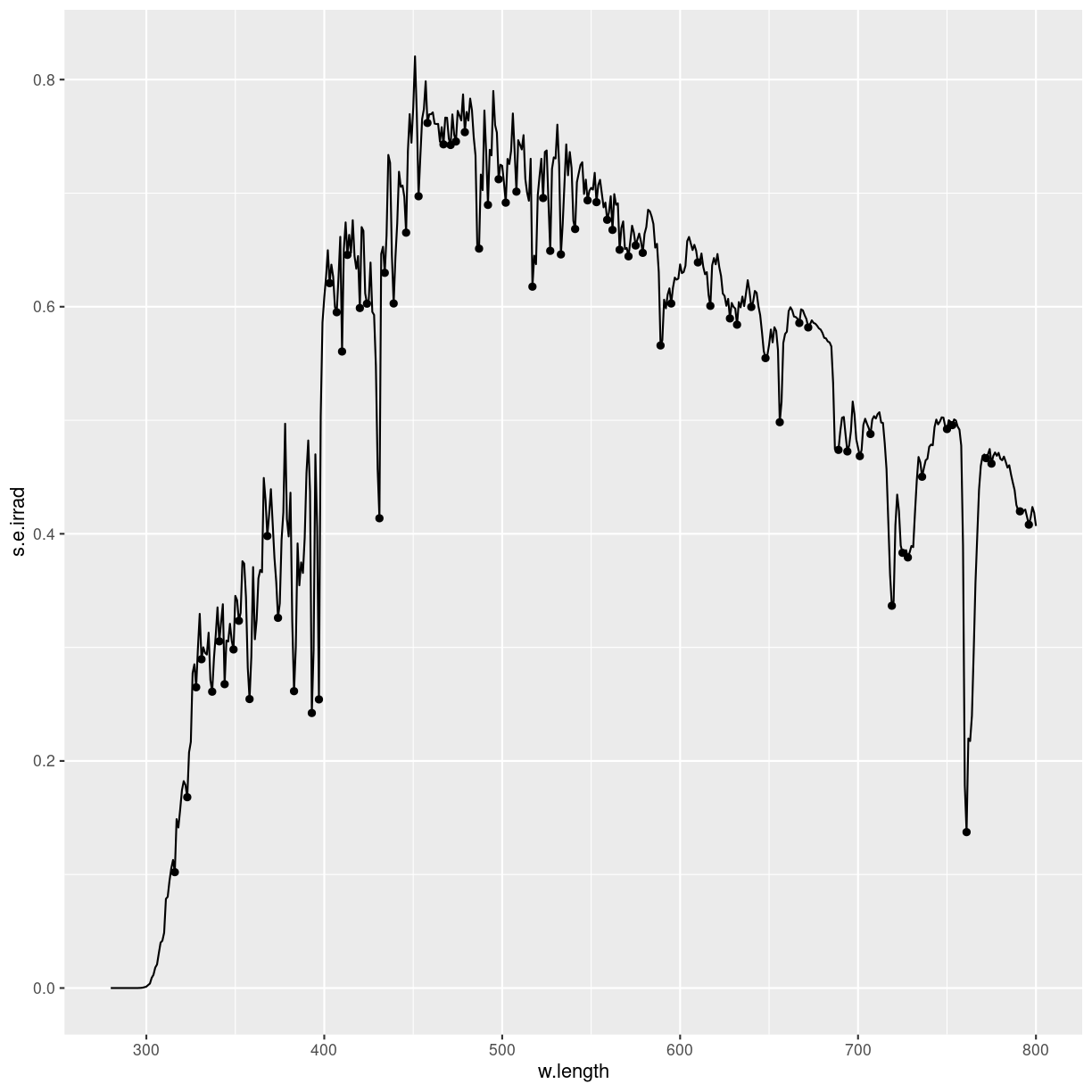
plot of chunk unnamed-chunk-2
ROC curves
What are they?
What do we use them for?
how do we make them?
Interesting variations
Think about
Men hvordan hænger de data sammen med det plot?
Vi har en kontinuert værdi. Den bruger vi til at forudsige et binært outcome.
Oprindelsen har rødder til radar-operatører i England under anden verdenskrig. Der var input fra radarene. Baseret på dem forsøgte man at skelne. Var det tyske bombefly? Eller var det ikke? I sidste tilfælde var det ofte gæs.
Der er to mulige fejl. Enten siger man tyskere når det var gæs. Eller også siger man gæs når det var tyskere. Den ene er falsk positiv. Den anden er falsk negativ. Fortegnet er styret af hvad man prøver at opdage.
Nogle radar-operatører var bedre end andre. ROC-kurven giver os et værktøj til at sætte tal på forskellen.
Vi bruger pakken plotROC. eller - det gør vi måske ikke. Jo, det gør vi!
Vi skal have noget data:
set.seed(47)
D.ex <- rbinom(200, size = 1, prob = .5)
M1 <- rnorm(200, mean = D.ex, sd = .65)
#M2 <- rnorm(200, mean = D.ex, sd = 1.5)

test <- data.frame(D = D.ex, D.str = c("Gås", "Tysker")[D.ex + 1],
                   M1 = M1, stringsAsFactors = FALSE)

head(test)
  D  D.str         M1
1 1 Tysker  0.9073656
2 0    Gås -0.3025575
3 1 Tysker  0.7239910
4 1 Tysker  1.4857584
5 1 Tysker  1.4286289
6 1 Tysker  1.1292391
hvad er det vi har?
library(plotROC)
test %>% ggplot(aes(d = D, m = M1)) +
  geom_roc()
Error in test %>% ggplot(aes(d = D, m = M1)): could not find function "%>%"
Når vi laver logistiske regressioner, forsøger vi at fitte en model til en virkelighed hvor vores responsvariabel er binær. Ja/nej, sand/falsk.
I analysen af hvordan radaroperatører under anden verdenskrig klarede sig, opfandt man denne metode. Vi ser noget på en skærm. Vi ser mange forskellige input på en skærm. Vurder om det er en tysk bombemaskine på vej mod London, eller en flok gæs.
Der er to interessante ting. Sensitiviteten. Sandsynligheden for at vi beslutter os for at det er tyskere, når det faktisk er tyskere.
Specificiteten, Sandsynligheden for at vi beslutter os for at det er gæs, når det faktisk er gæs.
Der er subtile forskelle mellem de to.
Den ideelle model har en sensitivitet på 1. Og en specificitet på 1.
Vi skal starte med at have noget data, før vi kan plotte en roc-kurve. Hvis ikke du har det data, så kom igen når du har det.
AUC, ROC,
survival, den slags.
Survival plots
What are they?
What do we use them for?
how do we make them?
Interesting variations
Think about
manhattan plots
What are they?
What do we use them for?
how do we make them?
Interesting variations
Think about
scree plots
What are they?
What do we use them for?
how do we make them?
Interesting variations
Think about
biplots - pca
What are they?
What do we use them for?
how do we make them?
Interesting variations
Think about
Key Points
FIXME
Animations
Overview
Teaching: 42 min
Exercises: 47 minQuestions
FIXME
Objectives
FIXME
animerede plots. Det er jeg ikke sikker på kan håndteres her - men lad os se:
Det kan de…
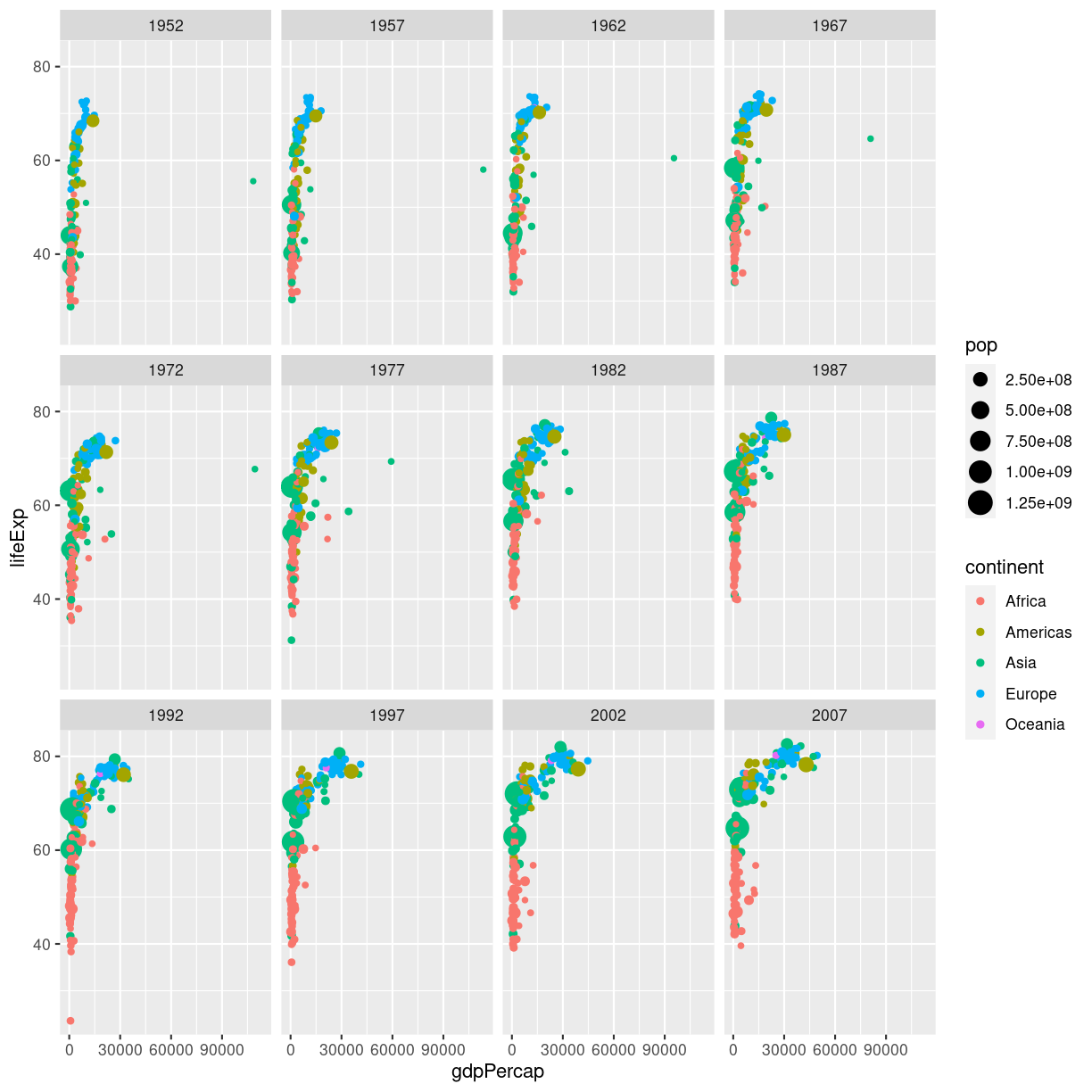
En fiks måde at vise en udvikling er ved at animere plottet. Start med at lave dit plot, og facetter efter tidsvariablen:
ggplot(gapminder, aes(gdpPercap, lifeExp, size = pop, color = continent)) +
  geom_point() +
  facet_wrap(~year)
plot of chunk unnamed-chunk-1
Når så du vil animere, erstatter du facet_wrap(~year) med transition_time(year).
og vupti har du en animation. I dette tilfælde smider vi ldit ekstra på.
# Make a ggplot, but add frame=year: one image per year
ggplot(gapminder, aes(gdpPercap, lifeExp, size = pop, color = continent)) +
  geom_point() +
  scale_x_log10() +
  theme_bw() +
  # gganimate specific bits:
  labs(title = 'Year: {frame_time}', x = 'GDP per capita', y = 'life expectancy') +
  transition_time(year) +
  ease_aes('linear')

plot of chunk animation_test
Vi smider en logaritmisk skala på x-aksen, piller i hvordan plottet themes.
Og så skriver vi eksplicit ease_aes('linear'). For hvad stiller vi op når
vi har et punkt til tiden 1957, og et til tiden 1962, men ikke til årene imellem?
Vi lader R beregne hvordan punktet ville se ud i 1958, 1959 etc. Hvis ændringen er lineær. Der er andre muligheder end lineær. Læs dokumentationen for mulighederne.
Hvad hvis vi deler den op?
# Save at gif:
anim_save("../fig/271-ggplot2-animated-gif-chart-with-gganimate1.gif")
Key Points
FIXME
Tables
Overview
Teaching: 0 min
Exercises: 0 minQuestions
What are histograms?
What are violin plots?
What are density plots?
What are boxplots?
Objectives
FIXME
den her er værd at kigge på: https://cedricscherer.netlify.app/2019/08/05/a-ggplot2-tutorial-for-beautiful-plotting-in-r/#text
We do not typically think of tables as visualisations. But they are often the best way of showing data.
Charts use an abstraction to show the data. And sometimes that abstraction gets in the way. Tables present data as close to raw as possible.
Use tables when data cannot be presented visually easily, or when the data requires more specific attention.
The goal of presenting data is to make trends, connections, differences or similarities more apparent to the reader.
library(reactable)

table_ex <- mtcars %>%
  select(cyl, mpg, disp) %>%
  reactable()

table_ex
Error in loadNamespace(name): there is no package called 'webshot'
Maybe not a visualisation as we usually understand it.
But still
https://themockup.blog/posts/2020-09-04-10-table-rules-in-r/
Også denne, men den hører hjemme et andet sted.
Key Points
FIXME
snailcharts
Overview
Teaching: 0 min
Exercises: 0 minQuestions
FIXME
Objectives
FIXME
Muligvis så fæl at det slet ikke kan gøres i ggplot.
https://medium.com/nightingale/yet-another-alternative-for-bar-charts-introducing-the-snail-chart-4fe69b938594
Key Points
FIXME
Forest plots
Overview
Teaching: 0 min
Exercises: 0 minQuestions
FIXME
Objectives
FIXME
hvad er de?
Forest plots (der ikke har noget med skove at gøre) er plots der viser de estimerede resultater fra flere videnskabelige studier - af samme fænomen. Sammen med de samlede resultater. De bruges i metaanalyser af litteraturen. Og kaldes også blobbogrammer.
Hvordan laver man dem?
Man starter med at lade den rigtige funktion beregne odds ratioer for ens studier.
annoteret
vi vil godt have p-værdier på dem. så vi starter med at få trukket data ud på de forskellige modeller. Her er noget data vi har forberedt på forhånd. Der er fem modeller, der er estimater, lav og høj ende af konfidensintervallerne, p-værdier. Og (den naturlige) logaritme af estimat og konfidensintervaller:
data <- tribble(
~model, ~log.estimate, ~log.conf.low, ~log.conf.high, ~estimate, ~conf.low, ~conf.high, ~p.value,
"A",          -0.685,        -0.895   ,   -0.475  ,    0.504  ,  0.409  ,   0.622, 1.68e-10,
"B",          -0.0526,       -0.420   ,    0.315   ,   0.949  ,  0.657  ,   1.37,  7.79e-1,
"C",          -0.0864 ,      -0.457   ,    0.284   ,   0.917  ,  0.633  ,   1.33,  6.47e-1,
"D",          -0.121   ,     -0.587  ,     0.344  ,    0.886  ,  0.556  ,   1.41,  6.09e-1,
"E",          -0.422    ,    -0.882 ,      0.0386 ,    0.656  ,  0.414  ,   1.04,  7.26e-2
)


forestplot(base_data)
Error in eval(expr, envir, enclos): object 'base_data' not found
Det skal vi have plottet:
midt <- data %>%
  ggplot(aes(y = fct_rev(model))) +
  # theme_classic() +
  geom_point(aes(x =log.estimate), shape = 15, size = 3) +
  geom_linerange(aes(xmin = log.conf.low, xmax = log.conf.high)) +
  labs(x = "log hazard ratio") +
  coord_cartesian(ylim=c(1,6), xlim=c(-1,.5)) +
  geom_vline(xintercept = 0, linetype = "dotdash") +
  annotate("text", x = -.32, y = 6, label = "OK") +
  annotate("text", x = 0.25, y = 6, label = "ikke så godt")
midt
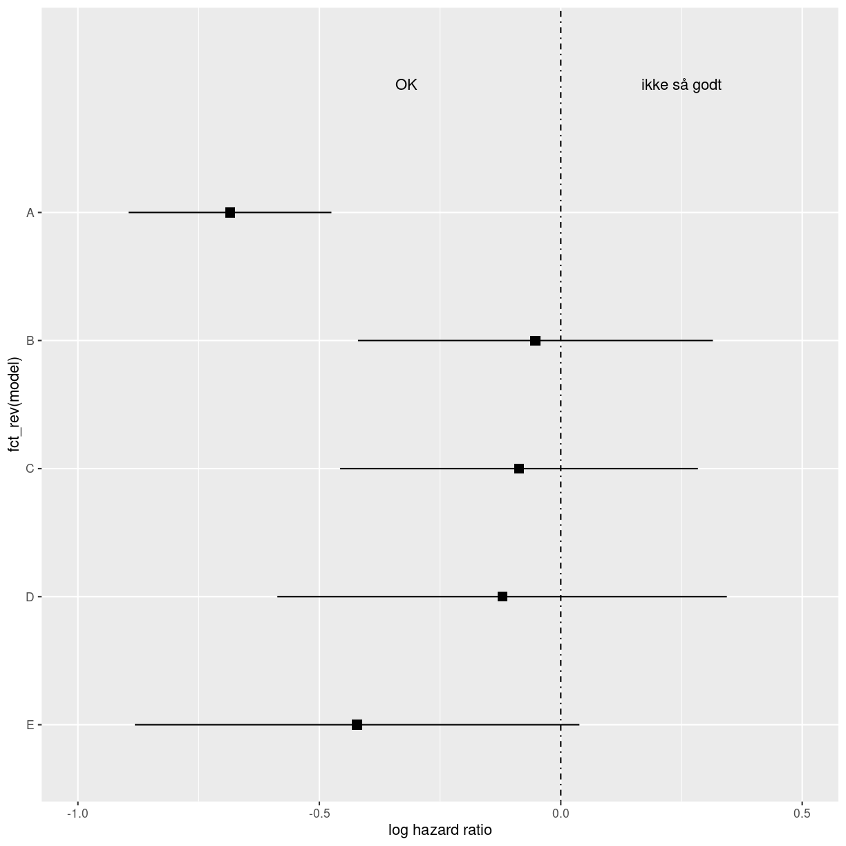
plot of chunk unnamed-chunk-3
Det er det plot vi vil have i midten, så det gemmer vi.
Så har vi noget vi vil se til venstre for det plot:
# Cochrane data from the 'rmeta'-package
base_data <- tibble::tibble(mean  = c(0.578, 0.165, 0.246, 0.700, 0.348, 0.139, 1.017),
                            lower = c(0.372, 0.018, 0.072, 0.333, 0.083, 0.016, 0.365),
                            upper = c(0.898, 1.517, 0.833, 1.474, 1.455, 1.209, 2.831),
                            study = c("Auckland", "Block", "Doran", "Gamsu",
                                      "Morrison", "Papageorgiou", "Tauesch"),
                            deaths_steroid = c("36", "1", "4", "14", "3", "1", "8"),
                            deaths_placebo = c("60", "5", "11", "20", "7", "7", "10"),
                            OR = c("0.58", "0.16", "0.25", "0.70", "0.35", "0.14", "1.02"))

log(36/60)
[1] -0.5108256
base_data %>%
  forestplot(labeltext = c(study, deaths_steroid, deaths_placebo, OR),
             clip = c(0.1, 2.5),
             xlog = TRUE) |>
  fp_set_style(box = "royalblue",
               line = "darkblue",
               summary = "royalblue") %>%
  fp_add_header(study = c("", "Study"),
                deaths_steroid = c("Deaths", "(steroid)"),
                deaths_placebo = c("Deaths", "(placebo)"),
                OR = c("", "OR")) |>
  fp_append_row(mean  = 0.531,
                lower = 0.386,
                upper = 0.731,
                study = "Summary",
                OR = "0.53",
                is.summary = TRUE) %>%
  fp_set_zebra_style("#EFEFEF")
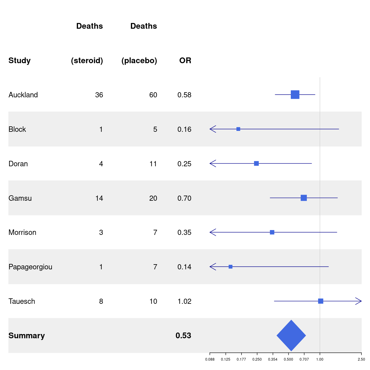
plot of chunk unnamed-chunk-5
Key Points
FIXME
Ternære plots
Overview
Teaching: 0 min
Exercises: 0 minQuestions
FIXME
Objectives
FIXME
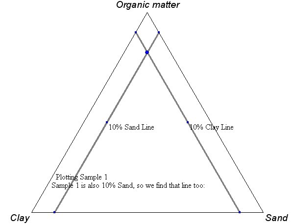
Sådden nogen her:
Hvis du ved at du har brug for at lave sådan et - så ved du også hvordan du skal aflæse dem. Men vi har lige et eksempel eller to til sidst alligevel.
Vi skal bruge en ekstra pakke, ggtern.
library(ggtern)
Registered S3 methods overwritten by 'ggtern':
  method           from
  grid.draw.ggplot ggplot2
  plot.ggplot      ggplot2
  print.ggplot     ggplot2
--
Remember to cite, run citation(package = 'ggtern') for further info.
--
Attaching package: 'ggtern'
The following objects are masked from 'package:ggplot2':

    aes, annotate, ggplot, ggplot_build, ggplot_gtable, ggplotGrob,
    ggsave, layer_data, theme_bw, theme_classic, theme_dark,
    theme_gray, theme_light, theme_linedraw, theme_minimal, theme_void
Så skal vi bruge noget data der kan plottes på den måde. De kommer oprindeligt herfra: https://ourworldindata.org/electricity-mix
Dem indlæser vi:
elmix <- read_csv("../data/electricity-prod-source.csv")
Rows: 8070 Columns: 15
── Column specification ────────────────────────────────────────────────────────
Delimiter: ","
chr  (2): land, code
dbl (13): aar, Coal, Gas, Hydro, Nuclear, Oil, Other_renewables, Solar, Wind...

ℹ Use `spec()` to retrieve the full column specification for this data.
ℹ Specify the column types or set `show_col_types = FALSE` to quiet this message.
Du kan finde dem her: (indsæt link når siden er renderet første gang).
Vi kan lave dem på to måder. Enten direkte:
elmix %>%
  filter(aar == 2018, land == "Sweden") %>%
  ggtern(aes(x=fossil/total,
             y = vedvarende/total,
             z = kernekraft/total)) +
  geom_point()
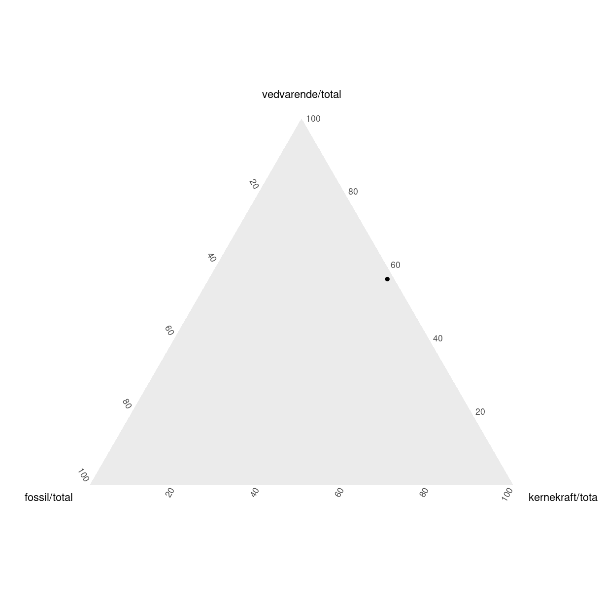
plot of chunk unnamed-chunk-4
den ser ud som den gør, fordi fordelingen af elproduktionen i Sverige i 2018 var således:
elmix %>%
  filter(aar == 2018, land == "Sweden") %>%
  transmute(fossil = fossil/total,
         vedvarende = vedvarende/total,
         kernekraft = kernekraft/total) %>%
  pivot_longer(everything(), names_to = "kilde",
               values_to = "andel") %>%
  mutate(andel = scales::percent(andel)) %>%
  knitr::kable()
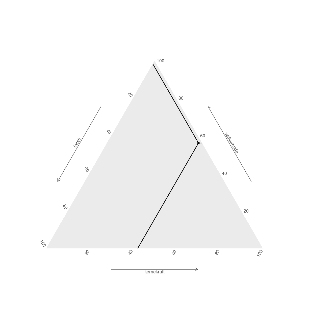
|kilde |andel | |:———-|:—–| |fossil |2% | |vedvarende |56% | |kernekraft |42% | I stedet kan vi bruge ggplot (ggtern er baseret på den), og supplere med et nyt koordinatsystem:
tern_plot <- elmix %>%
  filter(aar == 2018, land == "Sweden") %>%
  ggplot(aes(x=fossil,
             y = vedvarende,
             z = kernekraft)) +
  coord_tern() +
  geom_point()
Coordinate system already present. Adding new coordinate system, which will
replace the existing one.
tern_plot
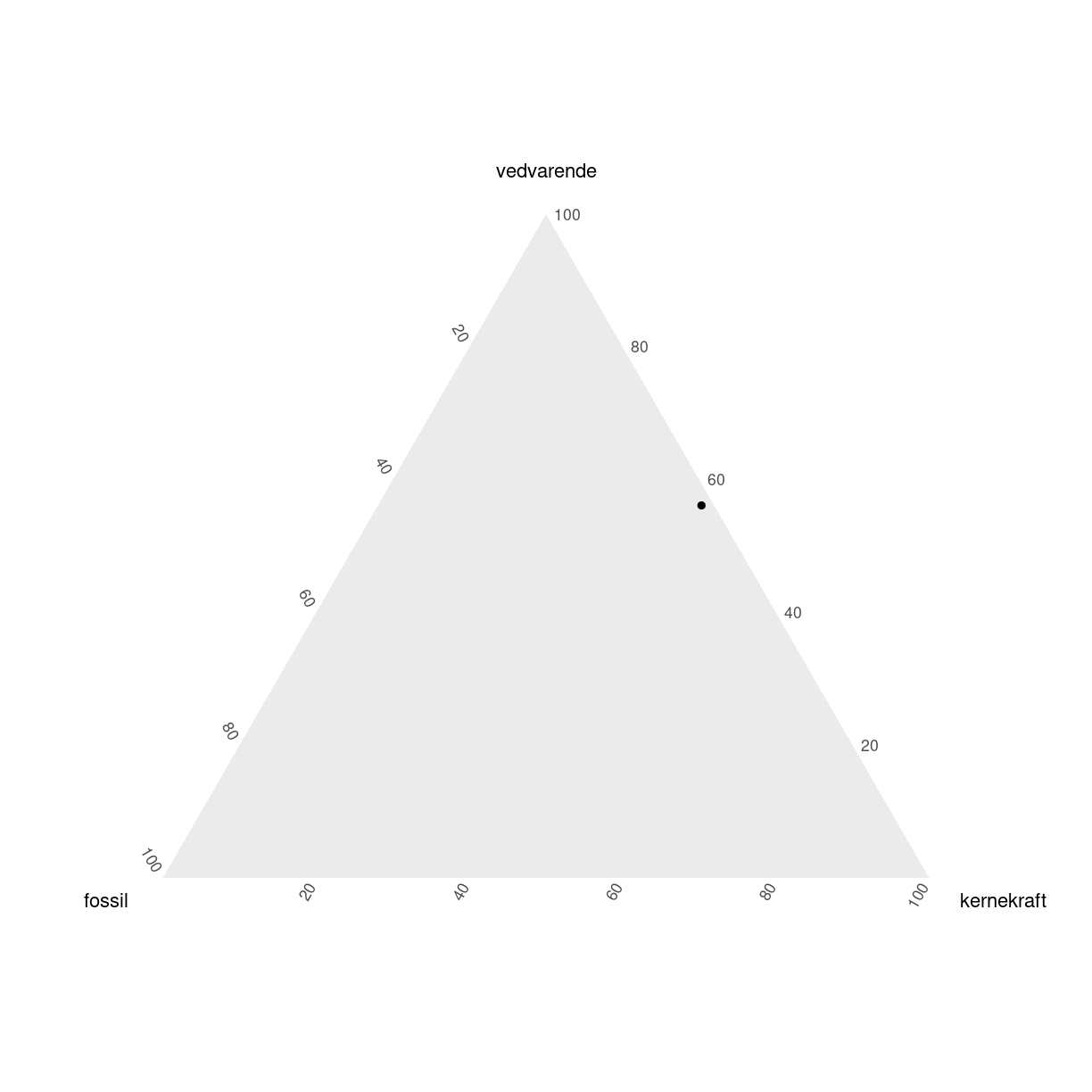
plot of chunk unnamed-chunk-6
Bemærk også at det ikke var nødvendigt at beregne andelene - det klarer ggtern for os. Det var heller ikke nødvendigt i det første eksempel.
Vi kan bruge andre (men ikke alle) geoms fra ggplot. geom_text til at sætte etiketter på eksempelvis. Vi får advarsler i konsollen hvis vi prøver at gøre noget der ikke er muligt.
ggtern kommer med egne ekstra geoms.
tern_plot + geom_crosshair_tern()
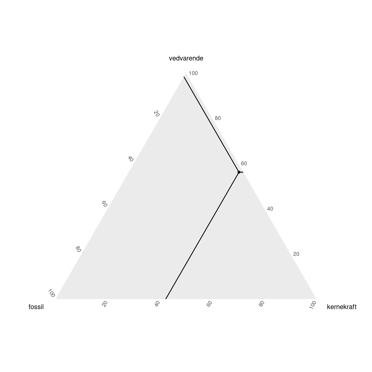
plot of chunk unnamed-chunk-7
Der kan gøre det lettere at aflæse punkterne. Det er stadig pænt svært at huske hvad der er hvad. ggtern har nogen themes, der kan gøre det lettere:
tern_plot +
  geom_crosshair_tern() +
  theme_hidetitles() +
  theme_showarrows()
plot of chunk unnamed-chunk-8
Der er mange andre ting gemt i pakken. Læs evt. dokumentationen.
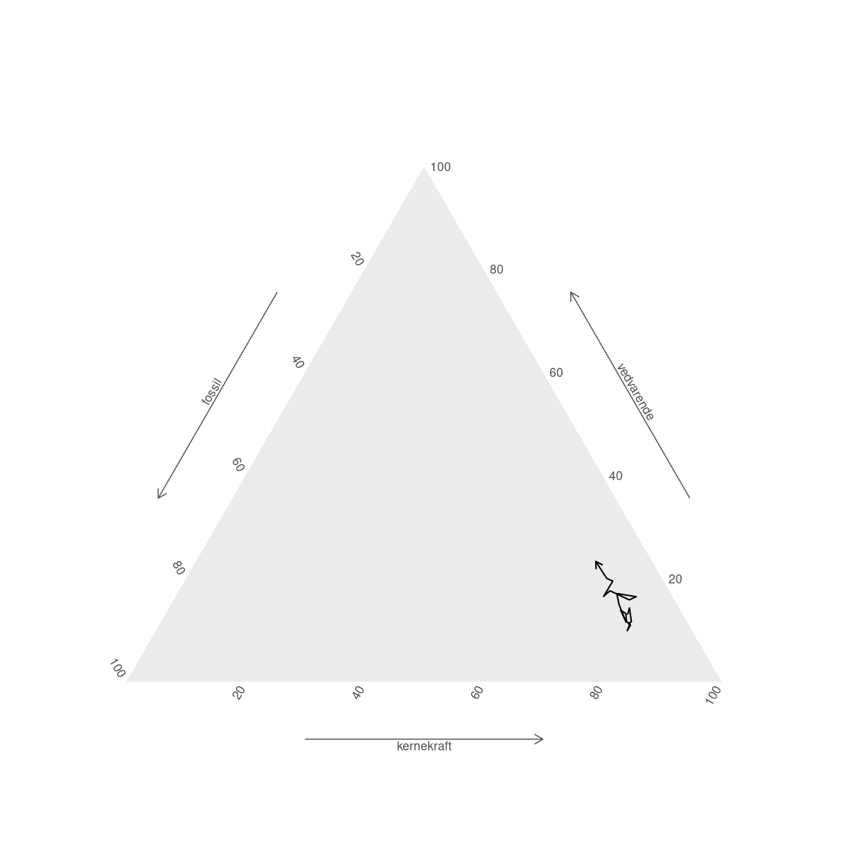
Stier kan bruges til at illustrere hvordan tingene har udviklet sig. Her skal vi huske at der kan optræde NA værdier i datasættet. Dem kan vi ikke plotte. vi bruger geom_path som geom - og smider en pil på, så vi kan se hvilken vej Frankrig bevæger sig.
elmix %>%
  filter(land == "France") %>%
  filter(complete.cases(.)) %>%
   ggplot(aes(x=fossil,
             y = vedvarende,
             z = kernekraft)) +
  geom_path(arrow = arrow(length=unit(.2, "cm"))) +
  coord_tern() +
  theme_hidetitles() +
  theme_showarrows()
Coordinate system already present. Adding new coordinate system, which will
replace the existing one.
plot of chunk unnamed-chunk-9
Blot som et eksempel på hvad man kan få ud hvis man bruger et par timer på hjælpefilerne:
ggtern(data = data.frame(x = rnorm(100),
                         y = rnorm(100),
                         z = rnorm(100)),
       aes(x, y, z)) +
  stat_density_tern(geom = 'polygon',
                    n    = 200,
                    aes(fill  = ..level..,
                        alpha = ..level..),
                    bdl = 0.02) +
  geom_point() +
  theme_rgbw() +
  labs(title = "Example Density/Contour Plot")    +
  scale_fill_gradient(low = "blue",high = "red")  +
  guides(color = "none", fill = "none", alpha = "none")
Warning: The dot-dot notation (`..level..`) was deprecated in ggplot2 3.4.0.
ℹ Please use `after_stat(level)` instead.
ℹ The deprecated feature was likely used in the ggplot2 package.
  Please report the issue at <https://github.com/tidyverse/ggplot2/issues>.
This warning is displayed once every 8 hours.
Call `lifecycle::last_lifecycle_warnings()` to see where this warning was
generated.
Warning: Removed 93 rows containing non-finite values (`StatDensityTern()`).
plot of chunk unnamed-chunk-10
Key Points
FIXME
Noter
Overview
Teaching: 0 min
Exercises: 0 minQuestions
FIXME
Objectives
FIXME
https://github.com/davidsjoberg/ggstream https://ivelasq.rbind.io/blog/other-geoms/
Key Points
FIXME