Parts of a whole
Overview
Teaching: 42 min
Exercises: 47 minQuestions
FIXME
Objectives
FIXME
Barplot - grouped and stacked
What are they?
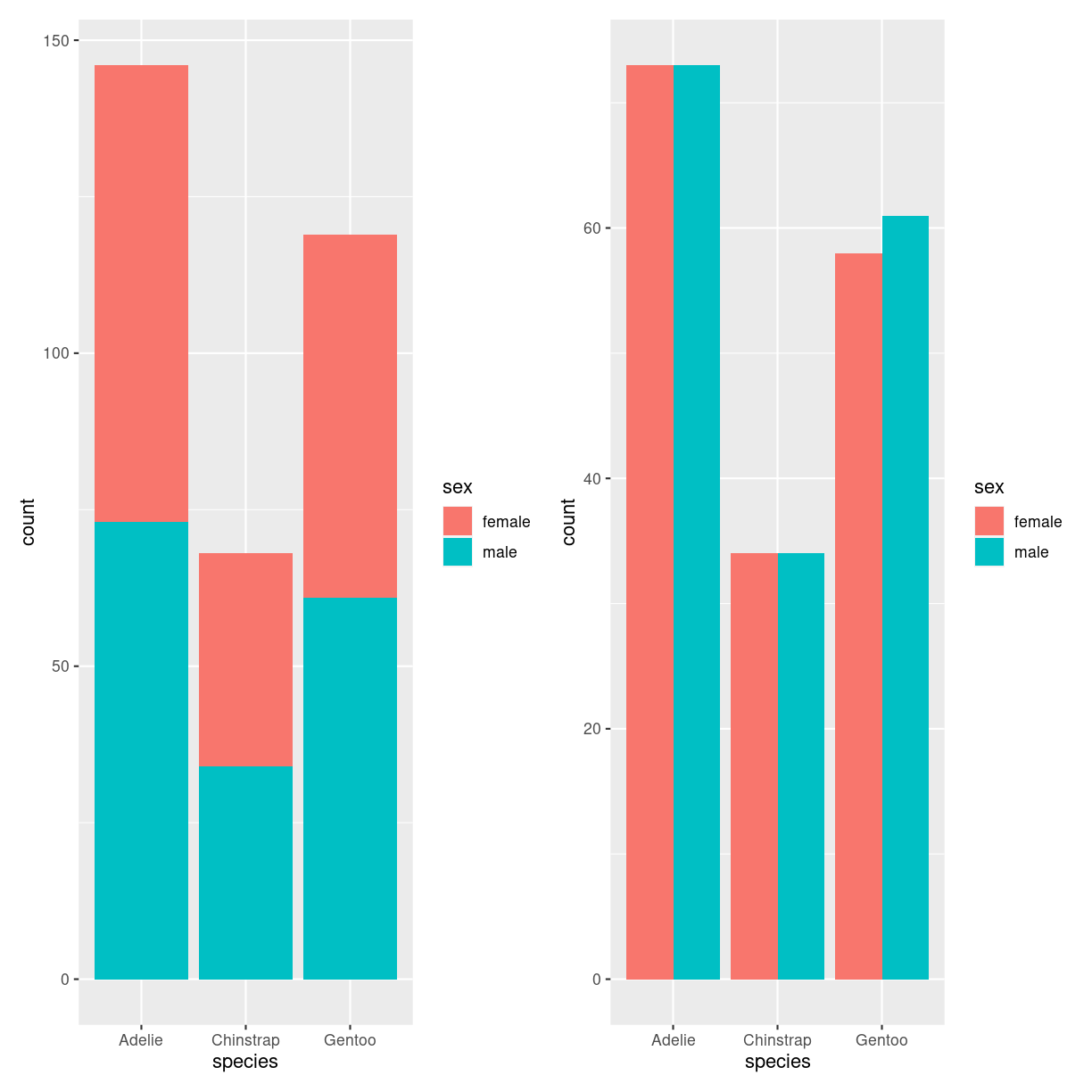
plot of chunk barplot_what
What do we use them for?
how do we make them?
penguins %>%
  filter(!is.na(sex)) %>%
  ggplot(aes(species, fill=sex)) +
  geom_bar()
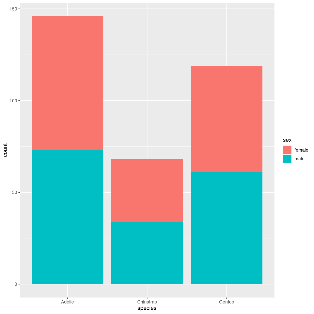
plot of chunk barplot_stacked_how
penguins %>%
  filter(!is.na(sex)) %>%
  ggplot(aes(species, fill=sex)) +
  geom_bar(position="dodge")
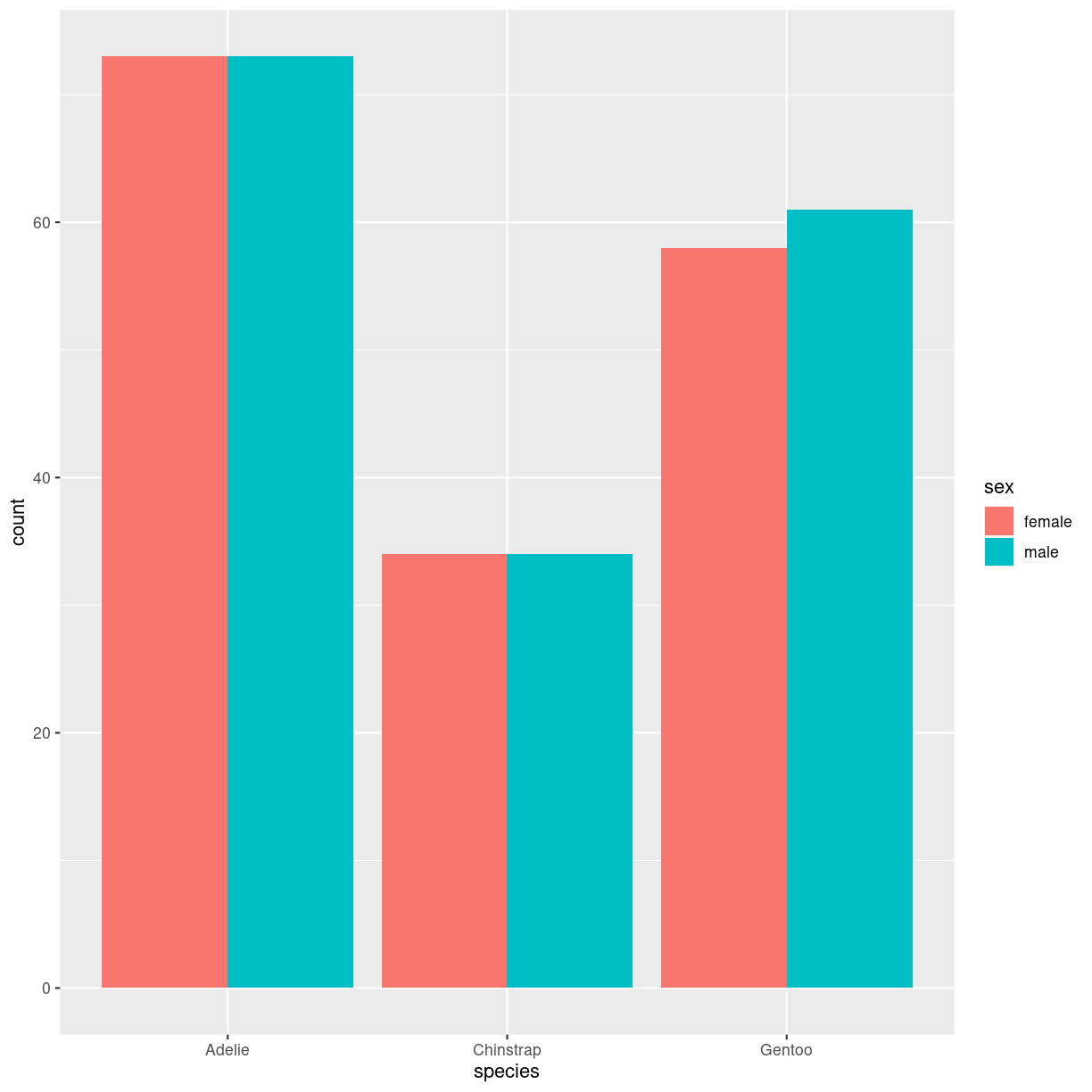
plot of chunk barplot_grouped_how
Interesting variations
Think about
Treemap
What are they?
Viser hierarkisk data i nestede rektangler. Hver gruppe repræsenteres af en rektangel, hvis areal er proportionalt med dens værdi.
treemap.
Den kan også gøres interaktiv med detreeR.
What do we use them for?
how do we make them?
Vi bygger dem med pakken treemap.
Vi skal bruge noget data. Det organiseres, i den enkleste udgave på denne måde:
data <- tribble(~group, ~value,
                "one", 13,
                "two", 5,
                "three", 22)
Og så laver vi det med:
library(treemap)
treemap(data,
        index = "group",
        vSize="value")
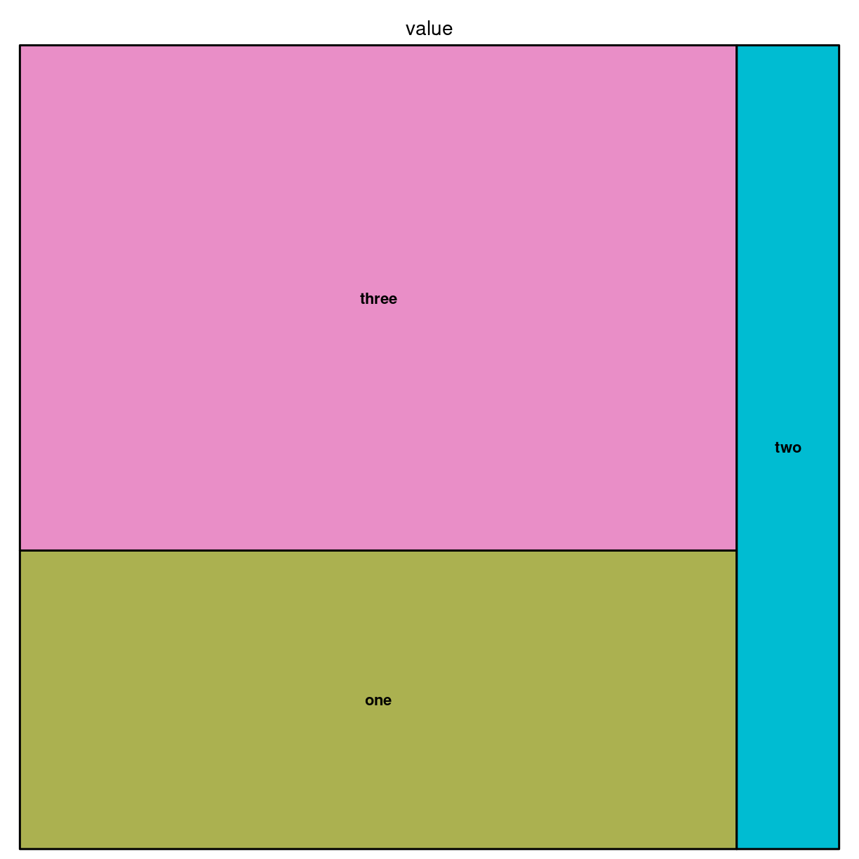
plot of chunk unnamed-chunk-3
Det kan også gøres med ggplot:
library(treemapify)
ggplot(data, aes(area = value, fill = group)) +
  geom_treemap()

plot of chunk unnamed-chunk-4
Interesting variations
Hierarkisk
For det tilfælde at en (eller flere) grupper har underkategorier.
group <- c(rep("group-1",4),rep("group-2",2),rep("group-3",3))
subgroup <- paste("subgroup" , c(1,2,3,4,1,2,1,2,3), sep="-")
value <- c(13,5,22,12,11,7,3,1,23)
data <- data.frame(group,subgroup,value)

# treemap
treemap(data,
            index=c("group","subgroup"),
            vSize="value",
            type="index"
            )
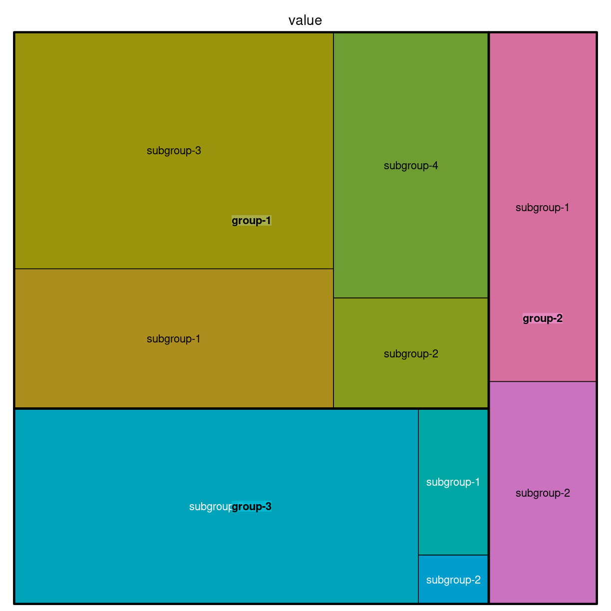
plot of chunk unnamed-chunk-5
Think about
Doughnut
What are they?
En lagkage med hul i. Og derfor ca. lige så ringe som lagkagediagrammer
What do we use them for?
Mange ting - som man ikke bør bruge dem til.
how do we make them?
fordi de er noget skrammel, understøtter ggplot2 dem ikke direkte.
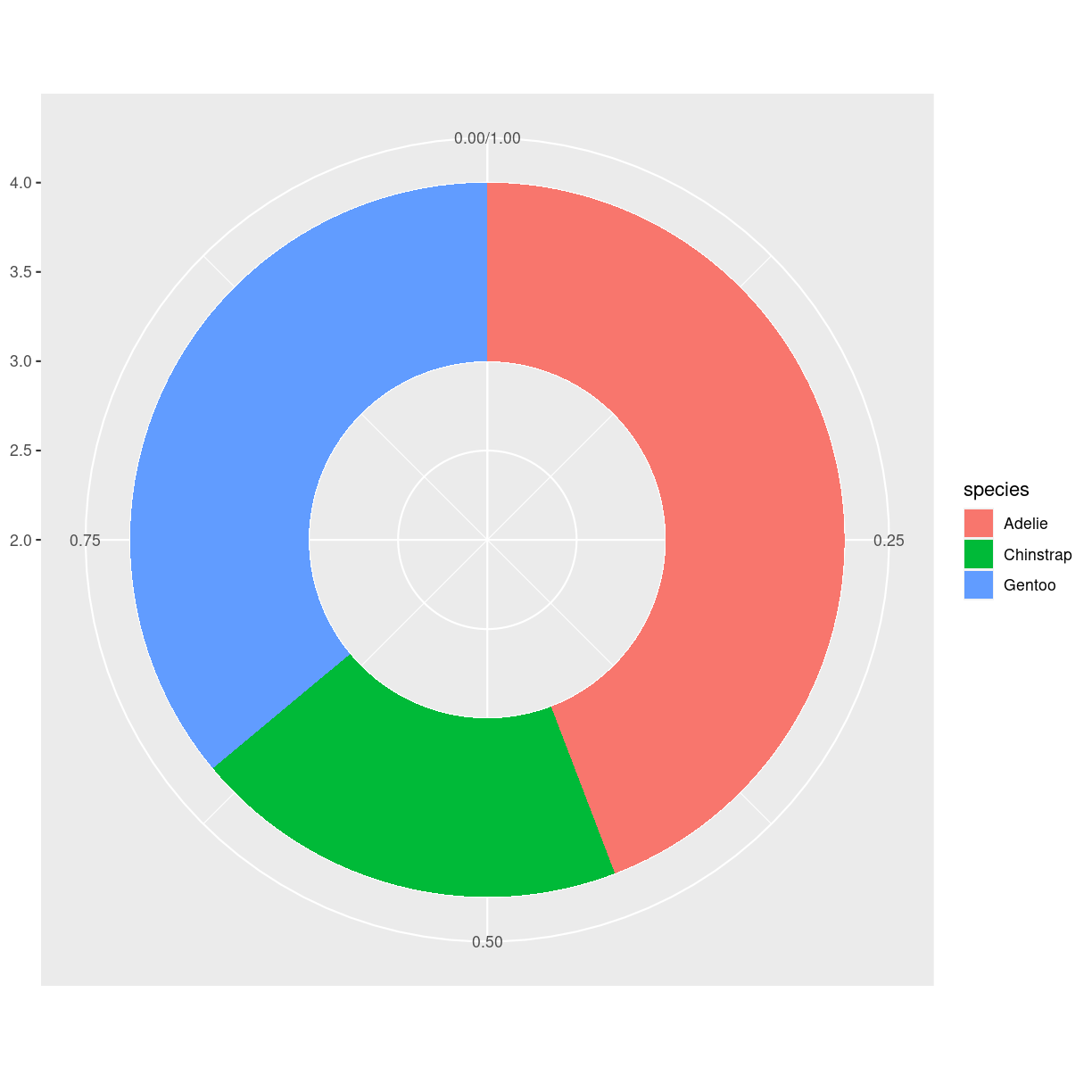
penguins %>%
  group_by(species) %>%
  summarise(count = n()) %>%
  ungroup() %>%
  mutate(frac = count/sum(count)) %>%
  mutate(ymax = cumsum(frac)) %>%
  mutate(ymin = lag(ymax, default = 0)) %>%
  ggplot(aes(ymax=ymax, ymin = ymin, xmax = 4, xmin = 3, fill=species)) +
  geom_rect() +
  coord_polar(theta="y") +
  xlim(c(2,4))
plot of chunk unnamed-chunk-6
# Create test data.
data <- data.frame(
  category=c("A", "B", "C"),
  count=c(10, 60, 30)
)

# Compute percentages
data$fraction = data$count / sum(data$count)

# Compute the cumulative percentages (top of each rectangle)
data$ymax = cumsum(data$fraction)

# Compute the bottom of each rectangle
data$ymin = c(0, head(data$ymax, n=-1))

ggplot(data, aes(ymax=ymax, ymin=ymin, xmax=4, xmin=3, fill=category)) +
     geom_rect() +
     coord_polar(theta="y") + # Try to remove that to understand how the chart is built initially
     xlim(c(2, 4)) # Try to remove that to see how to make a pie chart
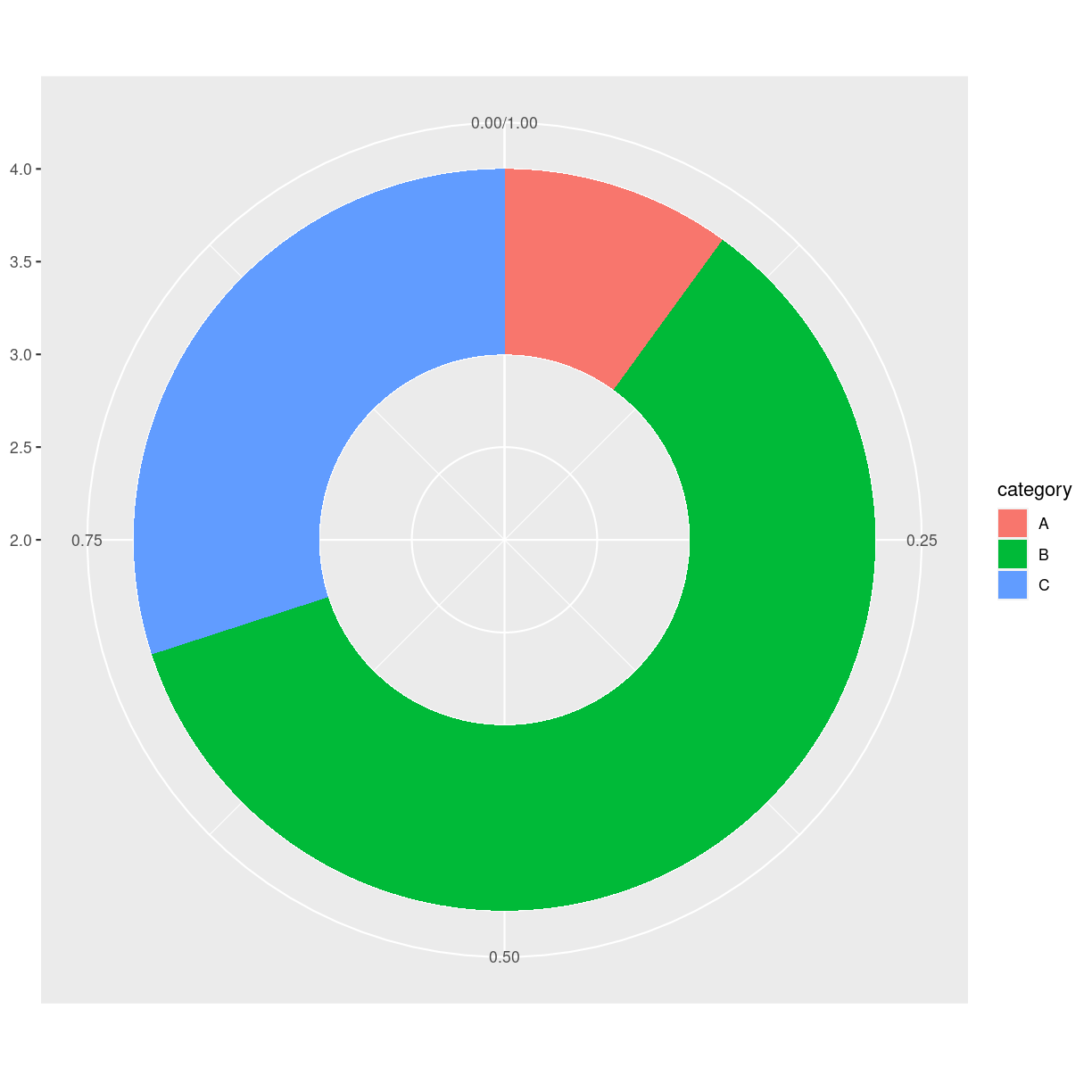
plot of chunk unnamed-chunk-7
Interesting variations
Think about
Pie chart
What are they?
verdens værste plot type.
En cirkel delt ind i slices hvor hver repræsentere en andel af helet.
What do we use them for?
Alt. det er en del af problemet…
how do we make them?
penguins %>%
  group_by(species) %>%
  summarise(count = n()) %>%
  ungroup() %>%
  ggplot(aes(x="", y =count, fill = species)) +
  geom_bar(stat = "identity", width = 1) +
  coord_polar("y", start = 0)
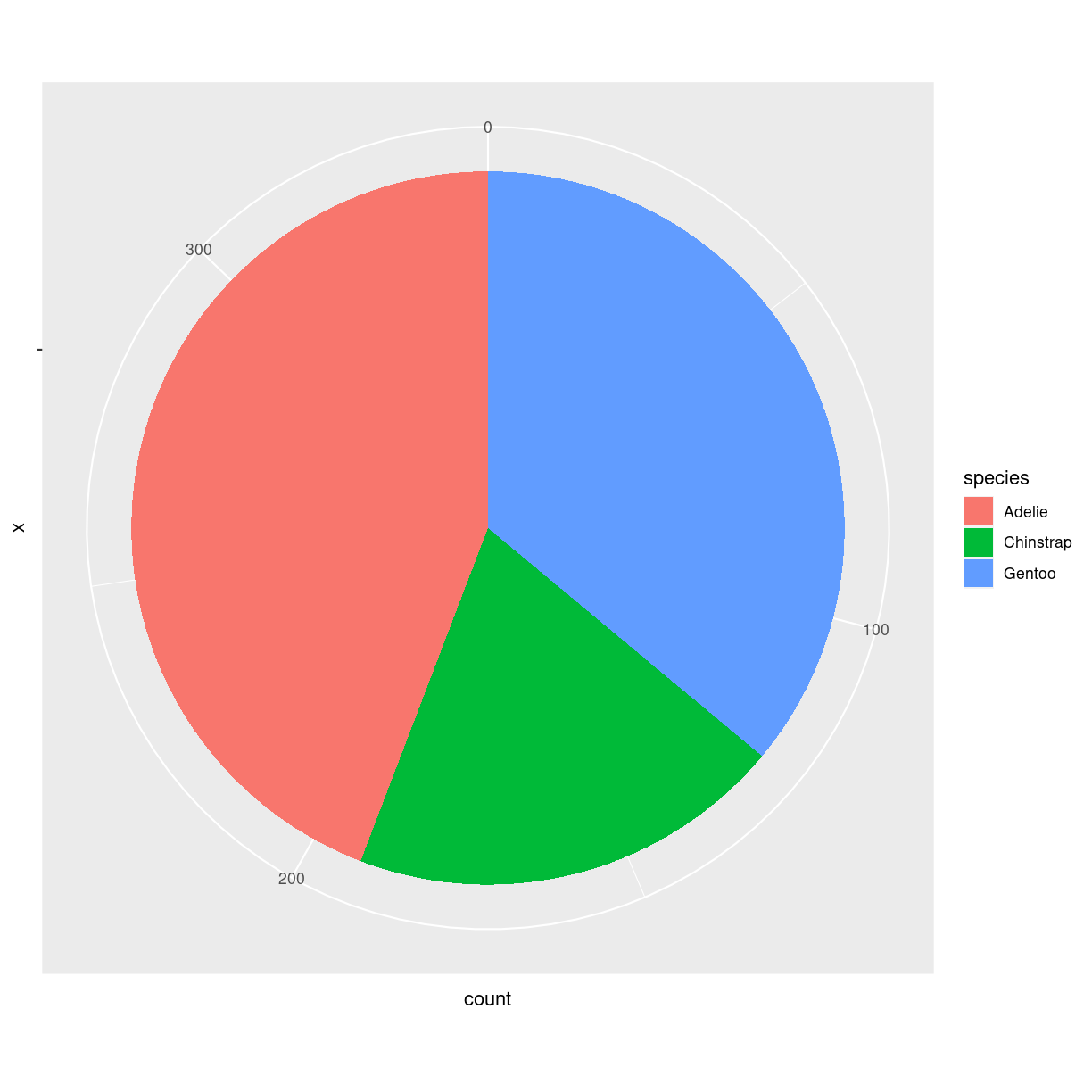
plot of chunk unnamed-chunk-8
ggplot har holdninger. Så der er ikke et geom_ i ggplot til at lave lagkager.
Skal man - så laver man et barplot, og ændrer på koordinatsystemet med coord_polar.
Interesting variations
Der er ingen gode variationer. Lad nu bare være.
Think about
Overvej helt at lade være med at lave den. Brug barcharts, treemaps eller andet.
Hvorfor er det grafen fra helvede?
Problemet med piecharts er at de grundlæggende viser forskelle på forskellige grupper ved at vise en vinkel. Og det er vi mennesker ret dårlige til.
lad os lave tre piecharts, og tre barcharts. https://www.data-to-viz.com/caveat/pie.html
library(tidyverse)
a <- data.frame( name=letters[1:5], value=c(17,18,20,22,24) )
b <- data.frame( name=letters[1:5], value=c(20,18,21,20,20)  )
c <- data.frame( name=letters[1:5], value=c(24,23,21,19,18) )

a <- a %>%
  arrange(desc(name)) %>%
  mutate(prop = value / sum(a$value) *100) %>%
  mutate(ypos = cumsum(prop)- 0.5*prop )

b <- b %>%
  arrange(desc(name)) %>%
  mutate(prop = value / sum(b$value) *100) %>%
  mutate(ypos = cumsum(prop)- 0.5*prop )

c <- c %>%
  arrange(desc(name)) %>%
  mutate(prop = value / sum(c$value) *100) %>%
  mutate(ypos = cumsum(prop)- 0.5*prop )

# Basic piechart
pa <- ggplot(a, aes(x="", y=prop, fill=name)) +
  geom_bar(stat="identity", width=1, color="white") +
  coord_polar("y", start=0) +
  theme_void() +
  theme(legend.position="none") +
  geom_text(aes(y = ypos, label = name), color = "white", size=6) +
  scale_fill_brewer(palette="Set2")

pb <- ggplot(b, aes(x="", y=prop, fill=name)) +
  geom_bar(stat="identity", width=1, color="white") +
  coord_polar("y", start=0) +
  theme_void() +
  theme(legend.position="none") +
  geom_text(aes(y = ypos, label = name), color = "white", size=6) +
  scale_fill_brewer(palette="Set2")

pc <- ggplot(c, aes(x="", y=prop, fill=name)) +
  geom_bar(stat="identity", width=1, color="white") +
  coord_polar("y", start=0) +
  theme_void() +
  theme(legend.position="none") +
  geom_text(aes(y = ypos, label = name), color = "white", size=6) +
  scale_fill_brewer(palette="Set2")

pa + pb + pc
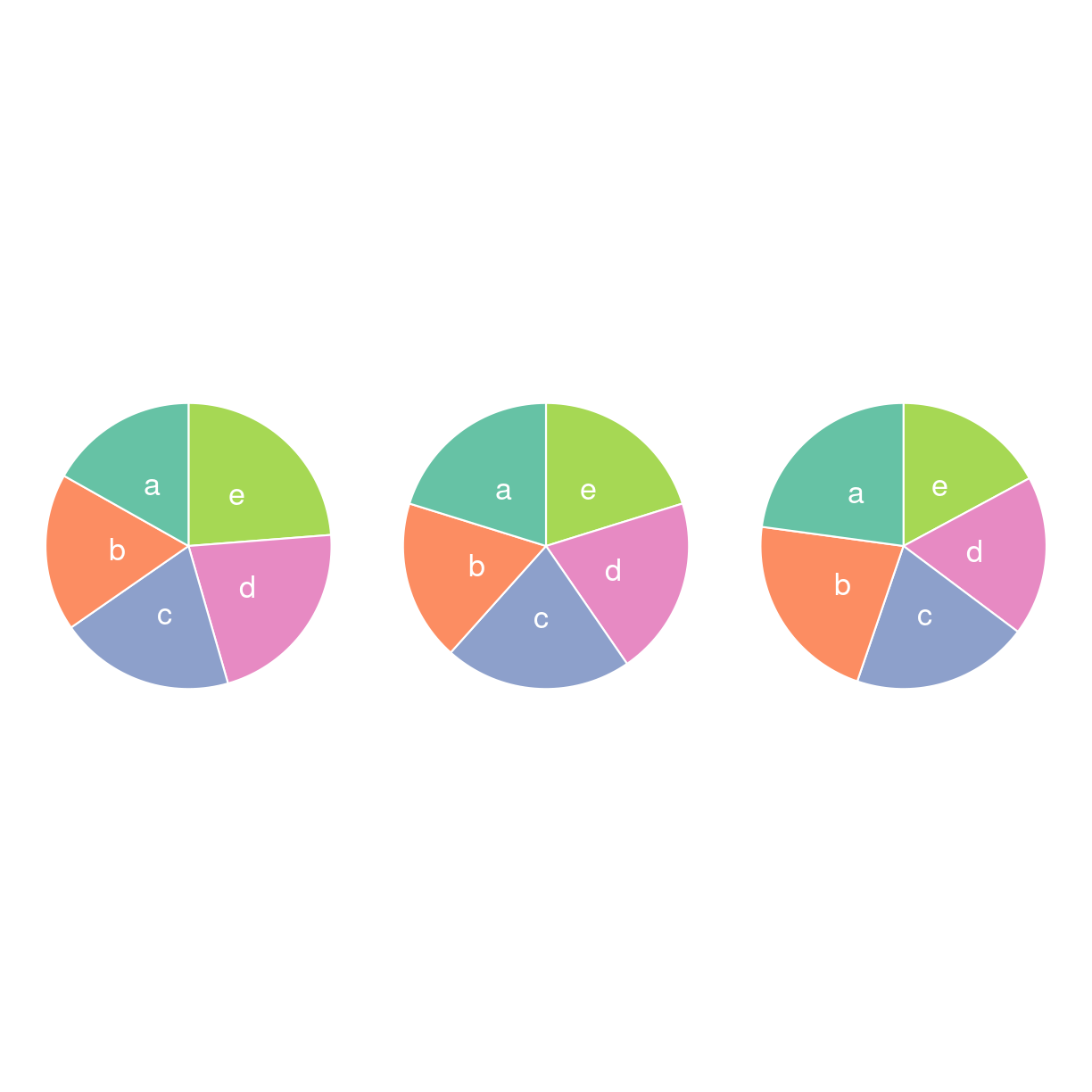
plot of chunk unnamed-chunk-9
Hvad er udviklingen i det?
ba <- a %>% ggplot(aes(name, value, fill = name))  +
  geom_bar(stat= "identity") +
  scale_fill_brewer(palette="Set2") +
  theme(
    legend.position = "none",
    panel.grid = element_blank()
  ) +
  xlab("") +
  ylab("")
bb <- b %>% ggplot(aes(name, value, fill = name))  +
  geom_bar(stat= "identity") +
  scale_fill_brewer(palette="Set2") +
  theme(
    legend.position = "none",
    panel.grid = element_blank()
  ) +
  xlab("") +
  ylab("")
bc <- c %>% ggplot(aes(name, value, fill = name))  +
  geom_bar(stat= "identity") +
  scale_fill_brewer(palette="Set2") +
  theme(
    legend.position = "none",
    panel.grid = element_blank()
  ) +
  xlab("") +
  ylab("")
ba+bb+bc
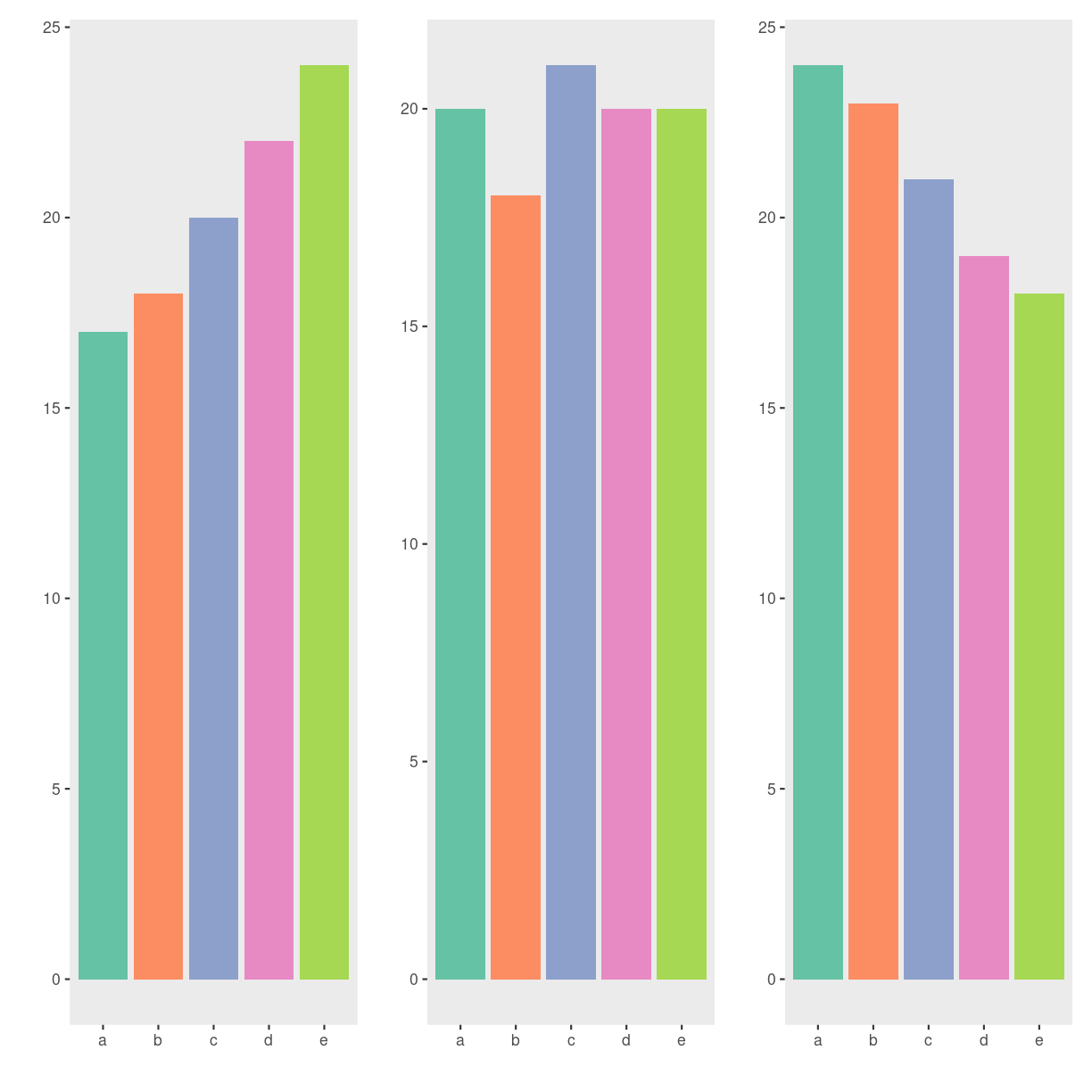
plot of chunk unnamed-chunk-10
Kunne du se det da det var lagkagediagrammer? Nej, det kunne du ikke. Så lad nu bare være med at lave dem.
Pie charts can be made even worse
Please dont. 3D-effects. Exploding piecharts. Percentages that do not sum to
- Too many slices. Almost anything added to piecharts will make them even worse.
It can be done in R. But it is difficult. ggplot2 have opinions, and makes it difficult to commit crimes against datavisualisation.
In some, very rare, cases a pie chart will be the best chart for what we want to visualize. And in some, even more rare cases, a pie chart can be improved to make it even better, by adding stuff to it.
But as a general rule: Dont.
Dendrogram
https://cran.r-project.org/web/packages/ggdendro/vignettes/ggdendro.html
What are they?
What do we use them for?
how do we make them?
library(ggraph)
library(igraph)
Attaching package: 'igraph'
The following objects are masked from 'package:lubridate':

    %--%, union
The following objects are masked from 'package:dplyr':

    as_data_frame, groups, union
The following objects are masked from 'package:purrr':

    compose, simplify
The following object is masked from 'package:tidyr':

    crossing
The following object is masked from 'package:tibble':

    as_data_frame
The following objects are masked from 'package:stats':

    decompose, spectrum
The following object is masked from 'package:base':

    union
library(tidyverse)

# create an edge list data frame giving the hierarchical structure of your individuals
d1 <- data.frame(from="origin", to=paste("group", seq(1,5), sep=""))
d2 <- data.frame(from=rep(d1$to, each=5), to=paste("subgroup", seq(1,25), sep="_"))
edges <- rbind(d1, d2)

# Create a graph object
mygraph <- graph_from_data_frame( edges )

# Basic tree
ggraph(mygraph, layout = 'dendrogram', circular = FALSE) +
  geom_edge_diagonal() +
  geom_node_point() +
  theme_void()
Warning: Using the `size` aesthetic in this geom was deprecated in ggplot2 3.4.0.
ℹ Please use `linewidth` in the `default_aes` field and elsewhere instead.
This warning is displayed once every 8 hours.
Call `lifecycle::last_lifecycle_warnings()` to see where this warning was
generated.
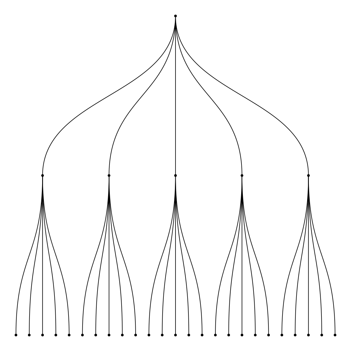
plot of chunk unnamed-chunk-11
Men også ggdendro! Den baserer sig på resultater fra hclust
Interesting variations
Think about
Circular packing
What are they?
What do we use them for?
Kan vise hierarkisk organisering. Ækvivalent til treemap og dendrogrammer. Hver node repræsenteres af en cirkel. Hver subnode repræsenteres som en cirkel inden i denne cirkel.
Enkelt niveua laves med ggiraph og/eller packcirles.
Flere niveauer laves med ggraph
Der kan laves interaktive ting med flere niveauer med circlepackeR.
how do we make them?
Interesting variations
Think about
Key Points
FIXME