Nicer barcharts
Last updated on 2026-06-15 | Edit this page
Overview
Questions
- How do we style barcharts to look better?
Objectives
- Explain how to use ggplot to make barcharts look better
Introduction
Barcharts are easy to make, but how can we get them to look nicer?
This is a checklist for cleaning up your barchart.
We start by getting some data:
R
library(tidyverse)
OUTPUT
── Attaching core tidyverse packages ──────────────────────── tidyverse 2.0.0 ──
✔ dplyr     1.2.1     ✔ readr     2.2.0
✔ forcats   1.0.1     ✔ stringr   1.6.0
✔ ggplot2   4.0.3     ✔ tibble    3.3.1
✔ lubridate 1.9.5     ✔ tidyr     1.3.2
✔ purrr     1.2.2
── Conflicts ────────────────────────────────────────── tidyverse_conflicts() ──
✖ dplyr::filter() masks stats::filter()
✖ dplyr::lag()    masks stats::lag()
ℹ Use the conflicted package (<http://conflicted.r-lib.org/>) to force all conflicts to become errors
R
library(palmerpenguins)
OUTPUT
Attaching package: 'palmerpenguins'

The following objects are masked from 'package:datasets':

    penguins, penguins_raw
R
penguin_example <- penguins |>
  select(species)
Barcharts and histograms are often confused. Histograms visualizes 1 dimentional data, barcharts 2 dimensional. The easy way to distinguish them is the white space between the columns. Histograms are describing a continious set of data, broken down into bins. Therefore there is no breaks between the columns. Barcharts describes values in discrete categories.
A further distinction in ggplot is between bar charts and column charts.
Bar charts, made with geom_bar() makes the height of the
bar propotional to the number of cases/observations in each group, where
as geom_col makes the heights proportional to a value in
the group - that is just one value pr. group.
The way this happens is in the inner workings of the ggplot object.
All geoms come with an associated function/argument
stats, that controls the statistical transformation of the
input data. In geom_bar that transformation is
stat_count(), that counts the observations in each group.
In geom_col´ it is ´stat_identity(), which does nothing
with the data.
The us make the first barchart:
R
penguin_example |>
ggplot(aes(x = species)) +
geom_bar()
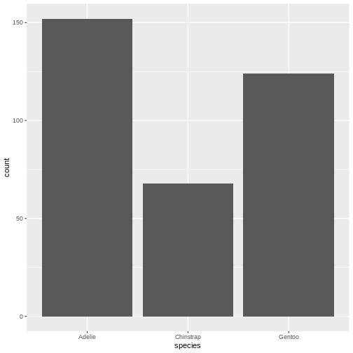
This barchart is boring. Grey in grey.
Step 1 - colours and labels
The first step would be to do something about the colours, and add labels and a title to the plot:
R
penguin_example |>
ggplot(aes(x = species)) +
geom_bar(fill = "darkorchid3") +
labs(
  x = element_blank(),
  y = "Number of penguins",
  title = "Number of penguins at Palmer Station, Antarctica")
WARNING
Warning: `label` cannot be a <ggplot2::element_blank> object.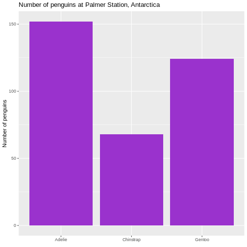 It is not strictly necessary to remove the label of the x-axis, but it
is superfluous in this case.
It is not strictly necessary to remove the label of the x-axis, but it
is superfluous in this case.
Second step - the order of the bars
Note that the plot orders the species of penguins in alphabetical order. For some purposes this is perfectly fine. But in general we prefer to have the categories ordered by size, that is the number of observations.
The order of categories can be controlled by converting the
observations to a categorical value, and ordering the levels in that
factor by frequency.
The forcats library makes that relatively easy, using
the function fct_infreq(), which converts the character
vector that is species to a factor with levels ordered by
frequency:
R
penguin_example |>
  mutate(species = fct_infreq(species)) |>
ggplot(aes(x = species)) +
geom_bar(fill = "darkorchid3") +
labs(
  x = element_blank(),
  y = "Number of penguins",
  title = "Number of penguins at Palmer Station, Antarctica")
WARNING
Warning: `label` cannot be a <ggplot2::element_blank> object.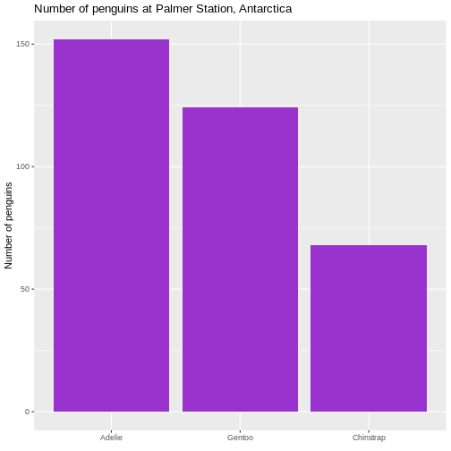 This facilitates the reading of the graph - it becomes very easy to see
that the most frequent species of penguin is Adelie penguins.
This facilitates the reading of the graph - it becomes very easy to see
that the most frequent species of penguin is Adelie penguins.
Rotating the plot
We only have three here, but if we have a lot of categories, it is
often preferable to have the columns as bars on the y-axis. We do that
by changing the x in the aes() function to
y:
R
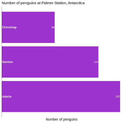
penguin_example |>
  mutate(species = fct_infreq(species)) |>
ggplot(aes(y = species)) +
geom_bar(fill = "darkorchid3") +
labs(
  y = element_blank(),
  x = "Number of penguins",
  title = "Number of penguins at Palmer Station, Antarctica")
WARNING
Warning: `label` cannot be a <ggplot2::element_blank> object.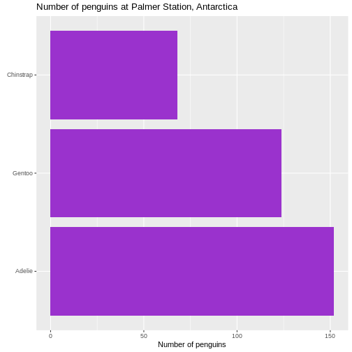
Size of text
The default size of the text on labels, title etc is a bit to the small side. To improve readability, we change the base_size parameter in the default theme of ggplot to 14. You might need to play around with the value, depending on the number of categories.
R
penguin_example |>
  mutate(species = fct_infreq(species)) |>
ggplot(aes(y = species)) +
geom_bar(fill = "darkorchid3") +
labs(
  y = element_blank(),
  x = "Number of penguins",
  title = "Number of penguins at Palmer Station, Antarctica") +
  theme_grey(base_size = 14) +
  theme(plot.title = element_text(size = rel(1.1)))
WARNING
Warning: `label` cannot be a <ggplot2::element_blank> object.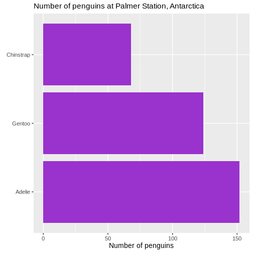 We also changed the scaling of the title of the plot. The size of that
is now 10% larger than the base size. We can do that by specifying a
specific size, but here we have done it using the
We also changed the scaling of the title of the plot. The size of that
is now 10% larger than the base size. We can do that by specifying a
specific size, but here we have done it using the rel()
function which changes the size relative to the base font size in the
plot.
Removing unnecessary space
There is a bit of empty space between the columns and the labels on the y-axis.
Let us get rid of that:
R
penguin_example |>
  mutate(species = fct_infreq(species)) |>
ggplot(aes(y = species)) +
geom_bar(fill = "darkorchid3") +
labs(
  y = element_blank(),
  x = "Number of penguins",
  title = "Number of penguins at Palmer Station, Antarctica") +
  theme_grey(base_size = 14) +
  theme(plot.title = element_text(size = rel(1.1))) +
  scale_x_continuous(expand = expansion(mult = c(0, 0.01)))
WARNING
Warning: `label` cannot be a <ggplot2::element_blank> object.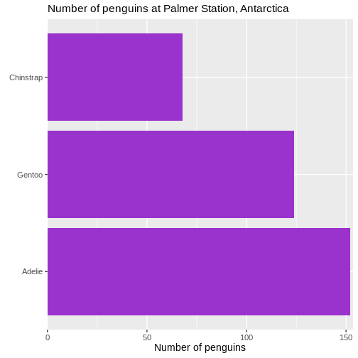 We control what is happening on the x-scale by using the family of
scale_x functions. Because it is a continuous scale, more
specifically scale_x_continuous().
What is happening by default is that the scale is expanded relative to the minimum and maximum values of the data. If we want to change that, we cab either add absolute values (or subtract by using negative values), or we can make a change relative to the data. That makes the change robust to changes in the underlying data.
The mult() function in this case add 0 expansion to the left side of the scale, and 1% ~ 0.01 to the righthand side of the scale.
Remove clutter
There ar horizontal lines in the plot background that are unnessecary. And the grey background we get by default is not very nice. Remove them:
R
penguin_example |>
  mutate(species = fct_infreq(species)) |>
ggplot(aes(y = species)) +
geom_bar(fill = "darkorchid3") +
labs(
  y = element_blank(),
  x = "Number of penguins",
  title = "Number of penguins at Palmer Station, Antarctica") +
  theme(plot.title = element_text(size = rel(1.1))) +
  scale_x_continuous(expand = expansion(mult = c(0, 0.01))) +
  theme_minimal(base_size = 14) +
  theme(
    panel.grid.major.y = element_blank(),
    panel.grid.minor.y = element_blank(),
  )
WARNING
Warning: `label` cannot be a <ggplot2::element_blank> object.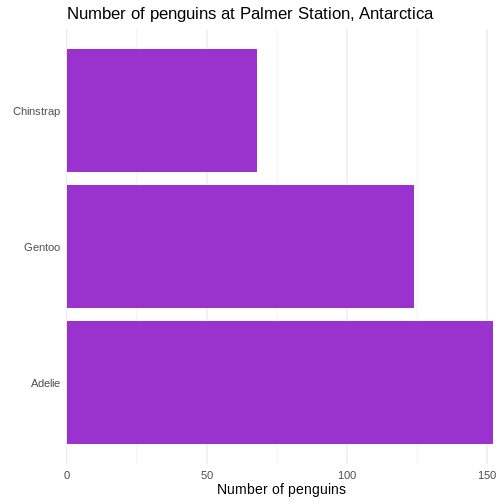 First we change the default theme of the plot from
theme_grey to theme_minimal, which gets rid of
the grey background. In the additional theme() function we
remove the gridlines, both major and minor gridlines, on the y-axis, by
setting them to the speciel plot element
element_blank()
Add raw numbers to the plot
Especially for barcharts, it can make sense to add the raw values to the columns, rather than relying on reading the values from the x-axis.
That can be done, but a more general, and easier to understand, approach is to construct a dataframe with the data:
R
penguin_count <- count(penguin_example, species)
penguin_example |>
  mutate(species = fct_infreq(species)) |>
  ggplot(aes(y = species)) +
  geom_bar(fill = "darkorchid3") +
  labs(
    y = element_blank(),
    x = element_blank(),
    title = "Number of penguins at Palmer Station, Antarctica") +
    theme(plot.title = element_text(size = rel(1.1))) +
    theme_minimal(base_size = 14) +
    theme(
      panel.grid.major = element_blank(),
      panel.grid.minor = element_blank()  ) +
  geom_text(data = penguin_count, mapping = aes(x = n, y = species, label = n),
    hjust = 1,
    nudge_x = -0.25,
    colour = "white") +
  geom_vline(xintercept = 0) +
  scale_x_continuous(breaks = NULL, expand = expansion(mult = c(0, 0.01)))
WARNING
Warning: `label` cannot be a <ggplot2::element_blank> object.
`label` cannot be a <ggplot2::element_blank> object.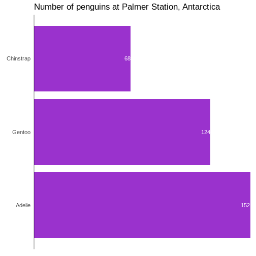
In general it is a good idea to remove all extraneous pixels in the graph. And when we add the counts directly to the plot, we can get rid of the x-axis entirely.
On the other hand, it can be a good idea in this specific example, to
add a vertical indication of where the x=0 intercept is:
geom_vline(xintercept = 0).
And: Always remember to think about the contrast between the colour of the bars and the text!
Add labels to the plot
We can do the same with labels if we want:
R
penguin_example |>
  mutate(species = fct_infreq(species)) |>
  ggplot(aes(y = species)) +
  geom_bar(fill = "darkorchid3") +
  labs(
    y = NULL,
    x = "Number of penguins",
    title = "Number of penguins at Palmer Station, Antarctica"  ) +
  theme_minimal(base_size = 14) +
  theme(
    plot.title = element_text(size = rel(1.1)),
    panel.grid.major.y = element_blank(),
    panel.grid.minor.y = element_blank(),
    panel.grid.major.x = element_blank(),
    panel.grid.minor.x = element_blank()  ) +
  scale_x_continuous(expand = expansion(mult = c(0, 0.01)), breaks = NULL) +
  scale_y_discrete(breaks = NULL) +
  geom_text(
    data = penguin_count,
    mapping = aes(x = n, y = species, label = n),
    hjust = 1,
    nudge_x = -0.25,
    colour = "white"  ) +
  geom_text(
    data = penguin_count,
    mapping = aes(x = 0, y = species, label = species),
    hjust = 0,
    nudge_x = 0.25,
    colour = "white",
    fontface = "bold",
    size = 4.5  ) +
  geom_vline(xintercept = 0)
Slimmer bars
Depending on aspect ratio of the final plot, number of categories etc, we might want to adjust the width of the bars:
R
penguin_example |>
  mutate(species = fct_infreq(species)) |>
  ggplot(aes(y = species)) +
  geom_bar(
    fill = "darkorchid3",
    width = 0.4  ) +
  labs(
    y = NULL,
    x = "Number of penguins",
    title = "Number of penguins at Palmer Station, Antarctica"  ) +
  theme_minimal(base_size = 14) +
  theme(
    plot.title = element_text(size = rel(1.1)),
    panel.grid.major.y = element_blank(),
    panel.grid.minor.y = element_blank(),
    panel.grid.major.x = element_blank(),
    panel.grid.minor.x = element_blank()  ) +
  scale_x_continuous(expand = expansion(mult = c(0, 0.01)), breaks = NULL) +
  scale_y_discrete(breaks = NULL) +
  geom_text(
    data = penguin_count,
    mapping = aes(x = n, y = species, label = n),
    hjust = 1,
    nudge_y = 0.1,
    colour = "white",
    size = 5.5  ) +
  geom_text(
    data = penguin_count,
    mapping = aes(x = 0, y = species, label = species),
    hjust = 0,
    nudge_x = 0.5,
    nudge_y = 0.1,
    colour = "white",
    fontface = "bold",
    size = 4.5  ) +
  geom_vline(xintercept = 0)
- Relatively small changes to a bar chart can make it look much more professional