Testing for normality
Last updated on 2026-06-15 | Edit this page
Overview
Questions
- How do we determine if a dataset might be normally distributed?
Objectives
- Explain how to visually estimate normality
- Explain how to get numerical indications of normality
A common question is: Is my data normally distributed?
Before panicking make sure that it actually is a problem that your data might not be normally distributed. Making a linear regression eg does not require the data to be normally distributed.
On the other hand, a linear regression requires the residuals to be normally distributed. So it is useful to be able to determine if it is.
What does it mean that it is normally distributed?
It means that the distribution of our data has the same properties as the normal distribution.
Let us get some data that we can test, first by loading the
palmerpenguins dataset:
R
library(tidyverse)
library(palmerpenguins)
And then by extracting the bill depth of chinstrap penguins:
R
normal_test_data <- penguins |>
  filter(species == "Chinstrap") |>
  select(bill_depth_mm)
Mean and median
One of the properties of the normal distribution is that the mean and median of the data is equal. Let us look at the penguins:
R
summary(normal_test_data)
OUTPUT
 bill_depth_mm
 Min.   :16.40
 1st Qu.:17.50
 Median :18.45
 Mean   :18.42
 3rd Qu.:19.40
 Max.   :20.80
This is actually pretty close! But equality between median and mean is a neccesary, not a sufficient condition.
What next. A histogram of the data should look normal. Let us take a closer look at bill_depth_mm where mean and median are closest:
R
normal_test_data |>
  ggplot(aes(x=bill_depth_mm)) +
  geom_histogram()
OUTPUT
`stat_bin()` using `bins = 30`. Pick better value `binwidth`.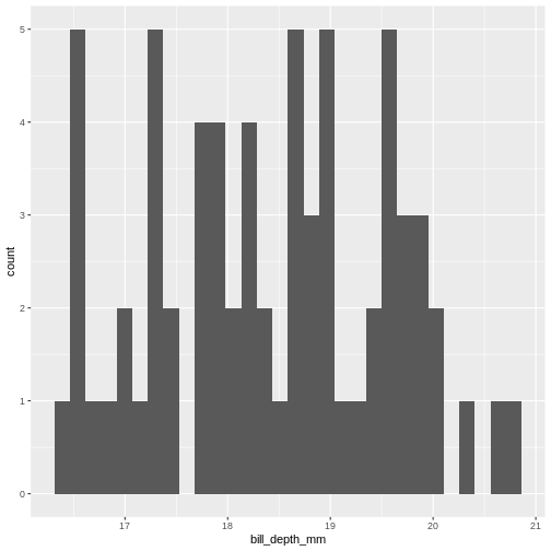
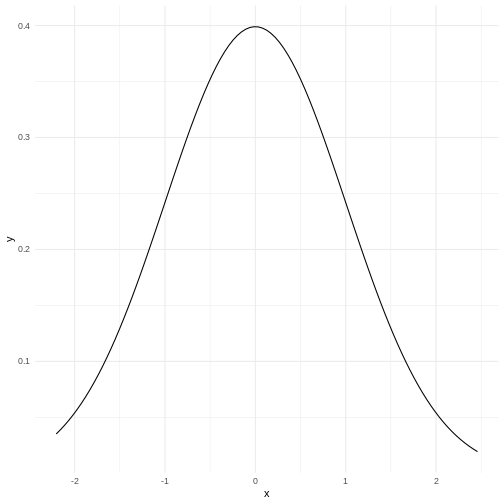
A normal distribution would have this shape:
 Our histogram does not really look like the theoretical curve. The fact
that mean and median are almost identical was not a sufficient criterium
for normalcy.
Our histogram does not really look like the theoretical curve. The fact
that mean and median are almost identical was not a sufficient criterium
for normalcy.
The shape of a histogram is heavily dependent on the bins we choose. Density plots are often a better way of visualizing the distribution:
R
normal_test_data |>
  ggplot(aes(x=bill_depth_mm)) +
  geom_density()
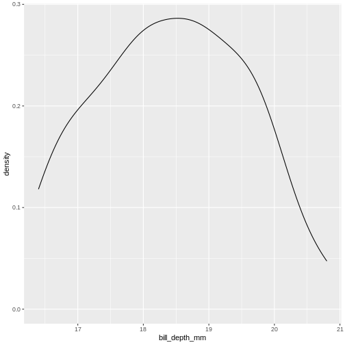
We can think of this as a histogram with infinitely small bins.
This does look more normal - but it would be nice to be able to quantize the degree of normalcy.
Percentiels and QQ-plots as a test
We know a lot about the properties of the normal distribution.
- 50% of the observations in the data are smaller than the mean
- conversely 50% are larger.
- We also know that 50% of the observations should be in the interquartile range.
- 2.5% of the observations (the 2.5 percentile) are smaller than the mean minus 1.96 times the standard deviation.
And for each of the observations we actually have, we can calculate which quantile, or percentile it is in. And we can calculate what percentile it should be in.
Comparing those gives us an indication of how well the data conforms to a normal distribution.
Rather than doing that by hand, we can get R to do it for us in a nice graphical way:
R
normal_test_data |>
  ggplot(aes(sample = bill_depth_mm)) +
  geom_qq() +
  geom_qq_line()
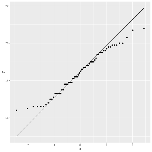
The geom_qq function calculate and plots which
percentile an observation is in.
Rather than being given percentiles, we are given the value that the percentile corresponds to if we calculate it as number of standard deviations from the mean.
This results in plots that are more comparable.
geom_qq_line plots the line corresponding til the values
the percentiles should have, if the data was normally distributed.
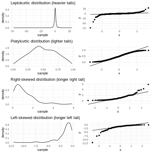
A common theme is that the midle of the data falls relatively close to the line, and that there are deviations from the line at both ends. In this case the deviations are largish, indicating that the data is not normally distributed.
We have two tails in the qq-plot, a left and a right. And they can be either above or below the qq-line.
That results in four different cases, that informs us about what is wrong with the data - in regards to how it deviates from normalcy.
| Left tail | Right tail | Name | What |
|---|---|---|---|
| Above | Below | Leptokurtic | Heavier tails - ie. more extreme values. Higher kurtosis |
| Below | Above | Platykurtic | Lighter tails - ie. fewer extreme values. Lower kurtosis |
| Above | Above | Right skewed | A tail that stretches to the higher values - the extreme values are larger. |
| Below | Below | Left skewed | A tail that stretches to the lower values - the extreme values are smaller. |
Numerical measures rather than graphical
With experience the qq-plots can be used to determine if the data is normally distributed - the points are exactly on the line. But only rarely will the points match exactly - even if the data is normally distributed enough. And how much can the tails deviate from the line before the data is not normally distributed enough?
The deviations can be described numerically using two parameters:
Kurtosis and skewness.
Base-R do not have functions for this, but the package
e1071 does:
R
library(e1071)
OUTPUT
Attaching package: 'e1071'OUTPUT
The following object is masked from 'package:ggplot2':

    element
Skewness
R
skewness(normal_test_data$bill_depth_mm, na.rm = TRUE)
OUTPUT
[1] 0.006578141As a rule of thumb, skewness should be within +/-0.5 if the data is normally distributed. Values between +/-0.5 and +/- 1 indicates a moderate skewness, where data can still be approximately normally distributed. Values larger that +/-1 indicates a significant skewness, and the data is probably not normally distributed.
Kurtosis
R
kurtosis(normal_test_data$bill_depth_mm, na.rm = TRUE)
OUTPUT
[1] -0.960087Evaluating the kurtosis is a bit more complicated as the kurtosis for a normal distribution is 3. We therefore look at excess kurtosis, where we subtract 3 from the calculated kurtosis. * An value of +/-1 excess kurtosis indicates that the data has a ‘tailedness’ close to the normal distribution. * Values between +/-1 and +/-2 indicates a moderate deviation from the normal distribution, but the data can still be approximately normally distributed. * Values larger than +/-2 is in general taken as an indication that the data is not normally distributed.
More direct tests
The question of whether or not data is normally distributed is important in many contexts, and it should come as no surprise that a multitude of tests has been devised for testing exactly that.
Shapiro-Wilk
The Shapiro-Wilk test is especially suited for small sample sizes (<50, some claim it works well up to <2000).
It is a measure of the linear correlation between data and the normally distributed quantiles, what we see in the qqplot.
The null-hypothesis is that data is normally distributed, and the Shapiro-Wilk test returns a p-value reporting the risk of being wrong if we reject the null-hypothesis.
R
shapiro.test(normal_test_data$bill_depth_mm)
OUTPUT
	Shapiro-Wilk normality test

data:  normal_test_data$bill_depth_mm
W = 0.97274, p-value = 0.1418
The p-value in this case is 0.1418 - and we do not have enough evidense to reject the null-hypothesis. The data is probably normally distributed.
Kolmogorov-Smirnov
The KS-test allows us to test if the data is distributed as a lot of different distributions, not only the normal distribution. Because of this, we need to specify the specific distribution we are testing for, in this case a normal distribution with specific values for mean and standard deviation.
Therefore we need to calculate those:
R
mean <- mean(normal_test_data$bill_depth_mm, na.rm = TRUE)
sd <- sd(normal_test_data$bill_depth_mm, na.rm = TRUE)
ks.test(normal_test_data$bill_depth_mm, "pnorm", mean = mean, sd = sd)
WARNING
Warning in ks.test.default(normal_test_data$bill_depth_mm, "pnorm", mean =
mean, : ties should not be present for the one-sample Kolmogorov-Smirnov test
OUTPUT
	Asymptotic one-sample Kolmogorov-Smirnov test

data:  normal_test_data$bill_depth_mm
D = 0.073463, p-value = 0.8565
alternative hypothesis: two-sided
In this test the null-hypothesis is also that data is normally distributed. The p-values is very high, and therefore we cannot reject the null-hypothesis. Again, this is not the same as the data actually being normally distributed.
This test assumes that there are no repeated values in the data, as that can affect the precision of the test. The p-value is still very high, and we will conclude that we cannot rule out that the data is not normally distributed.
Note that the KS-test assumes that we actually know the true mean and standard deviation. Here we calculate those values based on the sample, which is problematic.
Liliefors test
This is a variation on the KS-test, that is designed specifically for testing for normality. It does not require us to know the true mean and standard deviation for the population.
This test is also not available in base-R, but can be found in the
nortest package:
R
library(nortest)
lillie.test(normal_test_data$bill_depth_mm)
OUTPUT
	Lilliefors (Kolmogorov-Smirnov) normality test

data:  normal_test_data$bill_depth_mm
D = 0.073463, p-value = 0.483
Again the p-value is so high, that we cannot reject the null-hypothesis.
Anderson-Darling test
This test is more sensitive for deviations in the tails.
It is not available in base-R, but can be found in the
nortest package.
R
ad.test(normal_test_data$bill_depth_mm)
OUTPUT
	Anderson-Darling normality test

data:  normal_test_data$bill_depth_mm
A = 0.44788, p-value = 0.2714
In this case the null-hypothesis is also that data is normally distributed, and the p-value indicates that we cannot reject the null-hypothesis.
And is it actually normally distributed?
Probably not. Except for the excess kurtosis, all the tests we have done indicate that the depth of the beaks of chinstrap penguins can be normally distributed. Or rather, that we cannot reject the null-hypothesis that they are normally distributed.
But the fact that we cannot reject this hypothesis is not the same as concluding that the data actually is normally distributed.
Based on the excess kurtosis and the qq-plot, it would be reasonable to conclude that it is not.
- Begin by a visual inspection to assess if data is normally distributed
- Use a statistical test to support your conclusion
- Do not fret too much about non-normality. It is quite normal.