Descriptive Statistics
Last updated on 2026-06-15 | Edit this page
Overview
Questions
- How can we describe a set of data?
Objectives
- Learn about the most common ways of describing a variable
Introduction
Descriptive statistics involves summarising or describing a set of data. It usually presents quantitative descriptions in a short form, and helps to simplify large datasets.
Most descriptive statistical parameters applies to just one variable in our data, and includes:
| Central tendency | Measure of variation | Measure of shape |
|---|---|---|
| Mean | Range | Skewness |
| Median | Quartiles | Kurtosis |
| Mode | Inter Quartile Range | |
| Variance | ||
| Standard deviation | ||
| Percentiles |
Central tendency
The easiest way to get summary statistics on data is to use the
summarise function from the tidyverse
package.
R
library(tidyverse)
In the following we are working with the palmerpenguins
dataset. Note that the actual data is called penguins and
is part of the package palmerpenguins:
R
library(palmerpenguins)
head(penguins)
OUTPUT
# A tibble: 6 × 8
  species island    bill_length_mm bill_depth_mm flipper_length_mm body_mass_g
  <fct>   <fct>              <dbl>         <dbl>             <int>       <int>
1 Adelie  Torgersen           39.1          18.7               181        3750
2 Adelie  Torgersen           39.5          17.4               186        3800
3 Adelie  Torgersen           40.3          18                 195        3250
4 Adelie  Torgersen           NA            NA                  NA          NA
5 Adelie  Torgersen           36.7          19.3               193        3450
6 Adelie  Torgersen           39.3          20.6               190        3650
# ℹ 2 more variables: sex <fct>, year <int>
344 penguins have been recorded at three different islands over three years. Three different penguin species are in the dataset, and we have data on their weight, sex, length of their flippers and two measurements of their bill (beak).
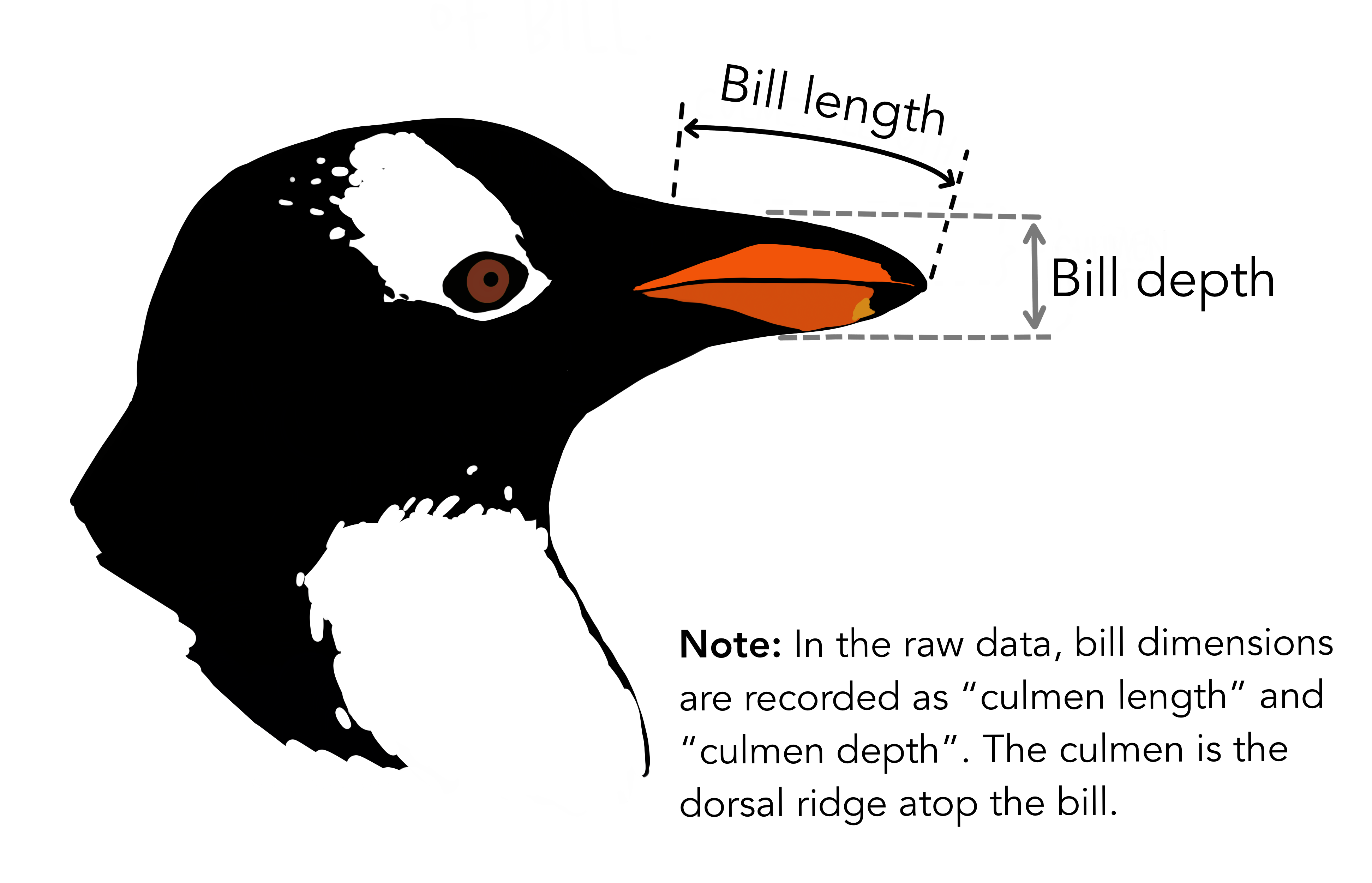 {Copyright Allison
Horst}
{Copyright Allison
Horst}
Specifically we are going to work with the weight of the penguins,
stored in the variable body_mass_g:
R
penguins$body_mass_g
OUTPUT
  [1] 3750 3800 3250   NA 3450 3650 3625 4675 3475 4250 3300 3700 3200 3800 4400
 [16] 3700 3450 4500 3325 4200 3400 3600 3800 3950 3800 3800 3550 3200 3150 3950
 [31] 3250 3900 3300 3900 3325 4150 3950 3550 3300 4650 3150 3900 3100 4400 3000
 [46] 4600 3425 2975 3450 4150 3500 4300 3450 4050 2900 3700 3550 3800 2850 3750
 [61] 3150 4400 3600 4050 2850 3950 3350 4100 3050 4450 3600 3900 3550 4150 3700
 [76] 4250 3700 3900 3550 4000 3200 4700 3800 4200 3350 3550 3800 3500 3950 3600
 [91] 3550 4300 3400 4450 3300 4300 3700 4350 2900 4100 3725 4725 3075 4250 2925
[106] 3550 3750 3900 3175 4775 3825 4600 3200 4275 3900 4075 2900 3775 3350 3325
[121] 3150 3500 3450 3875 3050 4000 3275 4300 3050 4000 3325 3500 3500 4475 3425
[136] 3900 3175 3975 3400 4250 3400 3475 3050 3725 3000 3650 4250 3475 3450 3750
[151] 3700 4000 4500 5700 4450 5700 5400 4550 4800 5200 4400 5150 4650 5550 4650
[166] 5850 4200 5850 4150 6300 4800 5350 5700 5000 4400 5050 5000 5100 4100 5650
[181] 4600 5550 5250 4700 5050 6050 5150 5400 4950 5250 4350 5350 3950 5700 4300
[196] 4750 5550 4900 4200 5400 5100 5300 4850 5300 4400 5000 4900 5050 4300 5000
[211] 4450 5550 4200 5300 4400 5650 4700 5700 4650 5800 4700 5550 4750 5000 5100
[226] 5200 4700 5800 4600 6000 4750 5950 4625 5450 4725 5350 4750 5600 4600 5300
[241] 4875 5550 4950 5400 4750 5650 4850 5200 4925 4875 4625 5250 4850 5600 4975
[256] 5500 4725 5500 4700 5500 4575 5500 5000 5950 4650 5500 4375 5850 4875 6000
[271] 4925   NA 4850 5750 5200 5400 3500 3900 3650 3525 3725 3950 3250 3750 4150
[286] 3700 3800 3775 3700 4050 3575 4050 3300 3700 3450 4400 3600 3400 2900 3800
[301] 3300 4150 3400 3800 3700 4550 3200 4300 3350 4100 3600 3900 3850 4800 2700
[316] 4500 3950 3650 3550 3500 3675 4450 3400 4300 3250 3675 3325 3950 3600 4050
[331] 3350 3450 3250 4050 3800 3525 3950 3650 3650 4000 3400 3775 4100 3775
How can we describe these values?
Mean
The mean is the average of all datapoints. We add all values
(excluding the missing values encoded with NA), and divide
with the number of observations:
\[\overline{x} = \frac{1}{N}\sum_1^N x_i\]
Where N is the number of observations, and \(x_i\) is the individual observations in the sample \(x\).
The easiest way of getting the mean is using the mean()
function. Adding the na.rm = TRUE argument removes missing
values before the calculation is done:
R
mean(penguins$body_mass_g, na.rm = TRUE)
OUTPUT
[1] 4201.754A slightly more cumbersome way is using the summarise()
function from tidyverse:
R
penguins |>
  summarise(avg_mass = mean(body_mass_g, na.rm = T))
OUTPUT
# A tibble: 1 × 1
  avg_mass
     <dbl>
1    4202.
As we will see below, this function streamlines the process of getting multiple descriptive values.
Barring significant outliers, mean is an expression of
position of the data. This is the weight we would expect a random
penguin in our dataset to have.
However, we have three different species of penguins in the dataset, and they have quite different average weights. There is also a significant difference in the average weight for the two sexes.
We will get to that at the end of this segment.
Median
Similarly to the average/mean, the median is an
expression of the location of the data. If we order our data by size,
from the smallest to the largest value, and locate the middle
observation, we get the median. This is the value that half of the
observations is smaller than. And half the observations is larger.
R
median(penguins$body_mass_g, na.rm = TRUE)
OUTPUT
[1] 4050We can note that the mean is larger than the median. This indicates that the data is skewed, in this case toward the larger penguins.
We can get both median and mean in one go
using the summarise() function:
R
penguins |>
  summarise(median = median(body_mass_g, na.rm = TRUE),
            mean   = mean(body_mass_g, na.rm = TRUE))
OUTPUT
# A tibble: 1 × 2
  median  mean
   <dbl> <dbl>
1   4050 4202.
Mode
Mode is the most common, or frequently occurring, observation. R does not have a build-in function for this, but we can easily find the mode by counting the different observations,and locating the most common one.
We typically do not use this for continous variables. The mode of the
sex variable in this dataset can be found like this:
R
penguins |>
  count(sex) |>
  arrange(desc(n))
OUTPUT
# A tibble: 3 × 2
  sex        n
  <fct>  <int>
1 male     168
2 female   165
3 <NA>      11
We count the different values in the sex variable, and
arrange the counts in descending order (desc). The mode of
the sex variable is male.
In this specific case, we note that the dataset is pretty evenly balanced regarding the two sexes.
Measures of variance
Knowing where the observations are located is interesting. But how do they vary? How can we describe the variation in the data?
Range
The simplest information about the variation is the range. What is the smallest and what is the largest value? Or, what is the spread?
We can get that by using the min() and
max() functions in a summarise() function:
R
penguins |>
  summarise(min = min(body_mass_g, na.rm = T),
            max = max(body_mass_g, na.rm = T))
OUTPUT
# A tibble: 1 × 2
    min   max
  <int> <int>
1  2700  6300
There is a dedicated function, range(), that does the
same. However it returns two values (for each row), and the summarise
function expects to get one value.
If we would like to use the range() function, we can add
it using the reframe() function instead of
summarise():
R
penguins  |>
  reframe(range = range(body_mass_g, na.rm = T))
OUTPUT
# A tibble: 2 × 1
  range
  <int>
1  2700
2  6300
Variance
The observations varies. They are not all located at the mean (or median), but are spread out on both sides of the mean. Can we get a numerical value describing that?
An obvious way would be to calculate the difference between each of the observations and the mean, and then take the average of those differences.
That will give us the average deviation. But we have a problem. The average weight of penguins was 4202 (rounded). Look at two penguins, one weighing 5000, and another weighing 3425. The differences are:
- 5000 - 4202 = 798
- 3425 - 4202 = -777
The sum of those two differences is: -777 + 798 = 21 g. And the average is then 10.5 gram. That is not a good estimate of a variation from the mean of more than 700 gram.
The problem is, that the differences can be both positive and negative, and might cancel each other out.
We solve that problem by squaring the differences, and calculate the mean of those.
For the population variance, the mathematical notation would be:
\[ \sigma^2 = \frac{\sum_{i=1}^N(x_i - \mu)^2}{N} \]
Population or sample?
Why are we suddenly using \(\mu\) instead of \(\overline{x}\)? Because this definition uses the population mean. The mean, or average, in the entire population of all penguins everywhere in the universe. But we have not weighed all those penguins.
And the sample variance:
\[ s^2 = \frac{\sum_{i=1}^N(x_i - \overline{x})^2}{N-1} \]
Note that we also change the \(\sigma\) to an \(s\).
And again we are not going to do that by hand, but will ask R to do it for us:
R
penguins |>
  summarise(
            variance = var(body_mass_g, na.rm = T)
          )
OUTPUT
# A tibble: 1 × 1
  variance
     <dbl>
1  643131.
Standard deviation
There is a problem with the variance. It is 643131, completely off scale from the actual values. There is also a problem with the unit which is in \(g^2\).
A measurement of the variation of the data would be the standard deviation, simply defined as the square root of the variance:
R
penguins |>
  summarise(
            s = sd(body_mass_g, na.rm = T)
          )
OUTPUT
# A tibble: 1 × 1
      s
  <dbl>
1  802.
Since the standard deviation occurs in several statistical tests, it is more frequently used than the variance. It is also more intuitively relateable to the mean.
A histogram
A visual illustration of the data can be nice. Often one of the first we make, is a histogram.
A histogram is a plot or graph where we split the range of observations in a number of “buckets”, and count the number of observations in each bucket:
R
penguins |>
  select(body_mass_g) |>
  filter(!is.na(body_mass_g)) |>
  mutate(buckets = cut(body_mass_g, breaks=seq(2500,6500,500))) |>
group_by(buckets) |>
summarise(antal = n())
OUTPUT
# A tibble: 8 × 2
  buckets         antal
  <fct>           <int>
1 (2.5e+03,3e+03]    11
2 (3e+03,3.5e+03]    67
3 (3.5e+03,4e+03]    92
4 (4e+03,4.5e+03]    57
5 (4.5e+03,5e+03]    54
6 (5e+03,5.5e+03]    33
7 (5.5e+03,6e+03]    26
8 (6e+03,6.5e+03]     2
Typically, rather than counting ourself, we leave the work to R, and make a histogram directly:
R
penguins |>
ggplot((aes(x=body_mass_g))) +
geom_histogram()
OUTPUT
`stat_bin()` using `bins = 30`. Pick better value `binwidth`.WARNING
Warning: Removed 2 rows containing non-finite outside the scale range
(`stat_bin()`).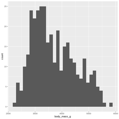
By default ggplot chooses 30 bins, typically we should chose a different number:
R
penguins |>
ggplot((aes(x=body_mass_g))) +
geom_histogram(bins = 25)
WARNING
Warning: Removed 2 rows containing non-finite outside the scale range
(`stat_bin()`).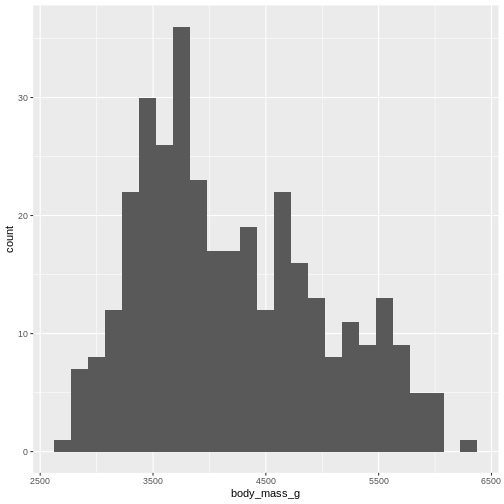
Or, ideally, set the widths of them, manually:
R
penguins |>
ggplot((aes(x=body_mass_g))) +
geom_histogram(binwidth = 250) +
ggtitle("Histogram with binwidth = 250 g")
WARNING
Warning: Removed 2 rows containing non-finite outside the scale range
(`stat_bin()`).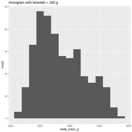 Or even specify the exact intervals we want, here intervals from 0 to
6500 gram in intervals of 250 gram:
Or even specify the exact intervals we want, here intervals from 0 to
6500 gram in intervals of 250 gram:
R
penguins |>
ggplot((aes(x=body_mass_g))) +
geom_histogram(breaks = seq(0,6500,250)) +
ggtitle("Histogram with bins in 250 g steps from 0 to 6500 g")
WARNING
Warning: Removed 2 rows containing non-finite outside the scale range
(`stat_bin()`).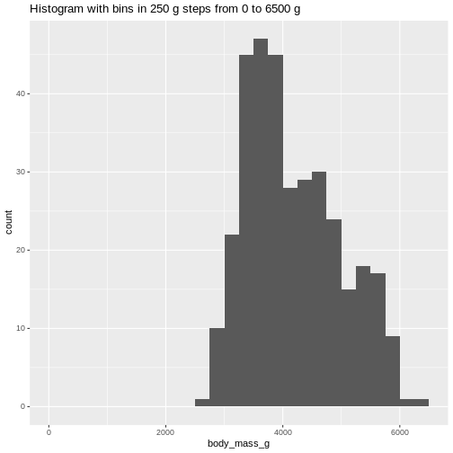 The histogram provides us with a visual indication of both range, the
variation of the values, and an idea about where the data is
located.
The histogram provides us with a visual indication of both range, the
variation of the values, and an idea about where the data is
located.
Quartiles
The median can be understood as splitting the data in two equally sized parts, where one is characterized by having values smaller than the median and the other as having values larger than the median. It is the value where 50% of the observations are smaller.
Similary we can calculate the value where 25% of the observations are smaller.
That is often called the first quartile, where the median is the 50%, or second quartile. Quartile implies four parts, and the existence of a third or 75% quartile.
We can calcultate those using the quantile function:
R
quantile(penguins$body_mass_g, probs = .25, na.rm = T)
OUTPUT
 25%
3550
and
R
quantile(penguins$body_mass_g, probs = .75, na.rm = T)
OUTPUT
 75%
4750
We are often interested in knowing the range in which 50% of the observations fall.
That is used often enough that we have a dedicated function for it:
R
penguins |>
  summarise(iqr = IQR(body_mass_g, na.rm = T))
OUTPUT
# A tibble: 1 × 1
    iqr
  <dbl>
1  1200
The name of the quantile function implies that we might have other quantiles than quartiles. Actually we can calculate any quantile, eg the 2.5% quantile:
R
quantile(penguins$body_mass_g, probs = .025, na.rm = T)
OUTPUT
2.5%
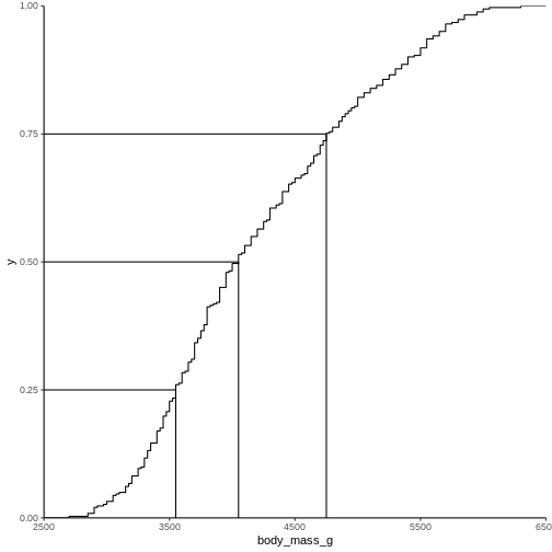
2988.125 The individual quantiles can be interesting in themselves. If we want a visual representation of all quantiles, we can calculate all of them, and plot them.
Instead of doing that by hand, we can use a concept called CDF or cumulative density function:
R
CDF <- ecdf(penguins$body_mass_g)
CDF
OUTPUT
Empirical CDF
Call: ecdf(penguins$body_mass_g)
 x[1:94] =   2700,   2850,   2900,  ...,   6050,   6300
That was not very informative. Lets plot it:
Measures of shape
Skewness
We previously saw a histogram of the data, and noted that the observations were skewed to the left, and that the “tail” on the right was longer than on the left. That skewness can be quantised.
There is no function for skewness build into R, but we can get it
from the library e1071
R
library(e1071)
OUTPUT
Attaching package: 'e1071'OUTPUT
The following object is masked from 'package:ggplot2':

    element
R
skewness(penguins$body_mass_g, na.rm = T)
OUTPUT
[1] 0.4662117The skewness is positive, indicating that the data are skewed to the left, just as we saw. A negative skewness would indicate that the data skew to the right.
Kurtosis
Another parameter describing the shape of the data is kurtosis. We can think of that as either “are there too many observations in the tails?” leading to a relatively low peak. Or, as “how pointy is the peak” - because the majority of observations are centered in the peak, rather than appearing in the tails.
We use the e1071 package again:
R
kurtosis(penguins$body_mass_g, na.rm = T)
OUTPUT
[1] -0.73952Kurtosis is defined weirdly, and here we get “excess” kurtosis, the actual kurtosis minus 3. We have negative kurtosis, indicating that the peak is flat, and the tails are fat.
Everything Everywhere All at Once
A lot of these descriptive values can be gotten for every variable in
the dataset using the summary function:
R
summary(penguins)
OUTPUT
      species          island    bill_length_mm  bill_depth_mm
 Adelie   :152   Biscoe   :168   Min.   :32.10   Min.   :13.10
 Chinstrap: 68   Dream    :124   1st Qu.:39.23   1st Qu.:15.60
 Gentoo   :124   Torgersen: 52   Median :44.45   Median :17.30
                                 Mean   :43.92   Mean   :17.15
                                 3rd Qu.:48.50   3rd Qu.:18.70
                                 Max.   :59.60   Max.   :21.50
                                 NAs    :2       NAs    :2
 flipper_length_mm  body_mass_g       sex           year
 Min.   :172.0     Min.   :2700   female:165   Min.   :2007
 1st Qu.:190.0     1st Qu.:3550   male  :168   1st Qu.:2007
 Median :197.0     Median :4050   NAs   : 11   Median :2008
 Mean   :200.9     Mean   :4202                Mean   :2008
 3rd Qu.:213.0     3rd Qu.:4750                3rd Qu.:2009
 Max.   :231.0     Max.   :6300                Max.   :2009
 NAs    :2         NAs    :2
Here we get the range, the 1st and 3rd quantiles (and from those the IQR), the median and the mean and, rather useful, the number of missing values in each variable.
We can also get all the descriptive values in one table, by adding more than one summarizing function to the summarise function:
R
penguins |>
  summarise(min = min(body_mass_g, na.rm = T),
            max = max(body_mass_g, na.rm = T),
            mean = mean(body_mass_g, na.rm = T),
            median = median(body_mass_g, na.rm = T),
            stddev = sd(body_mass_g, na.rm = T),
            var = var(body_mass_g, na.rm = T),
            Q1 = quantile(body_mass_g, probs = .25, na.rm = T),
            Q3 = quantile(body_mass_g, probs = .75, na.rm = T),
            iqr = IQR(body_mass_g, na.rm = T),
            skew = skewness(body_mass_g, na.rm = T),
            kurtosis = kurtosis(body_mass_g, na.rm = T)
  )
OUTPUT
# A tibble: 1 × 11
    min   max  mean median stddev     var    Q1    Q3   iqr  skew kurtosis
  <int> <int> <dbl>  <dbl>  <dbl>   <dbl> <dbl> <dbl> <dbl> <dbl>    <dbl>
1  2700  6300 4202.   4050   802. 643131.  3550  4750  1200 0.466   -0.740
As noted, we have three different species of penguins in the dataset. Their weight varies a lot. If we want to do the summarising on each for the species, we can group the data by species, before summarising:
R
penguins |>
  group_by(species) |>
  summarise(min = min(body_mass_g, na.rm = T),
            max = max(body_mass_g, na.rm = T),
            mean = mean(body_mass_g, na.rm = T),
            median = median(body_mass_g, na.rm = T),
            stddev = sd(body_mass_g, na.rm = T)
  )
OUTPUT
# A tibble: 3 × 6
  species     min   max  mean median stddev
  <fct>     <int> <int> <dbl>  <dbl>  <dbl>
1 Adelie     2850  4775 3701.   3700   459.
2 Chinstrap  2700  4800 3733.   3700   384.
3 Gentoo     3950  6300 5076.   5000   504.
We have removed some summary statistics in order to get a smaller table.
Boxplots
Finally boxplots offers a way of visualising some of the summary statistics:
R
penguins |>
  ggplot(aes(x=body_mass_g, y = sex)) +
  geom_boxplot()
WARNING
Warning: Removed 2 rows containing non-finite outside the scale range
(`stat_boxplot()`).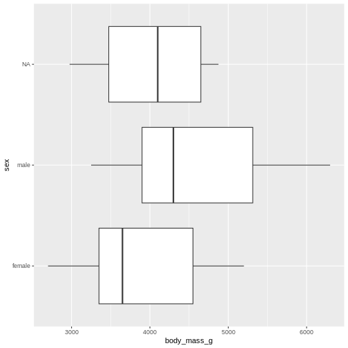
The boxplot shows us the median (the fat line in the middel of each box), the 1st and 3rd quartiles (the ends of the boxes), and the range, with the whiskers at each end of the boxes, illustrating the minimum and maximum. Any observations, more than 1.5 times the IQR from either the 1st or 3rd quartiles, are deemed as outliers and would be plotted as individual points in the plot.
Counting
Most of the descriptive functions above are focused on continuous variables, maybe grouped by one or more categorical variables.
What about the categorical themselves?
The one thing we can do looking only at categorical variables, is counting.
Counting the different values in a single categorical variable in
base-R is done using the table(() function
R
table(penguins$sex)
OUTPUT
female   male
   165    168
Often we are interested in cross tables, tables where we count the different combinations of the values in more than one categorical variable, eg the distribution of the two different penguin sexes on the three different islands:
R
table(penguins$island, penguins$sex)
OUTPUT
            female male
  Biscoe        80   83
  Dream         61   62
  Torgersen     24   23
We can event group on three (or more) categorical variables, but the output becomes increasingly difficult to read the mote variables we add:
R
table(penguins$island, penguins$sex, penguins$species)
OUTPUT
, ,  = Adelie


            female male
  Biscoe        22   22
  Dream         27   28
  Torgersen     24   23

, ,  = Chinstrap


            female male
  Biscoe         0    0
  Dream         34   34
  Torgersen      0    0

, ,  = Gentoo


            female male
  Biscoe        58   61
  Dream          0    0
  Torgersen      0    0
Aggregate
A different way of doing that in base-R is using the
aggregate() function:
R
aggregate(sex ~ island, data = penguins, FUN = length)
OUTPUT
     island sex
1    Biscoe 163
2     Dream 123
3 Torgersen  47
Here we construct the crosstable using the formula notation, and
specify which function we want to apply on the results. This can be used
to calculate summary statistics on groups, by adjusting the
FUN argument.
Counting in tidyverse
In tidyverse we will typically group the data by the variables we want to count, and then tallying them:
R
penguins |>
  group_by(sex) |>
  tally()
OUTPUT
# A tibble: 3 × 2
  sex        n
  <fct>  <int>
1 female   165
2 male     168
3 <NA>      11
group_by works equally well with more than one
group:
R
penguins |>
  group_by(sex, species) |>
  tally()
OUTPUT
# A tibble: 8 × 3
# Groups:   sex [3]
  sex    species       n
  <fct>  <fct>     <int>
1 female Adelie       73
2 female Chinstrap    34
3 female Gentoo       58
4 male   Adelie       73
5 male   Chinstrap    34
6 male   Gentoo       61
7 <NA>   Adelie        6
8 <NA>   Gentoo        5
But the output is in a long format, and often requires some manipulation to get into a wider tabular format.
A shortcut exists in tidyverse, count, which combines
group_by and tally:
R
penguins |>
  count(sex, species)
OUTPUT
# A tibble: 8 × 3
  sex    species       n
  <fct>  <fct>     <int>
1 female Adelie       73
2 female Chinstrap    34
3 female Gentoo       58
4 male   Adelie       73
5 male   Chinstrap    34
6 male   Gentoo       61
7 <NA>   Adelie        6
8 <NA> Gentoo 5- We have access to a lot of summarising descriptive indicators the the location, spread and shape of our data.