design-principles
Last updated on 2025-02-04 | Edit this page
Overview
Questions
- How do you write a lesson using R Markdown and sandpaper?
Objectives
- Explain how to use markdown with the new lesson template
- Demonstrate how to include pieces of code, figures, and nested challenge blocks
se også: https://ikashnitsky.phd/2024/rotate-damn-plot/
R
library(tidyverse)
OUTPUT
── Attaching core tidyverse packages ──────────────────────── tidyverse 2.0.0 ──
✔ dplyr     1.1.4     ✔ readr     2.1.5
✔ forcats   1.0.0     ✔ stringr   1.5.1
✔ ggplot2   3.5.1     ✔ tibble    3.2.1
✔ lubridate 1.9.4     ✔ tidyr     1.3.1
✔ purrr     1.0.2
── Conflicts ────────────────────────────────────────── tidyverse_conflicts() ──
✖ dplyr::filter() masks stats::filter()
✖ dplyr::lag()    masks stats::lag()
ℹ Use the conflicted package (<http://conflicted.r-lib.org/>) to force all conflicts to become errors
R
library(patchwork)
library(palmerpenguins)
These are our generel recommendations for making graphs. They do not cover every possible case. Because the number of different cases is pretty close to infinite.
Nor are they - with a few exceptions - very firm. Once in a very rare situation a pie chart is actually the best way of visualising data.
One of the gurus in the field of thinking about visual representations of data is Edward Tufte. He outlines a set of general principles:
Graphical integrity Visual representations of data must tell the truth - they must not lie.
He posits 6 principles of graphical integrity.
1. Representation of Numbers Should Be Directly Proportional to the Numerical Quantities Represented
The size of the elements in a graph (e.g., bars in a bar chart) should correspond to the actual data values. This prevents misleading interpretations. Example: A bar chart where the height of each bar accurately reflects the corresponding data value.
No gridlines
R
et <- penguins %>%
  ggplot(aes(y=species)) +
  geom_bar()  +
  theme_bw() +
  ggtitle("With gridlines")

to <- penguins %>%
  ggplot(aes(y=species)) +
  geom_bar()  +
  theme_bw() +
  theme(panel.grid = element_blank()) +
  ggtitle("Without gridlines")

et + to
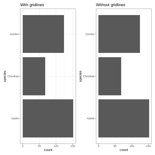 Do the gridlines add value to the plot? In general the answer is no, and
we have better ways of adding the value they might bring.
Do the gridlines add value to the plot? In general the answer is no, and
we have better ways of adding the value they might bring.
Inspireret af Common Consultancy.
ingen gridlines
Datalabesl eller aksemærkater - ikke begge. Vil du vise data eller tendens?
Datalabels inde i søjlerne støjer mindre end uden for.
Hvis grafen bedst læses fra venstre - så placer y-aksen til højre.
Brug ikoner og skriftstørrelse aktivt. https://x.com/ValdemarOsted/status/1829409939653001316/photo/4
Undgå legend ved linegraphs https://x.com/ValdemarOsted/status/1829409944270987537/photo/1
Ingen akselinier ved kategoriske variable https://x.com/ValdemarOsted/status/1829409944270987537/photo/2
Lagkagediagrammer er farlige, men flotte. Skal de absolut være der - brug datalabels! https://x.com/ValdemarOsted/status/1829409944270987537/photo/3
Fremhæv gerne værdier! https://x.com/ValdemarOsted/status/1829409944270987537/photo/4
Placer titlen på grafen i nederste højre hjørne https://x.com/ValdemarOsted/status/1829409948540772604/photo/1 Her er vi ikke helt enige…
Lange navne eller mange søgler - vandret søjlediagram
ALDRIG dobbelte y-eller x-akser. https://x.com/ValdemarOsted/status/1829409948540772604/photo/3 Og slet ikke hvis enhederne er forskellige.
R
library(palmerpenguins)
penguins %>%
filter(species == "Adelie") %>%
ggplot(aes(x=body_mass_g)) +
geom_line(aes(y = bill_depth_mm)) +
geom_line(aes(y = flipper_length_mm/5)) +
scale_y_continuous(sec.axis = sec_axis(~.*5)) +
theme_ipsum()
ERROR
Error in theme_ipsum(): could not find function "theme_ipsum"3D pie charts
There are only two situations where you should make a 3D pie chart.
- If you want to misrepresent the data.
- If you want to illustrate why 3D pie charts should never be made.
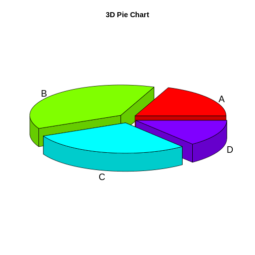
The values behind the four slices are: A: 20, B: 40, C: 30 and D: 15.
Or: Slice B represents a value twice as large as slice A. Slice C represents a value twice as large as slice D. This is not a all obvious from the plot. The perspective forced on the plot in order to give the 3D illusion, distorts the area of the slices.
The axes should always start at 0
Except when they shouldn’t.
A common rule of thumb is that axes should always start at 0.
However. If the axis does not have a natural 0 - do not.
Langt, langt de fleste gange skal aksen starte med 0. Men ikke hvis aksen ikke har et naturligt 0 punkt. Den klassiske om gennemsnitlig højde af kvinder. Tidsserier er også en undtagelse.
https://thedoublethink.com/tuftes-principles-for-visualizing-quantitative-information/
Key Points
- Use
.mdfiles for episodes when you want static content - Use
.Rmdfiles for episodes when you need to generate output - Run
sandpaper::check_lesson()to identify any issues with your lesson - Run
sandpaper::build_lesson()to preview your lesson locally