All Images
Reproducible Data Analysis
Figure 1
One example of these problems is shown every time we load tidyverse:
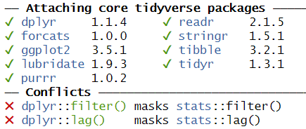
Figure 2

Figure 3

Figure 4

Figure 5
You will see a new button in RStudio: 
Reading data from fileCountryNamePhonenumber
Figure 1
Figure 2
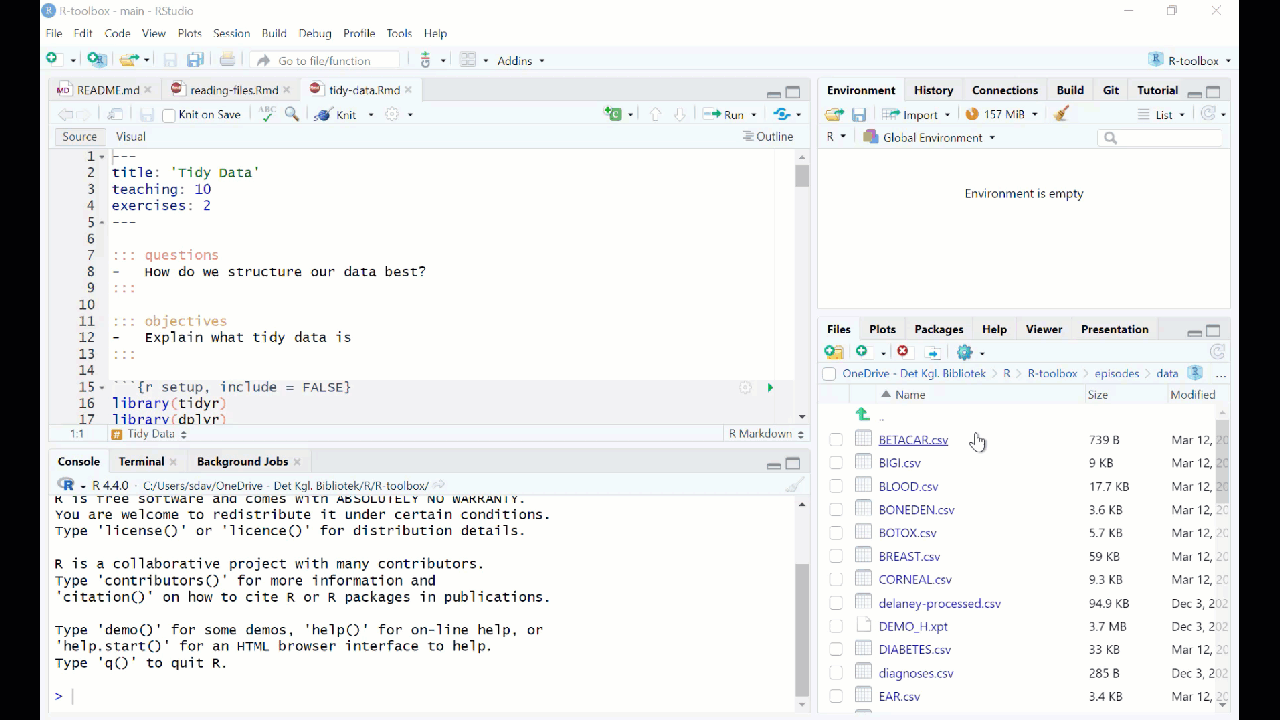
Figure 3
Descriptive Statistics
Figure 1
 {Copyright Allison
Horst}
{Copyright Allison
Horst}
Figure 2
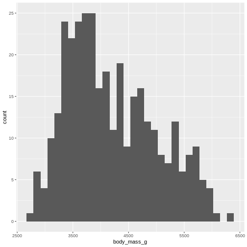
Figure 3
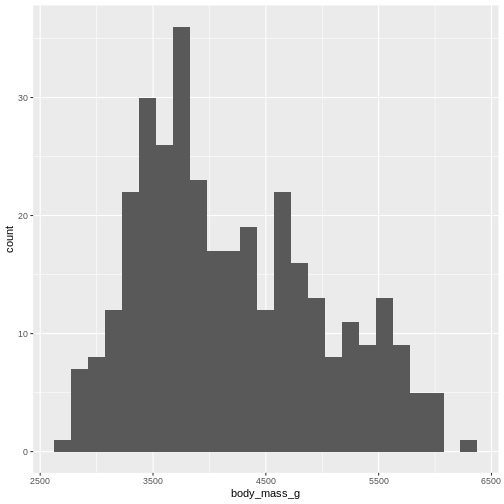
Figure 4
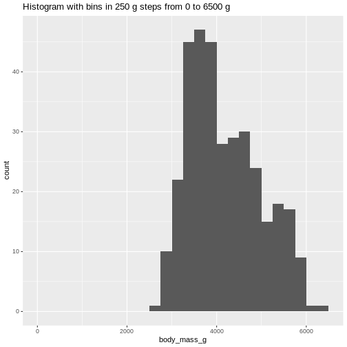
 Or even specify the exact intervals we want, here intervals from 0 to
6500 gram in intervals of 250 gram:
Or even specify the exact intervals we want, here intervals from 0 to
6500 gram in intervals of 250 gram:
Figure 5
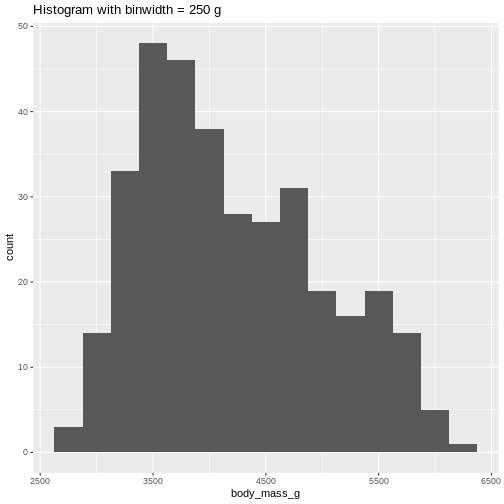
 The histogram provides us with a visual indication of both range, the
variation of the values, and an idea about where the data is
located.
The histogram provides us with a visual indication of both range, the
variation of the values, and an idea about where the data is
located.
Figure 6
Figure 7
Histograms
Figure 1
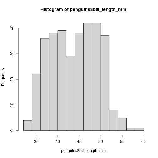
Figure 2
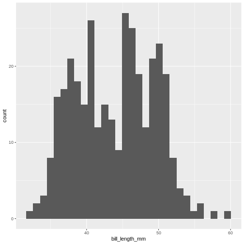
Figure 3
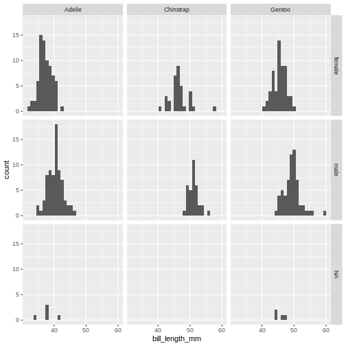
Figure 4
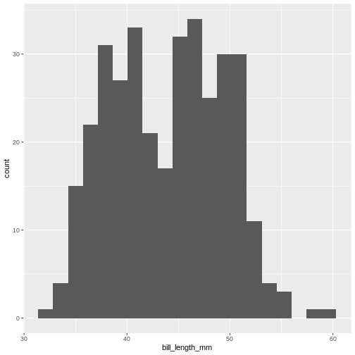
Figure 5
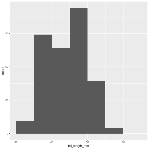
Table One
Table One - gt
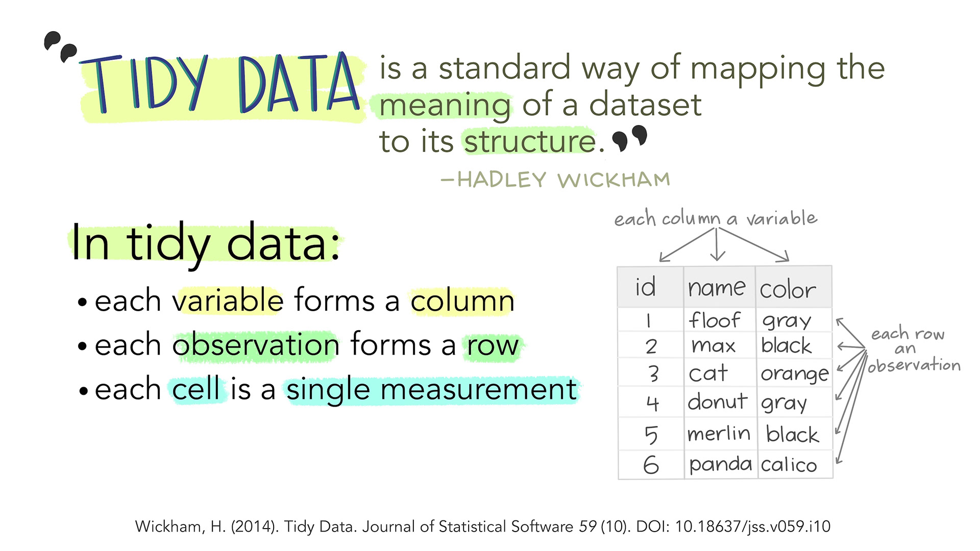
Tidy Data
Figure 1
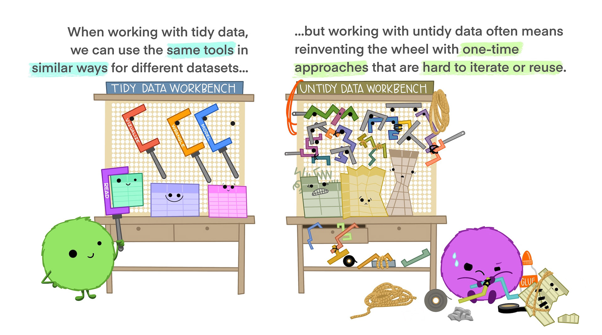
Figure 2
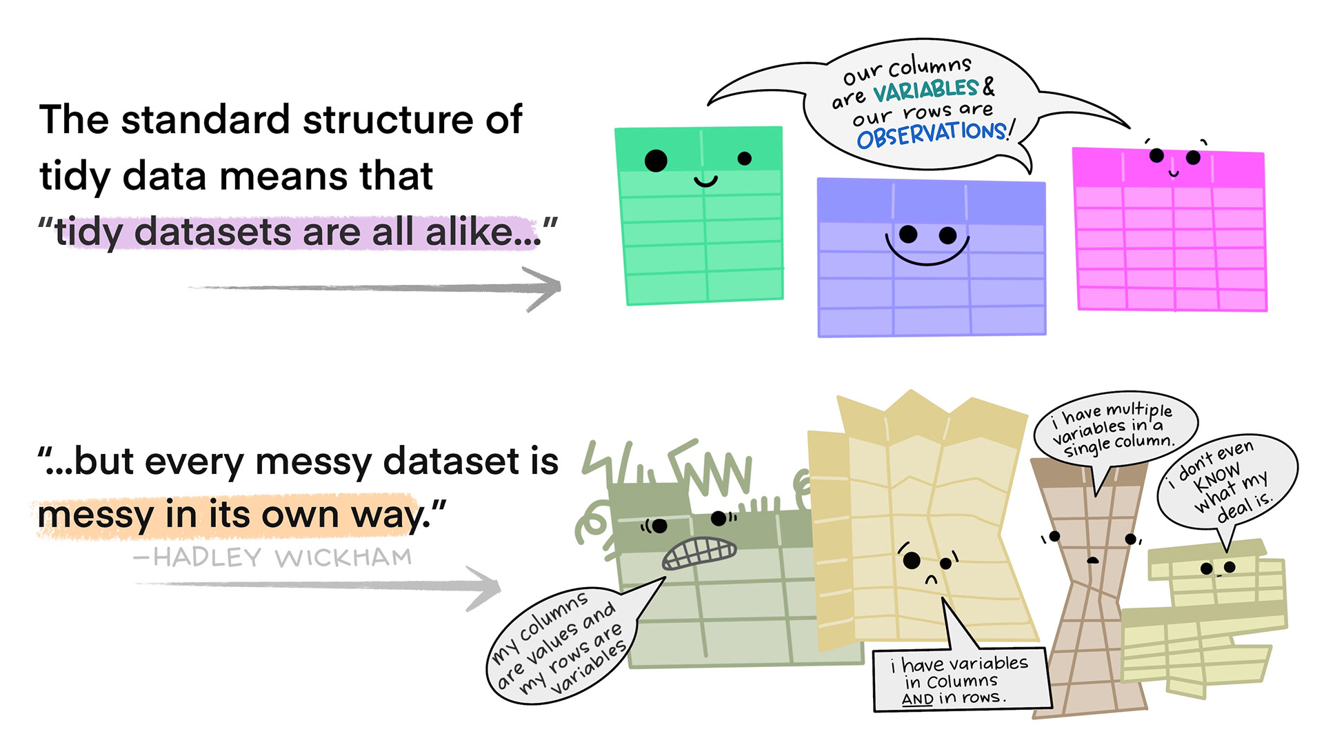
Figure 3
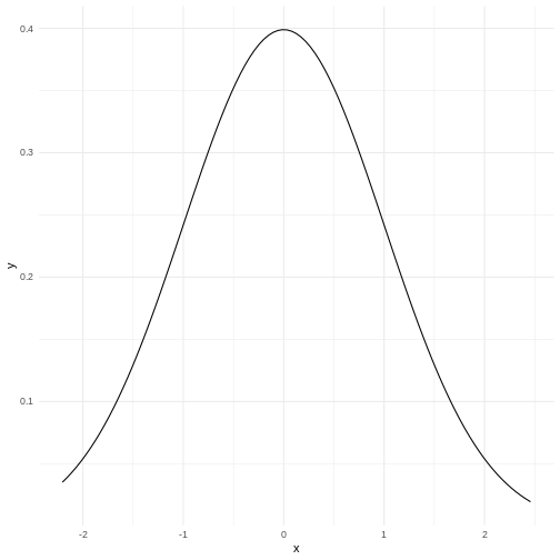
The normal distribution
Figure 1
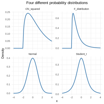
Figure 2
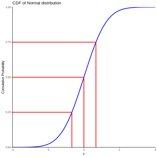
 The area under the curve is 1,
equivalent to 100%.
The area under the curve is 1,
equivalent to 100%.
Figure 3
Testing for normality
Figure 1
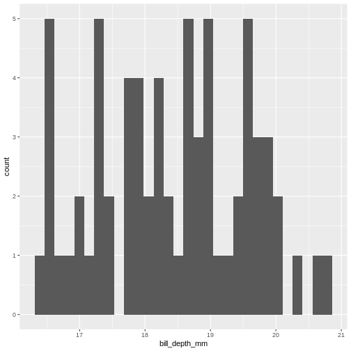
Figure 2
 Our histogram does not really look like the theoretical curve. The fact
that mean and median are almost identical was not a sufficient criterium
for normalcy.
Our histogram does not really look like the theoretical curve. The fact
that mean and median are almost identical was not a sufficient criterium
for normalcy.
Figure 3
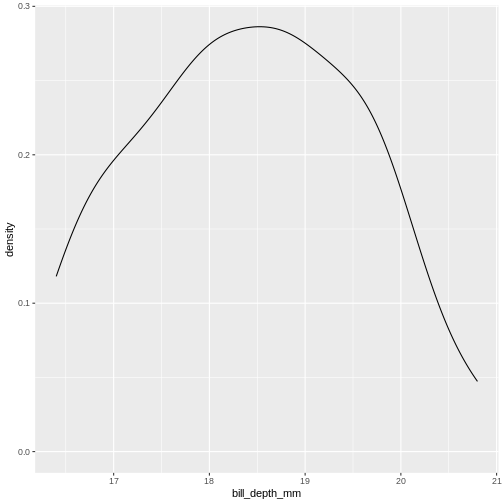
Figure 4
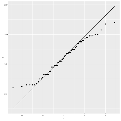
Figure 5
How is the data distributed?
Figure 1
Linear regression
Figure 1
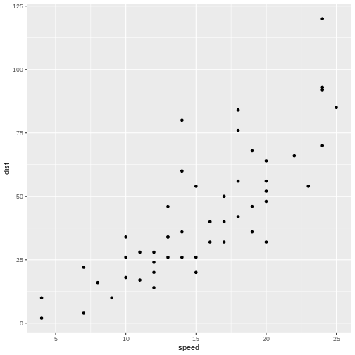
Figure 2
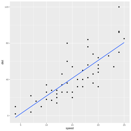
Figure 3
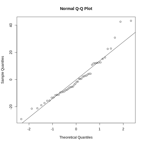
Figure 4
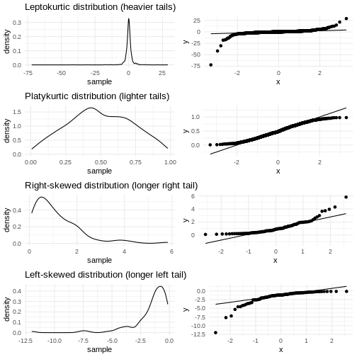
 They are relatively close to normal.
Multiple Linear Regression
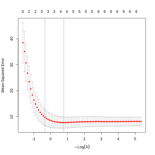
LASSO regularisation
Figure 1
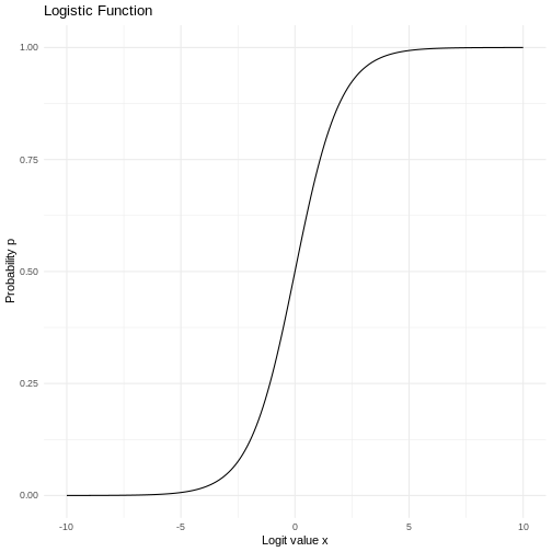
Logistic regression
Figure 1
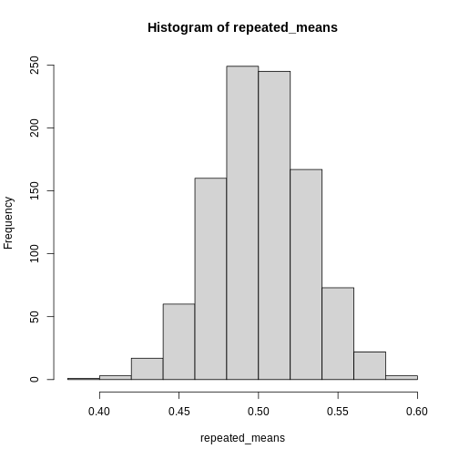
Central Limit Theorem
Figure 1
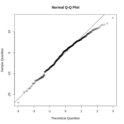
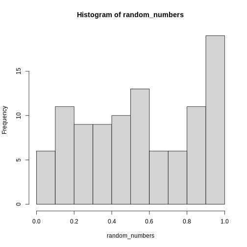 This is definitely not normally distributed.
Figure 2
Nicer barcharts
Figure 1
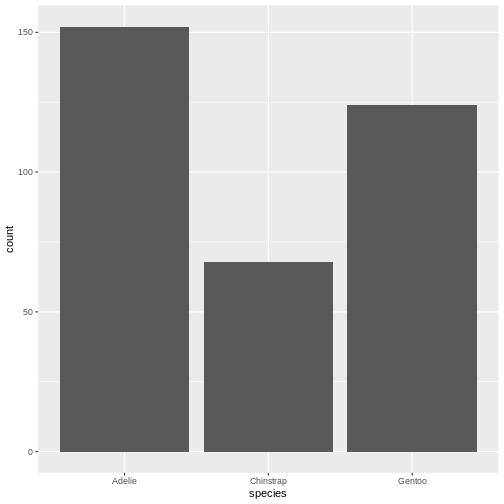
Figure 2
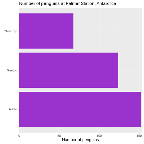
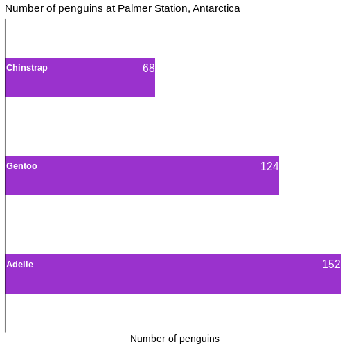
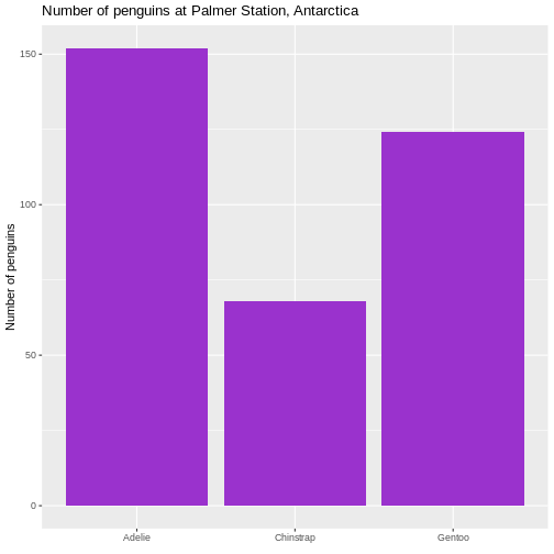 It is not strictly necessary to remove the label of the x-axis, but it
is superfluous in this case.
It is not strictly necessary to remove the label of the x-axis, but it
is superfluous in this case.
Figure 3
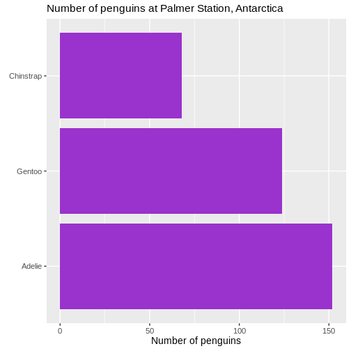
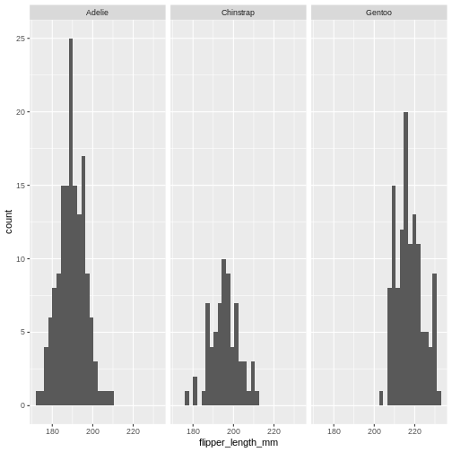
 This facilitates the reading of the graph - it becomes very easy to see
that the most frequent species of penguin is Adelie penguins.
This facilitates the reading of the graph - it becomes very easy to see
that the most frequent species of penguin is Adelie penguins.
Figure 4
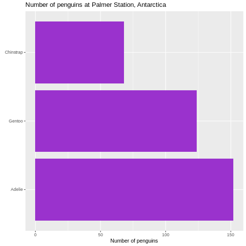
Figure 5
 We also changed the scaling of the title of the plot. The size of that
is now 10% larger than the base size. We can do that by specifying a
specific size, but here we have done it using the
We also changed the scaling of the title of the plot. The size of that
is now 10% larger than the base size. We can do that by specifying a
specific size, but here we have done it using the rel()
function which changes the size relative to the base font size in the
plot.
Figure 6
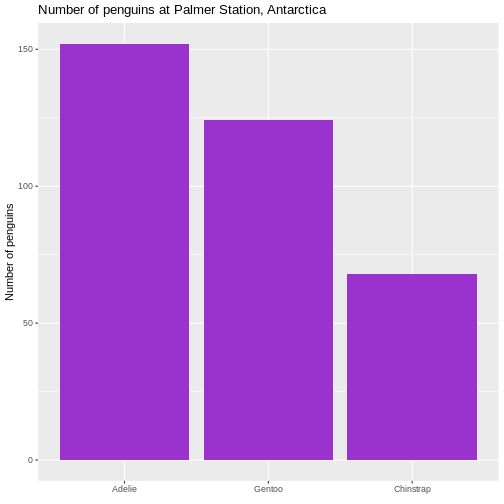
 We control what is happening on the x-scale by using the family of
scale_x functions. Because it is a continuous scale, more
specifically scale_x_continuous().
Figure 7
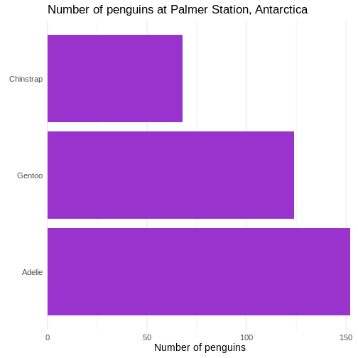 First we change the default theme of the plot from
theme_grey to theme_minimal, which gets rid of
the grey background. In the additional theme() function we
remove the gridlines, both major and minor gridlines, on the y-axis, by
setting them to the speciel plot element
element_blank()
Figure 8
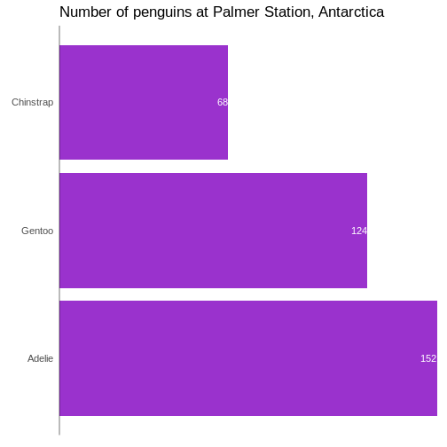
Figure 9
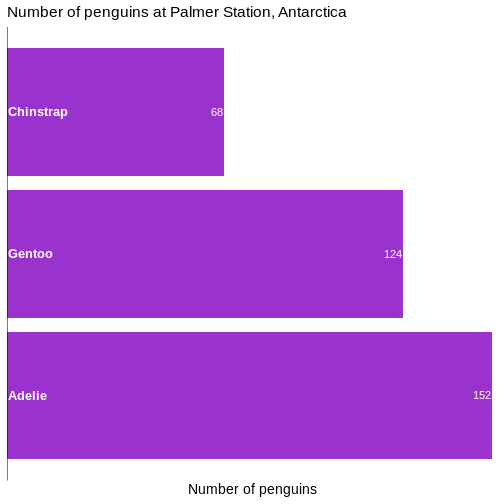
Figure 10
Power Calculations
k-means
Figure 1
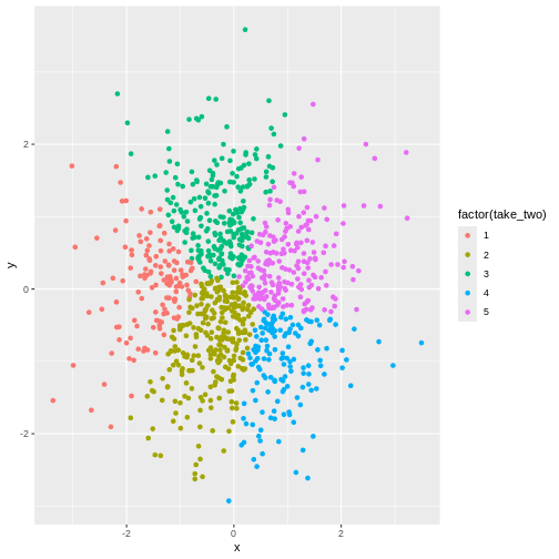
Figure 2

Figure 3
No. Even though there might actually be clusters in the data, the
algorithm is not necessarily able to find them. Consider this data:
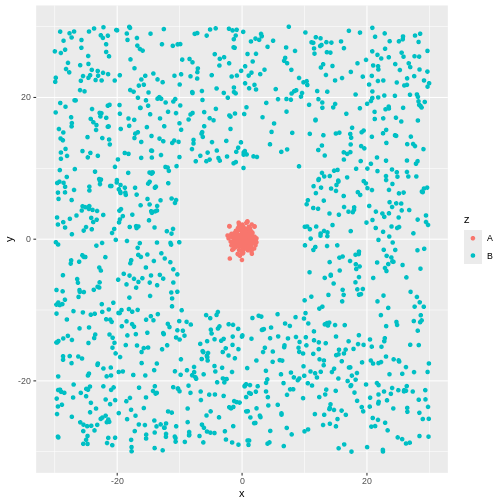 There is obviously a cluster centered around (0,0). And another cluster
more or lesss evenly spread around it.
There is obviously a cluster centered around (0,0). And another cluster
more or lesss evenly spread around it.
Figure 4
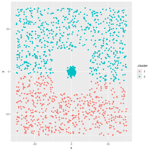 But not the ones we want.
ANOVA
Figure 1
 That looks reasonable.
Cohens Kappa
R on UCloud
Figure 1
Figure 2
Figure 3
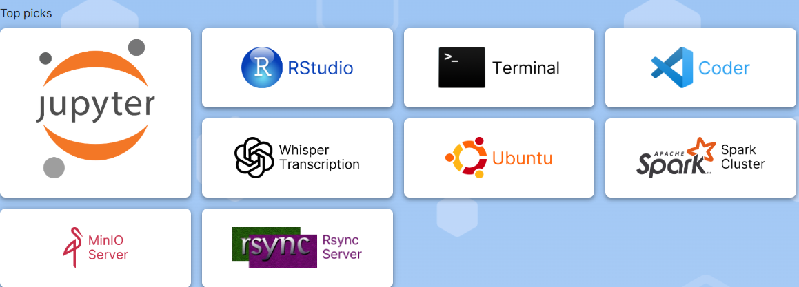
Figure 4
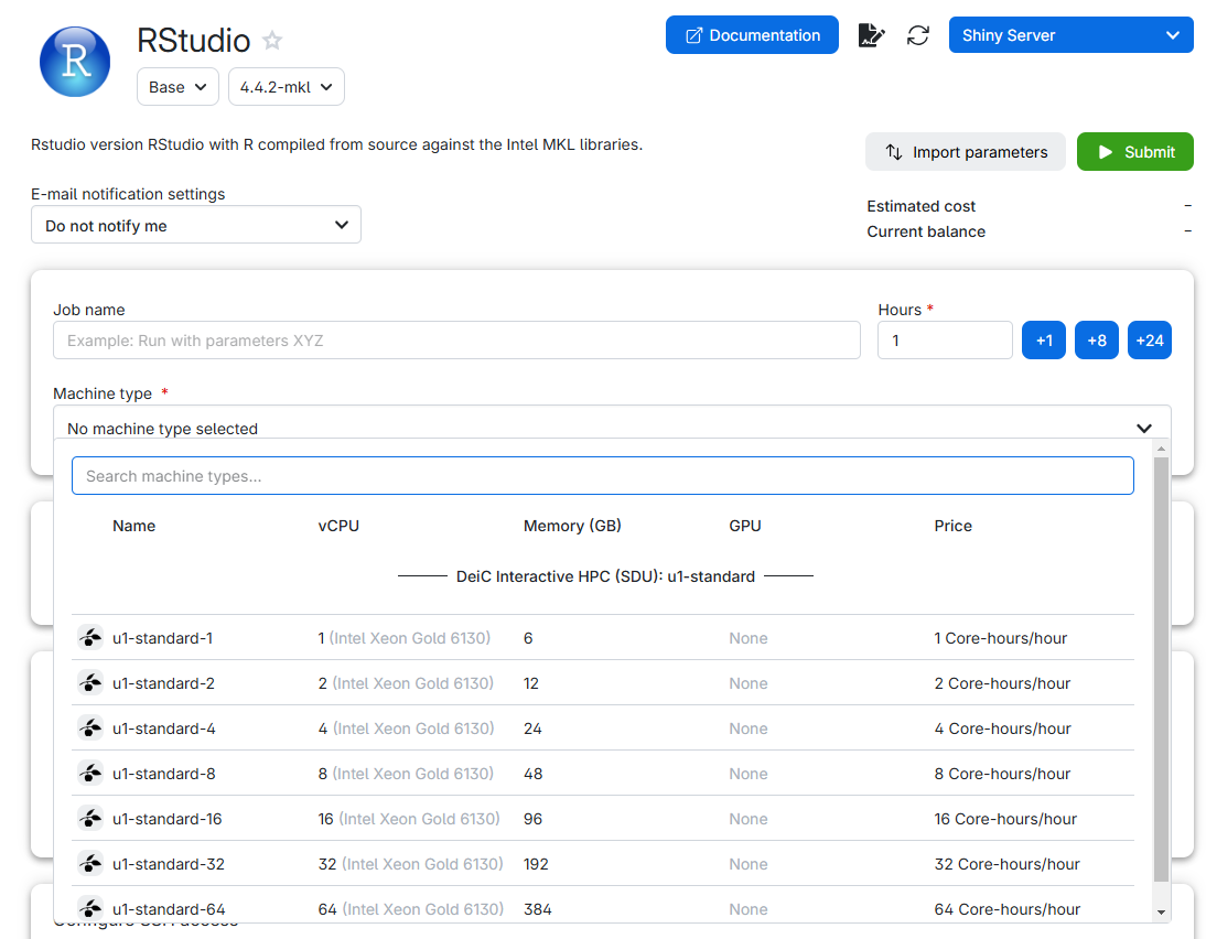
Figure 5
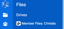
Figure 6
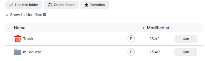
In it we find a listing of what is in our drive: 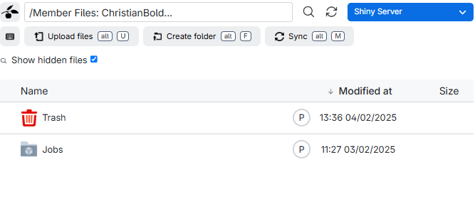
Figure 7
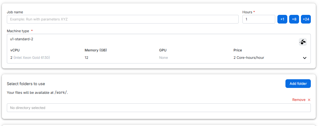
Figure 8
 And then click “Submit”
Figure 9
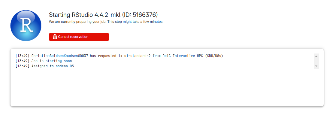
Figure 10
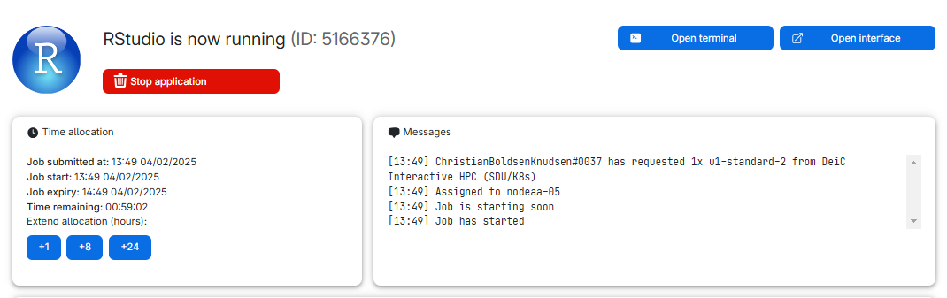
Figure 11
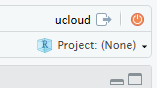
Figure 12
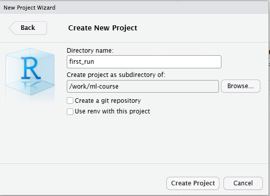
Figure 13
Sometimes we close a window, or nagivate away from it. Where can we
find it again? In the navigation bar to the left in we find this icon.
 It provides us with a list or
running jobs (yes, we can have more than one). Click on the job, and we
get back to the job, where we can extend time or open the interface
again.
It provides us with a list or
running jobs (yes, we can have more than one). Click on the job, and we
get back to the job, where we can extend time or open the interface
again.
Figure 14
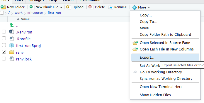
Figure 15
Figure 16
Parallellization in R
A deeper dive into pipes
Figure 1
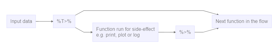
Figure 2
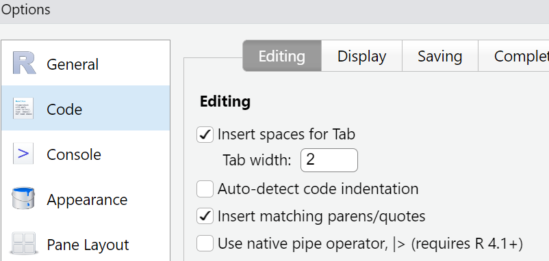 Place a tickmark in the box next to
“Use native pipe operator, |>”.
Place a tickmark in the box next to
“Use native pipe operator, |>”.
Setup for GIS
Setup for Git
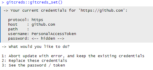
Figure 1
Begin by introducing yourself to Git. Go to the terminal 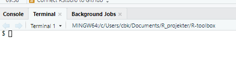
Figure 2
Click “Generate token”, and copy the token: 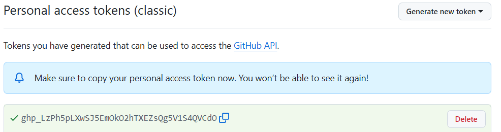
Figure 3
Introduction to Git(Hub)
Figure 1

Figure 2

Figure 3

Figure 4

Practice makes perfect
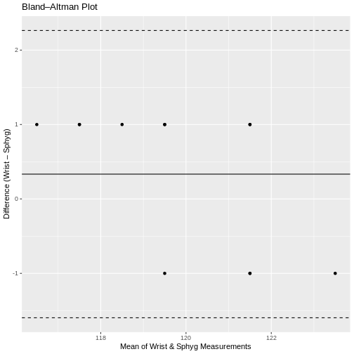
Statistical tests
Figure 1
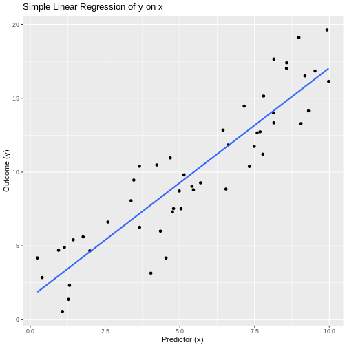
Figure 2
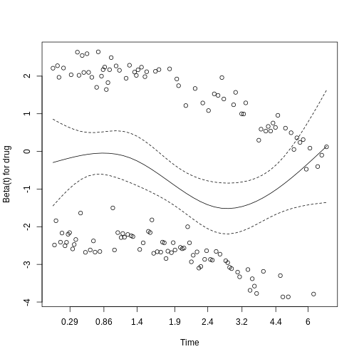
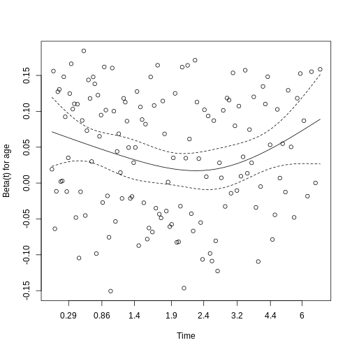
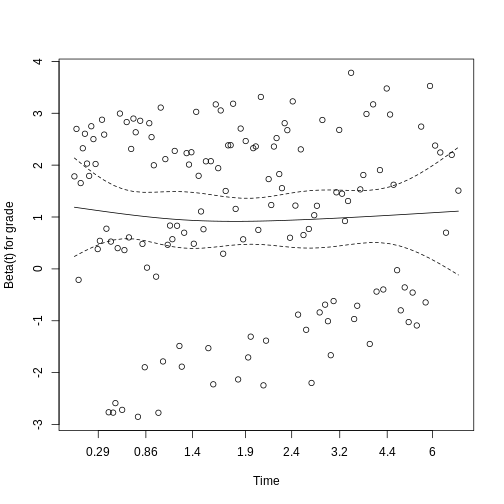
Figure 3
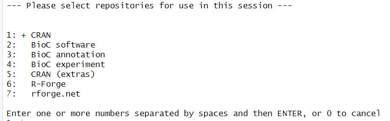
When install.packages fail
Figure 1
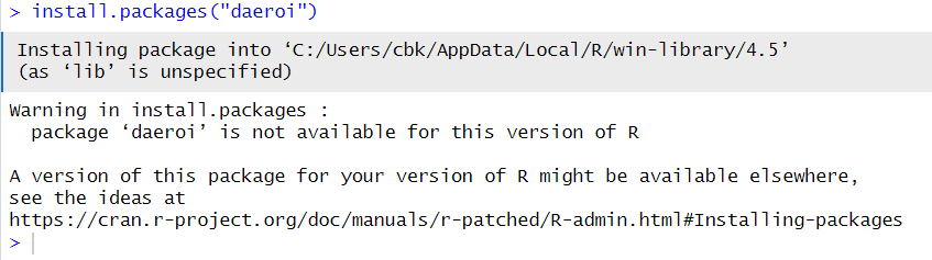
Figure 2
allow us to chose one or more of the repositories that R knows about: